Community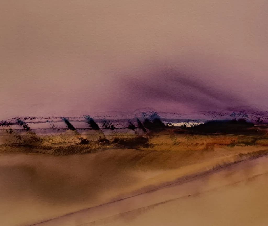
Painting
A place to share your work and connect with the ArtHelper painting community.
Posts
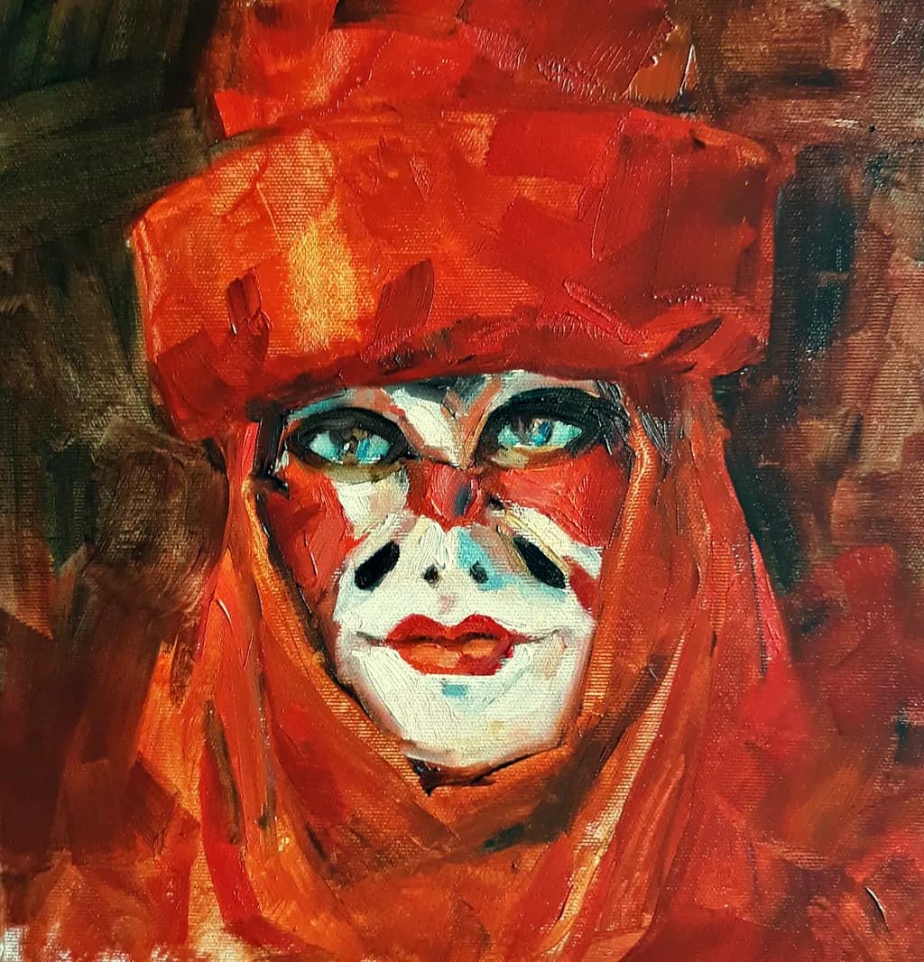
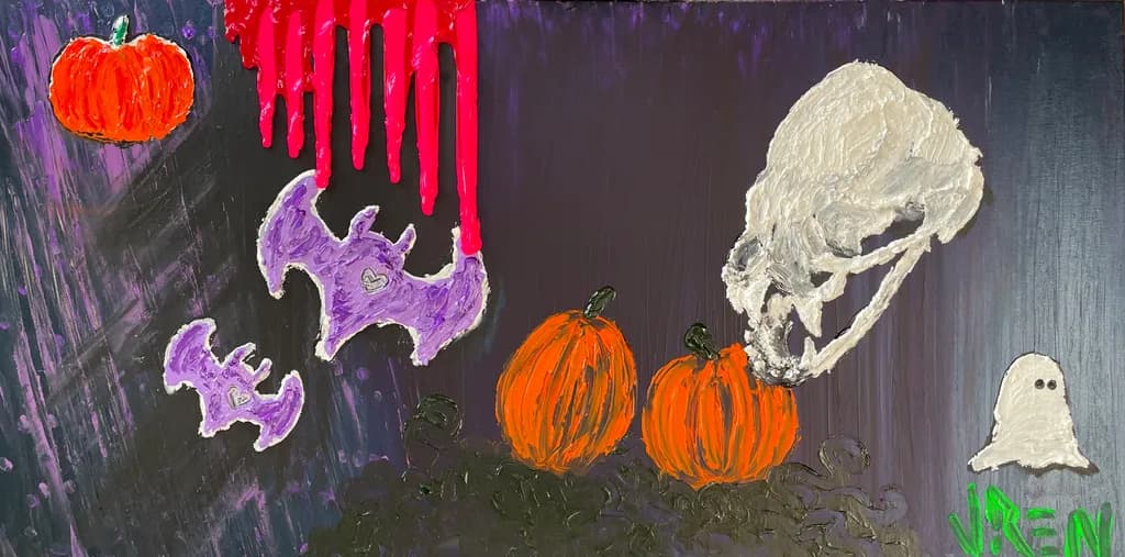
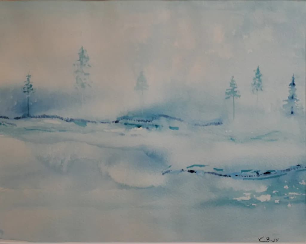
Landscape No 55
Watercolor, abstract expressionism. Inspired by one of these days in the High Coast.
0
10h ago
When you pick up color and everything you know falls apart
Every time I step outside my graphite comfort zone and try to add color to a drawing, it feels like my brain short circuits. I can construct forms, I can lay down confident lines from the shoulder, I can work through a full page of boxes and cylinders without flinching. But the moment I pick up a colored pencil or even a simple marker set, all that confidence just evaporates.
I genuinely do not understand how color works in practice. Value I get, that's just light and dark. But choosing actual hues, making them sit next to each other without looking muddy or cartoonish, figuring out how warm and cool temperatures play into a form. It's like learning to draw all over again from zero.
For those of you who came from a drawing background and eventually got comfortable with color, what actually helped it click? Was it studying color theory formally, or more of a "just start filling sketchbook pages with bad color studies" kind of path? I'd honestly love to hear what the early stages looked like for you.
0
11h ago
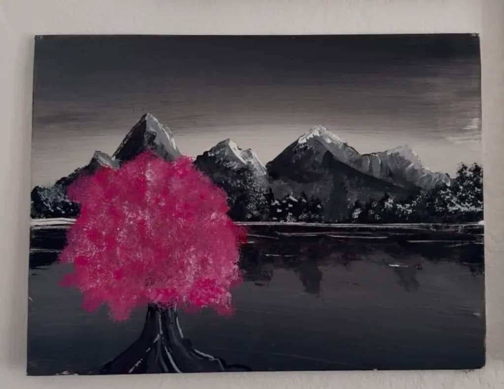
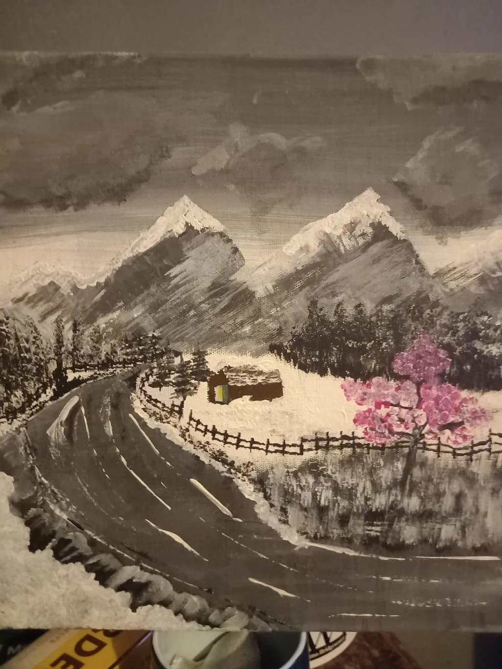
Todays landscape ☺
"A moody, monochrome world interrupted by a sudden punch of pink. It’s meant to feel like a pleasant shock to the system—a bit like finding cash when your skint.Just a reminder that a little bit of color can go a long way."
1
12h ago
When do you push through the ugly stage vs. step away?
Every acrylic painting I do hits a point around the second or third layer where it looks like a total mess. The underpainting is peeking through in weird places, the values are fighting each other, and nothing reads the way I imagined. For me this usually happens right after I block in my big shapes and start glazing transparent color over those dried passages.
I used to panic at that stage and overwork everything, piling on opaque layers trying to "fix" it. Now I mostly trust the process and keep going, because I know the next round of glazing will pull things together. But honestly, sometimes stepping away for an hour or even a full day gives me fresh eyes that save a painting from bad decisions made in frustration.
I still don't have a clean rule for when to push through versus when to walk away. How do you handle that awkward middle stage? Do you have a personal signal that tells you to put the brush down, or do you just keep layering and trust it?
0
13h ago
Paper dries my acrylics even faster, so why do I keep going back?
Acrylics already dry fast enough to make me sweat, but painting on paper cranks that up to another level. The surface pulls moisture out of the paint so quickly that my usual blending window basically disappears.
For a long time I treated paper as throwback sketchbook territory, something I'd slap color onto before "the real painting" on canvas. But lately I've been noticing that the way paper eats the moisture actually forces me to commit to my color mixes and values up front. I have to premix enough paint the first time because there is zero room to fuss. When I go back to canvas afterward, my layering feels more confident and my glazes land closer to where I want them on the first pass.
I started adding a thin layer of matte medium to some heavier weight paper and that slows the absorption just enough to let me push a soft edge here and there without losing that snap decision energy.
Does anyone else use paper on purpose as part of their process, not just for warmups? And if so, have you found ways to control how fast it drinks the paint, or do you lean into that speed?
1
Human-Made ArtTop Contributor
14h ago
Supporting One Another & Getting the Most out of this Community
I've been away 2 weeks on vacation, but I have a question or maybe an exhortation for the community. I have gotten into the habit of making sure I go the the Artist's art gallery on Art Helper any time they comment on one of my posts, follow me, or post a painting I am drawn to. I spend some time going through their artwork and "liking" the ones that most capture my attention. At the beginning, several months ago, a few people did that for me too and I cannot tell you how much I appreciated that. So often we're not really sure if our work resonates with the public, or which paintings most resonate. Knowing this, often helps me learn and develop in both areas that are working, as well as reviewing work that isn't "liked," asking myself if there are ways that I can improve it. I am wondering if we all practiced this to a degree, we could learn from each other. I know it takes some time, but I know how valuable it is to me and wonder if others feel the same. I do want to point out that our galleries are now set up in categories, so it's important to go the the full gallery menu option or all you see are the 12 pieces or so that are the headings for categories. What are all of your thoughts on this?
13
14h ago
Shadow temperature keeps fighting my light direction
Last week I blocked in a desert landscape, late afternoon warmth pouring in from the left. I glazed the shadow sides with a thin violet mixed from ultramarine and quinacridone magenta, trying to push that cool counterpoint against all the warm cadmium light. On the monitor it looked convincing. On the easel the next morning it just looked like I dropped purple everywhere.
The idea makes sense to me on paper. Warm light, cool shadows. Cool light, warm shadows. That temperature flip is supposed to sell the direction and depth. But in practice, especially with acrylics where a glaze dries fast and commits you, I keep overshooting it. The shadows end up calling more attention than the lit passages.
What I have started doing is premixing a larger puddle of my shadow color and testing it on a scrap canvas next to my lit mix before committing. That helps a little. But I still struggle with how far to push the temperature shift before it starts looking like a color exercise instead of a painting.
How do you handle this? Do you keep your shadow temperature subtle, or do you lean into a strong complementary shift and then knock it back with another layer?
1
15h ago
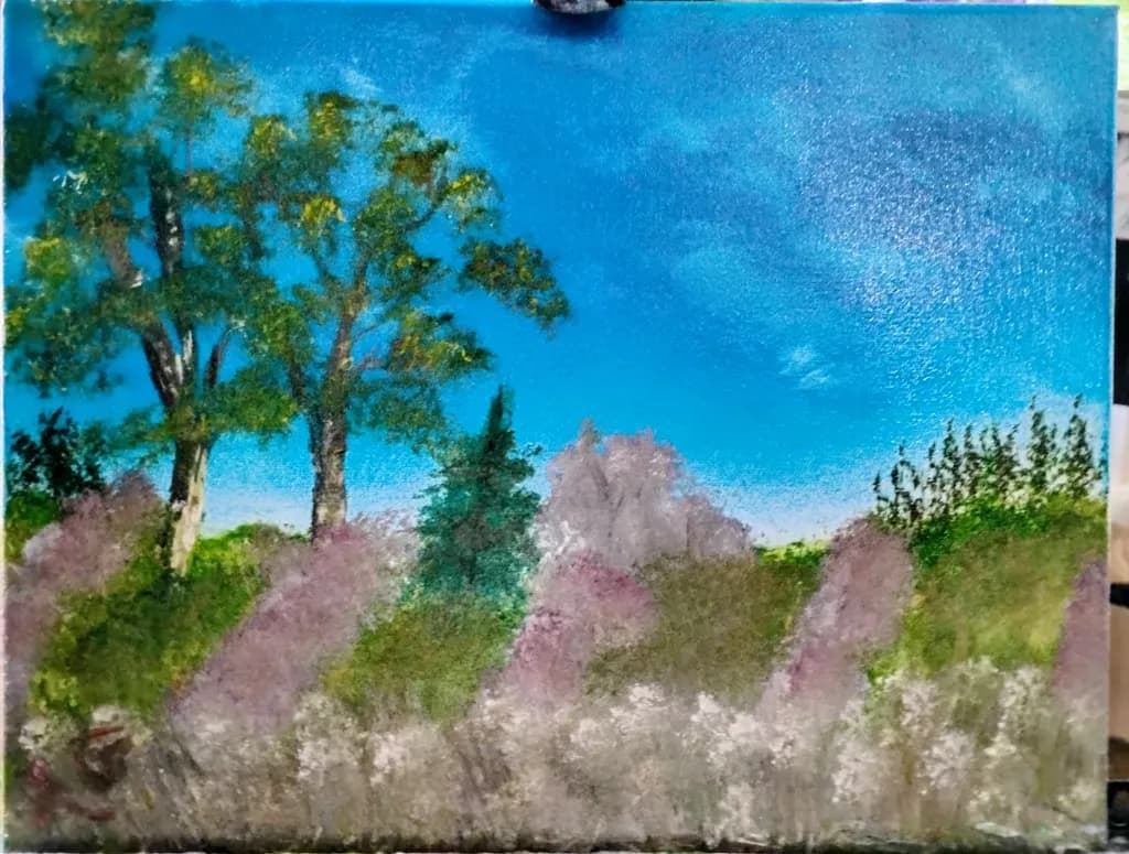
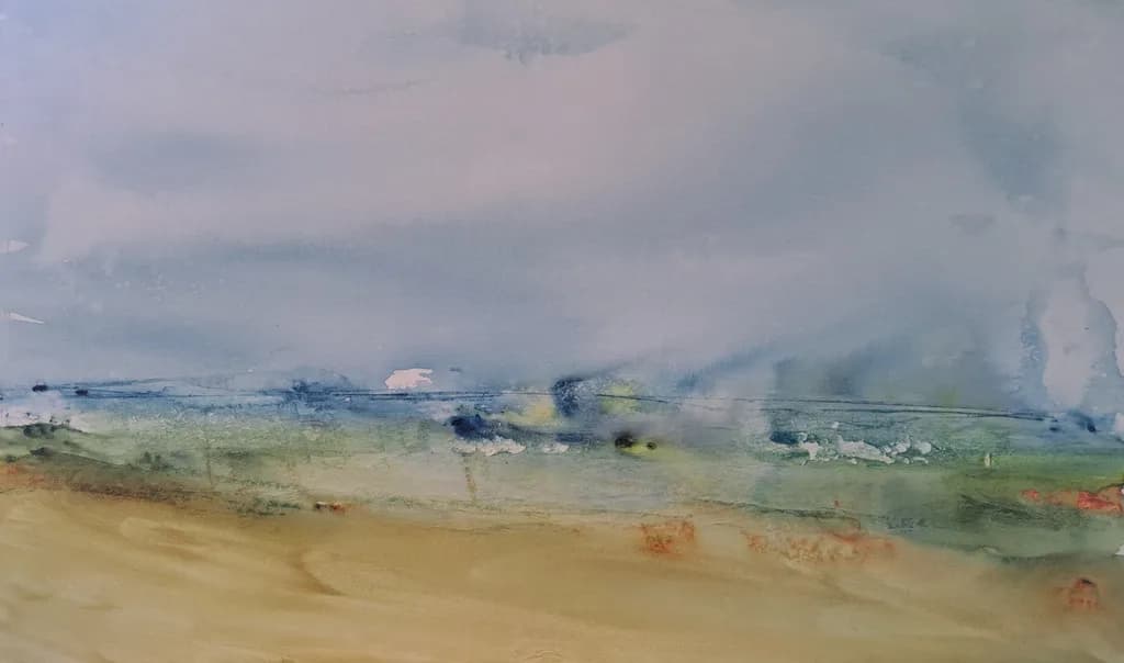
Lavender Fields
soft meadow lined with lavender fields. This gentle and quiet sky provides a beautiful contrast to the spring landscape just beginning to come to life with color.
6
22h ago
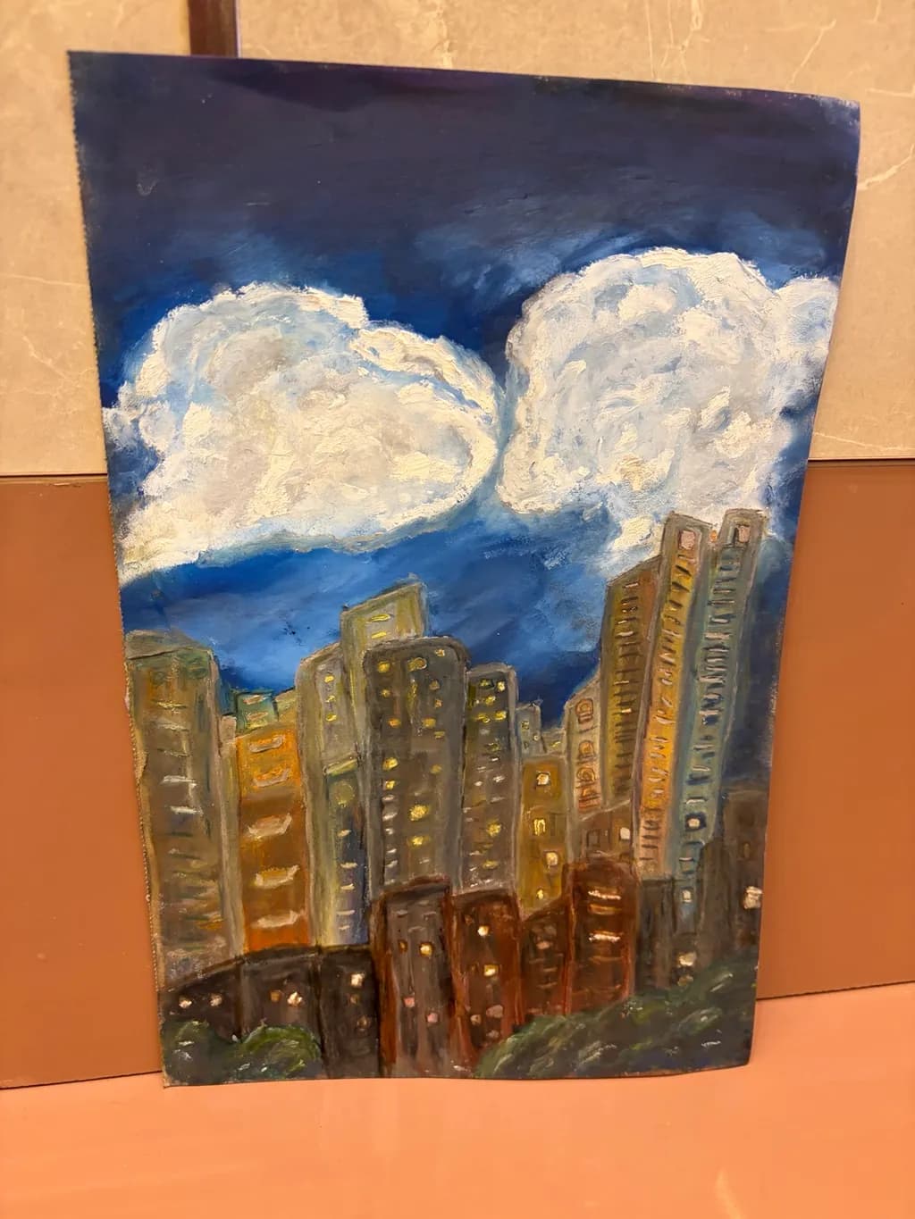
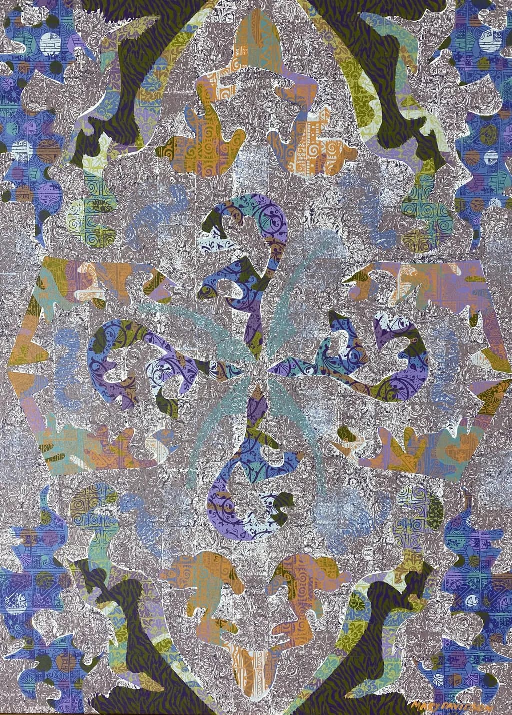
Pricing
One thing I still can't figure out is how to price my paintings. How do you decide what your artwork is worth?
0
1d ago
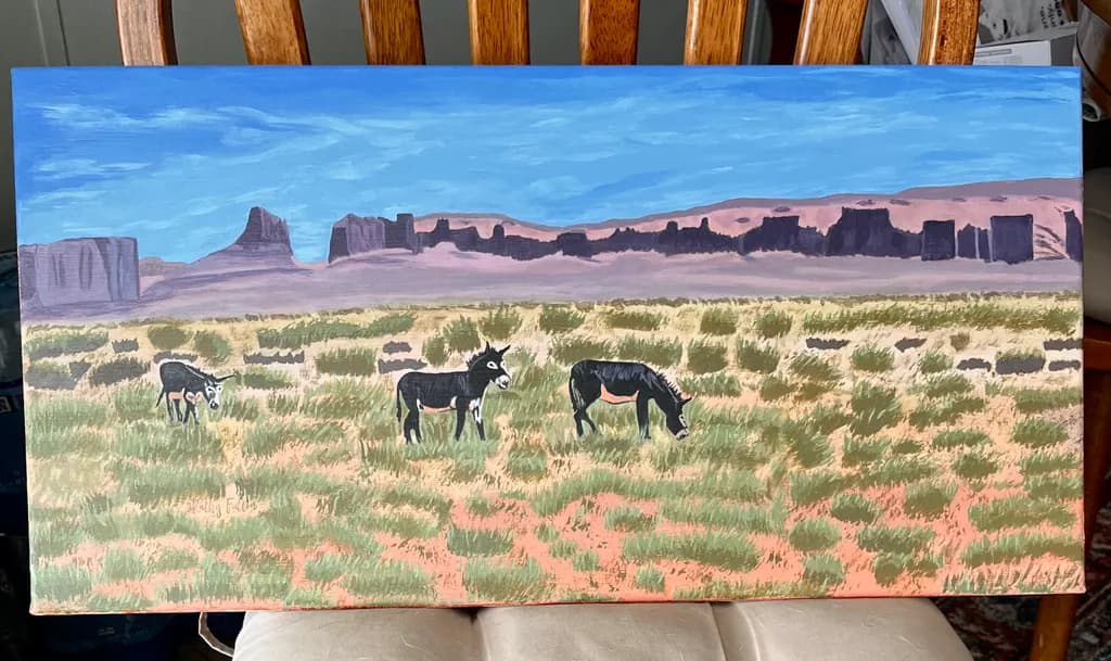
Newest Painting
A commission piece I just finished I call “Roaming Burros of Utah”. Photo was provided by customer who took it in Utah. Even though this piece is not available I am going to sell giclee prints.
2
1d ago(edited)
Winding track landscape.☺
I painted this winter mountain scene using mostly black, white, and grey, but I really wanted to add a fun pop of color to make it stand out. In the background, there are two big snow-capped mountains under a dark, stormy-looking sky, with a bunch of pine trees packed together below them. A winding road sweeps through the bottom left, and there’s a cozy little brown cabin sitting out in the snow behind a wooden fence. My favorite part to paint was definitely the bright pink blossoming tree on the right side—I love pink ☺
1
1d ago
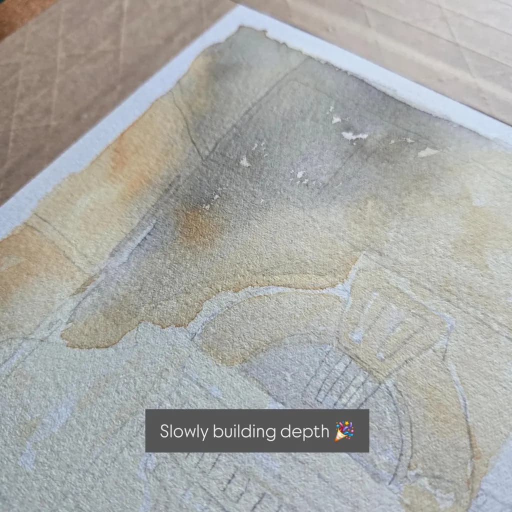
Estimating vanishing points without actually finding them
Halfway through a big perspective box exercise and I keep catching myself doing something I'm not sure is helping. When I need to figure out where lines converge, my instinct is to ghost the line way out past the page to locate an actual vanishing point, then work backward from there.
But I think the whole point of the exercise is to train your eye to feel the convergence angle without physically tracing it out. Like, you're supposed to look at the existing edges and estimate where the next line should go based on how steeply things are already converging. Not find the VP, just sense it.
I'm torn because the ghosting method gives me more accurate boxes right now, but it might be a crutch that keeps me from developing that internal sense of depth. When I did gesture studies, I had a similar moment where measuring every proportion kept me accurate but slow, and loosening up was the thing that actually built real skill.
For anyone who's ground through perspective construction exercises like this, did you let yourself ghost out to the vanishing points or did you force yourself to estimate purely from convergence angles? Did one approach build your spatial intuition faster than the other?
0