Nature & Wildlife Photography
Post image 1
Post image 2
Post image 3
1/3

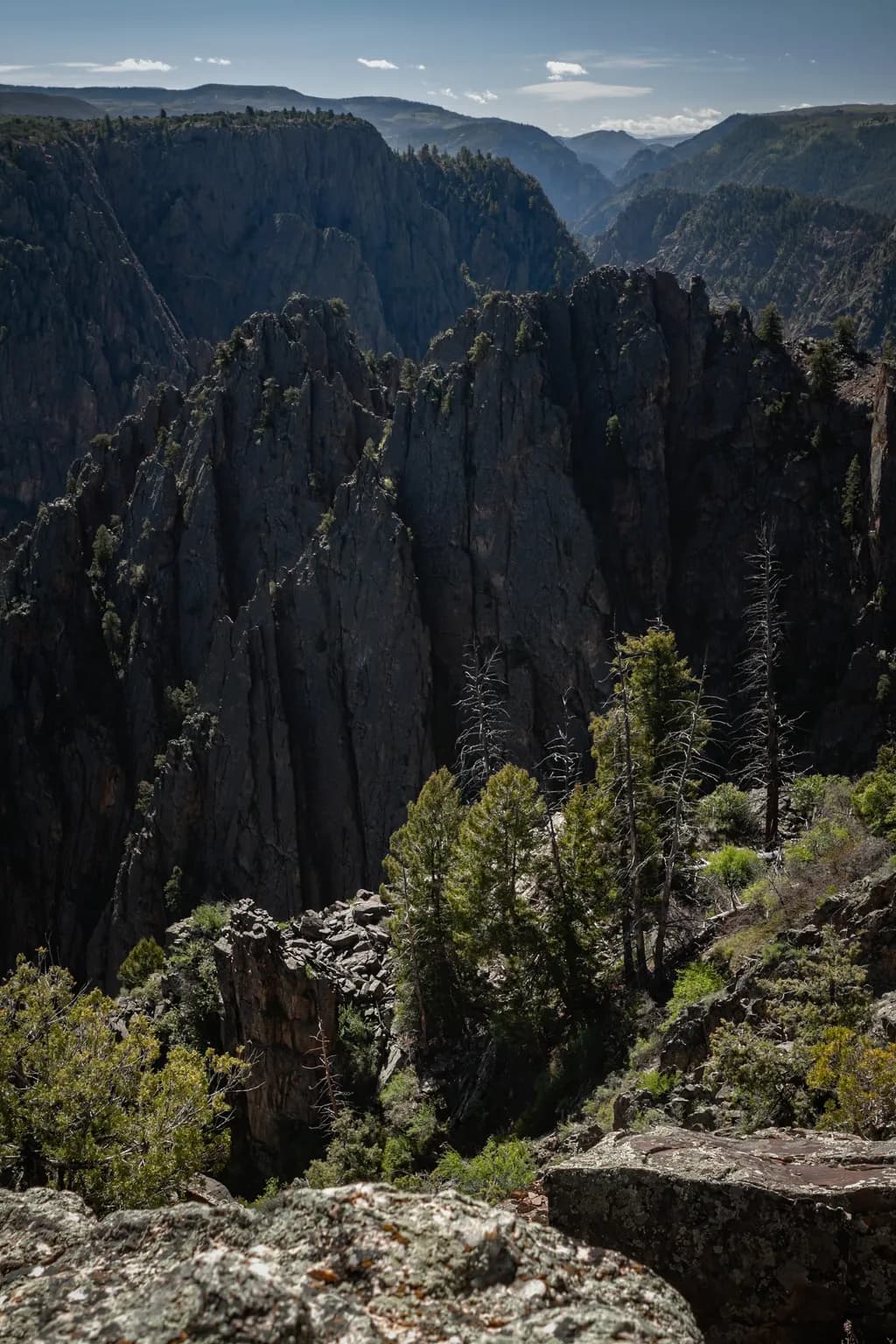
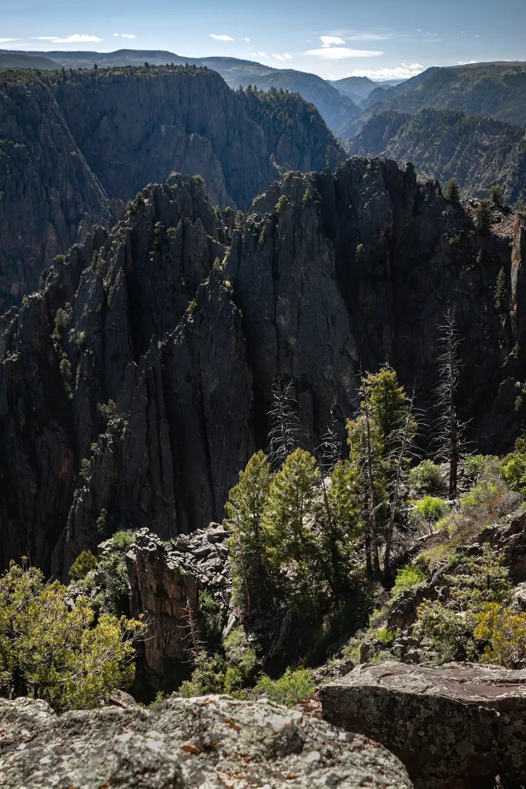
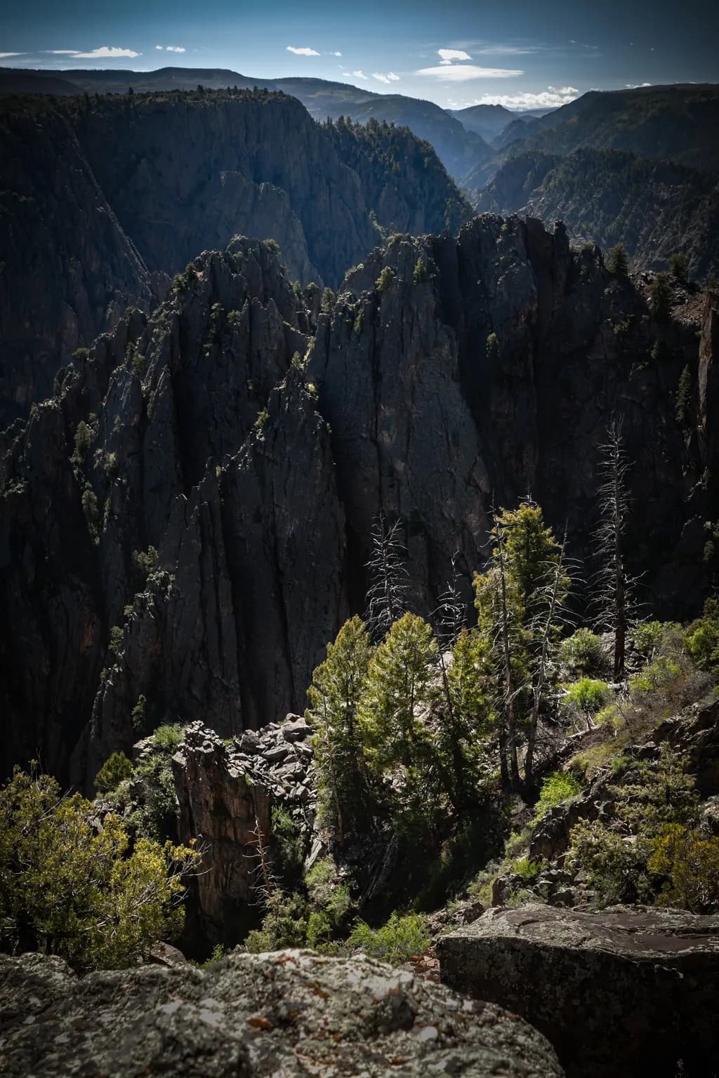
As promised, I've done a bit of additional work to an image I posted a week or so ago from the Black Canyon of the Gunnison NP called "Island Peaks." Here are the original, a version where I brightened the image and selectively dodged the fins a bit to hopefully bring out the texture better, and a third version with a vignette to try to reduce some of the glare on the foreground rocks. Let me know which version works best. (I played with b/w conversions as suggested on my first post, but I wasn't happy with what I was getting.)

4

4 Comments

Sort by:

I love how you can see every mountain and the fog fills in the mountains. The white clouds in the blue sky finish out the photograph in a great way.

0
Anabela Gaspar Sep 2, 2026
Translated from Português

For me, the second version works best. Bringing up the shadows reveals much more of the texture and layering in the canyon while still keeping its depth and dramatic character. I understand what you were trying to achieve with the vignette in the third, but I find myself noticing the vignette itself, particularly at the top. The second feels more natural to my eye, and I also think keeping the colour was the right choice here.

0
Arlene GottliebSep 1, 2026

I keep coming back to your middle version. The dodged fins hold their grain without going flat, and that matters more than managing the foreground glare. The vignette pulls my eye inward, which I understand, but it also softens the rawness of those rock faces. You kept the texture when you brightened them, that's the thing. The wall still has hours in it.

0

Hey! 👋 The selective dodging on those fins in version two absolutely brings the layering forward, that's the move. I've chased the same thing in my own travel work, trying to pull texture out of bright noon light without losing the scene's actual air, and honestly that dodge/burn precision is the whole game. Which national parks are you working from right now?

0