
22 Comments
Thank you. I've always loved Art Nouveau. It's nice to know that it's influence can be found in my work!
@Sue Dion I absolutely love this style of painting. It reminds me of the work of Bill Watterson, the creator of the fantastic comic strip, Calvin & Hobbes.
Thanks,Carol. I can see how you might make that connection, the style I'm currently working in is quite illustrative.
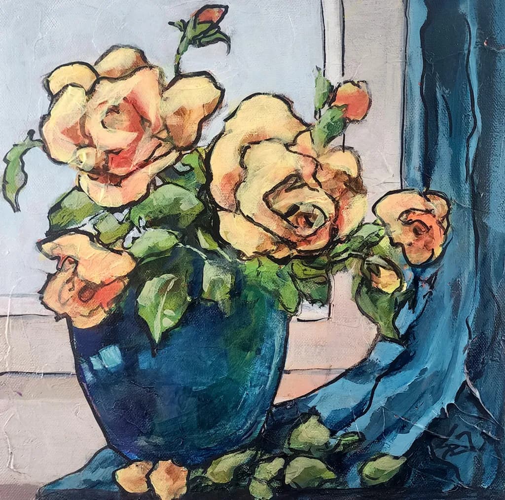
The blue palette here has a playful energy to it that matches the title perfectly.
I’d love for you to edit your post and add context to your art. It’s a good habit to have when sharing. It makes the experience of spending time with your art better.
Are you referring to the Thursday Share? I did not share this painting on social media so I imagine you are referring to my post for "A Splash of Citron". I thought that I HAD added context by mentioning how I am working with textures in my still lifes. Was that not enough? I tried to keep it brief because I keep hearing how no one reads anymore. What might you reccomend. Thanks for your comment and thoughts. -Sue
Love your roses, I might ,,"Steal like an Artist." Very nice. The color palatte would be easy to place in almost any room too. My roses aren't nearly as nice as these, Yours are quite good and the subject is great, off center, window, really well done.
Hahaha, it's funny you should say that! I "stole this like an artist" from a vintage print that has been hanging in my studio for years. I think it's from the forties and I couldn't find an artists name to credit for the original. Hopefully, I "stylized it" enough to call it my own. Have fun with it and be sure to post your result!
The motion in those blues works. I'm usually chasing still water at sunrise, but this has that same kind of energy I get when the light's moving fast and you have to decide in the moment. Whimsy fits.
Hello Sue, every comment has a degree of subjectivity; I will try to be objective.
Regarding the space, I liked the shift of the vase to the left; usually paintings with vases are placed in the center, which creates visual monotony; in this case the eye can traverse the space.
Regarding light and contrast: The light coming from above is very well defined, and the contrast between the oranges and yellow and the blues is well balanced, creating unity.
The blue layering here is really doing the work. I had a stretch where everything I painted felt flat, and it was because I wasn't letting color build like this. You can see where one shade sits under another, especially in that upper left where it goes almost violet. That depth doesn't happen by accident.
Thanks, Linnie. What a thoughful response. I appreciate your observations. -Sue
Was this written by AI?