Art Critique

Feedback on background decision for “Mother Nuzzle” (keep it plain or add sunrise?)

Post image 1

Hi everyone,

I’d love some feedback on my colored pencil piece titled “Mother Nuzzle” – it focuses on the close, affectionate moment between a mother and baby (nuzzling together).

Right now, the background is very simple, which keeps all the attention on their faces and that emotional connection. I’m considering adding a very light, soft sunrise background (gentle warm tones, nothing too strong) to enhance the mood and atmosphere.

My questions:

  • Do you think adding a subtle sunrise background would support the emotion, or risk distracting from the main subjects?

  • Does the current plain background already work well enough on its own?

I’m mainly looking for composition and mood feedback before I make any irreversible changes.
Thank you in advance for your thoughts and time!


31

162 Comments

Sort by:

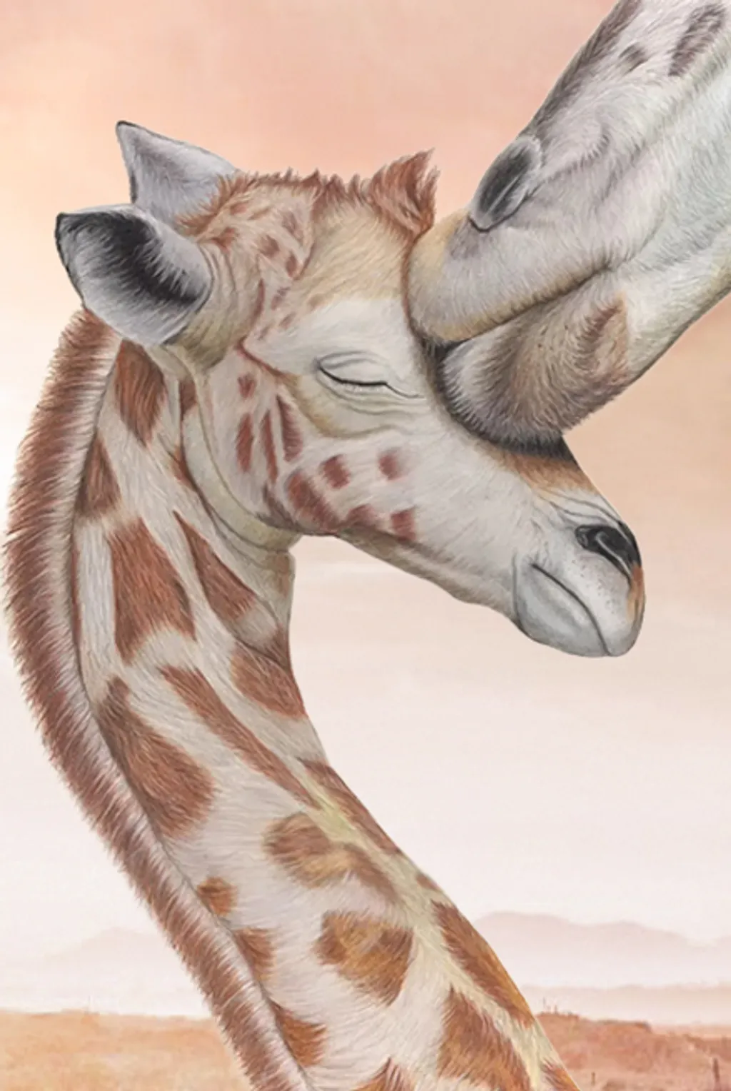
I love this piece. I think some color in the background would be nice. Like a color wash not necessarily a sun. I like the idea of just a soft color. It is a beautiful picture.

16

Agreed with Evelyn. A soft wash. Non specific, just the suggestion of a background.

5
Mary E. MorganApr 9, 2026

I agree something subtle I think a blue for suggested sky or green for environment

3
Taru AggarwalApr 9, 2026

Thanks Evelyn, by sunset I mean that color combination but very light.

0

I think it's a beautiful piece as well. I'd suggest a pastel blue, a complementary color to the main subject.

4

I agree with Evelyn - these insights are wonderful and would compliment to beautiful work you have done to express and celebrate the love shared between them.

2

I really love it like it is. I'm afraid a sunset would really take away from it. I love color and sometimes I have to step back and remember "less is more". You want the viewer to focus on the mother and child. You might go for a neutral with very little texture. But like it is, is just great. Lots of emotion and the color of the giraffes is gorgeous.

9
Taru AggarwalApr 9, 2026

Thanks Marsha.

0

I love it how it is! So sweet!

5
HeinrichApr 9, 2026
Translated from Deutsch
For me, it is very coherent as it is – I wouldn't add anything further.
3
KBPetrilloApr 9, 2026

If i was going to add a background, it wold be a soft light blue green on bottom shaded to light blue on top. Opposite color will pop this beautiful color pencil drawing. I would use pastel applied with cotton, to make it very airy looking rather than a penciled one which might have too much volume. It would then look like the Giraffes are out on the Savanah where they live, and the colors would be like a camera sees, blurred in the background.

Warm colors will blend in with the piece and you want mom and baby to stand out.

But thats me. Your work is so skillful and gives such a warm and loving expression. I love it the way you have it too.

3
Taru AggarwalApr 9, 2026

Thanks KBPetrillo for suggestion. I really like your idea blue and green combination. Will defiantly apply in one of my work.

1

I agree with kbpetrillo. It should help to bring your subjects forward. Something like this. I used a soft pastel in a teal and faded it up with just a hint of bronze at the top left. You may also consider richening up the browns and golds on your subjects.

3

Also before you change anything, take a photo of you piece and print it out on plain white paper. Test different colors or ideas on those test prints. It will help you determine what feels right to you. Good luck nice piece.

2
Harry MartinApr 9, 2026

Clean

3

i think it needs some contrast

3
April Art StorefrontsApr 9, 2026

The closed eyes and that gentle lean say everything already, honestly the clean background might be exactly right as is.

3

I think it's beautiful the way it is!🙂

3
Melissa TrittoApr 9, 2026

It is a very tender painting. I say a warm subtle sunrise would enhance the warmth of a mother loving her baby. It would also evoke feelings of a new day and a new beginning.

2

Plain Background works for me - - -

2

I don’t believe a background is necessary, especially one like a sunset. It would be distracting. Also, a background should be incorporated as one is painting otherwise runs the risk of looking separate. Actually it is up to the artist.

2

I think leave it plain. If you do want a colored background, use cool colors. It's a lovely drawing!

2

Love this piece and would prefer a background....some sort of light subtle gradation.

2

Plain, as to not distract from the beautiful work you did on the giraffes

2

Perfect ! Keep it plain ,,,stunning

1
Barbaraw WilliamsApr 12, 2026

Maybe a soft dark neutral or close to neutral colour with no detail.

Maybe even black?

1
Maria AntunesApr 11, 2026
Translated from Português
I really like the play; for me, it's just right as it is, highlighting everything it wants to convey.
1
Not Sure YetApr 11, 2026

If I were looking at this piece of artwork to hang in my house, I would prefer it in its current state. This way, I would have more mobility for its placements within the different rooms .

1

Make no changes to this piece of art. It exudes quiet, gentle elegance.

Keep it simple. Sometimes the focus needs to be on the subject. In this case, the emotional detail shines through, capturing a tender moment between these giraffes. The subject's elegant beauty is uniquely powerful.

Simplicity... this is truly wonderful simplicity.

1
Jo Gabe ArtApr 11, 2026

I love the softness and simple painting but a very soft focus sky or background would also work.

Josie Gabe

1

The white focuses the message. You could add very subtle color but would it add to the purpose of the art?

1

I love the age the way it is. It’s beautiful in its simplicity. The image I attached has an added background that I think could work and is highly complementary of the original imagery. Only you can make that final decision. I’m not sure if I would say it’s better, but it’s an option.

1

1
Taru AggarwalApr 11, 2026

Thanks Mark for taking time and creating this more. I really like this background will definitely use it in my future artwork.

0

Your welcome Taru,

Your talent is gracious and beautiful. The background was actually from an image of the Serengetti I found on the web, just to give your beautifully crafted colored pencil drawing some subtle context.

1
Donn Angel PerezApr 10, 2026

Keep it Plain - The eye is the focus

1

You could always scan it for reproduction as is, and then do a subtle background, and scan that one, too. Then you have two files to choose from for reproduction. And, you could take a poll from your audience on which one they like best (which most audiences love and o vote for!), and make what the public votes on as the one that goes to print. You could also offer a nice discount on a limited edition run for all the people who voted for the white background. Might as well get some sales out of the poll that way! 🦋

1

I think the piece needs a blurred background to help ground the image. As it is, or even with light color it is floating in space rather than appearing to be a real moment. If the background looks like an actual blurred setting, faded blurred plants greens or desert browns with some contrast that would enhance the image and let the viewer discover and become a part of the moment.

1
Tim DarnellApr 10, 2026

Taru: I saw your post and thought I would add a comment. I would go with the soft sunrise. Personally, I never like looking at a white background. Part of me feels the artist got lazy. Another part feels anything beats a white background. Just my preference.

1

Nice but you need a background to ground the image. A faded or blurred setting so it looks more like a moment that was caught, not posed. If you only have color it will not accomplish to enhance the mood. It should be a blurred plants, greens or desert browns. My opinion it is too stark making it more cartoon like rather than a real moment in time.

1

I feel like it needs a pale, pale blue backdrop-just a little pop of color to make the giraffes stand out(Nicely handled by the way)

1

I definately think some colored background whether a sunset or plain would enhance this piece

1

A sunrise would be distracting. This is perfect, as is!

1
Akinjide BaruwaApr 10, 2026

It resonate with me this way. Adding background may make it somewhat, cold.

1
Translated from Español
A not very defined sunrise, maybe the subtle gradation of colors...
1
Cindy StephensApr 10, 2026

I wouldn’t add blue or other colors it would limit byers. It’s neutral and stands well on its own.

1

I love the starkness of the white. But I think buyers would prefer a toned background. It’s a hard choice.

1

Most of the comments are probably what you’d expect, opinions on the piece itself. What people like, what they’d change, background vs no background… that kind of thing.

I’ve been thinking about it from a slightly different angle. Not so much what should it look like, but how far can this one piece actually reach?

If it stays as a one-of-one original, then realistically it reaches one collector in a meaningful way… and that’s kind of where it stops. So I wonder, what happens if you don’t change it… but you extend it? Leave the original exactly as it is. But create a second version that’s intentionally different, maybe that’s where a background comes in, maybe not but something that stands on its own. It’s not a copy, it’s something else entirely. Maybe that becomes a limited edition.

And then if people respond to it, does it make sense to open it up even further with different sizes, materials, whatever fits the work? At that point it’s not about “which version is better”… it’s more about how many different ways people can connect to the same piece.

Curious what you think about that, do you see the piece as a single destination, or something that can branch out a bit without losing what made it work in the first place?

1

This is such a beautiful image. So warm and tender and I think your idea of adding a subtle sunrise background would add another beautiful layer. Be courageous! And ultimately, for what you think is best. It's your artwork.

1

I think it is beautiful the way it is. Its very pure emotion and not sure additional background color would add anything, and might even mute the feelings.

1
AnonymousApr 9, 2026

Beautiful! I think I would add a very soft pastel color to the background

1

I love it, but if adding I think something that takes away the floating in space feeling,

1
AnonymousApr 9, 2026

No matter what, make sure to have a high quality scan of the image captured before adding a background so that you have options for others to purchase the reproductions of, according to their personal preferences. This way, the image is preserved and available both ways.

1
Taru AggarwalApr 9, 2026

Thanks..

0

This is so lovely and evocative. I agree that a soft wash background color would enhance this although I also love just the way it is. If you know how to play in Photoshop you could try different colors / tones for the background before you decide. In Africa I have photographed giraffes against golden Savannah grasses, green trees and even just blue sky. All work as long as you stay in natural tones. Good luck with your wonderful art!

1
Taru AggarwalApr 9, 2026

Thanks Peggy

0
Shannon WirrengaApr 9, 2026

Love this piece. The emotion will capture many!
Maybe a very subtle background at most. Something like a bokeh blur of a photo. The colors might imply sky and horizon/trees... or maybe just a gradiated complimentary color like turquoise, but very blurred/blended to not actually "see" what's there. Keep all eyes on that beautiful expression between mamma and baby! Love it!

1
Shubhra SarkarApr 9, 2026

It’s beautiful . But I think a darker monotone would show it off better.

1
Taru AggarwalApr 9, 2026

Hi everyone,

I just wanted to take a moment to say a heartfelt thank you to this amazing community. I received around 75 suggestions on my giraffe artwork, and I’m truly overwhelmed by the response.

So many of you took the time not just to comment, but to thoughtfully explain your ideas about adding (or not adding) a background. That level of effort and support really means a lot to me.

As a new artist, seeing so many people appreciate my work and share their perspectives is incredibly encouraging. It motivates me to keep improving and exploring new ideas.

Grateful to be part of such a kind and supportive community 🙏
Thank you all once again!

1
LpApr 9, 2026
Translated from Français
Hello, congratulations, this artwork is really beautiful, it exudes tenderness... Which leads me to say that a light atmosphere in the background, I think a blue aura would create a nice effect because it is the complementary color of brown and beige, so in my opinion it would make the giraffes stand out. Since you wanted to add a sunset, it is plausible and makes sense to incorporate it with the blue of the sky. I look forward to seeing the final choice.
1
AnonymousApr 9, 2026

This a beautiful work . I agree with. Many suggestions for a very soft color.

1
VentabrenApr 9, 2026
Translated from Français
A flat background looks a bit surgical. I might almost try a chalk rub to just make it vibrate.
1