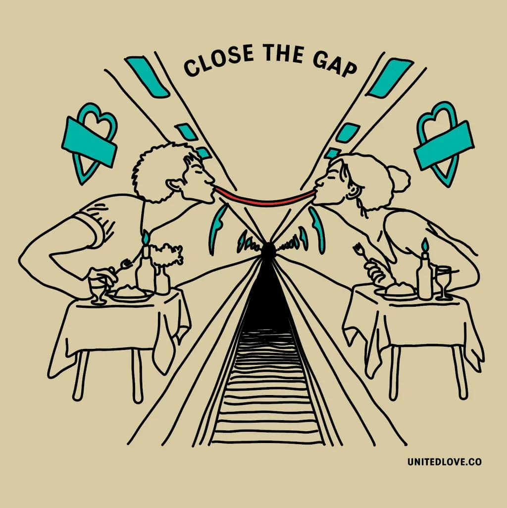
This illustration started with three random words: subway, dining table, and young couple.
No concept, no message, no particular direction.
I was experimenting with a different approach to creativity: instead of starting with something I wanted to communicate, I wanted to see what would happen if I simply followed an absurd idea.
After exploring a few possibilities, I ended up with two lovers having a romantic dinner on opposite platforms of the London Underground, sharing one ridiculously long strand of spaghetti.
And somehow, it made perfect sense. 😄
The title, CLOSE THE GAP, came later.
I wanted the illustration to feel playful and slightly ridiculous, while still communicating something tender about distance, connection, and the things people do for love.
Visually, I tried to keep the composition simple, using the strong perspective of the Underground tunnel to draw the eye toward the couple, with the red spaghetti as the only warm color accent.
I'd love some honest feedback.
Does the visual storytelling work without the explanation? Is the composition clear, or does the central perspective become too busy? And does the balance between humor and tenderness come across?
I'm particularly interested in whether the illustration stands on its own as a T-shirt print.
Thanks for taking a look!