Art Critique

Feedback Friday (June 12, 2026)

Have something you could use some extra eyes on? Share it here for feedback from our amazing community!

Think: A sketch, an idea, a newly-completed piece, an opportunity, a social post…whatever you could use some insight on today – we’re here to help.

3

17 Comments

Sort by:

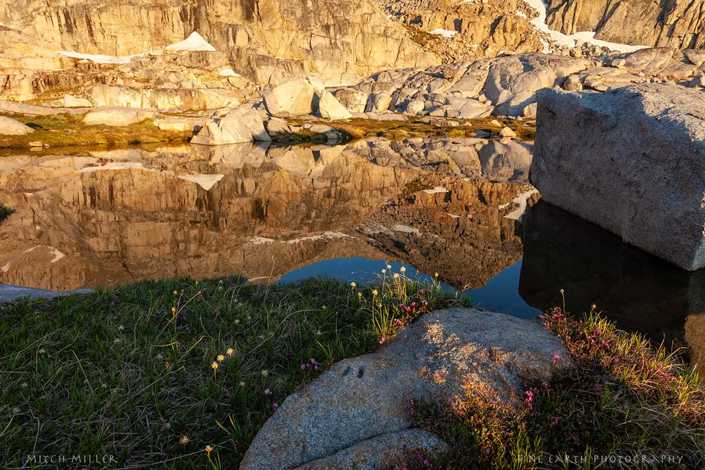
While I mostly shoot coastal scenes, I recently went to the Dolomites to try my hand at capturing the grandeur of the mountains. Thoughts, critque? Bring it on as I'm just starting the editing process.

3

It is a beautiful place and image, but too dark below the horizon. I selected sky, inverted it to choose landscape, then added a curves adjustment layer to brighten the ¼ tones, specifically remapping tonal values of 47 to 63. It makes the image come alive a little better.

1

Excellent Mitch. Let me give that a spin!

1

that's one of my favorite Photoshop features; the ability to select the sky and land and give the each different treatments. I just played with making the land a little brighter than before, and liked it even better. Have fun!

1

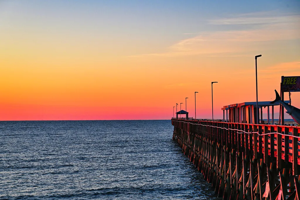
I don't have the exact answer, but I feel like this might benefit from playing with the cropping just slightly. Right now, the houses and grass feel like they're competing with the mountains as a focal point. But, overall, I think it's beautiful.

1

I now have 150 images in my Adobe Bridge “Add to ASF (short for my website)” collection. As I sit through my camera club’s bi-monthly competitions and listen to judges rip apart images, I often wonder how many potential buyers would even care what they think. I ask myself, could there be enough of an emotional connection for the viewer, who likely has no memories or knowledge of a place, to be moved to buy?

I love the contrast in this image, between winter’s remaining snow and summer’s flowers, between golden rock and blue water.

What do you think of it?

1

I think you are thinking about this absolutely completely. Emotional connection seems to be what sells. Having backpacked the Sierras for years, I totally appreciate what you captured here. But…how were the mosquitoes 🦟?

1

😆 Funny you should ask. On our first night above Kings Canyon's Roads End, just below Granite Pass, it was the 2nd worst mosquito evening of my Sierra backpacking life! I don't recall as great a problem days later at the pictured location, between two passes enroute to Marion Lake.

0

One of my earliest large prints (from a slide) was from Little Lakes Valley with golden hour light on the Kaweahs, but no clouds like that! Gorgeous.

1

My answer is I think most people would be absolutely clueless about what photography judges think. Emotional connection wins every time. And at the end of the day, judges are just flawed humans like the rest of us.

2

Then I shall seek to create their emotional connection to a place they've never heard of. I enjoy wordsmithing! Thanks, Gin.

0

Considering this image for an Endless Summer Gallery. I am leaning towards '𝘾𝙤𝙧𝙖𝙡 𝙃𝙤𝙧𝙞𝙯𝙤𝙣' for the name. Feedback on this as a photo candidate for Wall Art?

0

Insight on this feature within Pinterest?

I understand our Pinterest link on our website allows the user to share your product as a pin on their Pinterest - but it sounds like this "claiming your website" feature and ensuring my "name or brand name appears on every pin created from my site" is something I want to set up? But maybe the sharing feature setup with ASF already covers that?

Thanks for your feedback! Pinterest is very new to me but seems to be the most withstanding social media platform, so I'm spending some time getting it going 🙂

0

I love the contrast as well. I think too often photographers chase that HDR look that totally destroys contrast and therefore value ranges. I think the contrast areas provide us multiple places to linger and look longer and deeper, allowing for different discoveries in each viewing.

0

Ok, I love bright colors. I love bright, gradient colors. But every now and then I get to wondering if maybe, just maybe I'm overdoing it. Is anybody brave enough to weigh in on that?

0

Is there too much yellow in this?

0