Art Critique
7 Comments
Sort by:
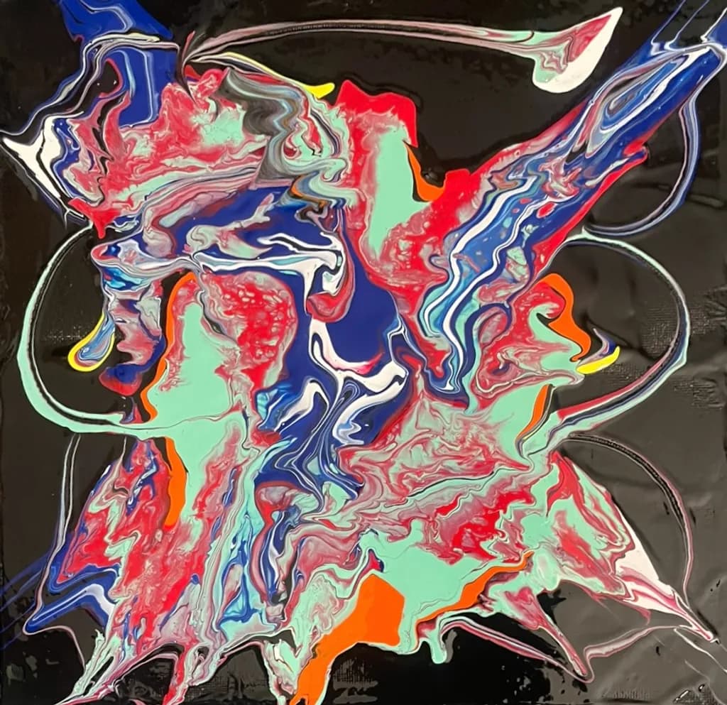
That red has real weight to it. The way the pour settled, you kept the density instead of thinning it out. I'd have been tempted to tilt it more, but this holds its ground.
0
That's a wild color palette. The pour technique can be tough to control when you're going for something specific like a character or figure, but there's real energy in those reds and golds. I tried pouring once years back and it went everywhere except where I wanted it, so I have a lot of respect for anyone who can wrangle it into something with this much presence.
0
Thank you very much. This was one of my first in this fluid form of art.
0
I could see it immediately, El Matador. You did a great job of expressing the feeling. It has fantastic movement.
Thank you!!