Critique request – “Elephant Majesty” (colored pencil)
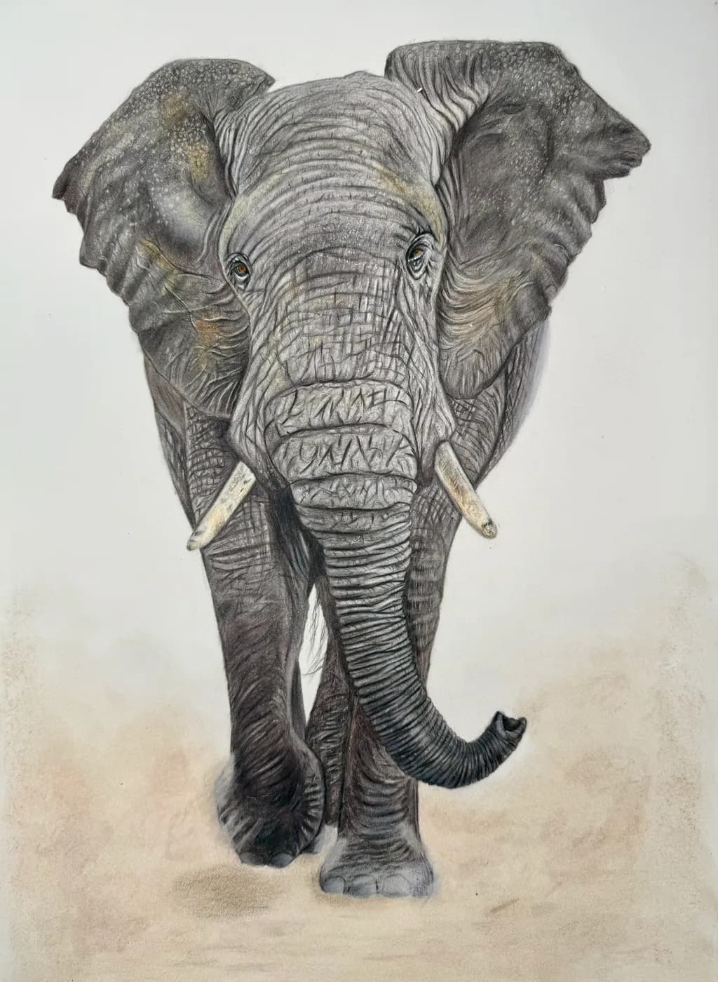
This is “Elephant Majesty,” a colored pencil drawing of an elephant on Fabriano Artistico paper.
I’d really appreciate specific critique on:
Do the values (lights/darks) feel strong enough, or should I push contrast further?
Does the texture of the skin read as realistic, or are there areas that look flat?
Any suggestions for background or composition changes that could elevate this piece?
All levels of critique welcome – feel free to be detailed and honest. Thank you in advance!
7
I would say you have great potential. It appears you have ‘the gift’, but you need to develop it.
In this drawing, the sky is overcast. We need better lighting to see the subject more clearly and make it more exciting. Bright light from top-left, weaker light from right. And feel free to use tricks - e.g., reflected light.
I'd say you're somewhere between the following:
- Wanting to record every detail (e.g., draw every single crease in the skin), in which case it fails because you haven’t gone far enough. You should at least focus on a particular area - say, the face and part of the way down the trunk.
- Giving an overall impression, in which case it is overworked because the human brain does not need all that information to interpret your message. For example, over a large area, we only need to see half a dozen bricks to know that the area represents a large brick wall.
Do you have any sketches? Did you study the subject before finally rendering it (e.g., by visiting a zoo to make sketches)?
Your drawing is a copy of another 2-dimensional rendering. You need to draw from life. Ditch the colored pens and paint sticks for now. Use hard and soft pencils to create still life monochromes. Use erasers as little as possible; construction lines in sketches and intermediary drawings are crucial for learning, and also for showing how you arrived at your final representation.
You should also attend life drawing classes. Find a class where the model provides several poses and a quick-fire half-hour session where they change position every couple of minutes. This is a great exercise for learning how to sketch moving objects like animals, children, etc. There's nothing wrong with using photographs and illustrations for reference. Indeed, they can often be the only source of reference. However, you need to observe things in the real world.
I estimate only 5% of people have a natural talent for draughtsmanship. It looks like you are one of them. To find out, you must aim to produce accurate 2-dimensional renderings directly from the 3-dimensional world around you.
Thank you so much for the detailed feedback—I really appreciate the time you took to explain this.
Your point about lighting and value makes a lot of sense, especially regarding the lack of a strong light source. I can see now how that’s affecting the overall depth.
The observation about being between detailed rendering and overall impression is also very helpful—I hadn’t consciously thought about it that way, but I understand what you mean. I’ll work on being more intentional with focus and simplifying less important areas.
I’ve mostly been working from photo references, so your suggestion about drawing from life and doing more studies is something I’ll definitely start incorporating.
Thanks again for the honest and constructive critique—it’s very helpful for my growth.