Pedido de críticaJanela de crítica encerradaCritiques earn 20X points
Quem somos nós?
Traduzido de Deutsch
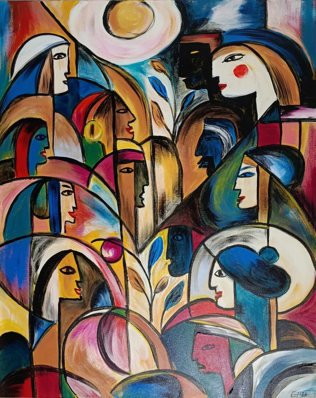
acrylic on canvas · 80x100Obra finalizada
O que eu buscava
Mein neues Werk „Wer ist wir?“, 2026, Acryl auf Leinwand, 80 × 100 cm. Mich interessiert diesmal besonders eure kritische Sicht auf die Arbeit. Wie erlebt ihr die Vielzahl der Figuren und ihre Beziehung zueinander? Entsteht für euch trotz ihrer Unterschiedlichkeit ein gemeinsamer Bildraum – oder konkurrieren die einzelnen Formen und Gesichter zu stark miteinander? Besonders interessieren mich Komposition, Blickführung und die Balance zwischen Individualität und Zusammengehörigkeit. Ich freue mich ausdrücklich auch über kritische Anmerkungen.
Quer feedback sobreCompositionColor & valueConcept
3 críticas
Publicado em Painting
5
Composition
The eye enters at the sun-disc top center and then ricochets through the crowd without settling anywhere, which I think is exactly what you wanted given your question about whether the figures compete. They do compete, but in a way that builds energy rather than chaos. The black contour lines create a scaffolding that holds nine or ten distinct profiles in conversation, each tilted at a different angle so no two heads repeat the same gesture. What I notice most is how you've stacked depth without traditional perspective, the way the green-lit figure in the lower right sits in front of the pink-robed one behind her, purely through overlapping shapes rather than scale or atmospheric shift. That flattened space keeps the group compressed into a single plane, which makes the "wir" feel more like a collective thought than a gathering of separate bodies. The plant stem rising through the center is the only vertical anchor in a composition that otherwise moves in arcs and curves, and it does unify the left and right halves without demanding too much attention for itself.
Color & value
You've got high-chroma primaries and secondaries everywhere, reds and blues and yellows all at near full saturation, but the piece doesn't scream because you've woven enough neutrals and dark passages between them to let the eye rest. The black contour lines and charcoal-gray shadows do most of that work. What I see happening with skin tones is that you're not treating them as "flesh" at all, you're assigning each face a different local color, blue or green or tan or white, which keeps the figures individual even when they're shoulder to shoulder. The value range is narrower than the color range, most of the piece lives in the midtones with only the sun-disc and a few white passages at the top of the scale. That compressed value structure is part of why the composition holds together, everything sits at roughly the same luminance even when the hues shift wildly. In my own work I sometimes overcorrect and push contrast too hard in the darks, here you've done the opposite and it makes the piece feel like a single woven surface rather than a stack of separate figures.
Concept
"Wer ist wir" is doing something more complicated than just showing a crowd. Each face has enough individuality, the red cheek-dot on the upper right figure, the open mouth on the yellow-toned profile in the center, that they register as distinct people, but none of them is developed enough to become a portrait that pulls focus away from the collective. That tension between Individualität und Zusammengehörigkeit is exactly where the piece lives, and I think it succeeds because you've avoided both extremes, they're not identical members of a pattern and they're not competing protagonists. The plant growing through the group is the one element that doesn't quite land for me conceptually. It's beautifully painted, the leaves have weight and the stem has a slight curve, but I can't tell if it's meant to be a literal thing they're gathered around or a symbolic presence, and that ambiguity doesn't feel intentional the way the ambiguity about who these people are does feel intentional. The German title sets up an expectation that the viewer will look for what binds these figures, and the composition delivers on that by keeping them locked in a shared plane, but the plant introduces a nature-versus-community read that doesn't seem to go anywhere.
What's working
The black line work is doing more than it appears to at first glance. Those contours are what let you push the color so far without the piece falling apart into decoration, because the lines give every shape a hard boundary that the eye can trace. I spent a long time looking at how the blue shape behind the upper-left figure's shoulder could just as easily belong to her garment or to the figure behind her, and that ambiguity of ownership makes the whole group feel more interdependent. The rhythm of the profiles is tight, every face is in three-quarter or full profile so there's not a single head-on gaze to break the pattern, which keeps the viewer outside the circle looking in rather than being met by anyone inside it. The way you've handled the hands and shoulders is especially strong, the lower-left figure has an earring and a bare shoulder and the posture of someone leaning forward, the pink sphere she's holding reads as something precious without being literal. That kind of detail work, just enough to give a figure a gesture but not so much that it becomes illustrative, is hard to get right and you've done it nine times over.
What to push
The real opportunity here is in the value structure, specifically in the deepest darks. Right now the black contour lines are doing almost all the heavy lifting for contrast, and the internal shadows inside the figures, especially in the hair and along the necks, are mostly mid-dark grays rather than true darks. If you pushed even three or four passages into actual black, not just charcoal, it would give the eye places to anchor and make the bright yellows and pinks feel even brighter by comparison. In my own layering I've learned that a painting can hold more dark than I think it can before it feels heavy, and this one has room. The other place to push is the transition between figures, there are a few spots where the contour line is doing all the separation and the color on either side is too close in value to create a clear boundary without it. The upper-right figure with the red cheek, her blue garment sits right next to a blue shape behind her at almost the same luminance, which makes that area feel flatter than the rest of the piece. Deepening one of those blues or warming it slightly would let the line do less work and the color do more.
One next step
Before this goes to exhibition, print it at actual size or as close as you can get and look at it from ten feet away, the distance someone will stand in a gallery. Then mark with a pencil on the print the three or four spots where your eye gets stuck because two adjacent shapes are too close in value to separate cleanly. Go back into the painting and deepen just those passages, not with more black line but with richer color or darker shadow inside one of the shapes. This isn't about repainting whole figures, it's about giving the composition a few more anchors so the eye can move through the crowd without having to work so hard to parse overlaps.
Muito obrigado por ter dedicado um tempo para observar a obra com tanta atenção. Sua observação de que as figuras, embora concorram pela atenção, não se tornam protagonistas concorrentes, aponta com muita precisão o que eu queria investigar com a pintura. Por trás da obra está a pergunta de como a individualidade pode permanecer visível e, ao mesmo tempo, tornar-se parte de um 'nós' comum.
Também achei particularmente interessantes as suas reflexões sobre a planta. Eu as tinha pensado como uma espécie de eixo comum de vida, que se estende através das diferentes figuras, e não como um objeto concreto em torno do qual elas se reúnem. Por tua observação ficou claro para mim que a função simbólica dela pode não ser tão facilmente legível para o observador quanto foi para mim durante a pintura. Isso é um retorno muito útil para mim.
Também as suas observações sobre a estrutura de valores tonais dão-me bastante em que pensar. Mantive deliberadamente grande parte da imagem dentro de uma faixa tonal relativamente estreita, porque queria que as figuras parecessem entrelaçadas como uma única superfície e não fossem claramente separadas entre o primeiro plano e o fundo. Por isso, quero ter cuidado para não perder esse efeito. A sua sugestão de observar a obra a partir de uma distância típica de galeria e, de forma deliberada, procurar apenas alguns pontos onde uma maior separação tonal poderia ser útil, acho-a muito interessante.
Obrigado novamente — exatamente esse tipo de abordagem mais diferenciada com a obra era o que eu esperava quando a submeti à crítica.
Essa leitura do eixo da vida compartilhado faz total sentido para mim agora que você disse isso, e sim, o teste de distância da galeria vai mostrar exatamente onde o espectador precisa de ajuda para interpretar essa intenção sem você ter que explicá-la.