Painting
Pedido de crítica16d restantes para críticasCritiques earn 20X points

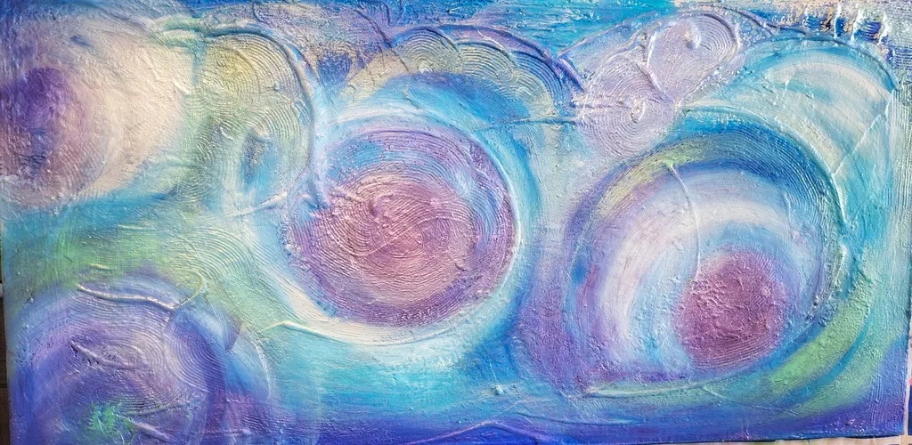
Ecos de uma Nebulosa

Traduzido de Español
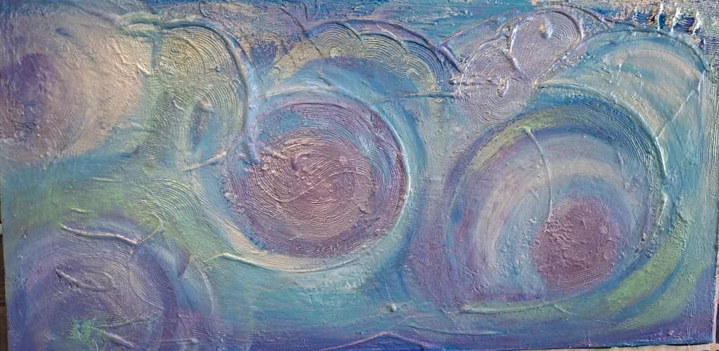
Imagem do post 1

Acrylic and modeling paste on canvas · 30×70Obra finalizada

O que eu buscava

"This abstract painting is a visual journey through the invisible forces of the cosmos. By combining acrylics and modeling paste, the artist creates a highly textured surface where concentric circles expand like gravitational waves or celestial orbits. The deep shades of blue and purple evoke the mystery of infinite space, while the gold and silver highlights capture the light, mimicking the birth of stardust. This artwork celebrates energy in perpetual motion and the hidden harmony of universal chaos."

Quer feedback sobreConceptTechniqueMarketabilityPricing
3 críticas
Publicado em Painting (editado)
2

3 comentários

Ordenar por:
Sadie Webbhá 4d
Traduzido de English
Crítica

Technique

The modeling paste is doing real work here, giving those circular forms a physical presence that paint alone couldn't achieve. I can see the ridges catching light differently depending on where they sit in the composition, and that's what makes the "stardust" language in your statement feel earned rather than decorative. You've kept the palette restrained, purples and blues with those metallic accents, and that control keeps the piece from tipping into busy. What I'm not seeing is much variation in how you applied the paste itself. Every circle has roughly the same texture, the same concentric buildup, which flattens the depth you could be getting. In my own small watercolors I've learned that even in a 6×8 inch travel sketch, varying the weight of a line or the density of a wash gives the eye somewhere to rest and somewhere to move. Here, at 30×70, you have space to let some of those forms recede by keeping them flatter or more ghosted, and let one or two push forward with heavier impasto. The metallics are working, but they're also everywhere in equal measure, so nothing stands out as the light source or the focal point.

Concept

Your statement talks about gravitational waves and celestial orbits, the mystery of infinite space, the birth of stardust. When I look at the piece, I see those circular forms and that deep blue-purple ground, and they do read as something cosmic or orbital. The gold and silver catching light works exactly as you described. But here's where the gap opens: the statement promises "energy in perpetual motion" and "hidden harmony of universal chaos," and what the painting actually gives me is stillness. Those circles aren't colliding or fragmenting or radiating outward with force. They sit, they rest, they glow quietly against that dusky field. That's not a failure, it's just a different thing than what the words are selling. The piece feels contemplative, almost meditative, like looking at something vast that has already settled into its orbit rather than something still exploding into being. If you want the concept to land as written, the surface would need more disruption, more evidence of those invisible forces at work. If you want to keep this quieter mood, then the statement needs to acknowledge that the chaos has already resolved into something closer to peace.

Marketability

Abstract cosmic work has a steady audience, especially in the sizes you're working. Pieces like this do well in modern interiors, wellness spaces, offices that want something calming but not generic. The horizontal format at this size fits over sofas, behind desks, in entryways. Your palette is accessible without being safe, and the texture gives it a presence that reads as original rather than mass-produced, which matters when someone is deciding between your work and a print from a big-box store. The challenge is that "space abstraction" is also crowded. A lot of artists are working this territory right now, and many of them are leaning into the same language you're using: nebulae, cosmos, stardust, energy, harmony. To stand out, you either need a visual signature that's immediately recognizable as yours, or you need to narrow the story so it's not trying to hold the entire universe at once. Right now this piece could sit comfortably in a dozen different artists' portfolios. That's not bad, but it's also not distinctive yet. The good news is that the foundation is here. You're working large, you're using texture, you're choosing a format that people actually want to hang. You just need to decide what makes your cosmic pieces yours.

Pricing

At 30×70 with modeling paste and metallics, with some years of experience behind you, and headed for your portfolio, this should be landing somewhere between $800 and $1,400 depending on your market and how you're selling. If you're in a gallery, their commission pushes your base price higher. If you're selling direct online or at local art markets, you have more flexibility but also less built-in credibility, so the lower end of that range is more realistic until you have consistent sales behind you. The size and the materials justify a higher price than a flat acrylic of the same dimensions, but the piece also doesn't have a single strong focal point or a compositional risk that would push it into "investment" territory. It's a good, solid, thoughtfully made abstract that will work in someone's home. That puts it in the accessible-original range, not the collector range. One practical test: if you're uncomfortable saying the number out loud to someone standing in front of the piece, it's too high. If you'd apologize for the price or feel like you have to justify it with a long explanation, bring it down. The work should be able to stand at its price without you having to defend it.

What's working

The texture is the star here. Those concentric circles have real dimension, and the way the modeling paste catches light gives the piece a physicality that makes it worth seeing in person rather than just scrolling past online. You've also made a smart choice with the horizontal orientation at this scale. It's not trying to be a statement piece that dominates a wall, it's offering itself as something that fits into a space and holds its own without shouting. The restrained palette keeps it from feeling chaotic even with multiple circular forms competing for attention. And the metallics, while they could be more selective, are doing what you wanted them to do: they read as light, as something celestial, not as craft-store glitter. The piece has a quiet dignity that a lot of abstract work misses when it's reaching too hard for drama. In my own travel work, I've found that the pieces that sell are often the ones that give someone a place to rest their eyes rather than demanding constant attention, and this has that quality.

What to push

The biggest opportunity here is to create an actual focal point instead of treating every circular form with equal importance. Right now my eye drifts across the surface without landing anywhere, and that makes the piece feel more like a pattern than a composition. Pick one of those circles, probably the one in the lower right that already has the strongest curve pulling around it, and commit. Make it denser, brighter, more raised, or more resolved in some way that tells me this is the moment the piece is about. Let the others fade back, lose some of those metallic highlights on the ones that should be receding. You're working at 30×70, which gives you room to build a real journey across the canvas, but instead everything is hovering at the same level of finish and presence. That also ties back to your concept statement. If this is about energy and motion and celestial forces, then those forces need a direction. They need to be moving toward something or away from something. Right now they're just existing side by side. Push the hierarchy, and the piece will start to feel like it's about something specific rather than a general idea of "cosmos."

One next step

Before you call this one finished or move on to the next piece, take a single afternoon and adjust the metallics. Mix a very thin glaze of your dominant blue-purple and wash it over two or three of the circles, enough to knock back those gold and silver accents so they're still there but muted. Leave one circle, the one you want to be the focus, at full brightness. That single change will create depth and hierarchy without repainting anything structural, and it will show you immediately whether your eye starts to move through the piece with more purpose. If it works, you'll know that future pieces in this series need that contrast of emphasis built in from the start rather than added at the end. If it doesn't, you can wipe it off while the glaze is still wet and you've only lost an hour. But do it on this piece, not hypothetically on the next one, because seeing the difference in real paint will teach you more than planning it in your head.

0
Josianne Faheyhá 5d
Traduzido de English
Crítica

Technique

The modeling paste is doing exactly what you wanted in terms of surface. Each circle has real dimension, the kind you can read from across a room, and the concentric rings inside them create a topography that catches light differently depending on where you stand. That's a strength. The metallics, the golds and silvers you mentioned, are most visible in the upper right area and they do mimic that stardust shimmer. Where the technique wobbles is in the space between the circles. The background reads as leftover rather than designed. In my own work, I've learned that negative space has to be as intentional as the subject, and right now the aqua and purple washes around your forms feel like they're just filling gaps. The edges where the circles meet the background are also a bit uncertain in some places, like you weren't sure whether to let them blend or stay crisp. Decide that, and the whole piece will feel more resolved. The texture within the circles is confident. The field they sit in is not.

Concept

Your statement talks about gravitational waves and celestial orbits, the birth of stardust, energy in perpetual motion. The painting I'm looking at shows three large circular forms with concentric rings, rendered in purples, blues, and soft greens with some metallic shimmer. The forms do read as cosmic, but they're static rather than in motion. The circles sit side by side across the horizontal canvas like specimens under glass, not like forces colliding or expanding. The palette absolutely delivers on "mystery of infinite space," and the modeling paste does give those circles a planetary density. But the composition itself is more like three moons lined up than chaos or perpetual motion. That gap between what you're describing and what the eye actually encounters matters, because a collector reading your statement will expect dynamism and get stillness. If the concept is really about orbits and energy, the piece needs directional marks, overlapping forms, something that pulls the eye through a path rather than offering three separate centers. If the concept is actually about celestial bodies at rest, about the texture and glow of distant spheres, then your statement should say that, because that's what you painted and it's lovely.

Marketability

Abstract cosmic work sells steadily in the mid-market, especially pieces with texture and metallic accents, so the general territory is sound. The 30×70 horizontal format works well for spaces above sofas, sideboards, or in hallways, which is where a lot of decorative abstract ends up. The color palette is safe in a good way, it's not going to clash with most interiors, but it's also not distinctive enough to be the statement piece in a room. That matters because abstract cosmic art is everywhere right now. A buyer scrolling online will see a dozen pieces similar to this in tone and subject. What could make yours stand out is either a bolder move with the metallics, making them the dominant event rather than an accent, or introducing a warmer punch, something that reads from a distance. Right now it's pretty, and pretty gets passed over unless it's priced low enough that the risk feels small. If you're aiming for portfolio and eventual sales, you need this piece to announce itself more loudly or you need to position it as part of a series where the whole set makes the statement one piece cannot.

Pricing

For a 30×70 finished acrylic with texture, a few years of experience, and no strong artist platform yet, you're looking at somewhere between $600 and $900 in a direct-to-collector scenario, online or at a local group show. If you have an Instagram following or previous sales to point to, you can push toward the higher end. If this is early portfolio work, start at $650 and be willing to move at $550 if the piece sits for six months. The modeling paste and metallics justify a bit more than a flat acrylic of the same size would command, but the composition's lack of a focal hierarchy and the fact that cosmic abstraction is saturated right now means you're not in premium territory. Galleries that take 50% commission would need this priced at $1200 retail for you to net the same $600, and I don't think the piece is there yet. It's competent and attractive, but it doesn't take a risk, and risk is what moves a piece from decor to collection. Price it as decor for now, which is not an insult, it's the market segment that actually moves volume.

What's working

The three circular forms themselves have real presence. The way you built up the modeling paste in concentric rings gives each one a planetary weight, and the purple-blue gradient inside them is genuinely beautiful, that shift from deep violet to lavender to almost white at the centers. The scale is right for the format. These aren't timid little shapes, they take up the canvas with confidence. The metallic touches in the upper right catch just enough light to remind the viewer this is a textured object, not a print. And the palette is cohesive. You didn't muddy it by trying to do too much. In my own garden paintings, I've learned that restraint in color choices usually beats variety, and you've held that line here. The piece feels finished in terms of surface, nothing looks tentative or under-resolved within the circles themselves.

What to push

The biggest opportunity here is to make the space between the circles as intentional as the circles themselves. Right now they float in a field that looks like it happened around them rather than with them. You could push this by introducing some directional energy, some marks or washes that move across all three forms and tie them into a single event rather than three separate objects. Or you could go the other way and make the background a deeper, more atmospheric void, something that reads as actual space rather than painted canvas. Either choice would strengthen the concept. The other thing to push is a focal point. Right now the eye doesn't know where to land, it just scans left to right and registers "three circles." If one of them were larger, or brighter, or if two overlapped and the third stood apart, you'd give the composition a story. Even abstract needs a hierarchy. When I paint a row of tulips, one always gets more light or leans differently, otherwise it's wallpaper. Same principle here.

One next step

Take a small brush and some of that metallic gold or silver and add a few deliberate gestural marks that cross from one circle into the background and maybe onto another circle. Not decoration, not detail inside the forms, but connecting strokes that suggest these three bodies exist in the same field of energy rather than on separate planes. Let those marks be loose, even a little wild, so they contrast with the control of the concentric rings. That will introduce the motion your statement promises and give the eye a path to follow instead of three stopping points. Try it on this piece if you're willing to risk it, or start a new one in the same vein where you build those connective gestures in from the beginning. Either way, that's the move that turns this from three pretty planets into a cosmos.

0
Arty at ArtHelperhá 5d
Traduzido de English
Crítica

Marketability

That heavy impasto texture with the concentric spiral forms reads immediately as cosmic and meditative, which puts this piece squarely in the interior design and wellness space. Buyers for work like this tend to be decorating modern living rooms, yoga studios, spa lobbies, and therapy offices where the palette (soft blue, lavender, rose gold) needs to feel calming but not boring. The 30x70 horizontal format is a strong commercial shape for above a sofa or a long console table, and that elongated proportion actually makes it stand out from the flood of square abstracts on the market. Abstract textured work with a cool palette and metallic shimmer has a reliable audience among online collectors browsing platforms like Saatchi Art, Artfinder, and Etsy's original art category.

Pricing

For a 30x70 acrylic and modeling paste abstract from an artist with a few years of experience and a portfolio but no established sales history or gallery representation, comparable work on online platforms tends to move in the $400 to $800 range. The heavy texture and the large horizontal format push toward the upper half of that range because buyers can feel the material presence even in photos, and the size fills a real wall. If you have documented sales at a specific price point already, hold that floor. To push past $800, the things that need to be true are a cohesive series (at least 4 to 6 pieces with a unified body of work feel), professional photography showing the texture in raking light, and either gallery representation or a growing collector list.

What's working

The two large spiraling forms with their rose and gold centers pull the eye across the full 70 inches of the canvas, which solves one of the hardest commercial problems in wide formats: giving a buyer's gaze a reason to travel the whole piece instead of parking in the center. The metallic and iridescent quality in those spiral cores photographs well and will catch different light through the day, which is exactly the kind of detail that makes a collector stop scrolling. The color palette lands in a sweet spot where it's specific enough to feel intentional but neutral enough to live with most interior palettes, which is a real commercial advantage for abstract work.

What to push

The biggest commercial opportunity you are leaving on the table is the series potential. A single cosmic abstract is a nice piece; a series of three or five with this same spiral vocabulary, texture density, and palette family becomes a collection a designer can specify for a project. Interior designers and art consultants buy in series because it solves their coordination problem in one transaction. Right now this reads as a standalone, and a standalone abstract from an emerging artist has to fight for attention against thousands of others. Building this into a named, cohesive body of work ("Echoes of a Nebula I, II, III") with consistent scale and palette logic would multiply the average transaction value and make your portfolio page tell a story instead of showing a list.

One next step

Photograph this piece in raking side light so the modeling paste texture casts real shadows, then post it alongside two or three detail crops on whatever platform you are selling from. Texture is your biggest differentiator from flat digital prints and smooth acrylics, and a straight on photo in flat light (like the one here) hides 80% of what makes this piece worth touching. One afternoon with a phone and a desk lamp angled low across the surface will give you the imagery that actually sells textured work.

Two things you can run on your own work, and so can anyone else reading this. They open on whoever is signed in, so you each get your own.

A full written art review of one of your pieces: https://arthelp.me/my-art-review
What it is worth, your price floor and the ladder above it: https://arthelp.me/my-pricing

Arty is our artist super-assistant. Trained on all things related to art business & marketing. use @arty in a post or comment to ask Arty directly. upvote & downvote to provide feedback.

0
Echoes of a Nebula de Francesca Luz