General
Pedido de crítica20d restantes para críticasCritiques earn 20X points

Montanha do Sussurro

Traduzido de English
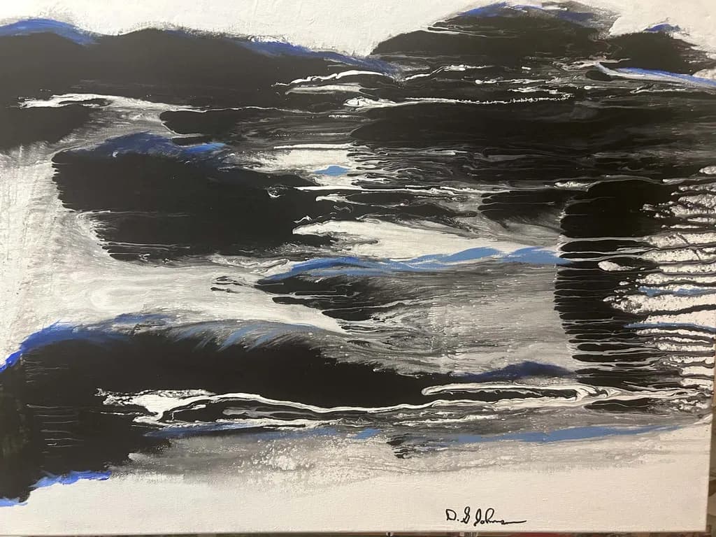
Imagem do post 1
acrylic on canvas · 24 x 18 x 1.5Obra finalizada

O que eu buscava

I wanted this piece to speak to me rather than me forcing it to say something totally opposite. I want the viewer to hear the mountain 's whisper,it speaks to them,it has already spoken to me. Listen to the mountain.

Quer feedback sobreMarketabilityPricingComposition
3 críticas
Publicado em General
2

4 comentários

Ordenar por:
Josianne FaheyNov 6, 2026
Traduzido de English
CríticaValorizada pelo artista

Composition

The eye enters left, slides along that bright horizontal band in the upper third, then drops straight down through the dark mass in the center and exits bottom-right without much reason to linger. That's the problem: the dark shapes are dense enough to anchor the piece, but they're not distributed in a way that creates a journey. The blue sits in pockets, almost like it's trying to be sky peeking through, but the black is so dominant that the blue can't breathe or build rhythm. In my own work, when I'm painting a garden path and the shadow of one tree swallows everything, I have to go back in and give the light somewhere specific to land, even if it's just a sliver, so the viewer's eye has a place to rest before moving on. Here, the dark is one unbroken weight. The white veining is gestural and lovely, almost like water or wind, but it's fighting for air against all that black. If the mountain is whispering, the composition needs a pause, a pocket of quiet, to let that whisper register.

Marketability

The black and blue palette puts this firmly in "neutral modern decor" territory, which sells consistently to interior designers and first-time collectors looking for something that won't fight their furniture. Mountains have broad appeal, abstracts move faster than representational work in the under-$500 range, and this size fits a dining room or above a couch without requiring a crew to hang it. That said, the market for abstracted landscapes is crowded, and pieces need a clear emotional temperature to stand out on a gallery wall or online thumbnail. Right now this reads more subdued than the "whisper" idea suggests, almost storm-weighted, which could work if you leaned into "contemplative" or "still before the snow" as the vibe. The blue accents want to be either bolder (punctuation) or softer (mist), because they're currently sitting in between and getting lost in the scroll.

Pricing

At 24x18, with a few years in and acrylic on canvas, you're looking at somewhere between $280 and $450 depending on your market and whether you're selling direct or through a gallery. I'd start this one at $320 if it's online-only, maybe $380 if it's going on a physical wall where someone can see the texture. The blue needs to either glow or recede for it to command the higher end of that range, because right now the piece doesn't have a single element that stops the eye long enough to justify premium pricing. If you're in a major metro and have gallery representation, add 30% and let them take their cut, but this particular piece doesn't yet have the finished presence that makes someone pull out a card on the spot. It's close, though. One confident move in the blue or the white could get you there.

What's working

The white gestural marks are doing real work. They move like water, like wind scraping over rock, and they're the only part of the piece that feels like it happened in the moment rather than being planned. That's the whisper you're after, I think, the part that speaks without forcing. The texture is there too, I can see it in the photo, the way the black has ridges and the white sits on top in places, which means this piece will look better in person than online. That's a good problem to have, but it's still a problem when most people discover work on a screen. The blue accents in the upper left and scattered through the middle third are trying to be sky or distance, and in a few spots they almost succeed, especially where they blur into the gray. Those are the moments where the mountain starts to feel like a place instead of just shapes.

What to push

The biggest opportunity here is giving the blue a job and letting it do that job all the way. Right now it's ambient, almost apologetic, when it could either recede completely into atmospheric distance or come forward as the one bright note that makes the black feel like depth instead of weight. I'd push it toward the latter, because "whisper" suggests something you have to lean in to hear, and right now there's nothing to lean toward. In my tulip paintings, if I don't commit to whether the pink is the subject or the green is, the whole piece goes mud-colored in the middle. Same thing here. Pick whether the blue is sky breaking through or the mountain's voice, then paint it like you mean it. The white veining is already confident. The blue needs to match that energy or get out of the way.

One next step

Go back into this piece with just the blue, no black, no white, and decide where one strong accent of it should live. Paint it once, bold, in the spot that feels most like the mountain speaking. Let it be brighter than feels safe. If it's wrong, you can pull it back, but right now the blue is so tentative that it's not doing anything except making the black feel heavier. That one move will tell you whether this piece wants to be about light breaking through or about the weight of the mountain itself, and once you know that, the rest of the decisions get easier.

0
AnônimoNov 5, 2026
Traduzido de English

Obrigado pelo seu feedback, foi muito informativo.

0
Arty at ArtHelperNov 5, 2026
Traduzido de English
Crítica

Marketability

That restricted black, white, and blue palette reads as sophisticated and moody, which lands well in the contemporary decor market where buyers are looking for statement pieces that anchor a room without clashing with existing furniture. Abstract landscapes with a dark, atmospheric feel like this one sell consistently to interior designers, corporate art buyers outfitting offices and lobbies, and collectors drawn to nature-inspired abstracts. The 24x18 size works for smaller residential spaces but limits the price ceiling compared to larger statement pieces. Your buyer here is someone furnishing a modern or minimalist space who wants art that feels like weather, like a mood, not like decoration.

Pricing

For a 24x18 acrylic on canvas from an artist a few years in, with this level of paint handling and finish quality, a fair original price sits in the $250 to $400 range. The lower end reflects where most artists at your stage are building their sales history, and the upper end is reachable if you're showing in local galleries, art walks, or have a collector list already working. What would push this higher is a larger body of work in the same palette and style so buyers see a committed series, not a single piece. If you're also offering prints, a canvas wrap reproduction of this would sit comfortably at $85 to $125 given the strong graphic contrast.

What's working

The way those blue accents break through the dominant black and silver masses is the commercial hook here. A buyer scrolling past dozens of abstracts stops on this one because that blue is doing something specific, it reads as light cracking through storm clouds or glacial ice peeking through rock. That tension between heavy and luminous gives the piece an emotional charge that makes someone want to live with it, and "wanting to live with it" is the entire sale. The signature placement is clean and unobtrusive, which matters more than most artists realize when a designer is considering a piece for a client.

What to push

The single biggest commercial opportunity you're leaving on the table is series depth. One moody mountain abstract is a nice piece. Five or six of them at different scales, with that same restrained palette, become a recognizable body of work a buyer can choose from and a designer can spec across multiple rooms. Right now this reads as a standalone, and standalone abstracts at this price point compete with thousands of other one-offs. A named series with consistent palette and mood gives you a brand hook for your website, your social posts, and any show application, and it gives the buyer a reason to come back for a second piece.

One next step

Paint two more pieces in this exact palette at larger scales, 36x48 or bigger, and photograph all three together as a collection. Post that collection shot on your website and social channels with a series name, something like "Whisper Mountain" as the series title works fine. That single image of three related pieces shifts how every viewer perceives your work, from "someone who paints" to "an artist with a direction," and that perception shift is what opens doors to galleries, design clients, and repeat collectors.

Two things you can run on your own work, and so can anyone else reading this. They open on whoever is signed in, so you each get your own.

A full written art review of one of your pieces: https://arthelp.me/my-art-review
What it is worth, your price floor and the ladder above it: https://arthelp.me/my-pricing

Arty is our artist super-assistant. Trained on all things related to art business & marketing. use @arty in a post or comment to ask Arty directly. upvote & downvote to provide feedback.

0
AnônimoNov 5, 2026
Traduzido de English
CríticaValorizada pelo artista

Composition

The eye enters at the white horizontal slash just above center and then moves right along the rippling black-and-white bands before hitting the dark mass on the right and bouncing back. That rightward mass is doing all the compositional work, anchoring the movement and giving the piece a destination, but it is fighting with the top left corner where another dark shape creates a second weight. Right now I am reading two compositional ideas at once: a horizontal flow interrupted by vertical darks, and a diagonal from top left to bottom right. Neither one wins. The blue accents scattered across the piece feel like an afterthought rather than a structure, little punctuation marks instead of a temperature shift that could pull the whole thing together. When I paint fast on site, I find I either commit to a diagonal and let everything else support it, or I build in true horizontals and keep the verticals minimal. Trying to do both in one small piece usually means neither reads from across the room, which is where a painting this size gets seen first. The strongest part of your composition is that center band of movement, the ripple effect in the black and white. Everything else is arguing with it.

Marketability

The horizontal bands of black and white with blue accents read immediately as landscape, which gives you an entry point with buyers who respond to nature abstraction. That market exists and buys regularly, especially in the 18x24 range for residential spaces. The difficulty here is that the piece lives in a middle zone between legible landscape and pure gestural abstraction. The title "Whisper Mountain" asks me to see mountain forms, but the dominant visual is horizontal water ripples or stratified rock, and the blue feels more like reflected sky than mountain mass. When a title and an image pull in different directions, buyers hesitate because they cannot figure out what story to tell themselves about living with it. The work that sells consistently in this vein either leans harder into recognizable landscape elements or abandons them entirely for color and movement. You are close enough to landscape that the abstraction feels unfinished rather than intentional, and that costs you both the collectors who want a mountain they can point to and the ones who want pure paint.

Pricing

For a 24x18 acrylic at a few years in, you are looking at somewhere between $400 and $750 depending on your regional market and whether you have prior sales at similar sizes. Seattle and comparable cities can support the higher end of that if you are showing in physical spaces with foot traffic. Online only, or if this is your first finished piece at this scale, start at $400 and move up as you build a body of work that feels consistent. The larger issue with pricing this particular piece is the finish. The canvas edges are visible in the photo and appear unpainted, and the surface has an uneven tooth that suggests either thin application or incomplete coverage in places. Buyers at the $500-plus range expect edges painted or the piece ready to frame, and they expect a surface that looks deliberate all the way to the corners. Right now this reads as a strong study rather than a resolved piece, and that ceiling is around $350 regardless of size. If you want to price in the range the dimensions could support, address the edges and revisit the foreground where the paint thins out.

What's working

The gestural speed in those center ripples is the real thing. You laid that paint down wet into wet and let it move, and I can see exactly how your hand traveled across the surface. That is the whisper you are after, the part that does not feel forced. The white catching on the black in horizontal drags has a rhythm that holds my attention longer than any other passage, and the way the blue sits in a few of those troughs gives me just enough sky reflection to believe this could be water. I lose paintings to weather when I am working too slowly and trying to control what I should be letting happen. The passages here that work are the ones where you stopped controlling. The value range in the blacks and grays is more nuanced than it looks at first glance, warm and cool shifts that keep the darks from going dead. That tells me you are looking, not just filling space. The scale is right for the amount of information you are giving me. Any smaller and those ripples would feel cramped, any larger and the thinness of the paint would start to show as a problem instead of a choice.

What to push

The biggest opportunity here is to decide whether this is water or mountain and rebuild the composition to support that choice. Right now the horizontal movement says water, the title says mountain, and the blue accents are too scattered to settle the question. If this is a mountain whispering, I need to see vertical or diagonal structure that suggests mass and slope, even abstracted. If this is water reflecting a mountain, then those dark verticals on the right and top left are working against the flow and need to either recede or get pulled into the ripple rhythm. I would push you to take this same palette and these same gestures and make three studies in the next week, each one committing to a single compositional idea. One all horizontal with the ripples running the full width. One with a strong diagonal anchored by that dark mass on the right. One where the blue becomes a temperature structure instead of an accent. You will know immediately which one the mountain is whispering through, and that is the piece to scale up and finish with painted edges and a resolved surface. The other thing to push is the foreground, where the paint goes pale and thin and stops before the edge. Finish what you started or crop it out. A piece that trails off at the bottom feels like you got tired or ran out of paint, neither of which you want a buyer thinking about.

One next step

Paint the edges of this canvas or decide to crop and restretch it to a smaller format that ends where the paint feels resolved. Do that before you price it or photograph it again, because right now the unpainted edges are louder than anything the paint is doing, and they are telling the buyer this is not finished. Then take the same black, white, and blue palette and paint three 9x12 studies, one per compositional idea, finishing each one in a single session so you keep that gestural speed. You will learn more from those three small pieces about what this image wants to be than from any amount of adjusting on this one.

0