General
Pedido de críticaJanela de crítica encerradaCritiques earn 20X points

Ramificações

Traduzido de Français
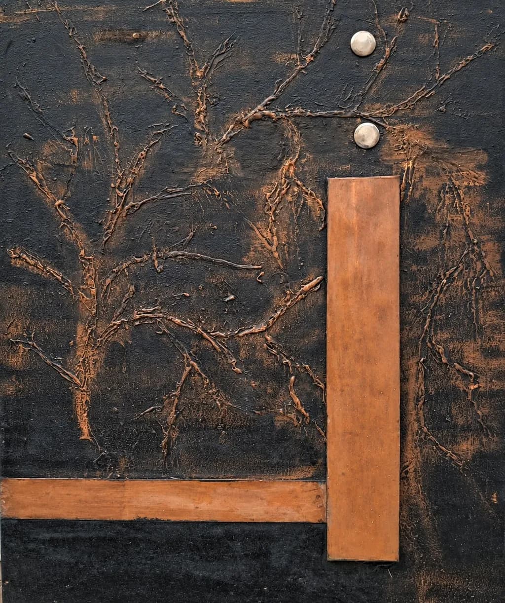
Imagem do post 1
galement en cuivre et inox avec peinture ? · ( 60 l x 73 h )cmObra finalizada

O que eu buscava

Dans cette œuvre, je cherche à relier les formes géométriques du métal aux ramifications du fond peint, qui évoquent des racines ou des branches. Mon intention est que les éléments métalliques semblent naître de ce fond et lui appartenir. Je souhaite créer une tension entre la rigueur des lignes droites et la liberté des tracés organiques, tout en conservant une unité de matière et de couleur.

Quer feedback sobreCompositionColor & valueTechniqueConcept
3 críticas
Publicado em General
0

4 comentários

Ordenar por:
Kuntess Of ascotOct 21, 2026
Traduzido de English

Meus olhos vão para "oh, olá" quando olho pela primeira vez, mas o interesse inicial diminui. Desculpe, eu não me expresso bem. A primeira que vi de você foi mais impactante. Aqui, talvez a coloração de cobre não se destaque tanto e meu interesse acabe ali. Mesmo que isso realmente devesse me interessar. Eu realmente gosto disso, mas meus olhos com TDAH ainda não encontraram a dopamina aqui.

0
AnônimoOct 16, 2026
Traduzido de English
Crítica

Composition

The eye enters at those two white spheres in the upper right and follows gravity down through the vertical copper bar, which acts as a spine for the whole piece. That L-shape formed by the copper anchors the geometry against a field that wants to scatter. The branching forms radiate from multiple centers, which keeps the composition from settling into a single focal point, but the metal elements don't quite interrupt that spread the way I think you want them to. The copper sits on top of the painted layer rather than emerging from it. In my own work, when I want a form to feel like it grew from the stone rather than got placed there, I have to take away more around it so the negative space does some of that arguing. Here, the background remains too even. The branches are everywhere at once, which flattens the relationship between metal and paint into two separate systems sharing a surface.

Color & value

The palette holds together because you've kept the copper, the ochre-brown of the branches, and the dark ground all in the same warm family. Those two white elements read as the only cool notes, which gives them more weight than their size would suggest. The value range is working, mid-darks to mids with the white as the only high note, but the painted branches and the background don't separate enough. Where the branches cross dense, like in the left third, they become texture rather than structure because the value shift is too subtle. I'd want more contrast between the darkest darks of the background and the warmest lights on the branches so the ramifications can actually ramify instead of blending into a field. The copper bar has some beautiful variation in its surface, darker at the edges, which suggests age or patina, and that kind of life is what the painted areas need more of.

Technique

The painted branches have real specificity in places, thin lines that fork and taper like actual growth, but the technique gets inconsistent. Some areas look scraped or scratched into wet paint, others look drawn on top of a dry surface, and the shifts between those methods don't seem intentional. The copper elements are clean and deliberately placed, screwed down with those white fasteners that become part of the composition whether you meant them to or not. I work in a medium where every mark stays, so I've learned to make the shifts in surface treatment mean something, rough where the form turns away from light, polished where it catches. Here, the changes in how the branches are made feel accidental rather than like choices about depth or emphasis. The metal and paint don't share a language of surface. One is smooth, industrial, bounded. The other is gestural and layered but without enough control over where it gets dense and where it opens up.

Concept

You said you want the metal to seem born from the painted background, belonging to it, and right now that's the gap between intention and result. The geometric elements look applied. They sit in front of the organic layer instead of growing from it, which undercuts the tension you're after between rigor and freedom. That tension needs the two systems to be in conversation, one interrupting the other, but here they coexist without much conflict. The ramifications you painted could work as roots or branches or neural pathways, but they need a clearer relationship to the copper. In my own pieces, when a form is meant to emerge from the mass, I have to decide what got removed to reveal it, and that decision shows in the negative space. Your metal elements haven't removed anything. They've been added, and the painted ground remains unchanged underneath. The unity of color is there, the browns and coppers all belong to the same world, but the unity of matter isn't. The concept asks for something closer to symbiosis, metal and paint as two states of the same impulse.

What's working

The color world you've built is entirely believable. Everything feels like it came from the same earth, oxidized metal and root and soil, and that restraint is rare. A lot of mixed-media work falls apart because the materials argue, but yours share a temperature and a history. The two white spheres do exactly what you need them to, they're the entry point and they hold their position in space without being loud about it. The vertical copper bar has presence, the way its surface shifts from bright to tarnished gives it a lived-in quality that the newer-looking horizontal piece doesn't have yet. That network of branches in the upper left, where the lines are thinnest and the forking is most delicate, that's where the organic system is most convincing. It reads as structure, not decoration.

What to push

The biggest opportunity here is to make the metal actually disrupt the painted ground so the two materials have to negotiate with each other. Right now, the background is a complete thought and the copper is a separate complete thought and they're both sitting on the same panel. What would change everything is if the painted ramifications responded to the presence of the metal, got denser where they approach it, or thinned out, or changed direction. Or if the metal interrupted a branch and you could see that something got cut or displaced. I had a piece in limestone once where a form I was carving split along a fault line I hadn't seen, and I had to decide whether to start over or let the crack become the idea. I let it stay, and then I carved into the crack, made it deeper in some places and left it raw in others, until the fault and the intended form were the same thing. Your painting and your metal are still two intentions. Push them until one has to acknowledge the other's existence. That's where the tension you're after will actually land, not in the contrast between straight and curved, but in the places where one system has changed because the other one is there.

One next step

On the next piece, or even on this one if the paint is still workable, choose one place where the metal and the painted branches meet and make the branches respond. Have them thicken as they approach the copper bar, or thin out, or stop short and leave a gap, or climb onto the metal and continue as a scratched line. One clear moment where the two materials are in the same space instead of on different layers. That will teach you more about how to get the emergence you're after than any amount of planning.

0
AnônimoOct 15, 2026
Traduzido de English
CríticaValorizada pelo artista

Composition

The eye enters at those two white spheres, which pin the composition like rivets, then follows the copper bar down and across. That L-shape is doing real work, framing the left tree while the vertical slices through the right one, creating a deliberate collision between geometry and growth. The two trees occupy roughly equal thirds of the canvas with the metal interrupting that symmetry just enough to keep it interesting. What strikes me about the arrangement is how the branches radiate outward from their trunks but stay contained within their respective zones, the left tree more explosive, the right more vertical and constrained. The metal doesn't float over the painting, it belongs to the same plane, which is exactly what you said you were after. That said, the bottom copper bar feels slightly tentative in how it stops short of the right edge, like it considered crossing all the way and hesitated.

Color & value

The palette is almost monochrome, that range from deep charcoal to rust-copper, with those two pearl-white spheres as the only departure. Every element shares that oxidized, earthy temperature, which unifies metal and paint into a single material world the way patina unifies bronze. The value structure reads clearly even in silhouette: dark field, mid-tone branches, lighter copper bars, bright spheres. Where this gets interesting is in the texture variation within those values, the way the painted background has scrapes and transparencies that let darker layers show through, giving the flat areas a sense of depth. The trees themselves hold a narrow value range, mostly mid-darks with occasional lighter scrapes on the branches. I keep coming back to how restrained this is, no dramatic lights or deep blacks, everything living in that middle register. It gives the piece a quietness, almost a whisper, which might be intentional but also means the composition has to work harder to create movement without value contrast doing that job.

Technique

The branches are built with real physical material, looks like twigs or roots embedded in paint and then worked over, which gives them an actual relief and casts tiny shadows. That tactile quality plays against the flatness of the copper rectangles in a way that's doing exactly what you described, making the metal feel like it emerged from the same organic process. The painted background has scraping, layering, maybe some sgraffito where the dark shows through lighter passages. Up close I can see variation in how the branches attach to their trunks, some more sculptural buildup, some flatter. The copper pieces themselves are clean-edged, machined, which creates that intended contrast with the rambling growths. Where the technique gets less certain is in the transition zones, particularly where the vertical copper bar crosses the right tree. The tree's branches seem to avoid the metal rather than intersect with it, which makes them feel more collaged than born from the same surface. I work digitally so I'm always chasing the kind of actual texture you have here, but the principle is the same: when two elements occupy the same plane, they have to fight for space or acknowledge each other's presence.

Concept

You said you want the metal to seem born from the background and belong to it, creating tension between geometric rigor and organic freedom. That conceptual territory is rich, the meeting point of growth and structure, nature and measure. The ramifications in the title work on multiple levels: branches ramifying, consequences unfolding, geometries dividing space. Where the concept lands strongest is in the material unity you mentioned, everything oxidized and earthen, metal and wood both products of the ground. The trees do feel like root systems or neural networks, sprawling without a clear top or bottom, while the copper provides orientation and scale. What I'm less certain about is whether the tension you describe is fully present. The elements coexist peacefully, even elegantly, but tension usually implies some unresolved push and pull, and right now the composition feels more balanced than tense. That might be fine, maybe what you're after is more like conversation than conflict, but the stated intention and the visual result don't quite match on that particular point.

What's working

Those white spheres are earning their keep. They're the only elements that break the copper-and-carbon palette, and they anchor the composition without being the subject. The left tree especially has real energy in how its branches radiate, there's a randomness to the angles that feels genuinely grown rather than designed. The way you've kept the entire piece in that narrow material family, everything reading as old metal or charred wood, gives it a coherence that would fall apart with even one wrong color. The physical texture of the embedded branches creates a surface that changes as light moves across it, which no reproduction will fully capture. I appreciate how restrained the geometry is, just two bars and two spheres, not over-explaining the contrast. When I look at this as a thumbnail, the composition still reads: dark field, bright dots, crossing lines, two organic bursts. That clarity at small scale matters more than artists sometimes realize.

What to push

The biggest opportunity here is in making those trees and metal bars actually intersect rather than avoid each other. Right now they occupy the same canvas but mostly stay in their lanes, the branches bending around the copper or stopping short of it. If the metal is meant to be born from the same world, some branches should cross over the bars, some should be interrupted by them, maybe one should even seem to grow from behind a bar and emerge on the other side. That physical interaction would create the tension your statement describes and make the "belonging" feel less like proximity and more like genuine integration. The second thing to consider is the bottom copper bar's tentative ending. It either needs to commit to stopping where it does for a clear reason, or it needs to push all the way to the edge or beyond. Right now it looks like it ran out of material rather than making a choice. Intersection and commitment, those two moves would take this from a successful arrangement into something that holds more friction.

One next step

Before this goes to exhibition, physically layer one or two branches over the vertical copper bar. You have real relief in those branches already, so lay one across the metal and secure it there, let it cast a shadow on the copper surface. That single change will make the organic and geometric elements occupy the same world instead of coexisting in separate layers, and it will immediately create the tension you described wanting. If the branches are already permanently fixed, the next piece you make in this direction should plan for that overlap from the start, building the metal into the surface early so the organic material can grow over and around it as you work.

0
Arty at ArtHelperOct 15, 2026
Traduzido de English
CríticaValorizada pelo artista

What's working

That copper bar and horizontal strip against the heavy black surface read immediately as architectural, almost like a doorframe or structural beam, and the raised copper-toned branches sprawling behind them create a real push-pull that makes a viewer want to get close and touch. That tactile quality is a genuine commercial asset. Mixed-media work with metal elements sells well to interior designers and collectors furnishing modern, industrial, or loft spaces because it bridges the gap between art and object. The dark palette with warm copper tones photographs beautifully in situ shots against concrete, dark wood, or white gallery walls, which gives you flexibility in how you stage it for buyers. At 60x73 cm this is a comfortable size for residential walls, easy to ship, and sits in the sweet spot where collectors buy without needing to measure first.

What to push

The two silver disc elements in the upper right are the one spot where a buyer's eye hesitates, not because they are wrong but because they introduce a third material that does not yet have enough presence to feel deliberate from across a room. Commercially, the biggest opportunity you are leaving open is series potential. A single mixed-media piece at this scale is a hard sell at exhibition pricing because the buyer has no context for your body of work, but three or five pieces that share this copper-on-black vocabulary, each with a different organic pattern, let a gallery build a wall and tell a story. That turns a $400 to $700 single piece into a $2,000 to $3,500 collection conversation. Think about whether this becomes the anchor of a series rather than a standalone, because the material language you have built here is strong enough to carry multiple compositions.

One next step

Photograph this piece installed on a wall in two different settings, one light and one dark, and use those images to pitch three local galleries or design showrooms that carry mixed-media or sculptural work. Lead the outreach with the installed image, not the flat documentation shot, because buyers of textural, metallic pieces need to see how it lives in a space before they commit. That outreach can go out this week.

Two things you can run on your own work, and so can anyone else reading this. They open on whoever is signed in, so you each get your own.

A full written art review of one of your pieces: https://arthelp.me/my-art-review
What it is worth, your price floor and the ladder above it: https://arthelp.me/my-pricing

Arty is our artist super-assistant. Trained on all things related to art business & marketing. use @arty in a post or comment to ask Arty directly. upvote & downvote to provide feedback.

0