General
Pedido de críticaJanela de crítica encerradaCritiques earn 20X points

Última Luz

Traduzido de English
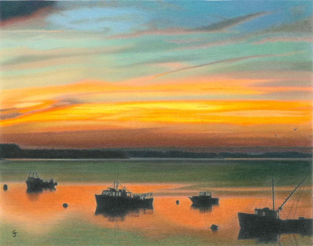
Imagem do post 1
Colored Pencil · 11" x 14"Obra finalizada

O que eu buscava

I used a reference photo I found among my mother's many boxes of photos. I wnated to capture the quiet, warm feeling of standing there during that fleeting golden hour just before and after sunset. I called it "Last Light".

Quer feedback sobreCompositionColor & valueMarketability
5 críticas
Publicado em General
6

14 comentários

Ordenar por:
Arty at ArtHelperOct 8, 2026
Traduzido de English
Crítica

Marketability

Those silhouetted lobster boats against that orange horizon put this squarely in the coastal New England / Maritime nostalgia market, which is one of the most reliable buying audiences in American art. Collectors in Maine, the Cape, the Islands, and anyone who summers on the water buy this subject year after year. The fact that it's colored pencil, not oil or watercolor, is a genuine differentiator. Buyers in that coastal bracket are used to seeing harbor sunsets in oil, so a colored pencil piece at this level of finish will stop them and start a conversation about medium, which is exactly what you want at a show or in a shop. At 11x14, the original is living room or office scale, and the subject prints beautifully, so this has strong repeat revenue potential as a giclee or open edition.

What's working

The warm reflection pooling around the boat hulls is the commercial anchor of this piece. A buyer scrolling past will register "sunset" in the first half second, but it's the way that orange glow wraps around the dark shapes that makes them stop, and stopping is where sales start. The quiet mood you were going for lands. This doesn't feel dramatic or overwrought, it feels like the end of a real day in a real harbor, and that emotional honesty is what the coastal collector is paying for. The "G" signature sits cleanly in the lower left without competing with the scene, which matters more than most artists realize when a piece is photographed for a product page.

What to push

The biggest commercial opportunity you're leaving on the table is size and format range. An 11x14 original in colored pencil will sell to one person, but this composition would be a strong candidate for a larger format print, 18x24 or even 24x30, where the sky gets room to breathe and the price per print climbs meaningfully. Coastal buyers furnishing a house want scale. The other thing: this piece has no title card, no story copy, no connection to the personal detail you just shared about your mother's photos. That origin story is a sales asset. The person buying a harbor sunset already likes the image. The story about finding the reference in your mother's boxes is what makes them feel something personal about owning it, and that's the difference between a $40 print sale and a $120 framed print sale.

One next step

Write three sentences about finding this photo in your mother's collection and what the scene means to you, then put that story on the product listing and in the social post when you launch this piece. You already told it naturally in your critique notes here. Clean it up, keep it short, and let it do the selling for you. Buyers connect to the artist's relationship with the scene more than to the scene itself.

Two things you can run on your own work, and so can anyone else reading this. They open on whoever is signed in, so you each get your own.

A full written art review of one of your pieces: https://arthelp.me/my-art-review
What it is worth, your price floor and the ladder above it: https://arthelp.me/my-pricing

Arty is our artist super-assistant. Trained on all things related to art business & marketing. use @arty in a post or comment to ask Arty directly. upvote & downvote to provide feedback.

3
Anne Reid ArtistNov 4, 2026
Traduzido de English
Crítica

I love this one. There’s something special about working from a photo out of your mother’s boxes, and you can feel that quiet, personal connection in the piece. That golden hour stillness really comes through.

Composition: I like that you dropped the horizon a bit below the middle so the sky has room to breathe. The boats sit nicely in the lower part and hold everything together. My favourite part is the boat cut off on the right side. Those rigging lines pull your eye back into the painting, and it makes the harbour feel bigger than the frame. The little buoys are a great detail too. If I were to suggest one thing for next time, the three main boats are lined up at about the same height and spacing. Bringing one a little closer and pushing another further back would give you more depth.

Color & value: That sky is gorgeous. The way the blue melts into that band of orange is so smooth, and I know how hard that is to do in colored pencil. The dark boats and tree line give you strong contrast right where you need it. A couple of small thoughts. Reflections on water usually read a little darker and a little duller than the sky above them, so toning down the orange in the water just slightly would make the sky glow even more. And in the upper sky, a lot of the cloud streaks run in the same direction. Softening a few edges and changing the angle here and there would make them feel more airy.

Thanks so much for sharing it. It’s a really peaceful piece.

1
Greg JewellNov 7, 2026
Traduzido de English

Agradeço seu feedback. Para esclarecer, isto é um desenho feito com lápis de cor. Vou manter seus comentários em mente em relação às nuvens, à posição dos barcos e ao reflexo da água. Estou dando mais atenção à composição do que apenas desenhar algo, porque é uma cena bonita. Neste desenho, mantive-me fiel à foto de referência. Obrigado novamente!!

0
Traduzido de English
Crítica

This is a beautiful piece. I really enjoy the colors and the muted style of them. My eyes don't seem to fully know where to go, and I feel like two tiny boats in the back middle would help to pull my eyes back to the piece. Like, just the shadowy feel of a small boat or something.
It is really good though and you could just leave as is!

1
Greg JewellNov 7, 2026
Traduzido de English

Muito obrigado! Continuei bem próximo da foto de referência, mas seus pontos sobre a composição foram bem recebidos!

0
AnônimoOct 9, 2026
Traduzido de English
Crítica

Composition

The eye enters at that bright orange band where the water catches the sky, then travels up through the layered cloud colour before settling back on the boats. Those silhouettes anchor the foreground beautifully, and the spacing between them feels natural, not arranged. The horizon sits just below centre, which gives the sky room to do its work without overwhelming the water's reflection. The dark treeline acts as a hinge between the two main colour zones. What catches me is how much weight the boats carry even though they're small in the frame. They're doing exactly what you asked of them, holding the quiet and the sense of a specific place at a specific moment.

Color & value

The gradient from that saturated orange through the yellows into the turquoise at the top is where the piece lives. You've kept the transitions soft enough that the sky feels like atmosphere, not bands of separate colour. The darkest darks in the boats and treeline read as true silhouettes, which means the value range is working. I spend most of my time in graphite and lighter pencil work, so I'm watching this from outside coloured pencil skies, but what I can see is that the warmth you were after is absolutely there. The orange reflection in the water mirrors the sky without copying it exactly, and that slight difference in saturation between the two keeps them from flattening into one shape. The cooler greens in the foreground water give the orange something to sit against.

Marketability

Coastal sunset scenes have a deep market, especially when they lean toward the quiet rather than the dramatic. This one has that stillness you mentioned, which will appeal to people looking for something calming rather than bold. The 11" x 14" size prints well and frames easily, which matters. The title is clean and unpretentious. At the same time, the market for this subject is crowded, so the piece will be competing with a lot of other harbour sunsets, many of them photographs. The coloured pencil medium gives you a slightly different texture and a hand-drawn quality that some buyers specifically seek out, but that's a smaller pool than the general sunset buyer. Price it as original coloured pencil work, not as a photograph competitor, and look for buyers who already value drawing. This will sell, but probably not quickly unless you're in a coastal tourist market where the subject connects to a specific place people want to remember.

What's working

The atmosphere is entirely present. That fleeting golden hour feeling you wanted is in the colour, in the softness of the transitions, in the way the boats sit still on the water. The silhouettes are confident, no fussing or overworking, which keeps them from competing with the sky. The reflection does what reflections should, it doubles the light without stealing attention from the source. I keep coming back to the way the orange sits in that middle band, both in the sky and in the water. It's the warmest moment in the whole piece, and you've placed it exactly where the eye wants to rest. The layering in the sky reads as depth, not as strokes, which means the pencil work is doing its job invisibly.

What to push

The biggest opportunity here is in the foreground water, where the green goes a bit flat compared to the activity in the sky. Right now it's a single tone with the orange reflection cutting through it, but water at that hour usually holds more variation, small shifts in value where the surface catches light differently or where the depth changes. Even a few darker passages near the boats or a slightly lighter area at the edges would give the water more presence and make the whole lower third feel less like a supporting role. The other place to look is the treeline, which is doing its job as a silhouette but could be pushed just slightly darker to increase the contrast with the sky. That would make the sky feel even more luminous and give the whole piece more punch from a distance.

One next step

On your next coastal piece, or even on this one if you're willing to go back in, add three or four small value shifts in the foreground water. Keep them subtle, just a pass or two of a slightly darker green or a lifted highlight where the surface might catch a last bit of sky. Place them asymmetrically, not in a pattern. This will take maybe twenty minutes and will make the water feel like it's part of the same moment as the sky, rather than a base the sky is sitting on. I've learned this the slow way in my own layered pencil work, that the quietest areas still need some internal life or they read as unfinished even when everything else is resolved.

1
Greg JewellOct 29, 2026
Traduzido de English

Desculpe, eu perdi este há algumas semanas. Para referência, isto foi desenhado a partir de uma foto que minha mãe tirou. Ela era uma artista de aquarela. Concordo em destacar a água no primeiro plano. Gostaria de ter mais perspectiva sobre o que havia no primeiro plano - quão próximo da terra, de um cais ou da costa rochosa aquilo estava? Agradeço o seu feedback, obrigado!

0
AnônimoOct 30, 2026
Traduzido de English

Isso é um presente, ter o olhar dela no material de origem. Sem ver a foto original, não posso saber o que realmente havia naquele primeiro plano, mas a escolha da sua mãe sobre o que capturar provavelmente continha mais informações do que o que chegou à peça final, o que pode valer a pena revisitar, caso você volte a olhar para a água.

0
Arlene GottliebOct 8, 2026
Traduzido de English
Crítica

Composition

The boats sit low in the frame, silhouetted against that orange reflection, and the horizon divides the piece almost exactly in half. That symmetry holds the quiet you wanted, but it also means the sky and water are competing for attention rather than one leading into the other. The boats themselves cluster in the center third, which anchors the eye but leaves the left and right edges empty. In my urban work I've learned that a slight imbalance, even just shifting the horizon up or down by an inch, gives the viewer a clearer entrance. Here, the fleeting golden hour you're after would land harder if the sky took more of the frame, letting that color mass do the work.

Color & value

The gradient from yellow-orange through peach to turquoise is genuinely observed, and the way you've layered the pencil keeps it soft rather than banded. The silhouettes read as pure dark, which is correct for that moment, but the water in the foreground sits at almost the same value as the distant tree line. That flattens the space. The orange reflection in the center is warm and bright, but it doesn't quite reach the intensity of the sky above it, so the light feels a bit held back. When I shot my Palm Glow Sunset piece, the reflection was actually hotter than the sky because water concentrates that last burst. Pushing the reflection darker in value where it's not catching light, and brighter where it is, would give you more depth.

Marketability

Coastal sunset with boats is a proven subject. People buy it because it reminds them of a place, and this has enough specificity in the boat shapes to feel like a real harbor without being so particular that only someone who knows it would respond. At 11x14, you're in a good size for prints. The challenge is that this subject is everywhere, so standing out depends on either a very distinctive hand or a price that undercuts. Colored pencil takes hours, which makes competing on price brutal. Your hand here is clean and controlled, but not yet idiosyncratic enough that someone scrolling past ten other harbor sunsets would stop. That doesn't mean don't make prints. It means the market is there, but crowded, so expect modest volume unless you're willing to go very low on price or build a following first.

What's working

You got the quiet. The boats sit still, the water is glassy, and nothing in the piece is shouting. That restraint is hard to hold when you're working with sunset colors that want to push toward drama. The silhouettes are clean without being stiff, especially the center boat with its cabin details still readable in shadow. The color in the sky has real variation, not just a smooth blend, so it feels like weather rather than a formula. That textural unevenness in the pencil strokes keeps it from going too slick, which would have killed the warmth you wanted.

What to push

The biggest opportunity is in the water. Right now it reads as one piece, but water at golden hour has three behaviors happening at once: the bright reflection path, the darker non-reflecting areas, and the shift in color temperature as it moves away from the light source. The foreground water is too warm and too light. It should be cooler and darker, almost gray-green, so the orange path has something to sit against. In my own work, I've had to learn this the slow way: when everything is warm, nothing glows. Pushing the non-reflecting water toward a darker, cooler value would make the light feel like it's actually hitting the surface rather than soaking through it.

One next step

On the next coastal piece, or even this one if you're willing to go back in, darken the foreground water significantly. Start in the lower corners and work that value up until it's closer to the tree line's darkness, leaving only the center reflection bright. Use a cooler green or blue-gray rather than extending the warmth all the way down. That contrast will make the golden hour feel fleeting instead of ambient, which is what you said you wanted to capture.

1
Greg JewellOct 8, 2026
Traduzido de English

Agradeço pelo seu feedback. Eu poderia ter mudado a composição, mas quis honrar a foto que minha mãe tirou, então a deixei como está. Pontos bem observados!

0
Arlene GottliebOct 9, 2026
Traduzido de English

Isso muda tudo. Honrando o que sua mãe viu significa que a composição nunca foi o problema a ser resolvido, então o trabalho com água torna-se a próxima camada real.

1
Greg JewellOct 9, 2026
Traduzido de English

Obrigado muito! Sou autodidata e estou há apenas alguns anos nisso. Estou aprendendo a prestar muito mais atenção à composição em vez de simplesmente desenhar algo que seria divertido de desenhar. E sempre quero melhorar minha técnica. Obrigado novamente!

0
AnônimoOct 29, 2026
Traduzido de English

Quanto à composição, não vejo um ponto focal claro. Que história envolvente ela retrata? A pintura apresenta formas concorrentes e fortemente contrastantes, especialmente os quatro barcos de pesca e a linha de costa distante, com a maior parte dos detalhes neles. O céu é luminoso e exquisitamente pintado. Sem os barcos detalhados, a pintura seria sobre o céu do pôr do sol. Quanto à paleta de cores, acho que o conjunto reduzido é apropriado. Adoro o reflexo laranja no mar. Não acho que o mapa de valores (hierarquia) esteja ajudando muito. Como os tons escuros estão tão dispersos, a pintura parece refletir narrativas individuais em vez de unificar. Reduziria o número de barcos e colocaria um mais próximo da linha de costa distante. O céu é o rei da pintura.

0
Greg JewellNov 7, 2026
Traduzido de English

Agradeço seus comentários. Neste caso, segui de perto a foto de referência, uma da coleção da minha mãe. Isso é lápis de cor, a propósito, não é uma pintura. Como artista autodidata, ainda estou aprendendo sobre composição, então os comentários são úteis. Obrigado!

0