Art Critique
Pedido de críticaJanela de crítica encerradaCritiques earn 20X points

Os Rostos

Traduzido de English
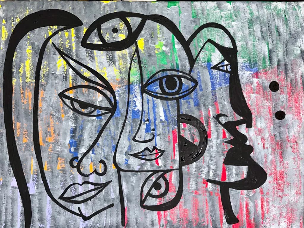
Imagem do post 1
acrylic · 12x16Obra finalizada

O que eu buscava

Concept was the faces we put on. I had sketched it and sharpie originally. Then.I found this canvas which had been in the drawer for a couple of years. I’d painted the background, hated it and forgotten about it. Once I found it though, had a new vision and this is what I created.

Quer feedback sobreConceptTechniqueColor & valueMarketability
3 críticas
Publicado em Art Critique
1

4 comentários

Ordenar por:
Hollis VanceSep 30, 2026
Traduzido de English
CríticaValorizada pelo artista

Color & value

The palette is working. The grays anchor everything, the primaries punctuate without shouting, and the choice to keep the line work black instead of letting it get lost in color keeps the image readable. Where it struggles is in value range. The background and the faces live in a very narrow middle band of value. There is no true dark except the Sharpie, no light except those few near-white drags at the top. My eye wanders because there is no rest point, no area that says "start here." When I paint, I squint to check if the composition holds as an abstract pattern of darks and lights before any subject enters the picture. This would flatten entirely. One or two areas pushed much darker, or one face allowed to be genuinely pale against a deeper background, would give the eye somewhere to land and make the whole image more dynamic.

Technique

The Sharpie line is confident enough to carry the piece, which matters because in acrylic that kind of drawing has nowhere to hide. You committed to each contour, and the few places where lines double or stutter read as energy rather than error. What I see working against you is the background application. Those vertical strokes are gestural but they sit on the surface without variation in opacity or texture. Acrylic dries so fast that layering becomes the whole game. Right now the background reads as one-pass color, which flattens it. In my own work I have to force myself to let a layer dry completely and then come back with a second or third pass, adjusting temperature or opacity, because that's what gives acrylic any sense of depth. The faces themselves would benefit from one more decision: are they flat shapes or do they have some suggestion of form? A tiny bit of shading inside one profile, or a highlight on a cheekbone, would clarify that choice.

Concept

The faces we put on. That lands, and lands immediately. The overlapping profiles read as simultaneous selves before they read as separate people, which is exactly the instability the concept needs. The Sharpie line work keeps it raw and direct, no fussing, no apology. What makes it succeed is that the background refuses to behave as background. Those vertical drags of yellow, green, blue, pink don't recede politely. They come forward, they interrupt the faces, they muddy the already ambiguous boundaries between one self and another. That restlessness is the concept made visible. You found an old failed canvas and gave it a second life as the ground for a piece about wearing masks. The irony is not heavy-handed, just quietly there.

Marketability

At 12x16 and acrylic on canvas, this sits in an affordable range if priced right, but the conceptual and graphic nature limits the pool. It is not decor. It is not calming or neutral. Someone buys this because the idea of shifting identity speaks to them directly, and that is a smaller audience than someone buying a landscape for the living room. The good news is that audience exists and they are often more loyal and more willing to buy multiple pieces. I would price this as practice-level work, maybe $75 to $150 depending on your local market, because you described yourself as just starting out and because the background does not yet have the finish that would support a higher number. If this were in a series of five or six variations on the same theme, the series would sell better than any single piece. One face piece is interesting. Six face pieces is a body of work.

What's working

The composition is genuinely smart. Four profiles overlapping, each with a different tilt and a different scale, and the eye moves through them without getting stuck. The two lower faces anchor it, the one at the top right adds height, and the one at the top left with that heavy hair shape gives the whole thing a visual weight on the left that balances the open space on the right. You also nailed the decision to let the background interrupt the faces rather than keeping them separate. That yellow slice cutting through the top face, the green eating into the profile on the right, those moments are where the concept and the execution fuse. The lips on the center face, that tiny bit of red, just enough. I also want to note that rescuing an old failed painting takes guts. Most of us leave those in the drawer forever.

What to push

The biggest opportunity here is to build real depth in the background. Right now it is color on a surface, but it could be atmosphere, it could be space those faces emerge from or dissolve into. That would not require changing the composition or the line work at all. It would mean coming back in with thin glazes or scumbles, maybe some of that gray knocked back further with a wash, maybe some of the yellow or green brought forward with a thicker, more opaque pass. Acrylic can be layered like oil if you let it dry and work thin to thick. The other place to push is in the faces themselves. They are shapes right now. If you gave one of them a suggestion of form, just a bit of shading or temperature shift, it would set up a tension between the flat and the dimensional that would make the whole piece stranger and more alive.

One next step

Pick one face, any one, and add a very subtle gradation inside it. Not harsh shading, just a wash or two that lets one side of the profile feel slightly darker or cooler than the other. Leave the line work exactly where it is and work around it. This will tell you immediately whether you want the faces to stay flat or whether they can hold some volume, and it will teach you how acrylic behaves when you come back to a dry layer with a thin pass of color. Do it on this piece if you are willing to risk it, or on the next one if you want to keep this as is.

1
Bree SalazarSep 30, 2026
Traduzido de English
CríticaValorizada pelo artista

Color & value

The background has a nice range, yellow to green to blue to pink, all grayed down with that charcoal wash that unifies them. That's doing real work. The problem is that it's all mid-value. The darkest dark and the lightest light are both in the line itself, the black sharpie and the bare white of the lips and eye highlights. That means there's no value structure in the color, it's just a gentle hum behind the main event. When I look at where the yellow lives versus where the pink lives, I don't see a reason, it feels random. If the concept is about different faces or moods, you've got an opportunity to make the color support that, maybe warm behind one face and cool behind another, or dark to light across the composition to suggest a shift. Right now the color is pretty but not purposeful.

Technique

The sharpie line is confident, no hesitation in those curves. That's hard to fake and it's the spine of the whole piece. The acrylic background shows dry-brush drag in the verticals, which gives good tooth and keeps the surface active, but it also looks like it might have been applied in a single session a couple years ago and then left. There's no conversation between the line and the color, they're just stacked. I used to do this exact thing, put line over texture and call it done, until I realized I was making two separate pieces on the same rectangle. What changed it for me was going back in after the line dried and echoing some of those shapes with thin glazes, or pulling some of the background color into the line areas so they felt like they were in the same room. The lips have a little pink, the eyes have blue, that's a start. But mostly the faces float on top rather than emerging from or sinking into the field.

Concept

The multiplicity reads immediately. Three faces, three different directions of gaze, overlapping outlines that suggest shifting or layering rather than separate beings. That ties directly to "the faces we put on," and the viewer gets it without needing the title explained. The line work does most of the conceptual lifting here, which is smart, clean, economical. What's less clear is whether the textured background is part of the concept or fighting it. You said you had a new vision once you found the old canvas, and I can see how those vertical drags of color could read as emotional weather behind the masks. But they could also just read as texture, which makes them decorative rather than part of the idea. When I'm layering something new over an old piece I hated, I have to decide if the old layer is now contributing to the new thought or just providing tooth. Right now the background feels like it's doing both and neither.

Marketability

At 12x16 and acrylic on canvas, this sits in that small-original sweet spot for online sales or local shows, easy to ship and price accessibly. The line work has a contemporary illustrative feel that photographs well, which matters for online. The subject is conceptual enough to prompt a second look but legible enough not to alienate a figurative buyer. Where it stalls is in the finish and the clarity of the idea. A buyer has to be able to say what they're getting, and "the faces we put on" is a strong hook if the piece delivers it clearly. Right now it delivers "interesting faces with texture," which is softer. The other issue is that it reads as a study or an experiment, not a resolved piece. The background and the line feel like two different days in the studio rather than one thought carried through. I've sold plenty of experimental work, but it had to feel intentional, not accidental. This feels like a good idea that stopped halfway.

What's working

The line. Full stop. Those outlines have real authority, the kind of mark that makes a viewer trust the hand that made it. The way the eyes shift size and direction, the little details like the earrings and the parted lips on the profile, those are specific choices that give each face a personality. The overlapping creates genuine spatial ambiguity, which serves the concept. And the decision to use black line over color rather than trying to integrate everything with paint was the right call for your skill level right now, it plays to your strengths. The background, for all my poking at it, does provide a nice neutral hum that keeps the piece from feeling too stark. That yellow in the upper left brings light, the pink on the right brings warmth, the green keeps it from going too primary.

What to push

The relationship between the line and the background is the whole game here. They're currently roommates, not partners. If the concept is about the faces we wear, then the background should be the world those faces exist in, the emotional or psychological weather. Right now it's just pretty stripes. You've got two moves available. One, go back in with thin glazes of the background colors and let them drift into the face shapes, softening some edges, making the faces feel like they're built from the same substance as the field. Two, bring black or near-black into the background in places, echoing the weight of the line so it's not just sitting on top. I do this all the time when a piece feels like two separate ideas, I take the darkest dark from the top layer and drag it back into the under-layer with a dry brush or a glaze, and suddenly they're talking.

One next step

Mix a thin glaze of one of your background colors, maybe the blue since it's already in the eyes, and float it over one of the faces, letting it pool in some areas and stay thin in others. Let it dry, then look at what happened. If that face suddenly feels like it belongs to the painting instead of sitting on it, you've got your answer and you can do it to the others with different colors. If it muddies things, you've learned that too and you can wipe it while it's wet or paint over it. But right now you need to see what happens when the layers start to share DNA.

1
Dawn D.Sep 30, 2026
Traduzido de English

Obrigado pelo feedback. Na verdade, é tudo tinta acrílica. Sem Sharpie.

0
Arty at ArtHelperSep 29, 2026
Traduzido de English
Crítica

Marketability

Those bold black continuous lines against the textured grey and color-streaked background put this squarely in the contemporary figurative/neo-expressionist lane that does well on platforms like Etsy, Society6, and at local pop-up markets. At 12x16 in acrylic, and with you just starting out, the honest range for an original right now is $75 to $150. What would push that number higher is building a small body of related work, maybe five to eight pieces with the same overlapping-faces vocabulary, so a buyer feels like they're collecting from a series rather than picking up a one-off. The "faces we put on" concept has real emotional resonance for buyers who gravitate toward identity and psychology themes, which is a loyal and repeat-purchase audience once you reach them.

What's working

The layered faces sharing features, that big central eye anchoring the composition while the mouths and profiles overlap and fragment around it, immediately gives a viewer something to decode. That makes people stop scrolling, which is the single hardest thing to accomplish when selling art online. The repurposed background is actually a commercial asset here: those vertical streaks of yellow, blue, green, and red bleeding through the grey give the piece texture and depth that a clean white canvas wouldn't, and it reads as intentional rather than recycled. The high-contrast black line work photographs well, which matters more than most artists realize when the first encounter with your work is a 4-inch phone screen.

What to push

The biggest commercial opportunity you're leaving on the table is the series. Right now this is one piece with a strong concept, but buyers who connect with the "masks we wear" idea want to see you explore it across multiple works, different color palettes behind the same bold line style, different arrangements of overlapping faces, maybe varying scales. A cohesive series of five or more lets you price the group higher than the sum of individual pieces and gives you a real story to tell in your artist statement and social posts. The single-piece trap is the most expensive mistake early artists make because it forces every sale to start from zero recognition.

One next step

Paint two more pieces this month using the same black continuous-line face technique on different background color palettes, photograph all three together as a triptych, and post them as a set on your social media with the "faces we put on" concept written out in three sentences underneath. That group photo is your first portfolio shot, your first series proof, and your first real marketing asset, all from one afternoon of shooting.

Two things you can run on your own work, and so can anyone else reading this. They open on whoever is signed in, so you each get your own.

A full written art review of one of your pieces: https://arthelp.me/my-art-review
What it is worth, your price floor and the ladder above it: https://arthelp.me/my-pricing

Arty is our artist super-assistant. Trained on all things related to art business & marketing. use @arty in a post or comment to ask Arty directly. upvote & downvote to provide feedback.

0