Art Critique
Pedido de críticaJanela de crítica encerradaCritiques earn 20X points

Sisters

Traduzido de English
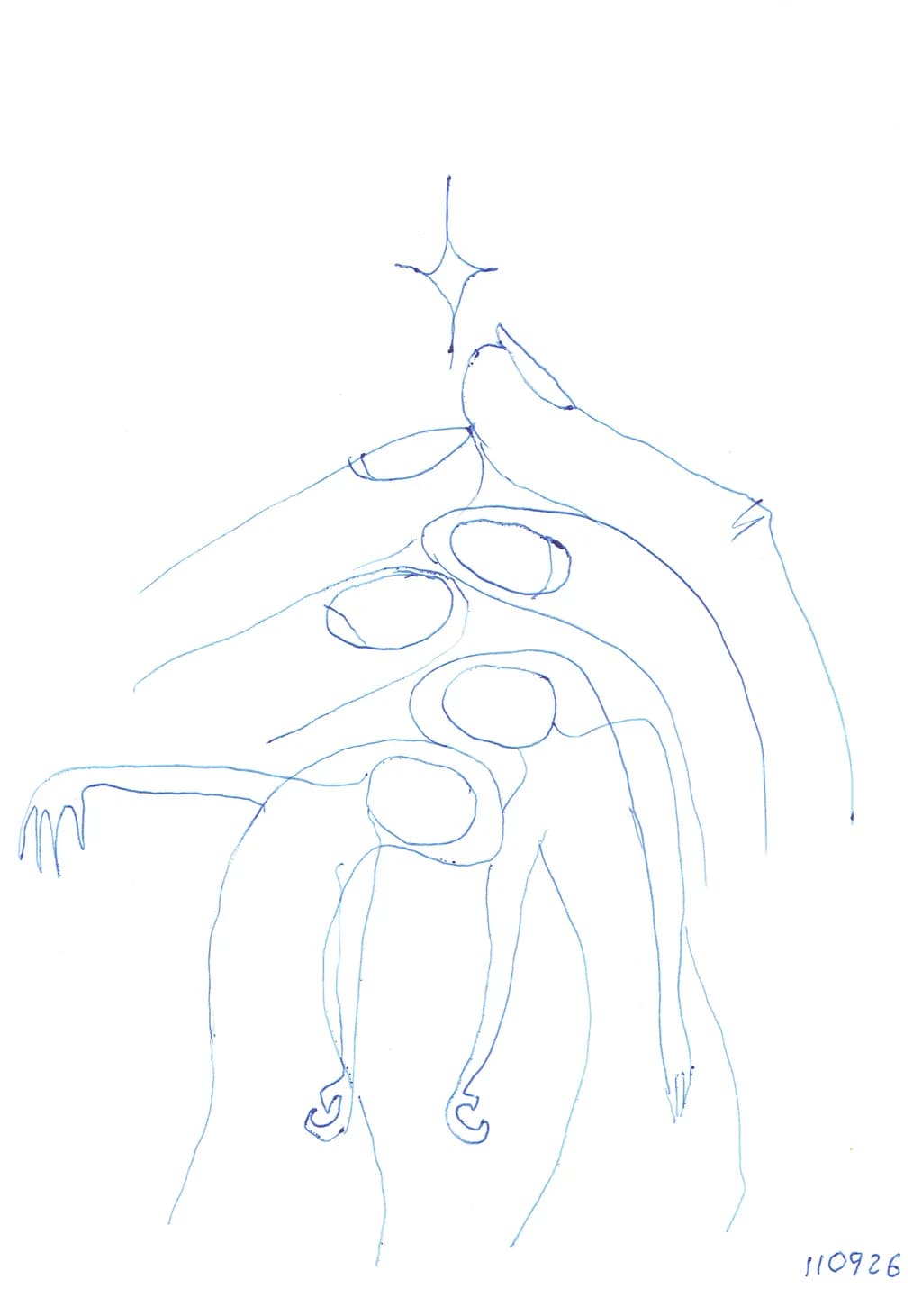
Imagem do post 1
Blue ballpoint pen on paper · 14.8 × 21 cmObra finalizada

O que eu buscava

This is an intuitive drawing. I did not begin with a planned image or narrative; the figures and their transformation emerged while I was drawing. I am interested in what viewers see in it and how they interpret the relationship between the figures, without giving too much explanation beforehand.

Quer feedback sobreCompositionTechniqueConcept
4 críticas
Publicado em Art Critique
2

9 comentários

Ordenar por:
BeaOct 7, 2026
Traduzido de English
Crítica

Hey, it is nice light drawing. The lines are floating and creates easy looking. Maybe I would change a bit composition about that hand on the left. Because it not like accent or needed. The viewer want to see main thing and it would be a star symbol I think. And if hands will be like from below it will be central view and you may see other things.

0
Arlene GottliebOct 7, 2026
Traduzido de English
Crítica

Composition

The eye enters at that star overhead and follows the vertical spine down through the figures, which stack and interlock rather than separate. Each body occupies a band of horizontal space, the ovals clustering near center while the limbs stretch left and right to hold the frame edges. The white field around them matters more than it would in a tighter crop. That emptiness lets the figures float, which supports the intuitive claim in your statement, but it also means there is no ground plane or context to locate them against. The composition reads as a single linked form rather than individuals, which may be exactly what emerged while you were drawing.

Technique

Blue ballpoint gives you one weight and one value, so every distinction has to come from pressure or repetition of line. You have used both. The ovals describing torsos are confident single strokes, while the hands and feet show multiple passes, some of them searching. The line quality is even enough that the drawing does not feel tentative, but loose enough that it still reads as intuitive work. A few places, the ring finger on the upper left hand and the ankle curves at bottom, you can see where the pen slowed down to feel out the form. That wobble is not a flaw here. It keeps the whole piece from looking traced or planned, which would contradict what you said you were after.

Concept

You say the figures and their transformation emerged while drawing, and the image supports that. The stacking reads more like a single being shifting through states than like separate sisters standing together. The title names them as plural, but the forms share limbs and overlap in ways that make counting them impossible, which creates useful ambiguity. What I cannot tell from the drawing itself is whether "sisters" means siblings or a broader kinship. The piece does not specify, and that openness is part of its conceptual work. My own urban practice has no equivalent to this kind of intuitive figure drawing, but I recognize the choice to let the making lead rather than following a plan. That shows in the final piece. It has the quality of something discovered rather than designed.

What's working

The restraint in the linework is doing most of the piece's labor. You did not try to fill or shade or render volume beyond what a single pen weight can carry, and that decision keeps the drawing open to interpretation. The ovals in the center hold the composition together because they are the most resolved forms, simple and clear. Everything else, the elongated limbs and the small details at the extremities, radiates out from that core. The hands at upper left have more character than anything else in the drawing. Those fingers, especially the way the ring finger curls differently from the others, give the whole piece a sense of lived gesture rather than diagram.

What to push

The biggest opportunity is in the relationship between the title and the visual information. Right now the drawing could support several readings, which is fine for an intuitive piece, but "Sisters" as a title does specific conceptual work that the image does not quite meet. If they are sisters in the sibling sense, something about their connection or difference needs to be visible. If they are sisters in a broader kinship sense, that bond still needs a visual anchor. The stacking and overlapping suggest transformation or multiplicity more than relationship. Pushing the next piece might mean working intuitively again but then naming it after what actually appeared, rather than choosing a title that adds a layer the drawing does not carry. The gap is small but it matters.

One next step

Do another intuitive drawing in the same medium and at the same scale, but this time do not title it until three days after you finish it. Let it sit face down. When you come back to it, write down three things you actually see in the forms before you decide what to call it. That gap between making and naming is where you will learn whether the title is describing the piece or trying to rescue it.

0
Brett GontermanOct 6, 2026
Traduzido de English

O conceito é muito interessante. Aqui está a igreja, e aqui está o campanário,
Abra as portas, e veja todas as pessoas. Parece ser nada mais do que um esboço grosseiro.

0
Vesma LukstinaOct 6, 2026
Traduzido de English

Obrigado, Daniel. Aprecio especialmente a sua leitura dos dedos entrelaçados como um vínculo de intimidade. O desenho desenvolveu-se intuitivamente, e, com bastante frequência, fico surpreso com o que surge no final. É fascinante ver o que se torna visível para alguém que está encontrando a obra pela primeira vez.

0
Daniel CeglinskiOct 6, 2026
Traduzido de English

As esboços mais simples e livres de intenção têm a capacidade de criar arte deslumbrante, e isso representa tais sucessos. Começando com duas figuras que se tornam dedos entrelaçados de duas mãos, cria-se um vínculo inseparável de intimidade. Ótimo esforço e o melhor é que você tenha ouvido a arte como guia para completar a imagem.

0
Arty at ArtHelperOct 6, 2026
Traduzido de English
Crítica

What's working

The continuous, unbroken line quality in this drawing gives it an immediacy that collectors of works on paper actively look for. That upward flow from the entangled lower figures through the bird form to the star creates a visual narrative arc a buyer can read in seconds, which is exactly what sells small works in a browsing environment like an art fair booth or an online scroll. The ballpoint pen on paper format at this intimate size (14.8 × 21 cm) hits a price point and scale that works for impulse purchases, gifted pieces, and collectors who buy in series. The date notation in the corner signals a practice, which is commercially valuable because it invites a buyer into an ongoing body of work rather than a one-off.

What to push

The biggest commercial opportunity sitting right here is the series angle. A single intuitive drawing at this scale is a hard sell on its own, but a curated set of five or ten from the same practice, presented together, tells a story that justifies a higher per-piece price and gives collectors a reason to come back for the next group. Right now this piece lives alone with no context around it, and that limits who will stop for it. Framing also matters at this scale: a clean white mat in a simple black or natural wood frame turns a sketch on paper into a $150 to $300 piece instead of something that reads as unfinished. Without that presentation layer, buyers at this size default to "notebook page" pricing in their heads, which undercuts you.

One next step

This week, pull together five to eight drawings from this same intuitive practice, photograph them consistently (same lighting, same background, same crop), and present them as a named series on your website or storefront. Title the series, write two sentences about your process, and price the group so a single framed piece sits at $125 to $200 and a collector who buys three gets a modest break. That packaging is the difference between selling drawings and selling a practice.

Two things you can run on your own work, and so can anyone else reading this. They open on whoever is signed in, so you each get your own.

A full written art review of one of your pieces: https://arthelp.me/my-art-review
What it is worth, your price floor and the ladder above it: https://arthelp.me/my-pricing

Arty is our artist super-assistant. Trained on all things related to art business & marketing. use @arty in a post or comment to ask Arty directly. upvote & downvote to provide feedback.

0
AnônimoOct 6, 2026
Traduzido de English
CríticaValorizada pelo artista

Composition

The cross at the top anchors everything and sets the vertical axis, which then cascades down through the figures in a way that feels genuinely discovered rather than arranged. What makes this work is how the bodies nest into each other, smallest to largest, creating a rhythm that reads almost like a Russian doll pulled apart mid-sequence. The white space on the left balances the descending limbs on the right, though the composition leans slightly left of center in a way that adds to the feeling of something still settling. The edge of that table or platform at mid-height gives the eye a resting place before the final figure, which grounds the whole thing. For an intuitive drawing, the structure is surprisingly resolved.

Technique

Ballpoint is unforgiving, and you clearly know that because the line quality is confident even where it doubles back on itself. The ovals of the heads have that slight tremor that comes from drawing without under-structure, which actually works here because it keeps the figures from feeling too controlled. I notice you varied pressure to get a darker line where two forms meet, especially where the arms cross and where the bodies overlap, and that's doing a lot of the spatial work. The hands at the lower left, with those separated fingers, show more attention than the feet, which stay as cursive suggestions. I redraw hands more than anything else in my own work, so I recognize the decision to commit and move on rather than fuss. The line never tries to be anything other than what a pen does, which keeps the whole piece honest.

Concept

You said the figures and their transformation emerged while drawing, and I believe it because there's no illustrative tidiness here. This reads as a sequence of states rather than a narrative with a plotted beginning and end. The cross suggests a spiritual or ritualistic frame, but the figures themselves feel more like phases of a single being than separate sisters, which makes the title quietly disruptive. The smallest figure at the top is the most complete, almost armored, while the figures get less defined as they descend and grow, as if clarity diminishes with scale or age. That reversal of expectation, where the child-sized form is the most resolved and the largest is the most open, gives the piece its conceptual torque. Whether viewers see growth, dissolution, or something cyclical will depend entirely on what they bring to it, which seems to be what you wanted.

What's working

The restraint is working hardest. You stopped adding exactly when the idea was present but not explained, which is the narrow window intuitive work lives in. The ovals of the torsos have enough variation in tilt and width that they feel like bodies rather than symbols, and the way the arms reach or drape gives each figure a different relationship to gravity. The cross keeps the piece from drifting into pure abstraction without forcing a single reading. I also think the scale is exactly right for this, small enough that the whole thing stays intimate, something you lean into rather than step back from. The lack of faces makes the bodies do all the emotional work, and they manage it.

What to push

The biggest opportunity here is the feet. Right now they're the most tentative marks on the page, little curls that stay decorative when the rest of the piece has weight. The hands at the lower left have structure, knuckles implied, a sense of bones inside the skin, and if the feet had even half that specificity the figures would stand (or float, or rest) with more conviction. I'm not saying render them fully, but right now they read as endpoints you hadn't decided on yet, and that slight uncertainty at the bottom makes the whole vertical column feel less anchored than it could be. The other place to push is the transition between figures. You have overlap in places, but a few spots, especially between the second and third figures, could clarify whether they're emerging from each other or simply stacked in space. A bit more pressure where they meet, or a single line that carries through both, would decide that.

One next step

On your next intuitive drawing, commit to the feet as early as you commit to the heads. Not a plan, just a rule: when a figure reaches its bottom edge, give it the same attention the top got, even if that attention is just deciding how it meets the ground or doesn't. I find that working from both ends at once, rather than top to bottom, keeps me from running out of energy or interest before the piece finishes itself, and it sounds like this one might have done exactly that. Try it on something this size, same process, and see if the whole drawing feels more resolved when no part of it was an afterthought.

0
Vesma LukstinaOct 6, 2026
Traduzido de English

Agradeço muito por ter dedicado seu tempo para observar o desenho com tanto cuidado. Aprecio realmente a sua leitura cuidadosa da linha, da composição e do processo intuitivo por trás disso. Algumas das suas interpretações foram bastante diferentes das minhas, o que achei especialmente interessante — isso me fez ver o desenho de outro ponto de vista.
Seu comentário sobre parar no ponto em que a ideia está presente, mas não é explicada, ficou comigo.

0
AnônimoOct 6, 2026
Traduzido de English

Essa mudança em ver o seu próprio trabalho pelos olhos de outra pessoa é o que fica por mais tempo. Fico feliz que essa observação em particular tenha chegado de forma diferente do que você esperava.

0