Primeira publicação de Nasir Hussain!
Pedido de crítica12d restantes para críticasCritiques earn 20X points
Iterations
Traduzido de English
1/3
acrylic · 36 × 48 inObra finalizada
O que eu buscava
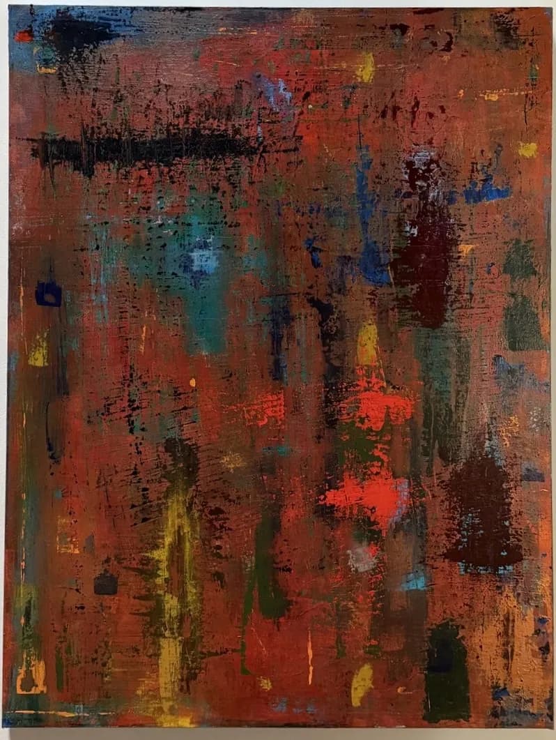
Iterations reflects the idea that meaning is rarely made in a straight line. The painting developed through repeated passes—building, disrupting, obscuring, and revealing—until the surface began to hold both tension and coherence at once. The warm ground carries a sense of heat and pressure, while cooler passages and darker interruptions create moments of distance, weight, and fracture. What remains is not a record of perfection, but of process: a surface shaped by revision, persistence, and the marks left behind by trying again.
Quer feedback sobreCompositionColor & valueTechniqueConceptMarketabilityPricing
3 críticas
Publicado em Art Critique
8
Composition
The eye enters left, catches the bright blue corner, then gets pulled across horizontally by that strong black band in the upper third. What holds me is how the piece resists a focal point but still has structure — the vertical drags and streaks keep it from collapsing into pure chaos, while the horizontal black sweep anchors the top half. The warm ground dominates maybe seventy percent of the surface, which makes the cooler moments (that teal patch lower left, the blue verticals) feel like they're interrupting rather than balancing. That imbalance reads as intentional, like the painting is weighted toward heat and disruption is the exception, not the rule. The corners are active — small pockets of yellow, blue, those dark incidents — which keeps the edges from going dead.
Color & value
The warmth you described is absolutely there: rust, burnt orange, ochre, a terracotta base that feels like sediment or old metal. The cooler passages — teal, cobalt, that one sharp red-orange accent just right of center — function as interruptions, exactly as your statement says. What I notice is that the value range is compressed: most of the piece sits in the mid-tones, with only a few darks (the black horizontal, some deep umber verticals) and almost no true lights. That compression creates density and weight, but it also means the piece doesn't breathe much. The yellow streaks are the brightest notes, and they're doing a lot of work holding the eye. The color relationships feel reactive, layered, like you were problem-solving as you went rather than planning a palette upfront.
Technique
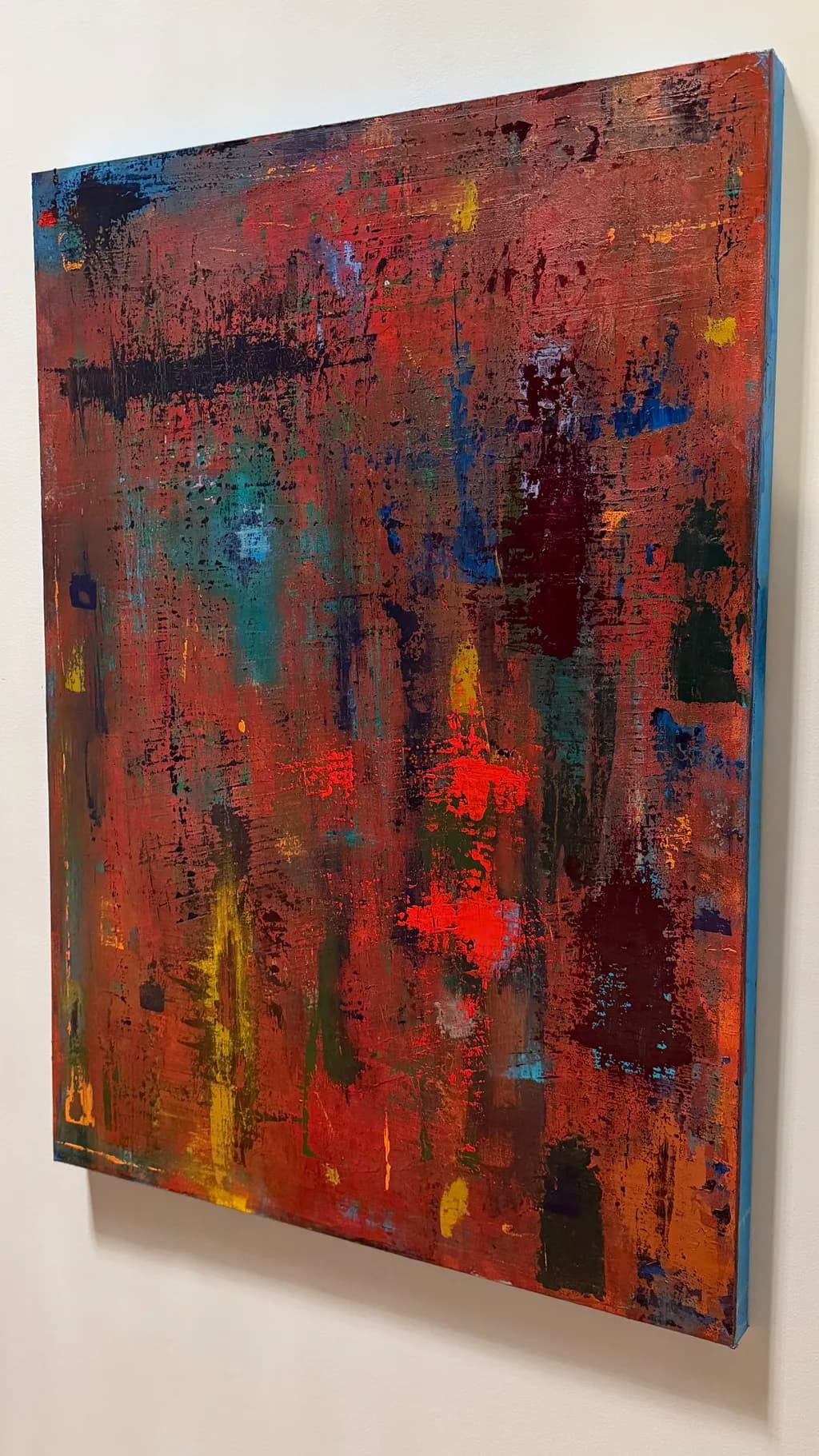
The surface has real history. I can see the buildup: dry-brushed passages, thicker impasto moments, areas where you scraped back or dragged through wet paint with something stiff. The black band at the top has texture variation — some parts crisp, others blurred or broken — which keeps it from reading as a graphic element. The vertical drips and streaks feel like they were made wet-on-wet, pulling the underlayers up, and that gives the piece its sense of revision. What's less clear is whether the buildup is serving the image or whether it's starting to mud out in places. Some of the mid-ground areas, especially the center-right, read as overworked — the colors are blending toward neutral and the texture is getting dense without adding information. That's a risk when you're layering acrylics without letting passages dry fully between sessions.
Concept
Your statement and the painting agree where it counts: this is clearly a record of process, not a preconceived image. The tension between order (those verticals, the horizontal band) and disruption (the scrapes, the color breaks) is legible. What I'm less sure about is whether "iterations" as a concept is visible enough to someone who hasn't read your words. The painting reads as abstract expressionist gesture, which is fine, but the specific idea of repeated passes building meaning — that's more visible to you, who made it, than to someone encountering it cold. The piece holds coherence, but I'm not sure it holds the narrative of revision you're describing. It looks finished, resolved, which might actually work against the concept of ongoing iteration. I don't know if that's a problem or just a gap between intent and perception.
Marketability
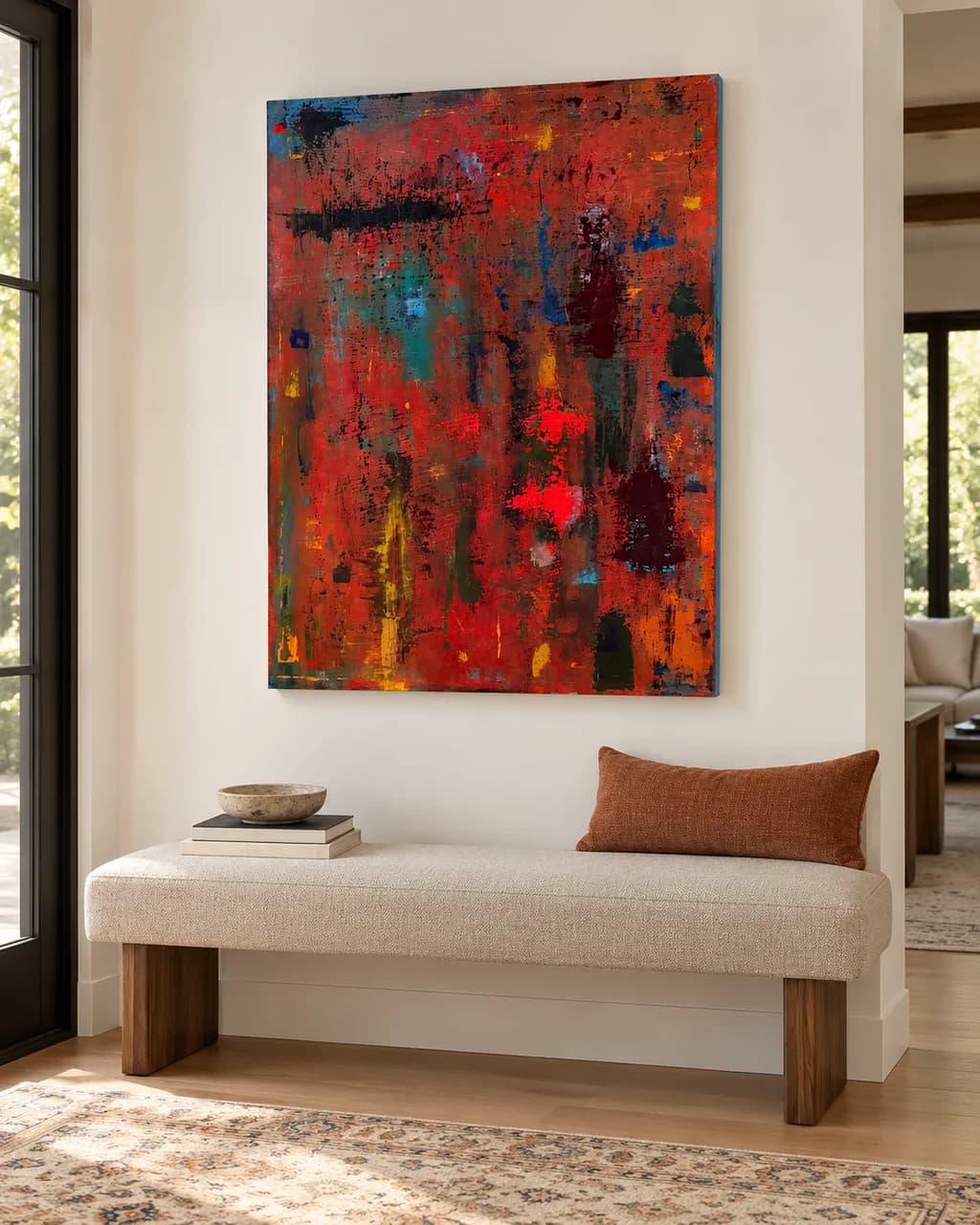
Abstract work at this size has a market, but it's not a wide one, and it depends heavily on whether you're selling to collectors who buy original abstracts (small group, higher price tolerance) or to people decorating a space (larger group, price-sensitive, looking for something that works with a couch). This piece has enough color complexity and texture that it could work in either lane, but you'll need to know which you're aiming for because the pricing and the platform are completely different. If you're putting this in a print store, that's the decor lane, and the original doesn't matter much — what matters is whether the image scales down well and whether the colors photograph true. If the warmth and texture flatten out in a print, the piece loses what makes it interesting. The concept you described won't travel through a print. People buying prints are buying a look, not a process story.
Pricing
For an original acrylic at 36 × 48 from an artist just starting out, you're looking at somewhere between $800 and $1,500 if you're selling locally or online without gallery representation. That's roughly $0.60 to $1.30 per square inch, which is the low end of the market for emerging abstract painters. If you price higher than that, you'll need either a body of work that establishes demand or a gallery taking half and adding their markup. For prints, this depends entirely on size and substrate, but a 16 × 20 giclée print on paper might sit around $40 to $80, maybe $120 for a canvas print. The problem is that print pricing is so compressed now that unless you're moving volume, it's hard to make it worth the setup cost. If this is headed to a print store and you're keeping the original, price the original as if prints don't exist — they're two different markets and shouldn't pull each other down.
What's working
The surface has presence. That buildup you described — the scraping, the layering, the wet-on-wet drags — gives the piece a physicality that makes me want to see it in person rather than on a screen. The warm ground is doing its job: it holds the space, creates continuity, and makes the cooler moments feel like deliberate fractures. The black horizontal band is a strong move. It could have killed the painting, but instead it organizes the top third and gives the verticals something to push against. The piece doesn't feel tentative. You committed to the disruptions, and that confidence shows. I also think the refusal to center anything — no focal point, no hierarchy of incident — matches your concept better than a more composed image would have. The painting feels like it's still in motion, which is what iteration means.
What to push
The biggest opportunity here is contrast, both in value and in temperature. Right now the piece sits in a narrow range — mostly warm mid-tones with a few darks and almost no lights — and that compression makes it harder for the eye to move through the space. Adding some true lights (not just yellow, but near-white or high-chroma brights) would open up the value structure and make the existing darks read stronger. Similarly, pushing the temperature contrast further — either cooling down one section significantly or warming another into near-red — would give the color more room to operate. The other thing to consider is whether every part of the surface needs to be equally worked. Some of the center areas feel dense in a way that's starting to neutralize the color. Leaving a few passages simpler, less built-up, would create rhythm and let the more complex areas breathe.
One next step
Photograph this piece in good light, then convert the image to black and white and look at the value structure without the color. If the painting goes flat or loses its divisions, that tells you the composition is leaning too hard on color and not enough on value contrast. If that's the case, your next piece should start with a stronger value map — maybe a dark ground with lighter passages built up, or vice versa — before you add the color. That habit, testing value separately, will make the iterations you're after more visible and give each layer more structural weight.