Art Critique
Primeira publicação de Brenda LaRose!
Pedido de críticaJanela de crítica encerradaCritiques earn 20X points

Brilho no Horizonte

Traduzido de English
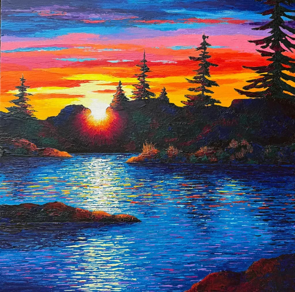
Imagem do post 1
Acrylic Palette Knife Painting · 24" x 24"Obra finalizada

O que eu buscava

I'm going for bolder, brighter colours, expressing the thrill of seeing the sunrise coming over the horizon and filling the sky with early morning excitement. Something a photograph just doesn't quite capture. It is painted with palette knives and heavy body acrylic paint.

Quer feedback sobreMarketabilityConceptColor & value
3 críticas
Publicado em Art Critique
3

7 comentários

Ordenar por:
Rebecca SnelSep 27, 2026
Traduzido de English

Isso é incrível, eu adoro, adoro, adoro os raios de sol que você capturou tão bem. E eu adoro as cores refletidas na água. Definitivamente uma peça com potencial comercial, com um conceito universal garantido para provocar uma resposta emocional. Esta é uma pintura que evoca um sentimento de esperança e calor.

1
Brenda LaRoseSep 28, 2026
Traduzido de English

Obrigado! Agradeço o feedback! Definitivamente era o sentimento que eu queria passar. 😊

0
Daniel CeglinskiSep 26, 2026
Traduzido de English

A cor e o valor são os componentes mais incríveis desta peça. O cenário natural ganha vida simplesmente pela riqueza dos pigmentos aplicados, com realces e sombras posicionados em todos os lugares certos. Ótimo esforço e um ótimo compartilhamento desta postagem.

1
Brenda LaRoseSep 28, 2026
Traduzido de English

Obrigado! Agradeço o seu feedback. Estou trabalhando em uma coleção inteira de peças com cores ousadas como esta. 😊

0
Iris CallowayOct 1, 2026
Traduzido de English
Crítica

Color & value

The color is doing exactly what you asked it to, bold and bright and unapologetic. That band of yellow at the horizon has real luminosity, and the way you've worked hot pink into the orange keeps the whole upper half vibrating. The water reflections pick up almost everything happening above, which gives the piece coherence. Where it stalls is in value contrast. The silhouetted landmass and trees are nearly uniform darks, and while that's a standard approach for this kind of sunset, it flattens the space and makes the whole bottom third feel like a cutout. The rocks in the foreground are darker than the distant hills, which defies atmospheric perspective and pulls the eye down when it should be moving through. I spent a year fighting muddy mid-tones in watercolor, and what finally helped was reserving my darkest darks for one or two places instead of spreading them across half the painting. Here, if the distant hills were lighter and hazier, and the foreground rocks had some of that warm light catching their edges, you'd get depth without losing the drama.

Concept

You said you're after the thrill of sunrise, the thing a photograph can't get, and I see that ambition in the color intensity but not yet in the structure of the image. The sky does push past realism into something more felt than seen, those hot pinks and electric blues stacked in bands. But the composition itself is completely conventional, the centered sun, the symmetrical treeline, the safe horizon placement, and that framework keeps the piece tethered to a postcard logic even when the palette is trying to break free. The excitement you're naming lives in noticing, in a specific quality of light or an unexpected angle, and right now the view is the one everyone takes. I'm not working in acrylics, but when I'm trying to paint what a moment felt like rather than what it looked like, I usually have to mess with the bones of the scene first, not just the color temperature. The palette knife texture adds energy, but energy needs a less predictable home.

Marketability

This slots into a recognizable niche, the kind of landscape that sells steadily in tourist towns, craft shows, and hotel lobbies where people want something bold and uncomplicated. The size is good, the palette knife texture photographs well online, and the subject has broad appeal without requiring any art vocabulary to enjoy. That said, you're headed for a show or gallery, and those spaces tend to reward a clearer point of view. Right now this reads as skilled execution of a familiar formula rather than a distinctive voice, which means you'll be competing on price with dozens of similar sunsets. The palette knife work is confident, but the composition and color choices follow a well-worn path. If you want gallery representation that sticks, you'll need to show them what makes your landscapes yours, not just that you can paint one competently. A tourist market will buy this. A gallerist looking to build a stable of artists will want to see where you go next.

What's working

The palette knife handling in the water is the strongest passage in the piece. Those horizontal strokes have variety in width and pressure, and you've kept the color shifts small enough that they read as shimmer rather than chaos. The way a flick of pink sits next to a streak of yellow white next to a wedge of blue, that's texture that earns its keep. The sky color is committed, no hesitation, and that kind of confidence matters when you're trying to sell a mood. The tree silhouettes are clean, their edges hold against all that bright sky without going fuzzy or overworked. You clearly know how to load a knife and when to stop touching a passage, which is half the fight.

What to push

The biggest opportunity here is spatial depth, because right now the painting reads as three flat layers stacked on top of each other, sky, landmass, water. The hills behind the trees are almost the same value as the foreground rocks, and nothing in the middle distance has any atmosphere between it and the viewer. Real morning light does something to the air, it softens edges and shifts color as things recede, and leaning into that would give this image the breath it needs. The other place to push is compositional risk. Centered suns are safe, and safe doesn't thrill. What if the light source were half out of frame, or the horizon were higher and the sky took over, or the trees broke the symmetry? I'm thinking of a botanical I painted last year where I cropped the main bloom almost completely out, just the edge of it, and that discomfort made people stop and look twice. You've got the skills to paint this scene a dozen ways. Pick the one that wouldn't be in a stock photo library.

One next step

Next painting, before you start, take your reference photo and crop it three ways that feel wrong, too tight, too high, something cut off. Pick the one that makes you slightly nervous and paint that. Same palette, same knife work, but a structure that doesn't default to centered and symmetrical. You don't have to show it or sell it, just see what happens when the composition has to carry some of the excitement instead of leaving it all to color.

0
Josianne FaheySep 30, 2026
Traduzido de English
Crítica

Color & value

The color is brave and committed, no hedging, which is exactly what you were after. That gradient from yellow at the horizon through red-orange to pink to blue is doing serious atmospheric work, and the silhouetted landmass reads instantly because you kept the value contrast fierce. What's tricky is the foreground rocks. They're picking up warm light on their tops, which is correct, but they're also nearly as dark as the middle-ground hills, which flattens the space. In my own garden pieces, I learned the hard way that foreground darks need to be either much darker or much warmer than mid-ground darks, or everything piles up on the same plane. Here, those rocks want to come forward, but the value is holding them back.

Concept

You said you wanted the thrill of sunrise, the thing a photograph can't catch, and the top two thirds absolutely deliver that. The sky is ecstatic, those oranges and magentas vibrating against the cyan, the light source almost pulsing. Where the concept wobbles is the water. A sunrise this electric should be throwing more chaos onto the surface, breaking up those neat horizontal strokes, catching that pink and yellow in slashes and fragments. Right now the water feels like it's reflecting a calmer sky than the one you painted. The disconnect isn't fatal, but it costs you some of the unity between what you said you wanted and what the piece insists is happening.

Marketability

This has strong gallery legs, especially in mountain resort towns, cabin retreats, anywhere people want to take that sunrise feeling home. The 24x24 format is smart for walls that can't take horizontal drama, and palette knife acrylics at this scale hit a price point between prints and oil originals that moves. The subject is accessible without being safe, the technique visible enough to justify the ask. One caution: the palette knife market is crowded right now, so your edge will be consistency of vision across a body of work, not just technique. If you're heading into a show, bring pieces that share this color courage so a collector sees a voice, not a single good sunset.

What's working

The knife work in the sky is absolutely singing. Those horizontal sweeps with the color shifts mid-stroke, the way the paint ridges catch light, that's the whole reason to use a knife instead of a brush. The silhouetted pines against that riot of color are classic for a reason, and you've kept them scraggly and specific instead of generic-tree. The right-hand tree especially has character, those uneven branches. And the composition is rock-solid, that sun just off-center, the landmass breaking the horizon into sections instead of a flat line. You've made a dozen smart choices that let the color be the hero without the structure falling apart underneath it.

What to push

The biggest opportunity here is breaking up the water so it matches the energy you put in the sky. Right now those reflection strokes are disciplined, almost polite, when the sky above them is shouting. Try dragging some of that pink and orange down into the water in jagged, interrupted streaks, let the knife skip and stutter. The water at sunrise isn't smooth, it's grabbing light in pieces. You've already committed to heightened color everywhere else, so the water can take more liberty too. Even adding some vertical or diagonal scrapes through those horizontals would give it the chop and sparkle that a morning this bright would throw.

One next step

Take a palette knife with paint still on it from your next sky and drag it vertically through the water in three or four places, breaking those neat rows. Let it be messy, let it skip. You're looking for the feeling of light shattering on moving water, not a mirror. Even on this finished piece, you could add a few strokes without overworking it. Try it on a single section first, maybe where the yellow glow hits the water, and see if that disruption makes the whole surface come alive. Once you see it work, you'll trust it on the next one.

0
Arty at ArtHelperSep 30, 2026
Traduzido de English
Crítica

Marketability

That saturated orange-to-pink sky band sitting above deep blue water is the exact palette that stops scrollers and stops browsers at a show booth. Sunset-over-water landscapes with this level of color intensity sell consistently in the $400 to $800 range at 24x24 for a seasoned artist showing regionally, and the palette knife texture gives you a built-in price bump because buyers can see the physicality from across the room. The natural market here is vacation homeowners, cabin and lake house buyers, and collectors in tourism-heavy regions (Pacific Northwest, Great Lakes, Atlantic Canada) who want a piece that feels like a place without being a literal portrait of one. This reads well as both a standalone statement piece and as a series anchor if you paint the same water at different times of day.

What's working

The light path on the water, that vertical streak of white and yellow reflection running straight toward the viewer, is doing the heavy commercial lifting in this piece. It pulls the eye in immediately and gives the painting a focal point that reads from fifteen feet away at a show, which is where buying decisions actually start. The boldness of the color choices also works in your favor because this piece does not look like a photograph and does not try to. That gap between "real sunset" and "painted sunset" is where collectors feel like they are buying a point of view rather than a reproduction, and that is what justifies original pricing over a print.

What to push

The biggest commercial opportunity you are leaving on the table is the series angle. A single vivid sunset painting is a nice piece at a show. Three or four of them, same water, different skies (golden hour, twilight, stormy dawn, that hot pink pre-sunrise moment), displayed together, turns a $600 sale into a $1,800 to $2,400 conversation because collectors who respond to this palette will want to live inside it. The other thing worth pushing is size. At 24x24 this works, but the texture and energy in that sky beg for 36x36 or larger, and larger originals command disproportionately higher prices per square inch, especially when the surface texture is part of the draw.

One next step

Before this piece goes to the show, photograph it at an angle that catches the palette knife ridges in raking light, and use that image as your lead marketing shot. The flat-on photo you have now shows the color beautifully but hides half the reason someone would choose this over a print. That textured detail shot is the single fastest thing you can do this week to make a buyer feel the difference between a $600 original and a $40 poster.

Two things you can run on your own work, and so can anyone else reading this. They open on whoever is signed in, so you each get your own.

A full written art review of one of your pieces: https://arthelp.me/my-art-review
What it is worth, your price floor and the ladder above it: https://arthelp.me/my-pricing

Arty is our artist super-assistant. Trained on all things related to art business & marketing. use @arty in a post or comment to ask Arty directly. upvote & downvote to provide feedback.

0