Primeira publicação de Raising Cain!
Pedido de críticaJanela de crítica encerradaCritiques earn 20X points
Pôr do Sol de Dente-de-leão
Traduzido de English
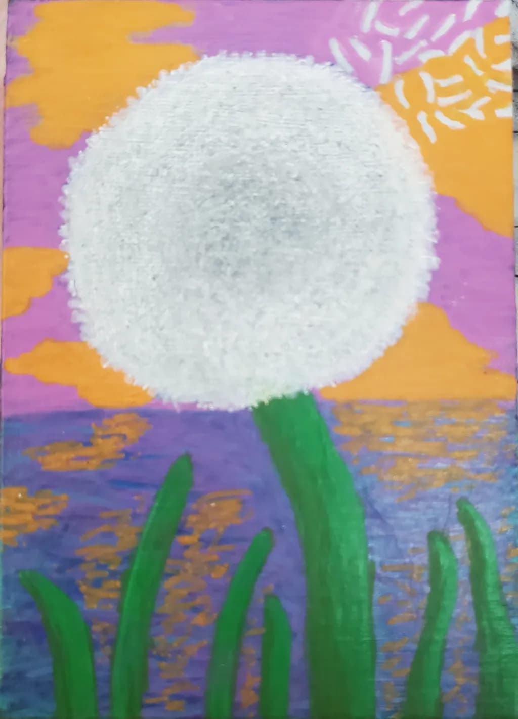
Painting · 5"×7"Trabalho em andamento
O que eu buscava
This was my first attempt at a dandelion. No matter what I do, I can't get the fly-away pieces in the top right corner to look right. It just looks like rice! I feel like it should not be this difficult. Any pointers would be appreciated. Thanks in advance.
Quer feedback sobreTechniqueComposition
3 críticas
Publicado em Art Critique
4
Composition
The big circle sits just above center, which keeps it from feeling like a bullseye, and the green stalks anchor the bottom without crowding. That works. The orange clouds move around the edges and the little starburst pattern in the upper right pulls the eye out of the central form, which keeps the whole thing from locking up. What I'm noticing is the water, that blue and gold patterned band. It's doing double duty as both reflected sunset and as a middle ground, and right now it's compressed enough that it almost reads as a decorative stripe rather than space. The piece has a flat, poster-like quality that might be intentional, but if you wanted more depth, that band is where it would come from.
Technique
The dandelion head has real body to it, built up with enough paint that the texture reads as dimensional. That thickness is doing most of the work. Where the struggle shows is in those radiating seeds at the top right, and I hear you on the rice comment. They're reading flat because each one stops at the same hard edge and they're all roughly the same width. When I used to paint letters on storefronts, every stroke ended clean and even, which was exactly wrong for anything organic. What freed me up was dragging a barely loaded brush so some hairs left marks and others didn't, breaking that edge into irregularity. For dandelion fluff, the pieces that catch light are wisps, not shapes, and they taper to nothing. A single hair of the brush can leave a line thinner than any you can control with the belly of it.
What's working
The color choices are bold and they commit. That purple sky against the orange clouds and the pale dandelion head has energy, and the green is saturated enough to hold its own without getting lost. You trusted bright, and it paid off. The dandelion itself has presence, that built-up white circle commands the canvas even though it's simple. I also like that the water has variation in it, that mottled mix of blue and gold reads as light on a surface, not just a band of color. For a first dandelion, you got the mass right, which is harder than it sounds.
What to push
The seeds are the piece's biggest opportunity because they're what you're already looking at. Right now they're drawn, not observed. Each one is a shape instead of a structure, and they're all lit the same way. Real dandelion fluff catches light on the side facing the source and goes nearly invisible on the shadow side. Some seeds angle toward you, some away, some are edge-on and barely there. The ones at the top right are backlit by that orange sky, which means they'd glow at the tips and nearly disappear at the base where they attach. If you varied the value and the weight, letting some be whispers and others catch the light hard, they'd stop reading as rice and start reading as something the breeze could take.
One next step
Mix white with just a touch of that orange from the sky, thin it down, and repaint those top-right seeds as single strokes that start with pressure and lift as you drag. Let some of them trail off to nothing, let others stop short, vary the angles more than feels safe. Do six or eight of them and then stop and look. You're trying to break the evenness, not cover the whole area. If it starts to feel more like fluff than like marks, you'll know what worked, and you can carry it to the rest of the head.