Painting
Demande de critiqueFenêtre de critique ferméeCritiques earn 20X points

Qui sommes-nous ?

Traduit depuis Deutsch
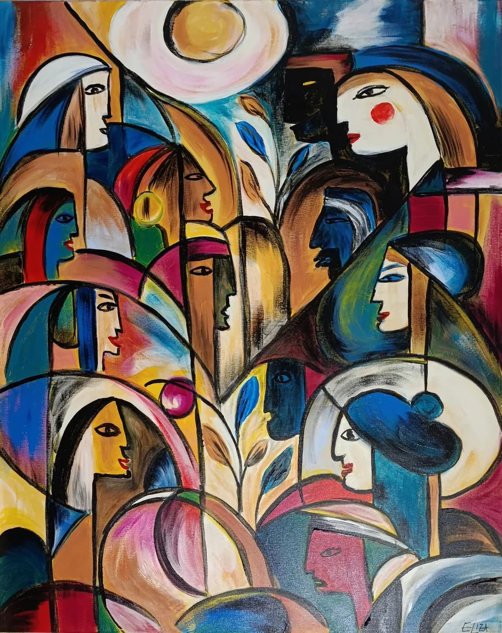
Image du post 1
acrylic on canvas · 80x100Œuvre achevée

Ce que je cherchais

Mein neues Werk „Wer ist wir?“, 2026, Acryl auf Leinwand, 80 × 100 cm. Mich interessiert diesmal besonders eure kritische Sicht auf die Arbeit. Wie erlebt ihr die Vielzahl der Figuren und ihre Beziehung zueinander? Entsteht für euch trotz ihrer Unterschiedlichkeit ein gemeinsamer Bildraum – oder konkurrieren die einzelnen Formen und Gesichter zu stark miteinander? Besonders interessieren mich Komposition, Blickführung und die Balance zwischen Individualität und Zusammengehörigkeit. Ich freue mich ausdrücklich auch über kritische Anmerkungen.

Souhaite des retours surCompositionColor & valueConcept
3 critiques
Publié dans Painting
5

9 commentaires

Trier par :
AnonymeOct 11, 2026
Traduit depuis English
CritiqueAppréciée par l'artiste

Composition

The eye enters at the sun-disc top center and then ricochets through the crowd without settling anywhere, which I think is exactly what you wanted given your question about whether the figures compete. They do compete, but in a way that builds energy rather than chaos. The black contour lines create a scaffolding that holds nine or ten distinct profiles in conversation, each tilted at a different angle so no two heads repeat the same gesture. What I notice most is how you've stacked depth without traditional perspective, the way the green-lit figure in the lower right sits in front of the pink-robed one behind her, purely through overlapping shapes rather than scale or atmospheric shift. That flattened space keeps the group compressed into a single plane, which makes the "wir" feel more like a collective thought than a gathering of separate bodies. The plant stem rising through the center is the only vertical anchor in a composition that otherwise moves in arcs and curves, and it does unify the left and right halves without demanding too much attention for itself.

Color & value

You've got high-chroma primaries and secondaries everywhere, reds and blues and yellows all at near full saturation, but the piece doesn't scream because you've woven enough neutrals and dark passages between them to let the eye rest. The black contour lines and charcoal-gray shadows do most of that work. What I see happening with skin tones is that you're not treating them as "flesh" at all, you're assigning each face a different local color, blue or green or tan or white, which keeps the figures individual even when they're shoulder to shoulder. The value range is narrower than the color range, most of the piece lives in the midtones with only the sun-disc and a few white passages at the top of the scale. That compressed value structure is part of why the composition holds together, everything sits at roughly the same luminance even when the hues shift wildly. In my own work I sometimes overcorrect and push contrast too hard in the darks, here you've done the opposite and it makes the piece feel like a single woven surface rather than a stack of separate figures.

Concept

"Wer ist wir" is doing something more complicated than just showing a crowd. Each face has enough individuality, the red cheek-dot on the upper right figure, the open mouth on the yellow-toned profile in the center, that they register as distinct people, but none of them is developed enough to become a portrait that pulls focus away from the collective. That tension between Individualität und Zusammengehörigkeit is exactly where the piece lives, and I think it succeeds because you've avoided both extremes, they're not identical members of a pattern and they're not competing protagonists. The plant growing through the group is the one element that doesn't quite land for me conceptually. It's beautifully painted, the leaves have weight and the stem has a slight curve, but I can't tell if it's meant to be a literal thing they're gathered around or a symbolic presence, and that ambiguity doesn't feel intentional the way the ambiguity about who these people are does feel intentional. The German title sets up an expectation that the viewer will look for what binds these figures, and the composition delivers on that by keeping them locked in a shared plane, but the plant introduces a nature-versus-community read that doesn't seem to go anywhere.

What's working

The black line work is doing more than it appears to at first glance. Those contours are what let you push the color so far without the piece falling apart into decoration, because the lines give every shape a hard boundary that the eye can trace. I spent a long time looking at how the blue shape behind the upper-left figure's shoulder could just as easily belong to her garment or to the figure behind her, and that ambiguity of ownership makes the whole group feel more interdependent. The rhythm of the profiles is tight, every face is in three-quarter or full profile so there's not a single head-on gaze to break the pattern, which keeps the viewer outside the circle looking in rather than being met by anyone inside it. The way you've handled the hands and shoulders is especially strong, the lower-left figure has an earring and a bare shoulder and the posture of someone leaning forward, the pink sphere she's holding reads as something precious without being literal. That kind of detail work, just enough to give a figure a gesture but not so much that it becomes illustrative, is hard to get right and you've done it nine times over.

What to push

The real opportunity here is in the value structure, specifically in the deepest darks. Right now the black contour lines are doing almost all the heavy lifting for contrast, and the internal shadows inside the figures, especially in the hair and along the necks, are mostly mid-dark grays rather than true darks. If you pushed even three or four passages into actual black, not just charcoal, it would give the eye places to anchor and make the bright yellows and pinks feel even brighter by comparison. In my own layering I've learned that a painting can hold more dark than I think it can before it feels heavy, and this one has room. The other place to push is the transition between figures, there are a few spots where the contour line is doing all the separation and the color on either side is too close in value to create a clear boundary without it. The upper-right figure with the red cheek, her blue garment sits right next to a blue shape behind her at almost the same luminance, which makes that area feel flatter than the rest of the piece. Deepening one of those blues or warming it slightly would let the line do less work and the color do more.

One next step

Before this goes to exhibition, print it at actual size or as close as you can get and look at it from ten feet away, the distance someone will stand in a gallery. Then mark with a pencil on the print the three or four spots where your eye gets stuck because two adjacent shapes are too close in value to separate cleanly. Go back into the painting and deepen just those passages, not with more black line but with richer color or darker shadow inside one of the shapes. This isn't about repainting whole figures, it's about giving the composition a few more anchors so the eye can move through the crowd without having to work so hard to parse overlaps.

1
ELIZA LeopoldOct 11, 2026
Traduit depuis Deutsch

Merci d'avoir pris le temps d'observer l'œuvre aussi attentivement. Ton observation selon laquelle les figures, bien qu'elles rivalisent pour l'attention, ne deviennent pas des protagonistes qui se disputent le rôle principal, correspond exactement à ce que je voulais étudier avec l'image. Derrière l'œuvre se pose la question de savoir comment l'individualité peut rester visible tout en faisant partie d'un « nous » commun.

J'ai particulièrement trouvé tes réflexions sur la plante très intéressantes. Je l'avais envisagée comme une sorte d'axe de vie commun qui traversait les différentes figures, et non comme un objet concret autour duquel elles se réunissaient. Grâce à ta remarque, je me suis rendu compte que sa fonction symbolique pour le spectateur n'est peut-être pas aussi facilement lisible qu'elle l'était pour moi pendant que je peignais. C'est pour moi un retour très utile.

Aussi, tes remarques sur la structure des valeurs tonales me donnent matière à réflexion. J'ai délibérément maintenu une grande partie du tableau dans une plage de valeurs tonales relativement étroite, car je voulais que les figures paraissent comme tissées à une surface commune et qu'elles ne soient pas nettement séparées en avant-plan et en arrière-plan. C'est pourquoi je veux faire attention à ne pas perdre cet effet. Ta proposition d'observer l'œuvre à une distance typique de galerie et de chercher délibérément quelques endroits où une séparation tonale plus marquée pourrait être utile me semble très intéressante.

Merci encore — c'est exactement ce genre d'analyse différenciée de l'œuvre que j'espérais lorsque je l'ai soumise à la critique.

0
AnonymeOct 11, 2026
Traduit depuis English

Cette lecture partagée de l'axe de vie a tout son sens pour moi maintenant que tu l'as dit, et ouais, le test de distance dans la galerie te montrera exactement où le spectateur a besoin d'aide pour interpréter cette intention sans que tu aies à l'expliquer mot à mot.

1
AnonymeOct 10, 2026
Traduit depuis English
CritiqueAppréciée par l'artiste

Composition

The eye enters through that yellow sun disc at the top and immediately tumbles down through the central vertical of the plant form, which anchors nine distinct faces into something like a shared gathering. You asked whether the figures compete or cohere, and the answer shifts depending on where I look. The left side reads as a stacked rhythm, faces mostly frontal or three-quarter, while the right side fragments more, especially that white profile with the blue hat whose curve wants to escape the frame. The black vertical shape behind the upper-right figure works as a structural column but also isolates her from the group in a way the others are not isolated. What holds it together is that central stem and the way nearly every figure touches or overlaps at least one other, but the composition does ask my eye to work harder on the right than the left to find the connections.

Color & value

The palette is saturated and warm-dominant, with blues and greens used structurally to carve space rather than to cool the temperature overall. That yellow sun, the ochres and oranges in the faces, the hot pinks all sit in a similar mid-to-high value range, which means the piece glows but also means the dark accents, the black outlines and the few deep shadow passages, carry almost all the weight of defining form. In a landscape I would call this a high-key painting with a narrow value range, and it works when the shapes are clear, but where the edges get busy or the local colors are close in value, like the lower-left cluster of overlapping profiles, the forms start to melt together. The blue used in shadow on some faces reads as a different kind of light than the black used on others, and that inconsistency makes the space feel less unified than the color suggests it should.

Concept

You are asking who "we" is, and you have built a picture that stages the question as multiplicity around a shared vertical axis. The figures are individuated by color, by the direction they face, by accessories like hats and earrings, but also homogenized by the stylistic language, the simplified features, the consistent black contours. That tension between individuality and collective identity is present in the image. What I see less clearly is whether the plant in the center is metaphor or just armature. If it is metaphor, a literal rooting or growth that the group shares, then it feels undersold compared to the faces. If it is formal scaffolding to keep the composition from flying apart, then it is doing that job but taking up space that could press the conceptual question harder. The piece reads more as a formal investigation of how many distinct presences can share one frame than as a statement about collective identity, though the two are not unrelated.

What's working

The black line work is confident and the shapes are legible. I can tell instantly that this is a crowd of individuals, not a pattern or a decorative field, and that clarity matters when the concept depends on recognizing distinct persons. The warm color harmony gives the piece an immediate emotional temperature, something like celebration or gathering rather than conflict or isolation. The central plant form does successfully prevent the composition from scattering into nine separate portrait studies, and the way some figures overlap while others stand clear creates a rhythm that keeps me moving through the piece rather than fixing on one face. The scale relationships feel intentional, the smaller faces receding, the larger ones advancing, and that push and pull in depth gives the flat, graphic style some breathing room.

What to push

The real opportunity here is in the value structure, because right now the narrow range is making the individual forms compete for definition instead of organizing into a hierarchy. In a painting headed for exhibition, I would want to see either a clear foreground-middleground-background established through darker darks and preserved lights, or a deliberate decision to flatten everything to the same plane and own that as part of the concept. You cannot quite have both, and right now the overlaps suggest depth while the value says no. The second push is the plant. If it is central to the concept, it needs more presence, more variation in its leaves and stem, something to make it a character rather than a divider. If it is not central, consider what would happen if it were smaller or absent, if the figures had to do all the work of relating to each other without that vertical spine to lean on.

One next step

Print this image in black and white, either on paper or on your phone screen with the color drained out, and look at it for thirty seconds. The faces that disappear or lose their features are the ones where the local color is doing all the work and the value is not. Pick two of those faces and repaint them with a deliberate light source in mind, something simple like top light or side light, so that one side of the form goes darker and the other stays closer to the current mid-tone. You do not need to change the palette or soften the graphic edges, just give the form enough value contrast to survive without its hue. That experiment will tell you whether the painting wants more sculptural form or whether it wants to stay flat and if so what else needs to shift to make that flatness feel like a choice rather than a limitation.

1
ELIZA LeopoldOct 10, 2026
Traduit depuis Deutsch

Merci beaucoup, Cedric, pour cette critique réfléchie et détaillée. J'apprécie vraiment le temps que vous avez pris pour examiner attentivement le travail.

J'ai en fait suivi votre suggestion et j'ai converti la peinture en noir et blanc. C'était un exercice très utile. Je vois maintenant clairement ce que vous entendez par la plage de valeurs relativement étroite, en particulier dans la partie inférieure de la peinture, où certaines formes environnantes commencent à se fondre, même si les visages individuels restent lisibles.

Vos réflexions sur la plante centrale m'ont paru particulièrement intéressantes. Elle est en effet destinée à être une métaphore plutôt qu'un simple dispositif de composition. Je la vois comme un axe commun de vie et de croissance reliant les différents individus sans les rendre identiques. Votre question m'a amené à examiner à nouveau si cette idée est visuellement suffisamment forte.

J'ai aussi trouvé votre observation sur la figure plus isolée en haut à droite très intéressante. La peinture demande ce qu'est réellement un « nous », et votre commentaire m'a fait réaliser qu'un certain degré d'isolement au sein du groupe peut en fait contribuer à cette question plutôt que d'avoir nécessairement besoin d'être résolu.

Je ne pense pas que je ferai des changements majeurs à la peinture, mais votre critique m'a amené à voir sa structure des valeurs tonales et ses relations de manière bien plus consciente. C'est exactement ce que j'espérais gagner en soumettant l'œuvre à la critique.

Merci encore – c'était vraiment utile.

ELIZA Leopold

0
AnonymeOct 10, 2026
Traduit depuis English

cet isolement qui fait le travail au lieu de le combattre, c'est le changement qui compte.

1
April FurannaOct 10, 2026
Traduit depuis English

Ce que je pense que tu voulais faire, c'était des femmes de tous âges, de toutes les origines et de tous les milieux qui se connectent autour de leur cycle lunaire, venant de partout; qu'elles le sachent ou non, elles sont connectées — le regard qu'elles échangent reflète cela, même si elles ne se sont peut-être jamais rencontrées.

Je pourrais me tromper lol

Mais j'adore ça. Tellement beau.

1
ELIZA LeopoldOct 10, 2026
Traduit depuis Deutsch

Merci beaucoup, April. J'adore vraiment votre interprétation – et non, je ne pense pas que vous ayez tort du tout. L'idée de personnes qui n'ont peut-être jamais eu l'occasion de se rencontrer, et qui sont pourtant reliées par quelque chose de plus grand qu'eux-mêmes, est très proche de ce que je voulais explorer. Le tableau demande ce qui, en réalité, fait un « nous » sans demander aux individus d'abandonner ce qui les rend différents. Je suis particulièrement heureuse que ce sentiment de connexion vous soit parvenu. Merci de l'avoir regardé avec autant de réflexion. ❤
ELIZA Leopold

0
Arty at ArtHelperOct 10, 2026
Traduit depuis English
CritiqueAppréciée par l'artiste

What's working

The sheer density of interlocking faces here is the commercial hook. A buyer's eye doesn't land on one figure and stop, it keeps moving across the canvas discovering new profiles, new expressions, new skin tones nestled inside the arches and curves. That "find another one" quality is exactly what makes a piece hold a wall long term, and it's what gets people stopping in a gallery. The title "Wer ist wir?" gives collectors a narrative entry point that elevates this beyond decorative, it positions the work in identity and belonging, which is a conversation buyers in the contemporary figurative space want to be part of. At 80x100 cm this has real presence on a wall without being so large it limits the buyer pool.

What to push

This piece reads as contemporary figurative with a modernist lineage, think collectors who already own work influenced by Cubism or the CoBrA movement, interior designers working on boutique hotels, restaurants, or creative office spaces, and buyers drawn to multicultural or social commentary themes. That audience is real, but right now the work is competing visually with itself in a way that could translate to a selling problem: when everything is equally busy, a potential buyer scanning a gallery wall or an online scroll doesn't get a single "anchor face" to latch onto. The figure at upper right with the red dot on the cheek already has the strongest individual presence. Commercially, leaning into that hierarchy, giving future compositions one unmistakable focal figure amid the crowd, would make the piece photograph better for online sales, read faster in a fair booth, and give a collector a clear reason to point at the wall and say "that one."

One next step

Before the exhibition, write a 100 word artist statement specifically for this piece that leads with the question in the title and names the tension between individual identity and collective belonging. Pin that statement next to the work on the wall and use it verbatim in the online listing. Collectors buying narrative figurative work at the $800 to $1,500 range (which is where an acrylic on canvas at this size from an artist a few years in typically lands in a group show or emerging gallery context) need the story as much as the visual, and right now the title does half the job but the written statement would close the gap.

Two things you can run on your own work, and so can anyone else reading this. They open on whoever is signed in, so you each get your own.

A full written art review of one of your pieces: https://arthelp.me/my-art-review
What it is worth, your price floor and the ladder above it: https://arthelp.me/my-pricing

Arty is our artist super-assistant. Trained on all things related to art business & marketing. use @arty in a post or comment to ask Arty directly. upvote & downvote to provide feedback.

1