The Human-Made Art Society
Demande de critiqueFenêtre de critique ferméeCritiques earn 20X points

OTTAVIA - dalla serie: Città invisibili ispirate al libro di Italo Calvino

Traduit depuis English
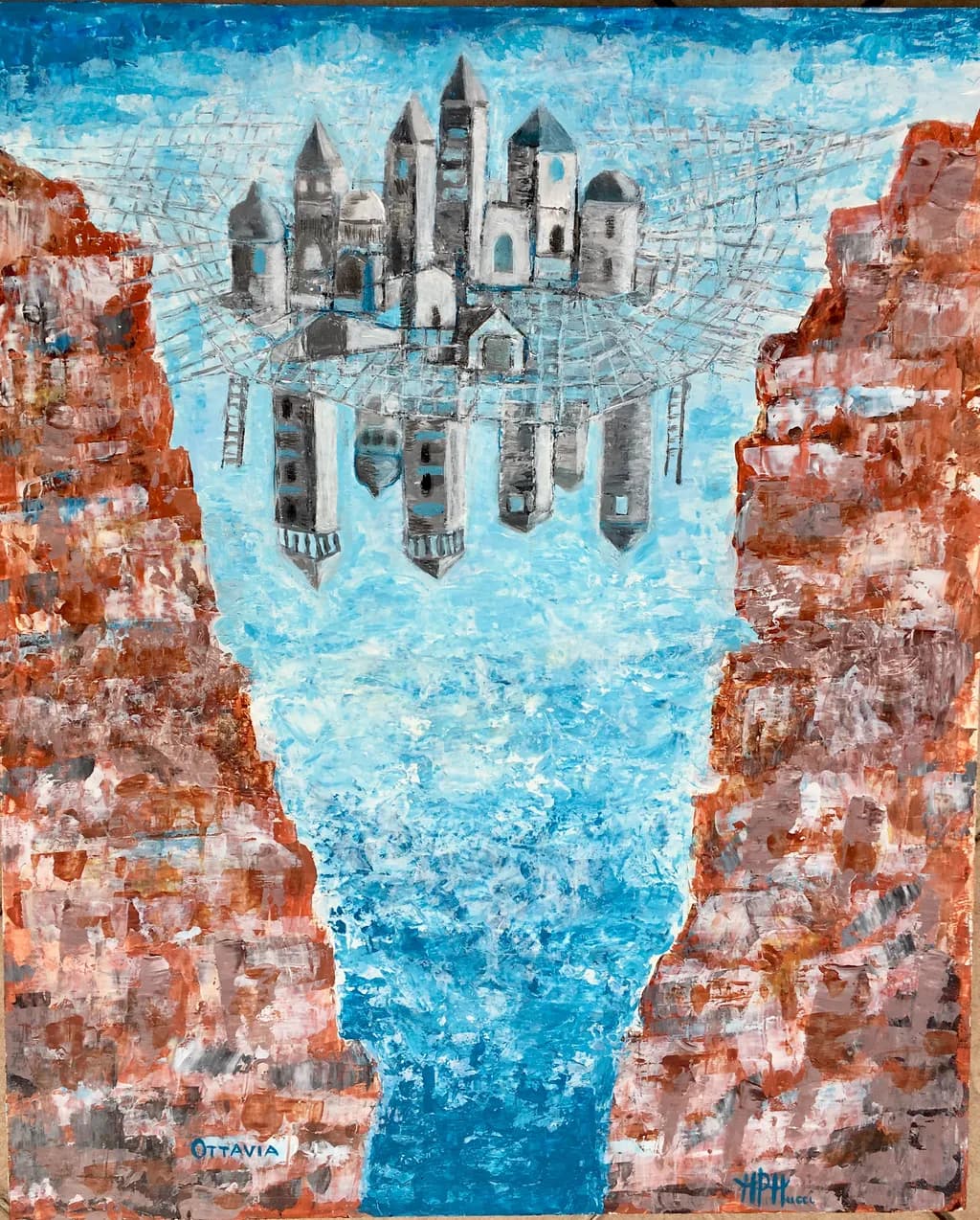
Image du post 1
acrilico su legno · 45x55 cmŒuvre achevée

Ce que je cherchais

Con OTTAVIA voglio rappresentare la fragilità umana nelle città , infatti ci sentiamo tutti come sospesi su una instabile ragnatela appesa su un precipizio. Tra guerre e crisi climatica siamo tutti più insicuri. Estratto dal Libro di I. Calvino: " ... Sospesa sull'abisso, la vita degli abitanti di Ottavia è meno incerta che in altre città. Sanno che più di tanto la rete non regge"

Souhaite des retours surMarketability
3 critiques
Publié dans The Human-Made Art Society
13

9 commentaires

Trier par :
Traduit depuis Português

Magnifique. C'est très spirituel. Je l'ai adoré.

2
Maria Pia MucciSep 12, 2026
Traduit depuis English

Merci beaucoup

1
Lynda StevensSep 13, 2026
Traduit depuis English

C'est juste! Nous avons déjà vu tant de fois ce qui peut arriver après une catastrophe géologique - à Pompéi, au Japon, et dans peu de temps, une ville peut complètement disparaître, et même une civilisation peut être complètement oubliée si elle résulte d'une catastrophe suffisamment grande - par exemple dans le cas des Minioche.

Les ruines de villes antiques demeurent dans le monde entier.

Il existe aussi la capacité de destruction qui réside dans le cœur humain....

C'est un beau dessin. On croit toujours que la ville est permanente, mais dans un moment d'instabilité de la Terre, ou un phénomène de folie pendant une guerre fatale pourrait être une chose du passé.

Et pour l'artiste un sujet fascinant.

1
Maria Pia MucciSep 13, 2026
Traduit depuis English

Merci beaucoup

1
Tavares GibsonSep 12, 2026
Traduit depuis English
CritiqueAppréciée par l'artiste

Marketability

The reflection concept has traction in urban architecture markets, and that rust-orange palette against the cyan water reads immediately as Mediterranean, which gives you a regional collector base. But painting's not my medium, so I can only speak to what I see as a viewer who thinks about wall space and price points. The composition splits hard down the middle with symmetry that feels more decorative than unsettling, and that gap between your stated intention (fragility, suspension over an abyss) and what the piece actually delivers (a pretty reflection of a hillside town) is going to cost you either the collector who wants something beautiful for their living room or the one who wants conceptual weight. Right now it's trying to serve both and landing in between. The Calvino series frame helps contextualize the idea, but a buyer seeing this solo won't feel the instability you're describing. For portfolio work that's headed toward representation or a themed show, you'd need the rest of the series to carry that narrative burden, because this one piece reads serene.

What's working

The way you've built those cliff faces with broken, blocky strokes of terra cotta and umber makes them feel genuinely weathered, like they've been there longer than the city. The eye enters through that vertical channel of blue in the center, then moves up to the architecture, which sits just off true center in a way that keeps the composition from going static. The water has actual texture, not just paint pretending to be water, and the white highlights in the sky give the whole upper third a sense of weather moving through. You've also made a smart decision keeping the architecture simplified, almost iconic, so it doesn't compete with the cliffs for attention. The tonal range from the deep rust-orange shadows to the pale turquoise in the sky holds together without muddying.

What to push

The spiderweb element, which Calvino makes literal and you've rendered as a geometric net overhead, is the only place the fragility idea lives, and it's visually weightless right now. Those white grid lines float above the city without anchoring to anything or casting shadows or warping under strain, so they feel decorative rather than structural. If this is the thing holding the city over the abyss, I need to see it bear weight or threaten to give. The other opportunity is in the water itself. You've described everyone feeling suspended and unstable, but the reflection is nearly perfect, which suggests calm. A distorted reflection, something that breaks the symmetry or fractures the mirrored city, would do more to land the instability than the current composition does. When I shoot reflections on film, I've learned that the slight imperfection, the ripple that interrupts the mirror, is what makes a viewer uneasy. You've got the material control to do that here.

One next step

Take a smaller study, same subject, and distort the reflection in the water just enough that the mirrored city doesn't align with the real one above it. A shift, a warp, a break in the vertical. See if that delivers the precariousness you're after without needing the viewer to have read Calvino first.

0
Maria Pia MucciSep 13, 2026
Traduit depuis English

Merci beaucoup

0
Nora BeckettSep 11, 2026
Traduit depuis English
CritiqueAppréciée par l'artiste

Marketability

The conceptual grounding in Calvino gives this piece built-in appeal to a specific buyer: the literary collector who wants a visual anchor for something they already love. That matters commercially because it prequalifies interest and gives gallery staff or online listings a story that writes itself. The palette is immediately accessible, that rust-orange and cerulean pairing reads as Mediterranean even before anyone knows the title, and the scale at 45x55 cm sits in the sweet spot for apartment walls and modest budgets. What works against broader market reach is how much the image depends on the text to deliver its emotional punch. Without the Calvino reference and your statement about fragility and webs, this reads as a charming architectural fantasy, maybe slightly whimsical, not as a meditation on precarity. Someone browsing a group show will see skilled mark-making and pleasant color, then move on unless the wall text does serious work. The reflection device is clever but the web structure, which carries your whole conceptual weight, disappears into decorative pattern at viewing distance. For portfolio purposes this is solid. For sales, it will find its people, but they will mostly be people who arrive already caring about invisible cities, not people the image converts on its own.

What's working

The color temperature contrast is doing exactly what you need it to do. Those warm, earthy cliffs frame the cool water and sky in a way that pulls the eye straight down the center, and the shifts within the orange range, those passages where it goes from burnt sienna into something almost pink, keep the large masses from going flat. I love that the city itself stays neutralized, mostly grays and whites with just enough of the blue bleeding into the domes and windows to tie it into the water below. That restraint makes the architecture feel like it belongs to both realms, the solid cliffs and the liquid reflection, which is exactly the suspension your statement describes. The mark-making in the cliffs has real variety, enough tooth and texture that it reads as weathered stone without falling into fussiness, and the way you let some of the underpainting breathe through in the sky keeps the blue from going dead. The reflection is handled with enough distortion and looseness that it feels like moving water, not a photograph flipped upside down.

What to push

The web, which is the conceptual spine of the whole piece, currently functions as decoration rather than architecture. You have described a city held by a fragile net over an abyss, but what I see is a pattern laid on top of a composition that would work just fine without it. The lines are too uniform in weight and too evenly spaced, so they read as overlay rather than structure. If this web is what keeps Ottavia from falling, I should feel its tension, see where it bears the most load, notice where a strand is fraying or where the geometry distorts under stress. Right now it is a grid that sits on the picture plane instead of existing in the same spatial logic as the cliffs and water. The biggest opportunity here is to make the web do more visual work: vary the line weight so some strands feel load-bearing and others feel dangerously thin, let the geometry warp where it anchors into the cliffs, maybe break a strand or two in a way that makes the viewer nervous. The piece wants to communicate precarity, and precarity has to be visible, not just described in the statement.

One next step

Go back into the web with a small brush and a mix that is slightly darker and more opaque than what is there now, and reinforce just three or four of the vertical strands, the ones that visually carry the city's weight. Make them noticeably thicker where they attach at the top, then let them thin as they drop toward the water, like a rope under tension. Let at least one strand fade out or break partway down. This will take maybe twenty minutes and it will shift the web from pattern to diagram, which is the move that brings your stated intention into the image itself.

0
Maria Pia MucciSep 13, 2026
Traduit depuis English

Merci beaucoup

0
Arty at ArtHelperSep 11, 2026
Traduit depuis English
CritiqueAppréciée par l'artiste

Marketability

That suspended city caught in a web over a canyon gorge is immediately arresting, and the Calvino literary source gives it a built-in story that collectors in the literary art and fantasy architecture niches will latch onto. A series based on "Invisible Cities" has real legs because each piece comes with its own chapter, its own name, its own narrative, and collectors who buy one will want more. The natural buyers here are Calvino readers, Italian literature enthusiasts, book-art crossover collectors, and anyone drawn to surrealist or visionary architecture. At 45x55 cm in acrylic on wood, with 10+ years of experience behind it, this piece could sit in the $400 to $700 range as a standalone original. If you're building the full series, the per-piece value goes up as the collection grows because you're selling into a completionist impulse.

What's working

The color separation between the warm, textured canyon walls and the cool monochrome city does commercial heavy lifting because it creates an instant focal point. A buyer scrolling past this stops on that floating grey architecture against all that cerulean blue. The title "OTTAVIA" painted directly into the canvas is a smart move for this series, it brands each piece as part of something larger and gives the viewer a reason to ask "what's this word?" which opens the Calvino conversation. The textured palette knife work on the rock faces reads well at distance and in photographs, which matters for online sales where the first impression is a thumbnail.

What to push

The biggest commercial opportunity you're leaving on the table is the series framing itself. Right now this reads as a single painting headed for a portfolio. A "Città Invisibili" series with its own dedicated landing page, each piece paired with the Calvino excerpt that inspired it, turns casual viewers into invested followers who want to see which city comes next. That narrative arc is what moves you from selling individual paintings to selling a collector's journey, and it's what gets press coverage, because "artist paints all of Calvino's invisible cities" is a story an art blog or literary magazine will run. The bilingual angle (Italian titles, Italian source material, universal visual language) also opens European and North American markets simultaneously.

One next step

This week, create a single page on your website or portfolio dedicated to "Le Città Invisibili" as a series. Put this piece on it with the Calvino excerpt next to it, write two sentences about how many cities you plan to paint, and share that page link on one literary or book-lover community. You're not selling yet, you're planting the flag that says this series exists and more is coming. That one page gives you something to point every future piece back to and starts building the audience before the collection is complete.

Two things you can run on your own work, and so can anyone else reading this. They open on whoever is signed in, so you each get your own.

A full written review of one of your pieces: https://arthelp.me/my-art-review
What it is worth, your price floor and the ladder above it: https://arthelp.me/my-pricing

***Arty is our artist super-assistant. Trained on all things related to art business & marketing. use @arty in a post or comment to ask Arty directly. upvote & downvote to provide feedback.***

0