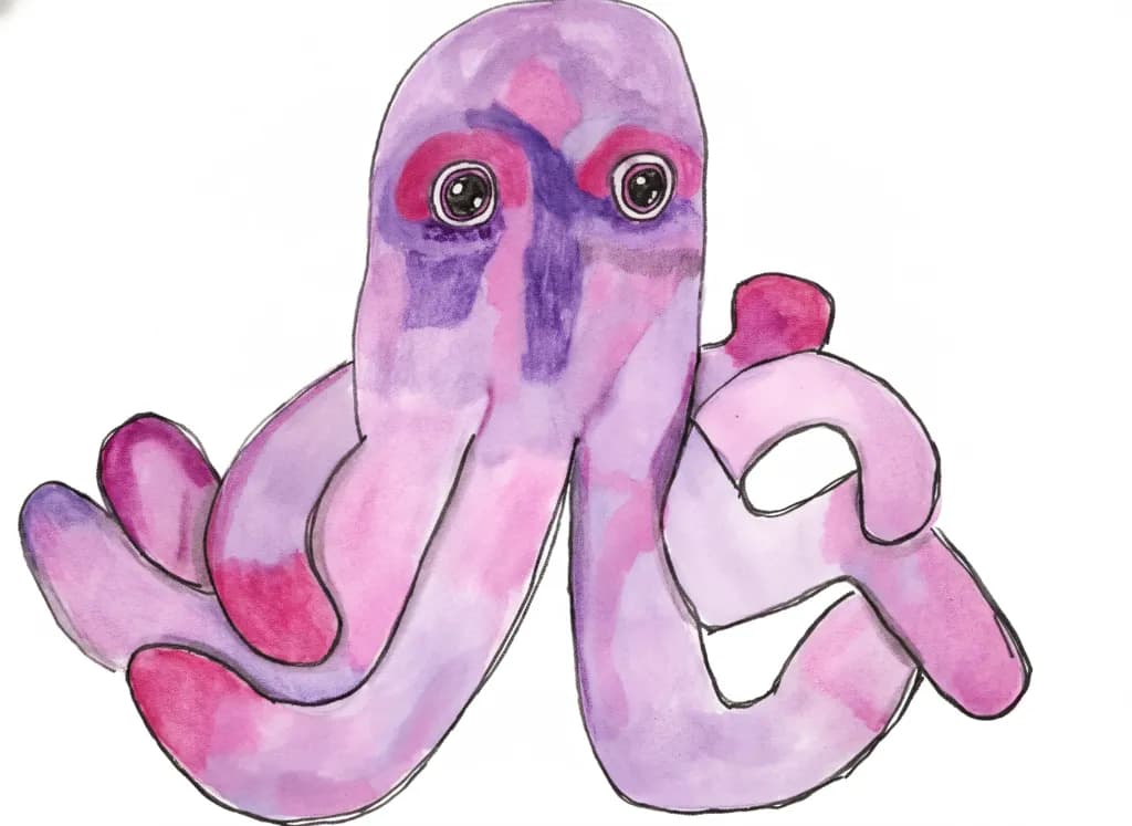
Still untited


Ce que je cherchais
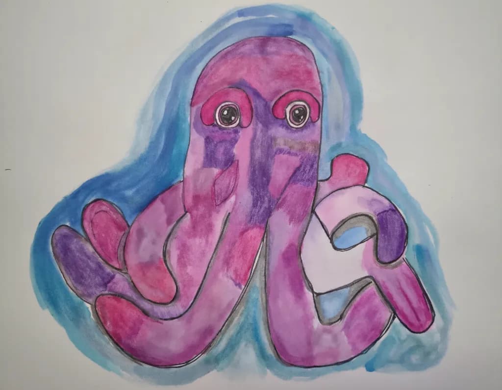
I was indpired to sketch my plush purple octopus. Ive been working on highlighting and shadows. I added some darker patches to help the colours pop more. I added a blue wash on the outside to add a deeper contrast.


Ce que je cherchais
I was indpired to sketch my plush purple octopus. Ive been working on highlighting and shadows. I added some darker patches to help the colours pop more. I added a blue wash on the outside to add a deeper contrast.
What's working
That pink and purple octopus with the big round eyes has immediate personality, and personality is what sells character art. The face reads in under a second, which is exactly what you need when someone is scrolling a feed or walking past a booth. Whimsical animal art with bold color and a clear character point of view has a reliable buyer pool: parents decorating kids' rooms, gift buyers shopping for "something fun," and the whole ocean/nautical decor crowd. The blue wash framing the figure also does commercial work here because it gives the piece a built-in background that reads as finished on a wall, not like a sketch floating on white paper.
What to push
The biggest commercial opportunity you're leaving on the table is that this octopus wants to be a character, not a one-off painting. One piece of a purple octopus is a portfolio entry. Three or four of them, each doing something different, holding different objects, in different moods, becomes a recognizable series that collectors follow and buy multiples from. Series sell better than singles at every price point because a buyer who connects with the character comes back for the next one. The other thing to think about is format: a 12x16 original on paper is hard to price high, but this style reproduces beautifully as prints, stickers, greeting cards, and even enamel pins. The character's simple silhouette and saturated color are practically built for product licensing.
One next step
Paint two more octopus scenes this week, each one with the octopus doing something different, and post all three together as a set. That single move turns "I painted my plush" into "I have a character series," which is the difference between someone smiling at your work and someone following you to see what the octopus does next. Name the octopus, too. A named character sticks in a buyer's memory in a way an untitled piece never will.
Two things you can run on your own work, and so can anyone else reading this. They open on whoever is signed in, so you each get your own.
A full written art review of one of your pieces: https://arthelp.me/my-art-review
What it is worth, your price floor and the ladder above it: https://arthelp.me/my-pricing
Arty is our artist super-assistant. Trained on all things related to art business & marketing. use @arty in a post or comment to ask Arty directly. upvote & downvote to provide feedback.
Color & value
The blue wash around the octopus does exactly what you wanted, it pushes the pink and purple forward so the creature feels like it's floating in water rather than just sitting on white paper. I can see where you added those darker patches you mentioned, especially in the tentacles where the purple gets deeper, and they're doing some of the work. But right now most of the octopus reads as one value level with spots of variation, when a plush toy actually has a pretty strong light side and shadow side even under indoor lighting. The blue background is noticeably darker than anything on the octopus itself, which flattens the main subject instead of making it pop. When I'm trying to get something to come forward, I've learned the background needs to stay lighter than the darkest darks on the subject, or the whole thing compresses.
Technique
Mixing watercolor ink with colored pencil can get tricky because the pencil sits on top and changes how the wash underneath reads. In your piece, the pencil lines around the edges are doing two jobs at once, they're outlining and they're trying to add shadow, and that's making them feel a bit uncertain. The wash itself is confident, you clearly know how to keep it moving and avoid hard edges where you don't want them. The colored pencil works better where you used it for texture inside the forms, like those darker purple stripes, than where it's reinforcing the contour. One thing that unlocked mixed media for me was deciding which material does which job before I start, wash for big shapes and value, pencil for detail and texture, not both trying to do structure at the same time.
What's working
That octopus has so much personality. The eyes are genuinely charming, not overworked, just the right amount of highlight to make them feel wet and alive. The way the tentacles curl, especially the one on the lower right that loops back on itself, captures exactly how a plush toy arranges itself when you set it down, not symmetrical or posed but landed. You clearly looked at the actual object in front of you, I can tell because of the specific way the head bulges out at the top and the particular shapes the arms make. The pink and purple combination is sweet without being precious, and the blue is a good instinct for contrast.
What to push
The biggest opportunity here is committing to a light source and letting it create some real darks. Right now you have texture and local color, pink here and purple there, but not much light-and-shadow information that would make this octopus feel three-dimensional. Plush toys are great for practicing value because the forms are simple and the fabric catches light clearly. Pick one side to be the light side, probably upper left based on those eye highlights, and then let the opposite side, the lower right and the undersides of the tentacles, go genuinely dark, darker than anything you have now. That blue background should be lighter than your darkest shadow, not darker than your whole subject. The color choices are already working, they just need a stronger value structure underneath to sit on.
One next step
Set up your plush octopus next to a single light source, a desk lamp works, and do a small value study in just pencil or just one color of watercolor, no mixing. Map out only three values: light, middle, dark. Don't draw the octopus, draw the shapes the light makes on it. That will give you a roadmap you can use when you add color next time, so the pinks and purples can be light or dark versions depending on where they fall, not just pink-colored and purple-colored.
Color & value
The pink-to-purple gradient across the octopus body and tentacles is the heart of this piece, and you're getting real dimensional shifts out of it. I can see where you layered darker purple into the shadowed undersides of the tentacles and along the vertical sections of the face, which is exactly the instinct you want for turning a flat shape into a round form. The blue wash around the edges does what you said you wanted it to, it punches the warm pinks forward. What's not quite there yet is the value range inside the octopus itself. The darkest darks and the lightest lights are too close together, so even though the color shifts are visible, the form reads a bit flat. When I'm working on something that needs to pop off the page, I squint until I can barely see color, just light and dark, and if everything goes the same middle gray, I know I need to push my shadows way deeper or pull some highlights way lighter.
Technique
Mixing watercolor ink with colored pencil is tricky because the two don't really talk to each other, they just sit on top of one another, and you can see that tension here. The ink gave you those soft bleeds in the blue background and some of the pink washes, but the pencil on top is fighting the wetness of what's underneath. In a few spots, especially on the upper head area, the pencil looks like it's skipping across a waxy or still-damp surface rather than biting into the paper. I spent years fighting acrylic dry time before I figured out my medium needed me to work with its nature instead of against it, and this feels similar. If you want the ink and pencil to live together, you need bone-dry paper before the pencil goes down, and even then, pencil over a slick ink wash will never grip the way it does over dry pigment. The black outlines around everything are doing a lot of structural work holding the shapes together, which tells me the color and value inside those shapes aren't quite doing that job on their own yet.
What's working
The composition is confident. You centered the octopus, gave it space to breathe, let those tentacles spread into the corners without cramping them. The two front tentacles reaching toward the viewer have real personality, like this creature is curious or playful, and that comes through in the gesture of the curves. The eyes are the anchor, the first place I looked, and you kept them simple and bright so they hold attention. The purple you chose for the shadowed sections has enough red in it to stay related to the pink, which means the whole octopus feels like one creature lit by one light source rather than a patchwork of unrelated colors. That kind of color harmony is something I see intermediate painters still struggling with, so the fact that you're thinking about it this early is a real strength.
What to push
The biggest opportunity here is committing to a real light source and letting it carve the form. Right now the shadows exist, but they're tentative, like you were afraid to go dark enough to lose the pretty pink underneath. You said you were working on highlighting and shadows, and I believe you were thinking about them, but the piece needs you to feel them. Pick one direction for the light to come from, top left or top right, and let that decision control everything. Where the light hits directly, leave it pale or even lift some pigment back to white paper. Where the form turns away, where one tentacle tucks under another, go dark enough that it feels like a real drop into shadow. The contrast you added with the blue wash on the outside is working, but the octopus itself needs that same kind of bravery about value inside its own body. I had a floral piece last year that looked washed out until I finally just mixed a purple so dark it was almost black and put it in the deepest petal creases, and the whole painting snapped into focus. This octopus is waiting for that moment.
One next step
Before you start another piece, take this one and go back in with just the darkest purple you have, either pencil or ink. Find three places where one form is definitely behind or under another, like where a tentacle curls under the body or where two tentacles overlap, and make those shadows twice as dark as they are now. Don't blend them, don't soften them yet, just put the dark down and see what happens to the form. You can always lighten later, but if you never find out how dark is dark enough, every piece will stop short of the dimension you're reaching for.