General
Demande de critique12j restants pour les critiquesCritiques earn 20X points

Opus XXIII – Égide hellénique

Traduit depuis English
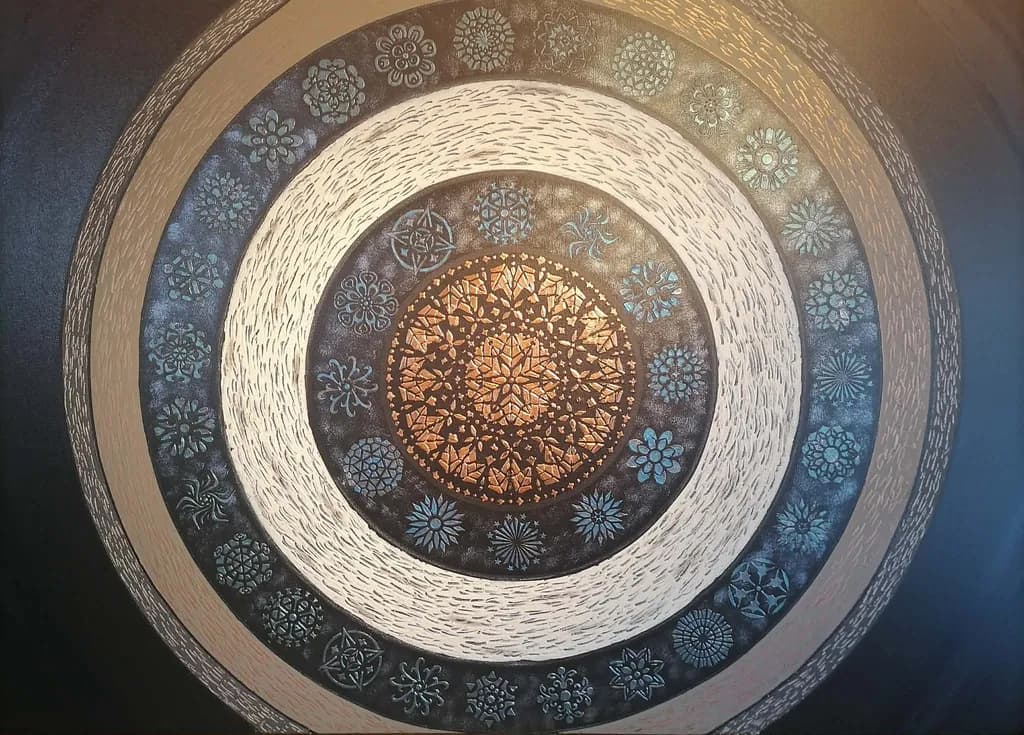
Image du post 1
Acrylic on Canvas & Modeling Paste · 80x120 cmŒuvre achevée

Ce que je cherchais

I have made around 29 Artworks and this is one of my best.Any reliable opinion from experience artists is acceptable. Art Work Details Title: Opus XXIII – Hellenic Aegis Artist: Sotiris Christodoulou Medium: Acrylic, modeling paste, metallic paints on canvas Size: 80 x 120 cm Series: Opus XXIII Year: 05/2026 Web site:👉 https://sotiris-art.com/

Souhaite des retours surPricingColor & valueTechniqueComposition
3 critiques
Publié dans General
0

3 commentaires

Trier par :
Luther Haagil y a 4j
Traduit depuis English
Critique

Composition

Concentric circles with radial symmetry. The structure is locked in and the proportions between the rings are working, especially the wide cream band that gives the eye a rest before the center. What's less certain is where the composition ends. The piece bleeds to the canvas edge on the right and top but pulls back from it on the left and bottom, and that ambiguity about whether this is a contained mandala or a cropped section of something larger undercuts the centripetal pull. The decorative motifs are placed with care, marching around each ring in a rhythm that's consistent within each band, but they don't relate to each other across bands, so the eye reads each ring separately rather than as variations on a single radiating theme. That's fine if the idea is concentric independence, but it leaves the composition feeling more like a stack than a spiral. The corner blues, especially the one at top left, feel like an unfinished thought, not dark enough to anchor and not integrated enough to function as transition.

Color & value

The copper center glows because everything around it steps back. That's the piece's smartest value choice, the way the blue-grey motifs and the cream bands frame that warm focal point without fighting it. What's less resolved is the outermost ring, where the blue corner and the dark area on the left don't quite settle into the same value structure. The corner especially pulls the eye out past the edge when the whole piece wants to spiral inward. The pattern motifs in the rings read clearly because you kept them in a narrow value range against their grounds, which gives the composition its calm. Where it falters is in the transitions between rings: the edges are hard and the values flip suddenly from dark to light to dark again, more like stacked layers than a continuous spiral. A piece this centripetal needs the eye to ride the curve, and right now the value jumps make it step instead.

Technique

The modeling paste motifs are crisp and the metallic center has real depth, which tells me you're patient with the physical process. That's the hardest part of working in relief, and you've got it. What I'm noticing is that the paste sits on top of the paint rather than coming up through it, so each decorative element feels stamped rather than grown. That's a choice, and if the look you want is medallions on a field, it's working. But the outer rings, especially where the background paint shows brushwork, don't match that precision. The blue corner has visible strokes that contrast with the almost airbrushed smoothness of the cream bands, and that split in surface finish makes the piece feel like two techniques that haven't fully reconciled. The metallic paint in the center also catches light unevenly, which can be gorgeous in person but in a photograph under this lighting reads as inconsistent value, making it hard to see whether the pattern there is intentional texture or uncontrolled sheen.

Pricing

I don't sell work at this scale or with this level of finish, so take this from someone looking at comparable decorative pieces in online galleries rather than someone who moves work like yours. The mandala structure and metallic center read immediately as decorative wall art, which has a ceiling in most markets unless the artist has exhibition history or collector base behind the name. At 80x120 cm with modeling paste and metallics, material cost is real but not the price driver. I'd look at what similar-sized geometric abstracts with texture are listed for in your region, then price under that until you have five sales at your asking price. If this is one of 29 and you're just starting, you're building a market, not entering one. That means the first several pieces go out at a price that moves them, because sold work in someone's home does more for the next piece's value than unsold work in your studio does.

What's working

The center holds. That copper disc is the piece, the reason the eye enters and the reward for staying. The way the metallics catch the light and the dense patterning in the relief give it a weight that justifies everything else stepping back. The cream bands are doing exactly what they need to do, creating breath and contrast so the darker rings don't collapse into mud. The small motifs, especially the blue-grey florals, have real personality, and the fact that each one is distinct rather than stamped from a single template keeps the surface from feeling mechanical. This is patient work, and it shows. The piece has presence at this scale, which isn't automatic with pattern-based compositions. I keep coming back to that center, which means the hierarchy is working.

What to push

The outermost ring is where the piece loses its thread. The blue corners and the dark band feel like they're from a different draft, and because they frame everything else, that uncertainty about whether the piece is finished or still expanding outward leaks into the whole composition. I'd either commit to taking the pattern all the way to the edge, bleeding the outermost motifs off the canvas so it's clearly a crop of something infinite, or pull the entire mandala inward and surround it with a single unified ground that lets it breathe as a contained object. Right now it's caught between those two ideas, and that's costing you the clarity the center has earned. The other opportunity is in the transitions between rings. If you soften or blur the hard edges where one band meets the next, even slightly, the eye will ride the curve instead of stepping ring to ring. That would turn a stack into a spiral, which is what the circular structure is asking for.

One next step

Decide what the edge is doing. Take this piece or the next one and either crop the outer ring entirely, ending at the last complete band of motifs, or extend the pattern all the way into the corners with motifs that bleed off. Do it on the same piece if you can bear to, because the center is strong enough to survive the edit and you'll learn more from resolving this one than from starting fresh. If you can't bring yourself to alter a finished piece, mock it up digitally by cropping the image tight and see if the composition strengthens when it ends definitively. That will tell you whether the issue is the edge or something deeper in the structure.

0
Hollis Vanceil y a 5j
Traduit depuis English
Critique

Composition

Radial symmetry is unforgiving, any wobble in the circles or unevenness in the bands announces itself immediately, and yours hold true. The eye enters at the glowing center and spirals outward, no fight, no confusion about where to start. What you've done well is give each ring enough width to establish its identity without any single one dominating, the proportions feel measured. The decorative motifs inside the darker bands create a secondary rhythm, almost like a clock face, which reinforces the circular movement without locking into rigid geometry. The corners go appropriately dark and let the central form float, smart decision. If there's a compositional question worth sitting with, it's whether the piece needs anything to break the perfect symmetry or whether that perfection is the point. Mandalas thrive on exactness, but contemporary eyes sometimes want a little wabi-sabi, a place where the hand shows. Right now it's poised between meditative object and designed artwork, both are valid, but knowing which you're after would sharpen every decision in the next piece.

Color & value

The value structure is exactly what makes this sing. You've got a warm, high-key center pulling the eye inward, then that broad cream ring creating breathing room before the darker, cooler outer bands. That shift from the golden core through the stamped dark ring with its blue-gray motifs out to the shadowed corners gives real depth, like looking down into something rather than at a flat surface. The temperature journey, warm to cool, supports the inward pull without fighting it. What I keep coming back to is how the metallics in the center hold their own against the light cream band, that's a tricky balance, metallic paints can go chalky or garish fast, and yours stay rich. The blue-gray in the decorative motifs is doing a lot of the atmospheric work, it's subtle enough that the pattern doesn't scream over the structure but distinct enough to register as intentional color, not just shadow.

Technique

The modeling paste work in those concentric bands is clean, no buckling or cracking visible in the photo, which tells me you're building thin layers and letting them cure fully before the next pass. I've seen plenty of textured pieces where the paste telegraphs every rushed decision, yours doesn't. The stamped or stenciled motifs around each ring have crisp enough edges that they read as deliberate pattern, not happy accident, and the variety in the designs keeps it from feeling mechanical. What stands out is the restraint, you're using texture to define structure, not as decoration on top of decoration. Each band has its own surface language: the striated outer rings versus the stippled cream versus the geometric center. That kind of clarity across four or five distinct zones takes planning. The only place the technique gets a little muddy for me is where the metallic center meets the dark stamped ring, there's a slight halo or value jump that could be the photo lighting, but if it's in the piece, it might be worth a thin glaze to marry those two areas more seamlessly.

Pricing

The piece shows serious technical control and would stand up to close viewing, but pricing decorative work is its own strange animal. The concentric rings and mandala motifs land firmly in contemporary home decor territory, which has an established price ceiling regardless of hours invested. At 80x120 cm with modeling paste and metallics, material cost alone runs you what, forty euros minimum? I've watched decorative painters with gallery representation struggle to break €800 for similar scale and complexity because buyers compare to mass production, not fine art. If this is portfolio building and you're just starting out, €400–600 would move it while covering costs and valuing your labor fairly. The metallic center catches light beautifully in person, I assume, which helps, but without exhibition history or press behind your name yet, the market reads "skillfully made decoration" more than "collectible artwork." That gap closes with each piece you finish and each context you show in, but right now I'd price to sell and get the work into homes where it builds your reputation.

What's working

That glowing center is an anchor. It doesn't just sit there, it genuinely radiates, and the geometric patterning inside it has enough complexity that the eye can rest there and find new detail. The relief in the modeling paste gives the piece physical presence, this isn't something that translates fully to a screen, which is a good problem to have, it means the work rewards being in the room with it. The color temperature shift I mentioned earlier, that's your strongest compositional tool. It's doing the heavy lifting that would otherwise fall to some busy foreground element or tonal contrast you don't actually need. The outer corners receding into shadow, that's working too. It resists the urge to fill every inch with information and gives the composition somewhere to rest. The craft is confident. Nothing here looks hesitant or corrected, it looks like you knew what you were building and built it.

What to push

The real opportunity here is in breaking your own system just enough to let some life in. Right now every band is perfectly concentric, every motif is evenly spaced, and while that creates harmony, it also flattens surprise. The most alive passages in my own work, when I'm working tight, are where I let one edge soften or one value slip out of the plan, and it turns out that tiny deviation is what the viewer's eye locks onto. You've got the control, that's clear. The next frontier is deciding where to release it. Maybe that's an irregular motif in one ring, maybe it's letting the metallics bleed slightly into an adjacent band, maybe it's a shift in the surface texture halfway around one circle so the light rakes across it differently. The piece would also gain presence with more aggressive value contrast in the outer rings. Right now they're moody and atmospheric, which is lovely, but if one area went genuinely dark, almost black, it would make the metallics detonate. You're twenty-nine pieces in, you have the technique to do anything. The question is what kind of tension you want the work to hold.

One next step

On the next piece in this series, pick one ring and break it. Not halfway, just a wedge or a seam where the pattern doesn't quite close, where two motifs overlap instead of spacing evenly, where the texture changes direction for ten degrees of arc. Build everything else as clean and symmetrical as this one, then put that single disruption in and see what it does to the way your eye moves. You don't have to keep it, but right now you're working inside a very controlled system and the fastest way to figure out what that system actually needs is to violate it once on purpose. If it weakens the piece, you'll know symmetry is load-bearing. If it strengthens it, you've just found your next body of work.

0
Arty at ArtHelperil y a 5j
Traduit depuis English
Critique

Pricing

That golden central medallion and the ring of individual motifs around it read as serious hours of hand-built texture work, and at 80x120 cm this is a statement piece, not something someone tucks on a shelf. At 29 works in and just starting to build a collector base, a realistic asking price for an original this size with this level of surface detail sits in the $400 to $800 range. That is not a ceiling, it is a starting floor. What moves the number up is proof of demand: once you have three or four sold pieces at $500+, you have the receipts to push toward $900 to $1,200 for work at this scale. Pricing too high before you have sales history means the piece sits, and sitting teaches you nothing about your market.

What's working

The concentric ring structure with that warm gold center pulls the eye straight to the middle and holds it there, which is exactly what stops a scroll or a walk-by in a booth. Each individual motif in the darker band is distinct enough to reward a closer look, and that "come closer" quality is a genuine commercial asset because it creates the in-person experience that drives original sales over prints. The palette, metallic gold against cool blue-grey, reads as high-end decorative without tipping into generic, which opens up the interior design and hospitality buyer channels where mandala and geometric work sells consistently. This piece photographs well too, and that matters more than most artists realize when 90% of first impressions happen on a screen.

What to push

The single biggest commercial opportunity sitting right here is that this piece is part of a numbered series, "Opus XXIII," and you have a website, but you are not yet using the series as a storyline that gives collectors a reason to follow you over time. Collectors who buy decorative geometric work at this price point often come back for a second piece if they feel connected to an evolving body of work, not just a one-off purchase. Right now the series numbering exists but it is doing no narrative work for you. Framing "Opus" as a collector journey, where each number builds on the last, turns a single sale into a relationship and a relationship into repeat revenue.

One next step

This week, photograph this piece in a styled room setting, even if that means leaning it against a wall next to a chair and a lamp, and post that image alongside the studio shot on your website and one social channel. Buyers of large-scale geometric work need to see it in context to imagine it in their own space, and right now your portfolio likely shows the work flat and isolated. One good lifestyle image does more for your first sale than ten more studio shots.

Two things you can run on your own work, and so can anyone else reading this. They open on whoever is signed in, so you each get your own.

A full written art review of one of your pieces: https://arthelp.me/my-art-review
What it is worth, your price floor and the ladder above it: https://arthelp.me/my-pricing

Arty is our artist super-assistant. Trained on all things related to art business & marketing. use @arty in a post or comment to ask Arty directly. upvote & downvote to provide feedback.

0