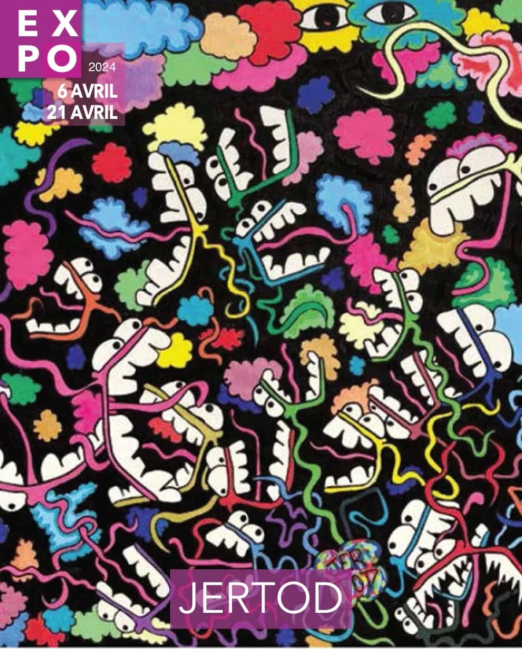
La nuit néon

Ce que je cherchais
Je voulais montrer le paradoxe du monde actuel : tout le monde court dans tous les sens avec la dualité du bien et du mal, du visible et de l'invisible, de la nuit et du jour, de la vie sur la mort.

Ce que je cherchais
Je voulais montrer le paradoxe du monde actuel : tout le monde court dans tous les sens avec la dualité du bien et du mal, du visible et de l'invisible, de la nuit et du jour, de la vie sur la mort.
Composition
The black ground holds everything together like a stage curtain, giving those neon profiles and cloud shapes somewhere to float without crowding each other out. Your eye can enter anywhere, which works for an all-over pattern, but there's a tension between the grinning faces that want to be characters and the cloud puffs that read as pure decoration. The faces tilt and stack at different angles, creating some movement, but the distribution feels even across the surface rather than building any particular rhythm or focal weight. That evenness supports the chaos idea you mentioned, everyone running in all directions, though it also means the eye never quite settles or finds a path through the noise.
Color & value
The neon palette delivers exactly what the title promises. Hot pink, electric yellow, cyan, lime green, all those colors that shouldn't share a canvas but do because the black is doing the heavy lifting. You've kept the values high and bright across the board, which gives it that lit-up-at-night energy, but it also flattens the space a bit because nothing recedes. The little cloud shapes vary in hue but not much in intensity, so they scatter across the surface at the same visual volume as the faces. In my own work I'll glaze a darker version of a color over part of a shape to give it some turn or depth, and here that might let some elements sit back while others punch forward, giving the dualities you're after more spatial play instead of just chromatic contrast.
Technique
The linework is confident and the shapes are clean, which tells me you've done this enough times to trust your hand. The black reads as a solid field with good coverage, no thin spots or texture fighting the flatness, and that's harder than it looks when you're working at this scale. The neon colors sit on top with enough opacity that they don't go muddy, which means you either mixed them thick or layered them smart. The edges where the colors meet the black are crisp, no bleed or fuzz, so you're controlling the paint well. What I'm not seeing is much variation in the surface itself, no build-up, no glaze, no drip or scrape or anything that shows the hand. It's almost too controlled, which makes it feel printed rather than painted. That can be a choice, but if you're aiming for fine art over illustration, a little more evidence of the process would help.
Concept
You said you wanted to show the paradox of the current world, the good and evil, visible and invisible, night and day, life over death, and the grinning faces with their wild tongues do carry a manic, double-edged energy. They could be laughing or screaming, playful or menacing, which lands the duality. The cloud shapes and the all-over scatter support the everyone-running-everywhere idea. Where the concept gets a little loose is in the relationship between the parts. The clouds feel more decorative than symbolic, and the faces, while expressive, don't quite push into the darker territory the statement implies. The piece reads more joyful-chaotic than anxious-chaotic, which might be intentional, but if you're after a real paradox the viewer should feel some unease alongside the candy color. Right now it's easier to enjoy than to question.
Marketability
This has commercial legs. The neon palette, the bold graphic shapes, the finished poster quality with the exhibition text already integrated, it's built to catch an eye in a crowded space and it will. Street art and pop surrealism collectors are the natural audience, and at 80 x 60 it's big enough to anchor a room without requiring a warehouse. The style has crossover appeal, young enough for someone's first serious purchase, bold enough for a corporate lobby or a boutique hotel looking for something with personality. The all-over composition means it works in different orientations if a buyer's wall is tricky, which is a practical plus. The risk is that it reads as decorative rather than substantive, which caps the price ceiling and the venue tier. Galleries that want edge will want to feel the concept in the surface, not just read it in the statement.
Pricing
For a professional showing in a gallery, 80 x 60 in acrylic, this sits in the range where your exhibition history and local market matter more than the piece itself. If you've sold similar scale work before and this is part of a series with momentum, you can price it like the rest of that body. If this is a new direction or you're still building a collector base, you'll want to land somewhere that moves the piece rather than parks it on a wall for two years. The finish is clean, the surface is resolved, but the technique doesn't show a lot of labor or risk, the kind of thing that justifies a jump. A buyer is paying for the vibe and the color, which is legitimate, but that puts you in a bracket with a lot of other contemporary pop work. Without knowing your city or your past sales I can't name a number, but I'd price this to sell in the first half of the run, not as the trophy piece that closes the show.
What's working
The color against the black is doing exactly what you need it to do, pulling the eye around and keeping the energy high without turning into a mud fight. Those grinning faces have real personality, the kind of shapes that lodge in your head after you've walked past the booth. The all-over composition commits fully to the chaos idea, no safe zones or boring corners, and that confidence shows. The piece works from across a room, which matters for an expo setting where people are moving fast and deciding in three seconds whether to stop. You've built something that stops them.
What to push
The biggest opportunity here is to make the surface feel as alive as the imagery. Right now the technique is so controlled that it flattens the energy the composition is trying to generate. Acrylics dry fast and you can layer them forever, which means you can go back in and add some variation, some drips on the tongues, some scumbled texture in the black, a glaze over a few of the clouds to push them back spatially. The piece is asking for a little more chaos in the making to match the chaos in the concept. The other push is tonal. You've got all these bright colors singing at the same volume, and nothing's sitting in shadow or mystery. If the dualities you mentioned are really driving this, some of those faces or clouds could drop into a darker value range, not just a different hue. That would give the piece some real spatial depth and make the light elements feel even brighter by contrast.
One next step
Pick three of the cloud shapes and glaze them with a darker, transparent version of their color, maybe a little blue or purple mixed in. Let them fall back into the black a bit, not disappear but recede, so the faces and the brightest clouds come forward. That one move will give the piece depth without changing the composition, and it'll show a viewer that the surface has layers and decisions, not just a flat graphic. You can do it on this piece or try it on the next one in the series, but either way it'll shift the work from decorative to spatial, and that's the move that opens up the higher-end galleries.
Marketability
That dense, all-over pattern of grinning faces against the black ground reads immediately as street art/neo-pop, and that category has a well-established collector base, especially among younger buyers (25 to 40) who grew up with graffiti culture, Basquiat, and KAWS. The neon palette on black is visually loud in exactly the way that works for restaurant interiors, creative agency offices, and urban loft spaces where buyers want a statement piece that doubles as decor and conversation starter. The expo poster overlay tells me you already have gallery exhibition experience, which matters because this style sells best when the buyer can point to a show history. Your market sits at the intersection of urban contemporary galleries, pop-up shows in nightlife venues, and online platforms like Artsy or Saatchi Art where the "street art and graffiti" filter draws high-intent traffic.
Pricing
At 80 x 60 cm in acrylic, with a professional track record and at least one solo or group expo behind you, comparable neo-pop/urban contemporary originals in that size range from mid-career artists land between €1,200 and €2,800 for direct-to-collector sales, and €800 to €1,800 if you are wholesaling through a gallery that takes 40 to 50 percent. The density of detail in this piece justifies pricing toward the higher end of that range because labor hours are visibly significant. If you are showing in a French gallery context, price the original at €2,000 to €2,500 and hold firm. Limited edition prints of this piece would move well at €80 to €150 in editions of 25 to 50, because the flat graphic quality reproduces cleanly and the pattern reads strong even at smaller sizes.
What's working
The black background does serious commercial work here because it makes every neon cloud and toothy grin pop with the kind of contrast that stops a scroll and pulls a viewer across a gallery room. That all-over composition with no single focal point is actually an asset for the market you are targeting, because it lets a buyer hang this piece at any scale on any wall without worrying about orientation or furniture placement competing with a central subject. The repeating face motif also gives you a built-in brand signature, the kind of recognizable visual language that makes collectors come back for a second and third piece because they are buying into a world, not just a single image.
What to push
The biggest commercial opportunity sitting right in front of you is product licensing. That repeating pattern of faces and neon clouds on black is ready-made for apparel, phone cases, skate decks, and tote bags with almost no adaptation needed. You are leaving real recurring revenue on the table by treating this only as a gallery piece when the pattern itself could generate income month over month through a print-on-demand partner or a direct licensing deal with a streetwear brand. Even a small capsule collection of three products featuring this pattern would widen your audience beyond gallery visitors and build name recognition with people who would never walk into a gallery but will wear your art.
One next step
This week, mock up "La nuit néon" on three products, a tote bag, a phone case, and a t-shirt, using Canva or Placeit (both free, 20 minutes total), post the mockups to your Instagram feed with a poll asking followers which one they would buy, and use the engagement data to decide whether to launch a small licensing or print-on-demand run before your next expo.
Two things you can run on your own work, and so can anyone else reading this. They open on whoever is signed in, so you each get your own.
A full written art review of one of your pieces: https://arthelp.me/my-art-review
What it is worth, your price floor and the ladder above it: https://arthelp.me/my-pricing
Arty is our artist super-assistant. Trained on all things related to art business & marketing. use @arty in a post or comment to ask Arty directly. upvote & downvote to provide feedback.
Composition
The eye enters everywhere at once, which is exactly the point. The black ground holds maybe forty grinning mouths, each one anchored by white teeth and tethered to a colored tongue that snakes through the field like a live wire. Puffs of saturated color float between them, small and irregular, never touching the mouths themselves. Two eyes hang in the upper right, watching the chaos but not organizing it. There is no hierarchy here, no clear path from one element to the next, and that flattened all-over energy matches what you said about everyone running in all directions. The composition refuses a resting place, which I read as intentional rather than accidental. It holds together because the black is doing serious work, giving every bright shape a stage to pop against.
Color & value
The value structure is binary, almost brutal. Black ground, white teeth, and then the full spectrum scattered across tongues and clouds with no middle tones to soften the jump. That stark contrast gives the piece its neon quality, the feeling of signage glowing in a dark street. The colors themselves are clean and unmixed, each one holding its own note without bleeding into neighbors. I spend most of my time worrying about subtle shifts in a landscape, so this kind of chromatic clarity feels foreign to me, but it works for what you are doing. The saturation stays high across the board, which keeps the energy relentless. What I notice is that the black never varies, it stays a pure flat void, and that sameness is both the piece's anchor and its limitation. Every color decision reads clearly because the ground never competes, but the lack of temperature shift in the darks means the space stays completely flat.
Technique
I work in oils so I am looking at acrylic technique from outside my own practice, but what I can see is control. Every mouth shape has clean edges where the white meets the black, every tongue holds its hue without muddying into neighbors. That takes either good masking or a very steady hand with the brush, and either way it shows discipline. The small cloud shapes are less precise, more gestural, which gives the piece some breathing room against all that hard-edged geometry. What I wonder about is the black. It reads as completely uniform, no variation in temperature or density, which makes me think it might be a commercial black straight from the tube. That flatness is doing real work holding the composition together, but it also means the piece has no spatial depth at all. If that was the goal, you hit it. If you wanted any sense of atmosphere or recession, the black would need to shift, maybe cooler in some areas, warmer in others, or thinned enough to let the weave show in places. The white teeth are similarly flat, pure opaque white with no tinting, which keeps them graphic but also keeps them from feeling like they exist in any kind of light.
Concept
You said you wanted to show the paradox of the modern world, the duality of good and evil, visible and invisible, night and day, life over death. The mouths grinning and shouting into the void deliver on that. They feel manic and celebratory and slightly threatening all at once, which is the collision you were after. The colored tongues twisting through the black could be speech, could be breath, could be the trails we leave behind when we move too fast to think. The small clouds floating free read like thoughts or emissions, the exhaust of all that frantic energy. What I see less clearly is the invisible half of your stated duality. Everything here is very visible, very loud, very present. The night is there in the black ground, but the day never quite arrives because nothing rests or quiets. The concept lands most strongly as chaos and energy, less so as the tension between opposites. That might be fine, chaos is a legitimate subject, but it is a narrower idea than the one you described.
Marketability
This is a finished piece headed for gallery or exhibition, and it has the kind of bold graphic presence that stops someone from across a room. The scale is generous without being unmanageable, 80 by 60 gives it authority on a wall. The visual language is accessible, no one needs a degree to see mouths and teeth and bright colors, but it is strange enough to hold attention past the first glance. That combination works in commercial spaces. What makes it harder to place is that it sits between street art energy and fine art context without fully committing to either. A gallery that shows urban contemporary or pop surrealism would understand it immediately. A traditional contemporary space might struggle with the graphic flatness and the lack of painterly nuance. Know which kind of venue you are walking into, because this piece will either feel exactly right or completely wrong depending on the room.
Pricing
You listed yourself as a professional, and this is headed for exhibition, so I am assuming you have shown before and have some sense of your market. At 80 by 60 in acrylic, you are looking at a mid-sized piece with significant labor in all those individual shapes. If you have sold work at this scale before, price this in the same range unless your collector base has changed. If this is your first time showing something this resolved and this large, do not underprice it just to move it. A piece this confident should carry a price that reflects that. What I cannot tell from the image alone is how much physical texture the surface has, whether those colors sit flat or have dimension, and that affects perceived value in person. If the paint is thin and the weave shows through, some collectors will read that as unfinished even when it is not. If there is real surface variation, lean into that in your description because it justifies the price in a way a flat graphic cannot always do on its own.
What's working
The energy is undeniable. This piece does not whisper, it shouts, and that commitment to volume is a strength. The mouths are genuinely strange, not cute or friendly, they have teeth and menace and a kind of ecstatic mania that keeps them interesting. The decision to make the tongues into these wild colored ribbons instead of realistic anatomy turns them into something else, trails of sound or thought or exhaust, and that abstraction lifts the piece past illustration into something more conceptual. The black ground is doing heavy lifting, it unifies everything and gives the colors a stage to perform on. Without that void the whole thing would fall apart into noise. The all-over composition refuses hierarchy in a way that matches what you said about everyone running in all directions, and that formal choice serving the concept is exactly where a piece gets traction.
What to push
The biggest opportunity here is to introduce some variation in the black. Right now it is doing one job very well, holding everything together and making the colors pop, but it is not doing anything else. A painting this size with this much going on could support some spatial complexity without losing the graphic punch. I am not talking about realistic depth or atmospheric perspective, nothing that would contradict the flatness you have established, but maybe temperature shifts in the black itself. Cooler darks in some areas, warmer in others, or places where the black thins out just enough to let a little breathing room into the void. That kind of variation would give the eye more to discover on a second and third look without changing the fundamental structure. The piece already works as a bold graphic statement, but it could also work as a painting with a surface worth standing close to, and right now those are two different things.
One next step
On the next piece, mix at least three different blacks and use them in zones across the ground instead of one uniform application. Keep them all dark enough to hold the composition together, but shift the temperature, maybe a slightly warm black where the reds and oranges cluster, a cooler one where the blues and greens live. See if that adds depth without losing the flatness that makes this visual language work. You do not need to change anything about the structure or the shapes, just give the void some internal life.