Demande de critique10j restants pour les critiquesCritiques earn 20X points
Introspection Bleue
Traduit depuis Español
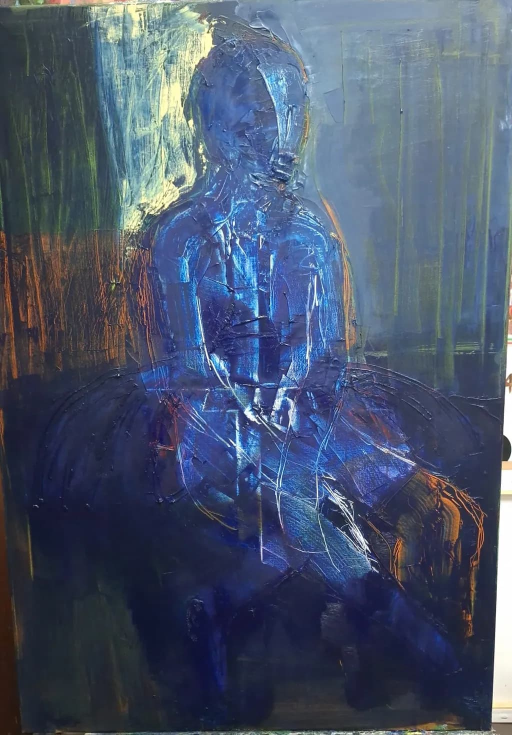
Oleo sobre linzo · 70*100 cmŒuvre achevée
Ce que je cherchais
La paleta dominada por azules profundos, ultramares y matices verdosos establece un tono de recogida melancolía y recogimiento interior. La figura —una bailarina sentada en postura de reposo o pausa— se aleja del espectáculo o la gracia técnica para adentrarse en la vulnerabilidad. Hay una vibración de soledad habitada, un instante congelado entre el agotamiento físico y la contemplación mental. Los destellos cálidos que asoman sutilmente en el fondo y en los bordes del cuerpo crean un contraste tenso, sugiriendo un conflicto latente entre la frialdad del entorno y la calidez de la vivencia interna
Souhaite des retours surTechniqueConceptMarketability
3 critiques
Publié dans General
1
Technique
The palette knife work carries most of the weight here, those slashing vertical strokes in the background and the thick impasto on the figure's torso and head. I'm not a painter, so I'm looking at this from a draughtsman's angle: the gesture reads immediately as seated, weight settled, but the underlying construction feels loose in a way that might not be intentional. The head and neck relationship is where it shows most, the tilt forward doesn't quite match the shoulder line beneath, and that gap between intention and execution is something I know from redrawing hands five times and still getting the knuckle angles wrong. The orange-brown verticals on the left create a nice temperature contrast against the blue, but they also fracture the spatial logic. I can't tell if the figure is sitting in front of a streaked window, a painted backdrop, or an abstract field, and that ambiguity might be working against the "recogimiento interior" you described. The white highlights on the blue form are doing something interesting with the light, they suggest volume and a light source from upper left, but they're applied in a way that feels more decorative than structural.
Concept
You wrote about a pause between physical exhaustion and mental contemplation, vulnerability instead of spectacle, and I see that in the posture, the head bent, the hands somewhere near the lap. The deep blues absolutely deliver that sense of "recogida melancolía." What I'm not getting from the image is the dancer part specifically. The figure reads as a seated person, but nothing in the body, the clothes, the setting, or the gesture tells me this is a bailarina rather than anyone else in a moment of solitude. That might be intentional, making it more universal, but your statement is specific about who this person is and what they've stepped away from. The "conflicto latente entre la frialdad del entorno y la calidez de la vivencia interna" is visible in the color temperature, those warm touches you mentioned do push against the cool dominance, but the actual figure feels remote in a way that might be more than you intended. The facelessness supports the introspection, but combined with the loose construction, it starts to feel more like a blue shape than a person with an inner life.
Marketability
The size is solid for a serious collector piece, 70x100 cm is substantial without being unmanageable, and the oil on linen signals a traditional approach that matters to certain buyers. The problem is the concept-to-image gap I just named. If you're marketing this as a dancer in a private moment, the storytelling isn't clear enough to support that narrative, and narrative is what moves figurative work in a crowded market. The blue palette is striking, but "blue figure in abstracted space" is a very common formula in contemporary painting, so differentiation becomes critical. Pricing depends entirely on your exhibition history and existing collector base, which I don't know, but a 70x100 oil should not be priced like a study or a small work. That said, if this is representative of your current technical level, you might have more success positioning it as part of a larger series exploring this theme, where the cumulative effect does the work that a single piece can't quite do alone. Galleries will want to see consistent execution within a recognizable visual language, and this piece suggests you're still developing both.
What's working
The color choice is confident. That deep blue holds the composition together and creates an immediate mood, and the decision to keep the figure and the space in a similar temperature range makes the piece feel unified even when other elements are fighting each other. The scale of the figure relative to the canvas is right, there's breathing room without the person feeling lost, and the vertical orientation supports the seated pose. The paint handling in the background has energy, those gestural streaks feel like they came from a real physical impulse rather than careful deliberation, and that's the kind of looseness that's hard to fake. The choice to leave the face undefined keeps the focus on the body language and the overall posture, which is the right call for a piece about interiority. I keep coming back to the temperature contrast you set up, those warm touches in the edges and the hint of orange-brown, because that's where the tension you described actually lives in the paint.
What to push
The biggest opportunity is clarifying the figure's construction before you add all that surface texture. Right now the blue form reads as a shape with highlights rather than a three-dimensional body in space, and that's costing you the vulnerability and presence you wrote about. The hands especially, I can't see them clearly, and hands in a moment of pause or exhaustion are where so much emotional specificity lives. In my own figure work, the pieces that fail are the ones where I got excited about the gesture and skipped past the underlying structure, and this feels similar. The other place to push is the setting. The vertical streaks are visually interesting but spatially confusing, and if the dancer has just stepped away from something, giving us a hint of where she is, even abstractly, would ground the narrative. It doesn't need to be literal, but right now the background is doing its own thing independent of the figure, and that diffuses the focus. Decide whether this is a person in a space or a blue form against an abstract field, because trying to do both is splitting the impact.
One next step
Do a series of quick gesture drawings or small painted studies of seated figures, focusing entirely on how the weight sits in the hips, how the spine curves, and where the head actually balances when someone is looking down in a moment of rest. Five to ten minutes each, no detail, just the big structural relationships. Then take one of those studies and build it up into a small painting, 30x40 cm or so, using this same palette but with the construction nailed down first. That will tell you whether the issue in this piece is the underlying drawing or the way the thick paint is obscuring what you actually saw, and either way you'll have a clearer foundation for the next work in this series. The goal isn't to fix this piece, it's to give yourself the information you need to make the next one stronger.