Liberté!2020
Ce que je cherchais
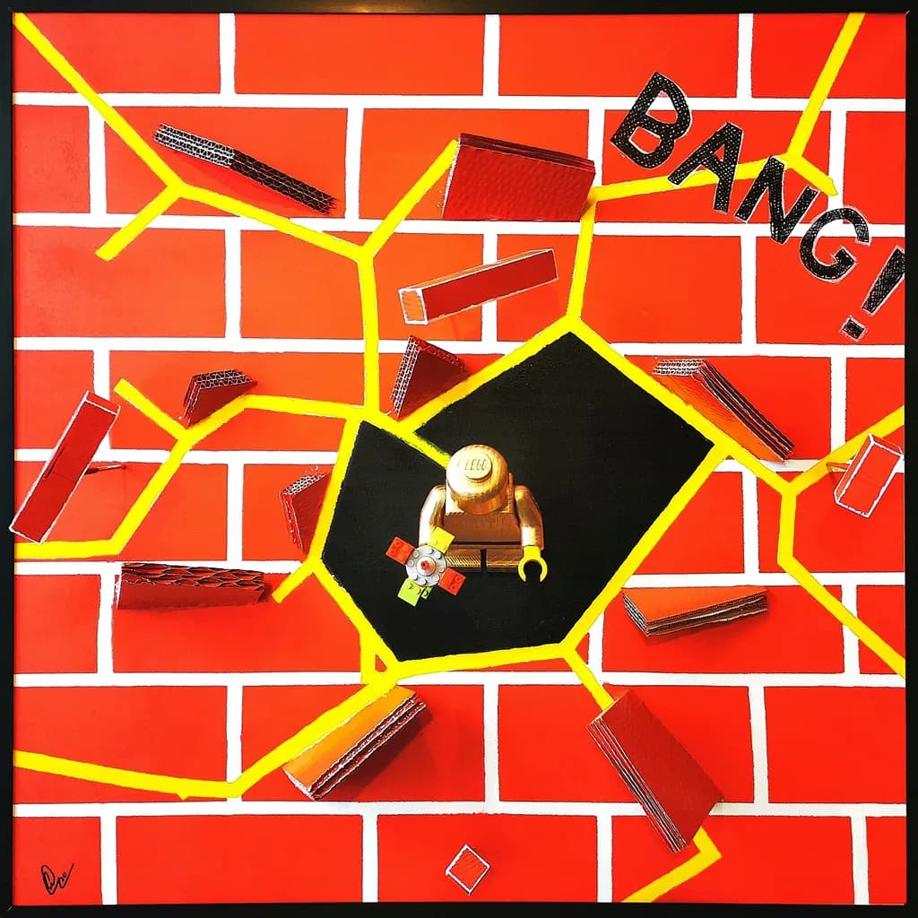
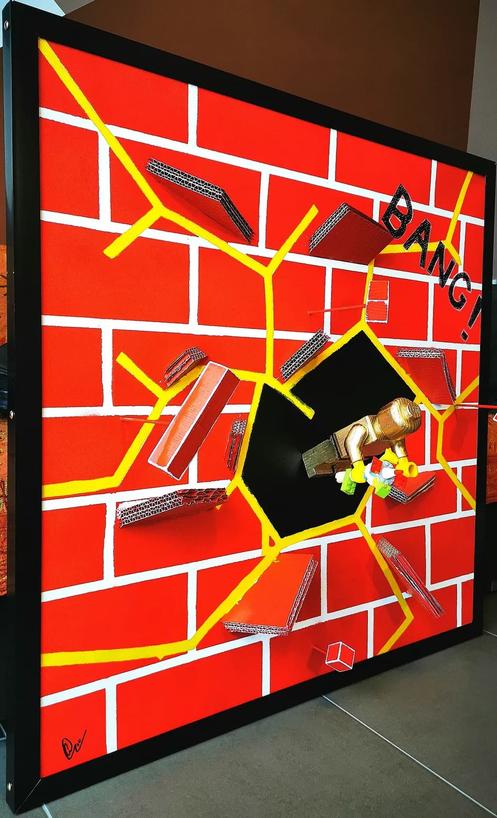
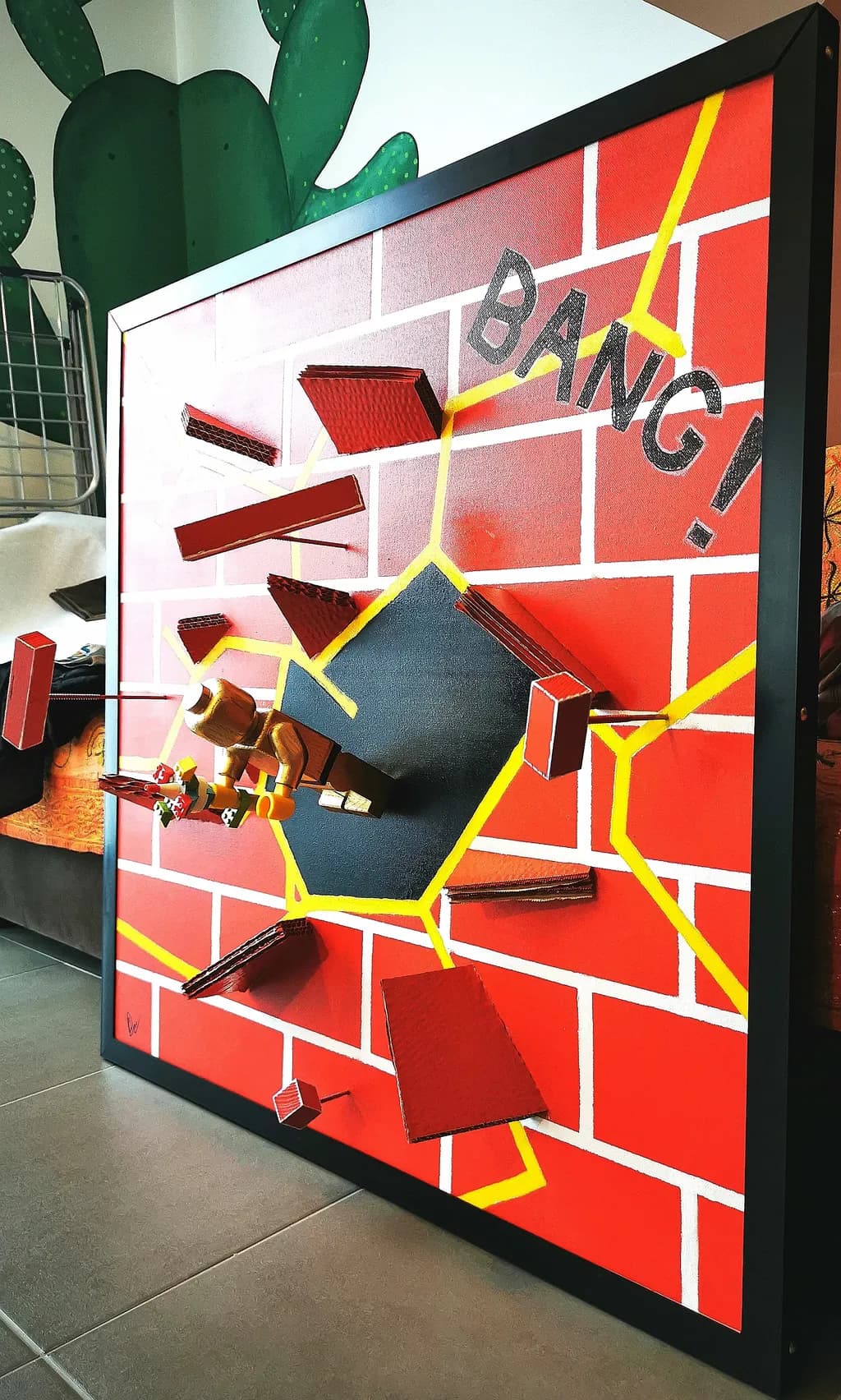
I created this work in the midst of 2020, as a direct response to the lockdown, isolation, and institutional control that suddenly came to define our lives. It was no coincidence; being shut in forced me to look for a way out. I used the language of comic books because it suggests direct, uncomplicated action: a wall, an impact, an escape. Beneath that visual immediacy, I wanted to capture my own tension between restriction and free will. The figure I built is a reflection of childhood, but it is also myself: a small insurgent body refusing to remain inside the structure built around it.For me, the wall had to be deliberately artificial. I painted cardboard to imitate solid masonry, intentionally leaving its corrugation visible to expose the fragility behind any illusion of control. I painted the cracks spreading from the center in golden yellow, turning damage and rupture into pure energy. By repurposing discarded plastic within the handmade frame, I sought to deepen the underlying logic of the work: the materials, symbols, and boundaries imposed upon us can all be dismantled and reconstructed.Suspended between sculpture, assemblage, and visual storytelling, Freedom!2020 is my proposition that liberation is an active gesture. I do not present freedom as something granted to us from the outside, but rather as the internal force we need to break open an opening—and the courage it takes to move through it.
Composition
The eye lands exactly where you want it: center mass, black hexagon, gold figure holding that tiny dynamite stick. Everything radiates outward from there in yellow lightning fissures that crack through the white mortar grid, and the scattered red bricks reinforce the explosion without cluttering it. What I keep noticing is how the yellow cracks don't all hit the edges at the same angle, they veer and fork, which makes the impact feel like it's still happening rather than frozen. The "BANG!" positioned upper right balances the figure's weight and keeps the composition from feeling too symmetrical even though the underlying grid wants symmetry. The cardboard edges of those flying bricks cast actual shadows on the flat painted surface, and that depth distinction between the intact wall and the debris field tells the whole story before you read a word.
Color & value
You committed to three colors and held that limit hard: the orange-red field, the yellow cracks, the white grid. That restraint makes the composition feel like a screen print or a comic panel, which serves your stated intent. The value range is narrow by design, everything sitting in the middle to high register, and it works because the black hexagon creates the only true dark note. What I'm seeing is that the red bricks in the debris are almost the same value as the painted background wall, so they read more by their outline and shadow than by contrast, which makes them slightly quieter than they could be. The yellow is doing all the energetic lifting. In my own work I've learned that when one color has to carry all the movement, it needs enough value punch to hold that job, and yours does.
Concept
The gap between your statement and the image is narrow and that's rare. You said you wanted to expose institutional fragility by leaving the cardboard corrugation visible, and I can see that texture even in this photo, especially along the brick edges where the material refuses to pretend it's solid. The Lego figure holding dynamite nails the comic book directness you were after, and centering a mass-produced plastic toy inside a handmade structure about escaping imposed systems is a move that actually deepens the read instead of flattening it. What you wrote about "a small insurgent body refusing to remain inside the structure built around it" is exactly what the image shows. The only place the concept might be carrying more weight than the visual can fully hold is in the "courage it takes to move through" the opening, because the figure is still centered in the black void, not yet stepping into the cracks. That stasis could be intentional, the moment before movement, but it's worth knowing whether viewers will see hesitation or defiance.
Marketability
This sits in an awkward scale for most residential walls but a perfect one for corporate lobbies, creative offices, and public institutions that want accessible contemporary work with a clear message. The 2020 timestamp will either date it or make it a historical marker depending on how long you wait to sell it. Right now we're close enough that "pandemic piece" is still a category buyers recognize, but in five years it might need to stand on "freedom and resistance" without the context. The comic book language makes it immediately readable, which is an advantage in spaces where art needs to work for a broad audience. The 30 cm depth is a problem for shipping and a selling point for presence, those two things at once. I've seen wall-mounted assemblages this size move through galleries that specialize in narrative work or Latin American contemporary, but they move slowly unless they're priced to acknowledge that the buyer is solving a logistics problem.
Pricing
At 90x90 with 30 cm projection and ten-plus years of practice behind it, you're looking at a narrow band. Too low and you're signaling that dimensional work is worth the same as a flat canvas this size, which it isn't. Too high and you're betting someone wants a statement piece badly enough to pay sculptural rates for materials that read as intentionally humble. If this is headed to your portfolio and you're testing the market, I'd start at $2,800 to $3,500 USD depending on your regional market and exhibition history. That's high enough to respect the labor and concept, low enough that a private collector or small institution can say yes without a committee. If it were silver or bronze I'd price it like jewelry, by material cost and hours, but cardboard and found plastic don't carry material value so you're pricing the idea and the decade of practice that let you execute it clearly. The 2020 context might add urgency for some buyers and cool interest for others, so be ready to move on price if it sits for six months.
What's working
The instant readability is your strongest asset. I can explain this piece to someone in one sentence and they'll get it before they see it, then the image delivers exactly that with enough visual care that it doesn't feel like an illustration of the idea. The yellow cracks are genuinely energetic, they don't look painted on, they look like they're glowing from inside the rupture. The decision to scatter the bricks in a realistic explosion pattern rather than in a decorative arrangement keeps the piece grounded in the action you're describing. That tiny dynamite stick is so small I almost missed it, and then it clicked and the whole gesture made sense. The black hexagon creates a stage, a spotlight, a moment of focus that the rest of the composition orbits around. Your material choices match your concept without being heavy-handed about it. The work does what you said you wanted it to do.
What to push
The biggest opportunity here is in the figure's relationship to the cracks. Right now the yellow lightning radiates from the center but doesn't quite touch the figure, so the Lego person looks like they're standing in the epicenter of someone else's explosion rather than causing it. If the yellow originated from the dynamite itself, or if one crack visibly connected the figure to the rupture, the causality would be unambiguous. The other thing I keep coming back to is that the figure faces forward, static, while the entire composition suggests violent outward motion. A turned shoulder, a lifted foot, even just rotating the figure ten degrees so it's angled toward one of the cracks would imply the next moment. I'm not saying it's wrong as it stands, arrested motion has its own power, but if your stated concept is about the active gesture of liberation then the visual might need to show the body in the act of moving, not posing. The third push is minor but visible: some of the scattered bricks are floating in space without clear attachment to the wall or clear separation from it, and that middle zone makes them feel less like debris and more like decoration. Decide whether each brick is still embedded or fully free.
One next step
Photograph this piece from a slight angle, maybe 15 degrees off center, so the 30 cm depth is visible and the scattered bricks cast longer shadows across the painted wall behind them. The straight-on shot you have flattens the sculpture back into illustration, and the dimensional aspect is half the point. For the next wall piece, start with the figure's gesture before you build the structure around it. I learned this the hard way when I was setting stones: if you build the bezel first and the stone doesn't quite fit, you've already committed to filing metal. If you set the stone's position first, everything else adjusts easier.