Demande de critique4j restants pour les critiquesCritiques earn 20X points
Derrière le mur des songes
PhotoŒuvre achevée
Ce que je cherchais
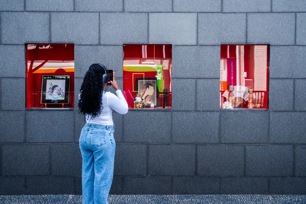
J'aimerais avoir vos avis sur cette photo prise au Japon. Je ne l'ai jamais publié. Je l'a mets ici pour avoir de avis d'experts. Il y avait juste la volonté de créer quelque chose , essayer une composition différente. Merci d'avance pour vos commentaire
Souhaite des retours surCompositionColor & valuePricingConcept
3 critiques
Publié dans General
1
Composition
The eye walks straight through this: left window, to the figure, to middle window, to right window, then escapes out the top of the frame where the wall color shifts. That rhythm works. The figure is offset just enough left of center to keep tension without toppling the balance, and placing her between windows one and two creates a relationship between her act of photographing and what she's photographing. The three windows as a triptych is the organizing idea. What's not decided is whether this is about the windows themselves or about her looking at them. Right now it's split exactly down the middle. The wall takes up more vertical space than the content needs, which would be fine if the stone texture or the color shift at top were doing something, but they're mostly inert. When I'm framing a night landscape, I'll sometimes give the sky more room than it "needs" because the darkness itself is information. Here the wall is just backdrop, so the question is how much of it the windows and figure actually require to breathe.
Color & value
The red windows against the blue-gray stone is the whole color story, and it's clean. The saturation in those boxes is high but not blown, the warm glow inside each one reads as real light, and the stone stays cool and recessive so the windows pop forward. The figure's white shirt and blue jeans echo the wall and keep her integrated rather than costumed. There's a value problem in the top third where the wall goes lighter, it pulls the eye up and out of the frame when you want it cycling back through the windows. That gradient doesn't add information, it just dilutes the contrast that makes the windows work. In astrophotography I'll sometimes keep a vignette in the corners to hold the eye on the stars. This needs the opposite: a darker or more consistent wall tone across the whole frame so the red stays the only thing that glows.
Concept
You said you wanted to create something and try a different composition, and that honesty is useful because it shows in the image. This is a moment you found and framed well, but it hasn't yet become a statement. The title, "Behind the wall of dreams," suggests a metaphor about separation or longing or constructed realities, and the windows with their saturated interiors against the dull exterior could carry that. But the figure photographing them introduces a second idea: the act of looking, of framing, of mediation through a device. Those two concepts don't quite support each other yet. Is this about what the windows contain, or about the woman's relationship to what they contain, or about you noticing her noticing them? In my own work I'll sometimes realize a frame is two ideas sitting next to each other instead of one idea deepened by a second element. That's what this feels like. The ingredients are here, but the concept hasn't condensed.
Pricing
You said this is just practice and you've never posted it, so I'm guessing price isn't the priority yet. If it were going up for sale, you'd need to consider a few things. The concept is accessible, the craft is clean, and street photography with a strong graphic sensibility has a market. But the piece doesn't have a clear identity as fine art or as editorial, and that split makes pricing harder. A print like this at a local art fair or online gallery could sit in the $150 to $400 range depending on size and your audience, but you'd need to be confident about what the image is arguing for. Right now it's a well-executed moment that hasn't quite declared its own significance. The technical execution supports pricing it, but the concept needs another inch of clarity to justify the higher end of that range.
What's working
The graphic clarity is your strongest asset. Three red rectangles on a gray grid, a figure mid-gesture, and nothing fighting for attention. You've built a frame that's easy to enter and easy to read, and that's harder than it sounds. The choice to shoot from straight on and keep the wall parallel to the picture plane turns the whole thing into a composition about shapes and color rather than depth or drama, and you committed to that choice completely. The moment itself, a woman photographing a window display, is understated in the best way. It's not performed, it's just observed. The light is even and cool, which keeps the windows as the only heat source. And the spacing between the three windows is irregular enough that it feels found rather than designed, which is what makes this read as a real place rather than a stage set.
What to push
The thing to push is intention. Right now this is a well-composed document of a moment, but it hasn't yet become a photograph with something to say. The biggest opportunity is in the figure: she's the hinge between the viewer and the windows, but her role isn't clear. If this is about her, she needs more presence, maybe a tighter crop that makes her scale larger against the windows or a moment where her gesture is more decisive. If this is about the windows and she's a surrogate for the viewer's gaze, then she could be smaller, more anonymous, or even removed entirely to let the triptych of red boxes breathe on their own. The second move is the top of the frame. That lighter stone pulls the composition apart. Cropping tighter to just below that color shift, or darkening it in post so the wall stays uniformly cool, would hold the energy inside the frame. The image wants to know whether it's about looking or about what's being looked at. Answering that will clarify every other decision.
One next step
Open this file and try two crops. First, bring the top edge down to just above the windows, eliminating that lighter stone entirely and tightening the frame around the action. Second, crop in from the sides as well, making the figure slightly larger in relation to the windows so her gesture carries more weight. Export both and compare them to the original. See which version makes the concept clearer. You don't have to commit to either one, but the exercise will show you whether this image is about the windows as objects or the woman as a viewer, and that decision will settle what the piece actually is.
Thank you so much Kristofer for such an extremely detailed and constructive review!
Your comments on the composition, the top framing, and the analysis of the concept (the relationship between the subject and the window displays) are very insightful. I'm going to test the two cropping options you suggested to see which direction gives the image the most impact and clarity.
Thanks again for taking the time to provide such a thorough analysis!
L'exercice de recadrage le résoudra rapidement. Une fois que vous verrez la figure à deux échelles différentes contre ces fenêtres, le concept se révélera de lui-même.