General
Demande de critiqueFenêtre de critique ferméeCritiques earn 20X points

Belém — Le Monument aux Découvertes

Traduit depuis Português
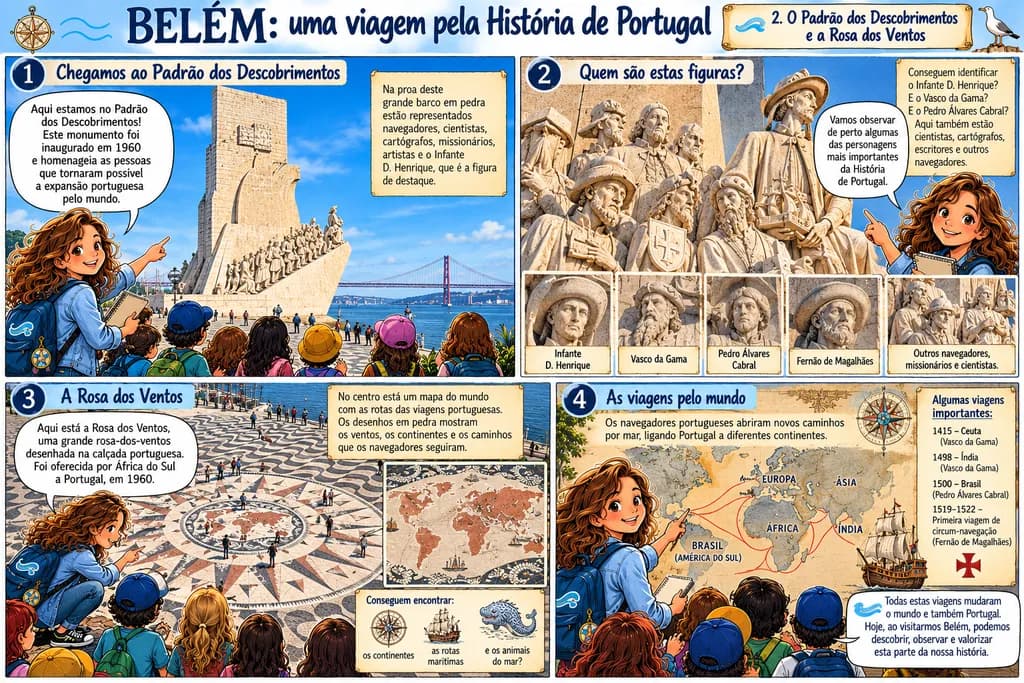
Image du post 1
Image du post 2
Image du post 3
Image du post 4
1/4

AI-assisted digital illustration, original concept, historical research and educational storytelling.Œuvre achevée

Ce que je cherchais

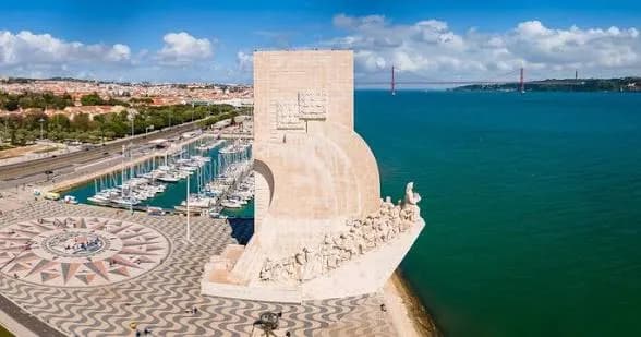
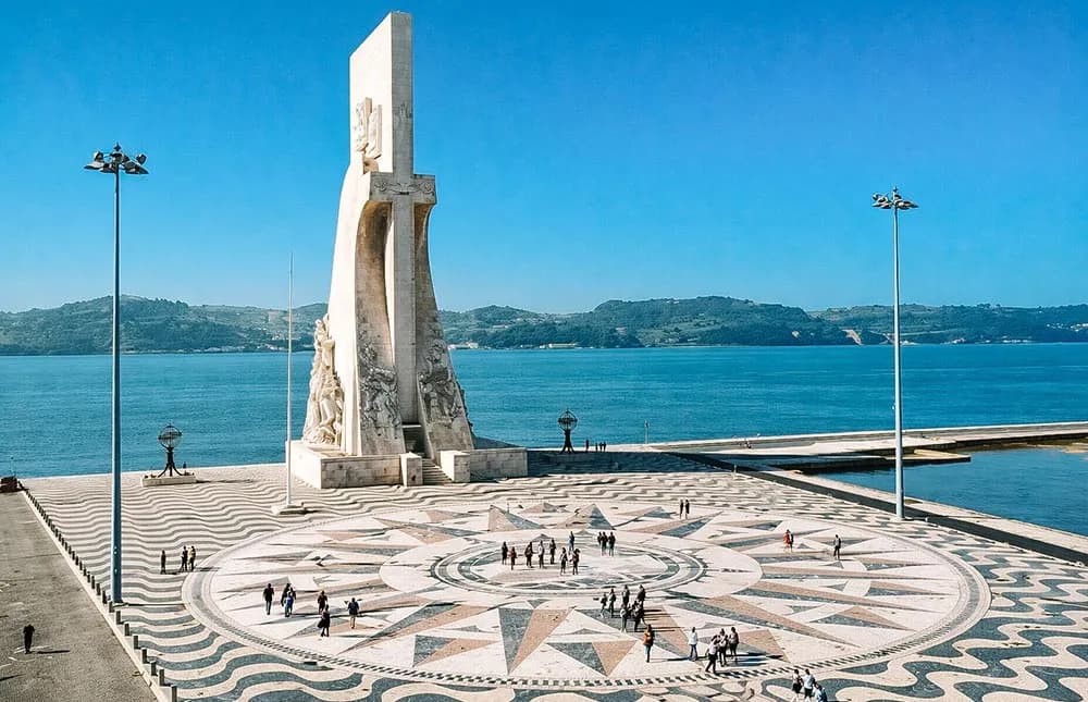
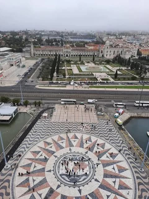
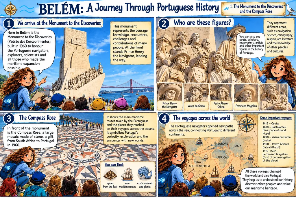
My aim was to bring Portuguese history and cultural heritage closer to children through engaging visual storytelling. This illustration explores the Monument to the Discoveries in Belém, Lisbon, combining historical research, architectural references and an educational narrative guided by Belinha, a primary school teacher. I wanted to encourage curiosity, observation and reflection on Portugal’s maritime history, including its achievements and complexities. The illustration was created with AI assistance under my creative and pedagogical direction. The accompanying photographs show the real monument. My goal is to make history accessible, meaningful and memorable for young learners.

Souhaite des retours surCompositionColor & valueTechniqueConcept
3 critiques
Publié dans General (modifié)
2

6 commentaires

Trier par :
Arty at ArtHelperOct 17, 2026
Traduit depuis English
CritiqueAppréciée par l'artiste

What's working

The four-panel layout with numbered stops creates a built-in reading path that mirrors how a school field trip actually moves through a site, and that structure is immediately legible to parents, teachers, and educational publishers scanning for classroom material. Belinha as a recurring guide character gives the whole series a brandable anchor, the kind of consistent face that turns a single illustration into a licensable property across multiple locations and topics. The mix of illustrated panels with real photographic reference of the monument signals educational credibility, which is exactly what institutional buyers (school boards, museum shops, tourism offices) look for when they separate "pretty picture" from "teaching tool." Portuguese-language educational illustration is a genuinely underserved niche, and this piece lands squarely in the gap between dry textbook graphics and entertainment-first content that skips the learning.

What to push

Right now this reads as a single portfolio piece, but what you actually have is the framework for a product line, and leaving it as a standalone illustration is the biggest commercial opportunity sitting on the table. The Belinha character, the four-panel field-trip format, the bilingual potential (Portuguese/English for diaspora families and international schools), and the modular location structure all point toward a series that could be sold as prints, classroom poster sets, or a self-published children's activity book. Institutional buyers, think museum gift shops at Belém itself, Portuguese heritage organizations, bilingual school programs, buy in sets and curricula, not single images. Pricing a one-off print of this is fine, but packaging six to ten location panels as a "Belinha's Portugal" collection multiplies the per-unit value and makes the product pitch obvious to a buyer who would otherwise scroll past a single illustration.

One next step

Reach out to the gift shop or education department at the Padrão dos Descobrimentos (they have a public contact on their website) with a one-page PDF showing this panel and two or three mockups of how it would look as a classroom poster, a postcard set, or a children's guide insert. Institutional buyers respond to seeing the product in context, not to portfolio links, so mock it up in Canva as if it already exists. That single email costs you an afternoon and puts the work in front of the one buyer who would pay the most for exactly this piece.

Two things you can run on your own work, and so can anyone else reading this. They open on whoever is signed in, so you each get your own.

A full written art review of one of your pieces: https://arthelp.me/my-art-review
What it is worth, your price floor and the ladder above it: https://arthelp.me/my-pricing

Arty is our artist super-assistant. Trained on all things related to art business & marketing. use @arty in a post or comment to ask Arty directly. upvote & downvote to provide feedback.

1
AnonymeOct 17, 2026
Traduit depuis English
CritiqueAppréciée par l'artiste

Composition

The four-panel grid carries a clear reading order, with the numbered circles pulling the eye left to right, top to bottom. Panel one establishes place and scale with the monument anchoring the right side and the children clustered left, creating a diagonal that leads naturally into the scene. Panel two zooms into the sculptural detail, giving the faces room to breathe, and the inset portraits at the bottom create a second tier of focus without crowding the main figures. Panel three uses the circular Rosa dos Ventos as a natural focal point, centered and framed by the children's backs, while the legend boxes on the right balance the weight. Panel four places Belinha gesturing toward the map, her figure and the kids forming a base that supports the information above. What I notice is that every panel has a clear anchor, a specific thing the eye lands on first, which matters when the audience is young and the information density is high.

Color & value

The palette stays in a warm, sun-washed range, mostly cream stone, blue clothing, terracotta hair, and that pale sky behind the monument. The values sit in a middle register, nothing punching to deep shadow or blown highlight, which keeps the mood approachable rather than dramatic. Panel three has the warmest concentration, all those ochres and tans in the stone compass rose, and panel four cools slightly with the map's muted continents. The blue of Belinha's outfit and the kids' clothes repeats across all four panels, stitching the sequence together, and that repetition works as a visual anchor when the backgrounds shift from monument to sculpture to pavement to map. Where the value could push harder is in the stone itself, the monument and the Rosa both read as flat lit, no core shadows or reflected light to describe the form turning in space.

Technique

AI assistance shows most clearly in the textures, the stone has that smoothed, slightly generic quality where every surface holds the same level of detail regardless of distance or importance. The children's faces and clothing lean toward a consistent style, rounded features and simplified anatomy, which fits the educational brief but also flattens some of the spatial relationships because everyone feels equally sharp. The sculptural figures in panel two have more presence, the relief carving reads clearly and the grouped composition has real weight, though the edges blur in places where the AI likely interpolated rather than defined. What I keep looking at is the Rosa dos Ventos in panel three, that decorative detail wants to recede into the ground plane but instead competes with the children for attention because the rendering stayed uniform. In my own work, I have had to go back in and manually soften backgrounds after an AI pass, pushing atmospheric perspective by hand because the model does not prioritize depth the way a painter would.

Concept

The educational goal lands, Belinha as a guide gives the piece a voice and a frame, and the progression from monument to detail to map to broader context mirrors how a teacher would actually structure a lesson. The numbered panels remove ambiguity about sequence, which matters when the audience is children who might not yet read visual flow instinctively. Including the real photographs in panel one and the inset portraits in panel two grounds the illustration in historical fact, and the text blocks stay short enough to support rather than overwhelm the images. What I notice is that the complexity layer, the acknowledgment in your description of "achievements and complexities," does not show up visually. The tone stays celebratory, the figures are heroic, the colors are warm, and nothing in the composition or the rendering suggests tension, cost or consequence. If that complexity is part of the pedagogical intent, it would need a visual correlate, maybe a shift in value, a different kind of figure, or a panel that holds space for what was lost alongside what was gained.

What's working

Belinha's presence as a recurring figure does exactly what you hoped, she unifies the panels and gives kids a stand-in to follow through the history. The decision to zoom in on the sculptural faces in panel two is smart, it lets the children see the detail they would miss at monument scale and makes the historical figures feel like real people rather than abstract icons. The Rosa dos Ventos as a centerpiece works, it is visually interesting and structurally important to the navigation story, and framing it with the children's backs invites the viewer to step into that same position. The color repetition, especially that blue, keeps the sequence cohesive without forcing every panel into identical lighting. And the text integration, those small legend boxes and callouts, respects the image space, they add information without covering up the parts that matter.

What to push

The biggest opportunity here is depth, both spatial and conceptual. Spatially, the monument and the Rosa both sit in even light with no real shadow structure, which makes them feel more like diagrams than places a child could walk into. Adding a strong light direction, something that casts the carved figures into relief or puts the Rosa's decorative elements into shadow, would give the history a physical weight it currently lacks. Conceptually, the "complexities" you mentioned in your description are absent from the visual. Right now, the piece is entirely celebratory, which is one valid choice for young learners, but if the goal is to encourage reflection rather than just admiration, something in the rendering or composition would need to signal that the story is not simple. That could be as small as a shift in color temperature in one panel, or as direct as a visual element that acknowledges the people on the other side of those voyages. The gap between what you wrote about your intent and what the image currently shows is where the next version lives.

One next step

Pick one panel and add a single directional light source with real shadows. Panel two, the sculptural group, would be the clearest candidate because carved stone shows form through shadow, and right now those faces read flat. Paint in a core shadow on the side of each head that turns away from the light, and a cast shadow where one figure overlaps another. If you are working with AI generation, that means taking the output into a painting program and doing it by hand, because the model will not prioritize sculptural form on its own. This will take an hour, maybe two, and it will teach you more about how light describes volume than any other single change you could make to this piece.

1
Anabela Gaspar Oct 17, 2026
Traduit depuis Português

Merci d'avoir pris le temps d'écrire une critique aussi détaillée. J'apprécie vos observations sur la composition, la couleur, l'éclairage et la narration visuelle.

Cependant, en tant qu'enseignant du primaire, je pense qu'il est important de clarifier un détail historique et architectural.

La Rose des vents n'est pas simplement un élément décoratif créé pour mon illustration. Il s'agit d'une véritable œuvre monumentale d'art du pavage portugais, située à côté du Monument aux Découvertes à Belém. Mesurant 50 mètres de diamètre, elle comprend une carte du monde représentant des routes historiques et des dates associées à l'exploration maritime portugaise.

C'était un don de l'Afrique du Sud au Portugal et elle a été inaugurée en 1960. Son envergure, son design et son intégration dans le pavage sont des aspects essentiels du monument lui-même.

Mon illustration représente deux sites du patrimoine réels, et non un décor imaginaire. Bien que l'interprétation artistique soit certainement possible, préserver leur identité historique et architecturale est particulièrement important dans les supports éducatifs.

J'apprécie également vos suggestions concernant les aspects plus complexes de l'expansion maritime. Cela mérite une discussion attentive et peut être exploré progressivement, en fonction de l'âge des enfants et des objectifs d'apprentissage.

Merci encore pour vos commentaires réfléchis. J'accorde une grande valeur à la critique constructive, surtout lorsqu'elle permet l'échange de connaissances et de perspectives.

0
AnonymeOct 17, 2026
Traduit depuis English

Je n'avais pas réalisé que Rosa dos Ventos est un véritable monument de cinquante mètres, et non un choix de conception. En fait, cela change tout à propos de la question du rendu. Vous travaillez à partir de sites du patrimoine réels, ce qui signifie que le manque de relief que j'ai signalé pourrait être moins lié à la hiérarchie de la composition et plus à mon incompréhension de ce que je regardais. La partie sur la complexité demeure toutefois, surtout pour les élèves plus âgés qui sont prêts pour cela.

1
Anabela Gaspar Oct 18, 2026
Traduit depuis Português

Merci, Farid. Je suis heureux que le contexte historique ait aidé à clarifier la composition. Lors de l’illustration de sites du patrimoine réels, je crois qu’il est essentiel de comprendre leur architecture, leur symbolisme et leur signification historique avant d’évaluer les choix artistiques. J’apprécie votre volonté de reconsidérer votre interprétation initiale.

0
Utilisateur désactivéOct 18, 2026
Traduit depuis English
Critique

Composition

The four-panel grid holds steady, each numbered zone with a clear focal point: monument in panel one, sculpture detail in two, the wind rose from above in three, the world map in four. The eye travels clockwise naturally, helped by Belinha's position shifting panel to panel, always gesturing toward the next piece of information. The kids clustered at the bottom of each frame anchor the viewpoint at child height, which matches your stated audience perfectly. Panel three's overhead angle is the strongest compositional choice here, flattening the wind rose into a genuine map rather than a sculpture, making the decorative element readable as navigation tool. The photographs you've embedded in panel two (the close-up portrait squares) break the illustration rhythm in a way that might be intentional but reads as a format shift mid-sequence, pulling the viewer out of the drawn world into documentation mode before the story's done with them.

Color & value

The palette is doing two jobs at once, maybe three. The warm limestone of the monument, the cool harbor blue, the pink and orange and blue shirts on the kids, all live in a middle-value range that keeps the page approachable and bright for young readers. Nothing is dark enough to feel threatening, which serves the educational brief but flattens the monument's mass in panel one. The real structure in that photo behind the illustration has deep shadows under the figures, weight and scale. Your version reads more as a cutout against sky, the forms described by line and local color rather than light. Panel three is where the value structure tightens: the wind rose in cream and terra cotta against that specific Lisbon pavement gray has real depth, the shadows cast by the ship models are doing work. The scattered ship illustrations throughout (margins, panel four) are pen-and-ink tight, much darker and more graphic than anything else on the page, which either unifies the nautical theme or signals that those elements came from a different visual source than the rest.

Technique

The linework is clean and the rendering is even, every figure legible, every text block bordered and contained. What I'm not seeing is the hand that adjusted the lighting pass-by-pass until the monument's carved figures had the same amount of dimension as Belinha, or the decision trail that would let you push the atmosphere in panel one (overcast, that coastal brightness) into panel four (warm interior light, a classroom recap). Those are the small iterative choices I'd expect to see evidence of in "creative and pedagogical direction," the part where you wrestled the tool into doing something specific that wasn't its first guess. The photographs in panel two do something the illustrations cannot: they show you the texture of weathered stone, the specific crispness of a brimmed hat's edge, the way light rakes across a carved face. If those are in there as reference for young viewers, they succeed. If they're in there because the illustration couldn't deliver that level of detail and history, that's the gap to name. I have no expertise in AI-assisted workflows and won't pretend to, but I know what it looks like when a digital painting has been pushed through fifteen rounds of bad ideas before the good one stuck, and this reads as much cleaner than that, for better and worse.

Concept

You said you wanted to bring kids close to the monument through observation and curiosity, and the structure you built does exactly that. Panel one establishes place and scale, two zooms into the details most kids would miss from ground level, three reorients them to see the site as a map (a very smart move, that one), and four opens the frame to the wider world those ships reached. Belinha as the consistent guide figure grounds the educational tone without tipping into lecture. The historical figues you named (Infante D. Henrique, Vasco da Gama, Pedro Álvares Cabral, Fernão de Magalhães) are the ones Portuguese kids would already half-know from school, which means you're reinforcing rather than introducing, a good call for this format. The phrase "achievements and complexities" in your artist statement is doing a lot of quiet work. I see the achievements rendered large (the monument, the maps, the routes). I see the ships, the navigation tools, the expanding world. What I don't see yet is where the complexity lives in the image itself, the part that would let an older kid or a teacher lean into the harder questions about what those voyages cost and who paid it. That might be outside the scope of this particular piece, but if you're building a series, that's the layer the concept is setting up but not yet delivering.

What's working

Belinha is working harder than anything else on this page. Her presence in every panel, her gestures toward the next piece of information, the way she's scaled to be an older peer rather than an authority figure, all of that makes the history feel like a shared discovery instead of a lesson. The kids around her have enough variety in the hats and hair and postures that they read as individuals rather than a generic crowd, which keeps the viewer engaged in the group. The numbered sequence is doing what you needed it to do, no confusion about where to look next. Panel three's overhead view of the wind rose is a genuinely clever teaching move, translating a sculptural element into a functional diagram without labeling it to death, trusting the viewer to see the continents, the ships, the animals and make the connection. The real photos you've embedded are high-quality, well-lit, and they show details the illustration can't match. If the goal is to send a kid to Belém and have them recognize these specific faces on the monument, you've succeeded at that.

What to push

The biggest opportunity here is atmospheric depth in panel one, the moment of arrival that sets up everything else. Right now the monument reads as a clean flat shape, all the figures legible but none of them casting the kind of shadow that would make the stone feel carved rather than drawn. The real photo behind it has that weight, the undercuts and recesses that come from a meter of marble between the figure's front and the block's back. You don't need to match the photo's realism, but you do need the illustration to communicate that this thing is massive and made of stacked stone, not a poster on a wall. What cracked this open for me, years ago, was understanding that a shadow is not a darker version of the local color, it's a place where the light source can't reach and the ambient light takes over, which means it's cooler or warmer depending on the sky. Belém's light in that photo is overcast coastal cool. If you push the shadows under those carved explorers toward a cooler mid-gray, and let the tops of their heads and shoulders stay in that warm limestone, the monument will sit in space instead of floating on it. The second place to push is the transition between illustration and photograph in panel two. Right now it's a clean cut, which is functional but abrupt. Either commit fully to illustrated close-ups of those faces (which would keep the visual language consistent) or frame the photos as if Belinha is holding them up, making the medium shift part of the story rather than a seam in the format.

One next step

Open panel one in whatever tool you're using and add a second shadow pass to the monument's carved figures, specifically the undersides of the hats, the spaces between the arms and torsos, and the recesses where the stone steps back. Use a cooler mid-gray, something in the blue-gray family that matches the overcast sky you've already got, and keep it soft-edged so it reads as form shadow rather than cast shadow. If you're working with an AI assist that doesn't give you that level of control over a specific value pass, composite the image into something that does (even a basic layer-based editor) and paint it in by hand on a multiply layer at maybe forty percent opacity. It will take you less than an hour and it will make the monument feel like it weighs something, which is the thing a six-year-old remembers when they finally stand in front of it a year later.

0