Demande de critiqueFenêtre de critique ferméeCritiques earn 20X points
The Faces
Traduit depuis English
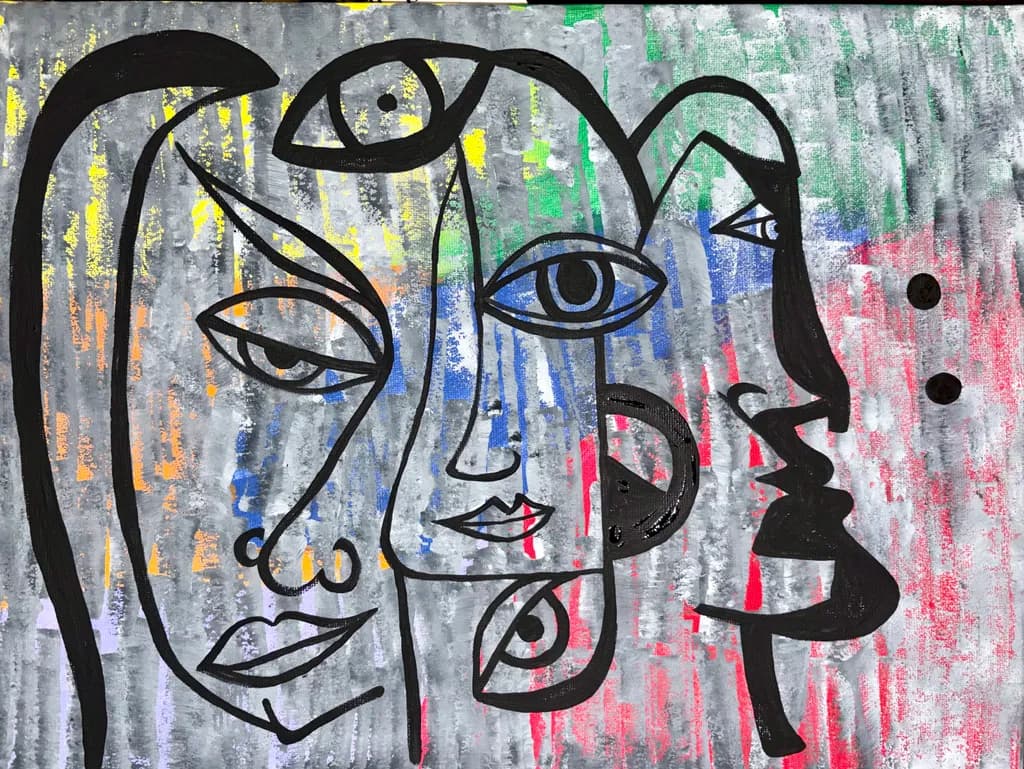
acrylic · 12x16Œuvre achevée
Ce que je cherchais
Concept was the faces we put on. I had sketched it and sharpie originally. Then.I found this canvas which had been in the drawer for a couple of years. I’d painted the background, hated it and forgotten about it. Once I found it though, had a new vision and this is what I created.
Souhaite des retours surConceptTechniqueColor & valueMarketability
3 critiques
Publié dans Art Critique
1
Color & value
The palette is working. The grays anchor everything, the primaries punctuate without shouting, and the choice to keep the line work black instead of letting it get lost in color keeps the image readable. Where it struggles is in value range. The background and the faces live in a very narrow middle band of value. There is no true dark except the Sharpie, no light except those few near-white drags at the top. My eye wanders because there is no rest point, no area that says "start here." When I paint, I squint to check if the composition holds as an abstract pattern of darks and lights before any subject enters the picture. This would flatten entirely. One or two areas pushed much darker, or one face allowed to be genuinely pale against a deeper background, would give the eye somewhere to land and make the whole image more dynamic.
Technique
The Sharpie line is confident enough to carry the piece, which matters because in acrylic that kind of drawing has nowhere to hide. You committed to each contour, and the few places where lines double or stutter read as energy rather than error. What I see working against you is the background application. Those vertical strokes are gestural but they sit on the surface without variation in opacity or texture. Acrylic dries so fast that layering becomes the whole game. Right now the background reads as one-pass color, which flattens it. In my own work I have to force myself to let a layer dry completely and then come back with a second or third pass, adjusting temperature or opacity, because that's what gives acrylic any sense of depth. The faces themselves would benefit from one more decision: are they flat shapes or do they have some suggestion of form? A tiny bit of shading inside one profile, or a highlight on a cheekbone, would clarify that choice.
Concept
The faces we put on. That lands, and lands immediately. The overlapping profiles read as simultaneous selves before they read as separate people, which is exactly the instability the concept needs. The Sharpie line work keeps it raw and direct, no fussing, no apology. What makes it succeed is that the background refuses to behave as background. Those vertical drags of yellow, green, blue, pink don't recede politely. They come forward, they interrupt the faces, they muddy the already ambiguous boundaries between one self and another. That restlessness is the concept made visible. You found an old failed canvas and gave it a second life as the ground for a piece about wearing masks. The irony is not heavy-handed, just quietly there.
Marketability
At 12x16 and acrylic on canvas, this sits in an affordable range if priced right, but the conceptual and graphic nature limits the pool. It is not decor. It is not calming or neutral. Someone buys this because the idea of shifting identity speaks to them directly, and that is a smaller audience than someone buying a landscape for the living room. The good news is that audience exists and they are often more loyal and more willing to buy multiple pieces. I would price this as practice-level work, maybe $75 to $150 depending on your local market, because you described yourself as just starting out and because the background does not yet have the finish that would support a higher number. If this were in a series of five or six variations on the same theme, the series would sell better than any single piece. One face piece is interesting. Six face pieces is a body of work.
What's working
The composition is genuinely smart. Four profiles overlapping, each with a different tilt and a different scale, and the eye moves through them without getting stuck. The two lower faces anchor it, the one at the top right adds height, and the one at the top left with that heavy hair shape gives the whole thing a visual weight on the left that balances the open space on the right. You also nailed the decision to let the background interrupt the faces rather than keeping them separate. That yellow slice cutting through the top face, the green eating into the profile on the right, those moments are where the concept and the execution fuse. The lips on the center face, that tiny bit of red, just enough. I also want to note that rescuing an old failed painting takes guts. Most of us leave those in the drawer forever.
What to push
The biggest opportunity here is to build real depth in the background. Right now it is color on a surface, but it could be atmosphere, it could be space those faces emerge from or dissolve into. That would not require changing the composition or the line work at all. It would mean coming back in with thin glazes or scumbles, maybe some of that gray knocked back further with a wash, maybe some of the yellow or green brought forward with a thicker, more opaque pass. Acrylic can be layered like oil if you let it dry and work thin to thick. The other place to push is in the faces themselves. They are shapes right now. If you gave one of them a suggestion of form, just a bit of shading or temperature shift, it would set up a tension between the flat and the dimensional that would make the whole piece stranger and more alive.
One next step
Pick one face, any one, and add a very subtle gradation inside it. Not harsh shading, just a wash or two that lets one side of the profile feel slightly darker or cooler than the other. Leave the line work exactly where it is and work around it. This will tell you immediately whether you want the faces to stay flat or whether they can hold some volume, and it will teach you how acrylic behaves when you come back to a dry layer with a thin pass of color. Do it on this piece if you are willing to risk it, or on the next one if you want to keep this as is.