Demande de critiqueFenêtre de critique ferméeCritiques earn 20X points
Sanctuaire (v1)
Traduit depuis English
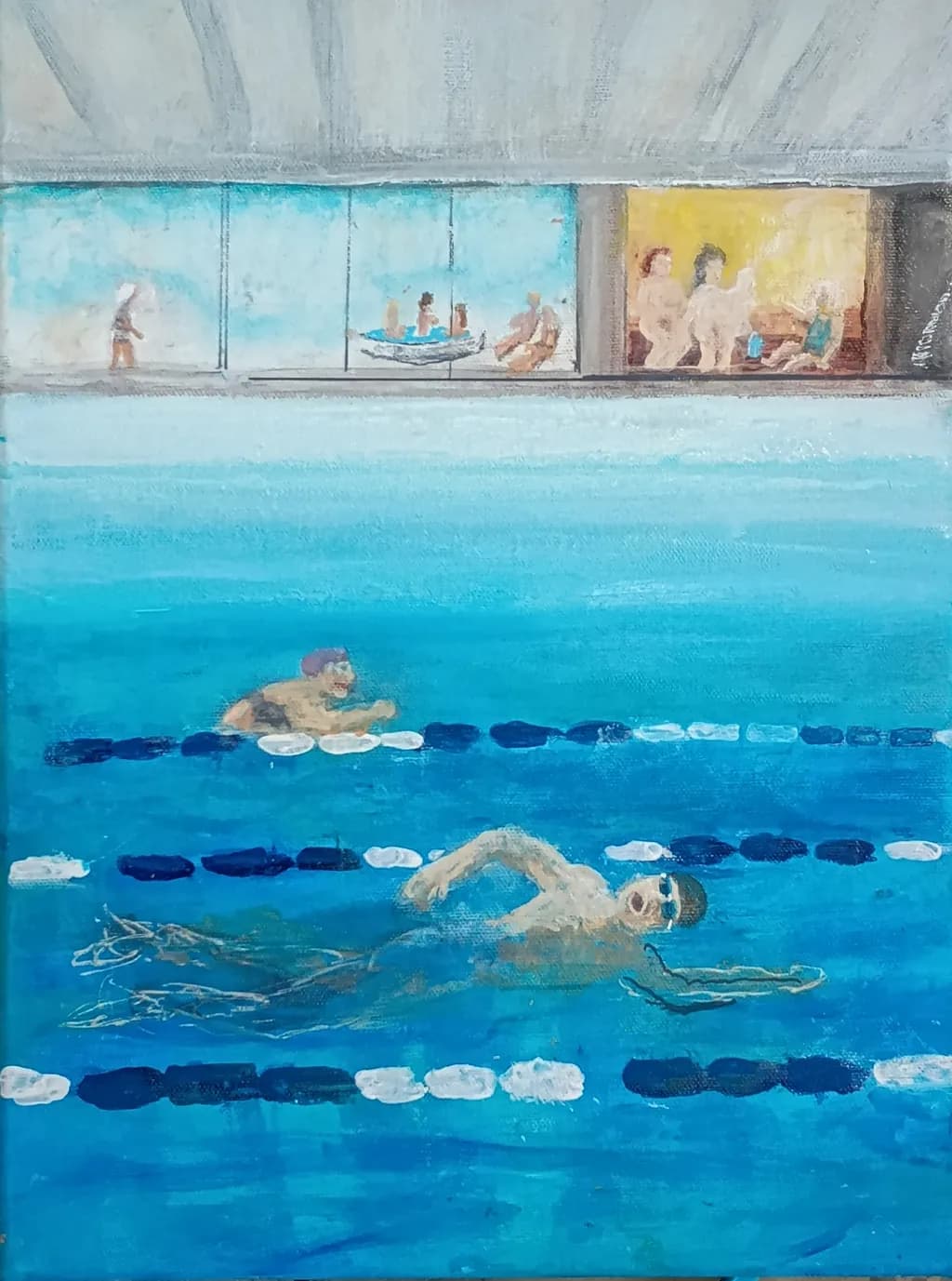
Acrylics on Canvas · 30x40cmTravail en cours
Ce que je cherchais
A piece I am working on right now. I try to capture wellnes, mental and physical health, harmony, joy and friendship. This is my sanctuary. Two times a week 🙂 Suggestions on how to proceed? Something you like or dislike? Something else?
Souhaite des retours surCompositionColor & valueTechniqueConcept
3 critiques
Publié dans Art Critique
2
Composition
The split world structure gives you two stages at once, water below and that windowed strip of poolside life above. My eye enters at the foreground swimmer, follows the lane dividers up through the middle figure, then travels right along that viewing gallery where the little vignettes of people sitting and standing break up the horizontal. The three lane lines create a strong rhythm that holds the space together even when the figures get loose. What strikes me is how much information you've packed into a small canvas without it feeling cluttered, the underwater volume reads clearly and the shallow depth of the viewing area contrasts well against it. The proportions feel observed, like you were actually there counting tiles.
Color & value
That turquoise carries the whole piece. You've kept it varied enough, more cyan near the surface, deeper and slightly grayer as it recedes, that the water feels like a place with actual depth rather than a flat field. The value range is narrower than it could be, everything lives in a middle register, which keeps the mood calm but costs you some punch. The lane dividers, especially those white segments, are nearly the same value as the lightest parts of the water, so they float rather than sit in space. Up in the gallery the warm yellow window and the cooler blue ones give a temperature shift that helps, but the whole upper third is close in value to the sky above it. I spent years muddying everything by refusing to push my darks dark enough, and I see a similar hesitation here.
Technique
The looseness in the figures works for the piece, they read as people without needing detail, and that keeps the focus on the overall feeling rather than on portraiture. The way you've scratched or dragged through the wet paint to suggest the shadows under the foreground swimmer shows you're thinking about what the medium can do beyond just brushwork. The lane dividers have a directness to them, each segment is a single confident mark, which gives them energy. Where it gets tough is in the transitions, the edge where water meets the pool deck is almost lost, and the windows in the gallery don't quite sit back in space because the frames and the glass are too close in temperature and value. Acrylics dry fast and that can make it hard to soften edges or blend, I know that's not my medium, but I can see you're working quickly and that speed is both a strength and a limitation here.
Concept
The statement and the image line up. This does feel like a sanctuary, the repetition of the lanes and the scattered figures above suggest routine and community without drama. What you're after, that mix of physical effort and social ease, comes through because you've shown both the solitary work of the swimmers and the casual groupings of people watching or resting. The underwater view is an interesting choice, it puts us in the space with the swimmers rather than observing from the deck, which makes it more immersive. The title fits. The only place the concept might be clearer is if there were a stronger sense of light, actual sunlight coming through those windows or hitting the water, because right now the light is ambient and even, which is calming but also a little static for a place about vitality and wellness.
What's working
The foreground swimmer is the strongest passage in the piece. The way the body is foreshortened, the arm reaching forward, the suggestion of motion in those few scratched lines for the shadow and wake, all of it reads immediately. That figure does what the whole painting is trying to do, it puts me in the water. The rhythm of the lane dividers, especially the way you've alternated the white and dark blue segments, creates a structure that lets everything else stay loose without falling apart. The little vignettes in the gallery, the boat, the seated figures, the standing pair on the right, each one is just enough information and no more, which keeps the eye moving rather than sticking. The overall color hold is confident, you committed to that turquoise and trusted it to carry the mood, and it does.
What to push
The biggest opportunity here is to get the upper and lower halves of the painting to sit in the same light. Right now the water and the gallery feel like they were painted in different sessions with different ideas about value, the water has some depth because you've varied the blue, but the gallery is almost all one mid-light value and it flattens. If you darken the interior of that yellow-lit room, push the shadows on the figures and especially the back wall, it will make the light in that window feel like actual light instead of just a warm color. The same goes for the blue windows, right now they're nearly as light as the sky, so they don't read as glass with darkness or another room behind them. Darkening those interiors will also help the pool deck itself come forward, because you'll have actual contrast to work with. The edge where the water meets the deck is lost entirely in the middle of the composition, and re-establishing that boundary, even softly, will help the space make sense. In my own work I've found that one strong dark, placed carefully, can reorganize a whole passage that felt flat, and I think that's what this piece is asking for.
One next step
Darken the back wall and the shadowed side of the figures inside that yellow-lit room on the right. Use a value at least three steps darker than what's there now, keep the color warm but let it go down into a real mid-tone. That one change will make the light in that window feel like it's doing something, and it will give you a reference point for how dark the rest of the gallery should go. Do it on this piece if the paint is still workable, or test it on the next pool study if this one is too dry to push further without overworking it.
Merci. Je vais certainement faire attention à la lumière dont tu parles. J'y étais aujourd'hui et c'est vraiment ce qui brille fortement à travers les fenêtres. J'ajouterai aussi des reflets partout. J'essaierai d'assombrir certaines choses... un peu 😉 En ce qui concerne les transitions, c'est toujours un souci. Le problème est que j'aime donner aux peintures et aux images une touche mystique et onirique. Certaines choses se perdront intentionnellement. Nous verrons où celui-ci mènera. À la fin, c'est le tableau lui-même qui décide 😎 À propos des séparateurs de voie, ils devraient flotter, c'est ce qu'ils font. Ou bien voulez-vous dire dans un langage de peinture ?
Les séparateurs de voies flottants, oui, c'est le langage de la peinture que je voulais dire, ils font leur travail structurellement. Mais lorsque la valeur est si proche de la surface de l'eau, elle perd la sensation d'être en espace, ce qui est différent de la qualité onirique que tu recherches. Une forte lumière à travers ces fenêtres résoudra pas mal de choses une fois que tu seras de retour devant elle.