Art Critique
Demande de critique22j restants pour les critiquesCritiques earn 20X points

Flore Rose

Traduit depuis English
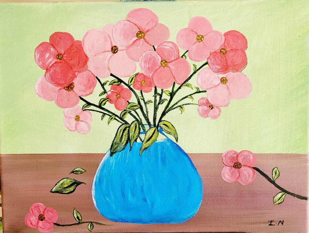
Image du post 1
Acrylic · 9" × 12"Œuvre achevée

Ce que je cherchais

I decided to try a still life painting of florals in a blue vase for contrast. A few petals lies on the table beside the vase with wilting leaves as the rest of the flora awaits a new vibrant growth.

Souhaite des retours surMarketability
3 critiques
Publié dans Art Critique
2
9 commentaires

Trier par :
Sadie Webbil y a 4j
Traduit depuis English
Critique

Marketability

The color blocking here, that sharp yellow to pink horizon line with the bright blue vase, reads immediately from across a room, which matters when you're trying to get someone to stop scrolling or walk closer at a fair. The scale is small enough to price accessibly and the subject is broadly appealing. What's holding this back is the flatness of the vase against a flat ground, no cast shadow or weight to anchor it, which makes it feel more like a study than a resolved piece someone would frame. I've had paintings sit unsold for months because they looked unfinished in one specific way even when the rest worked, and that single blue shape without any sense of the table supporting it or light describing its form is doing that here. The scattered petals and leaves on the table are a lovely idea that your statement mentions, but they float rather than rest, which costs you the narrative detail that would make this feel like a specific moment instead of a generic floral.

What's working

The pink range in those blossoms is really doing something, all those shifts from coral to pale to that deeper rose on the left flower. Your eye moves through the bouquet instead of landing once and stopping. The glitter or metallic centers catch light in a way that adds a little surprise, keeps it from being too sweet. That horizon line is a strong choice, cuts the canvas almost in half and the colors on either side hold their own without fighting. The scattered elements on the table, the few loose petals and leaves, show you were thinking about more than just the vase, about a fuller scene.

What to push

The vase needs to live in the space instead of sitting on top of it. Right now it's a blue cutout, no indication of how the light is hitting the curve or where the table meets the base or what shadow it's casting. Even a simple darker blue stripe down one side or a cast shadow in a deeper mauve would give it weight. The petals and leaves on the table have the same issue, they're drawn on the surface rather than resting on it, no shadows under them to say which are close to the vase and which have drifted farther away. That's the biggest opportunity here, grounding everything so the stillness and the "awaiting new vibrant growth" you mentioned comes through as an actual moment in time and space rather than shapes on a flat plane.

One next step

Mix a darker value of that pink tabletop, maybe with a touch of the blue, and put a simple cast shadow under the vase and under each petal and leaf. Keep the edges soft. Just that addition of shadow will make everything sit instead of float, and you'll see immediately whether the vase needs a value shift on its surface too.

1
Ted SmithSep 27, 2026
Traduit depuis English

D'accord, ma critique ne sera pas aussi gentille que les autres... Je m'en excuse par avance.

Ceci est une belle peinture, mais je suis curieux quant au style. L'approche est très plate. Je ne suis pas sûr que ce soit intentionnel ou non, alors je considérerai les deux possibilités.

Si ce que vous recherchez est une représentation réaliste, vous devez ne pas peindre ce que vous pensez, mais ce que vous voyez. Vous pensez voir un vase de fleurs. Ce que vous VOYEZ réellement est une surface réfléchissante bulbeuse qui contient une variété de formes organiques qui se plient et se replient et se chevauchent les unes sur les autres, certaines à la lumière, d'autres dans l'ombre..

Une chose consiste à élargir la plage des valeurs pour donner du volume et de la perspective. Toutes les fleurs font face exactement dans la même direction, qu'elles soient dans le vase ou sur la table. Cela n'arriverait jamais. Les fleurs sont très malléables; elles se plient, se tordent, se recourbent. Voilà ce qui leur donne du volume. L'autre chose est l'éventail des couleurs. Les fleurs sont rarement d'une seule couleur; c'est un principe botanique qui vise à imiter autre chose pour attirer les pollinisateurs. Les centres sont généralement d'une teinte plus sombre qui s'éclaircit ou devient même une autre couleur. Les bords des pétales peuvent aussi devenir plus foncés. Les reflets et les ombres ajoutent également du volume et de la valeur aux fleurs... et cela n'a pas à être blanc et/ou noir.

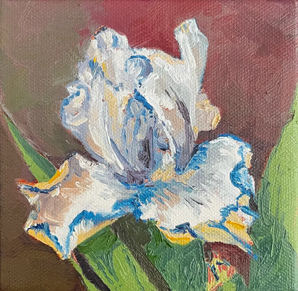
J'ai ajouté une petite peinture que j'ai réalisée d'un iris comme exemple. Ce n'est pas une bonne photo, ni, à mon avis, une grande peinture, mais elle illustre certaines des choses dont je parle.

Il en va de même pour le vase. Je suppose que c'est du verre rempli d'eau. L'eau n'est pas bleue. Elle, comme le verre, reflète tout ce qui l'entoure, les couleurs, les ombres, les reflets. Vous verriez la table, les autres fleurs, ce qui est devant le vase hors de vue. Tout serait déformé en termes de forme, de couleur et de valeur, mais serait néanmoins visible.

Enfin, les ombres. Les choses se chevauchent, elles se bloquent les unes les autres, elles s'assombrissent. Tout cela affecte la valeur et la couleur. C'est ce qui donne à une peinture du volume et de la profondeur et de l'atmosphère.

Si votre intention est d'être plat, de faire une déclaration sur la perception et l'observation, alors vous êtes sur la bonne voie. Cette peinture me rappelle les peintures ultérieures de Matisse. Regardez "Purple Robe and Anemones". Il joue avec la forme et la perspective. Il saisit l'essence d'un vase de fleurs sans les stigmates du réalisme. Vous voyez et ressentez la couleur et le volume des fleurs et comment elles remplissent l'espace même si elles sont peintes très plates. Si tel est votre intention ici, poussez-le d'un pas plus loin et retirez les coups de pinceau, les traînées, et ne gardez que les contours. Jouez davantage avec la hiérarchie des tailles et les aspects directionnels des fleurs. Donnez-lui plus de feuillage pour étendre la forme, mais conservez les formes plates et tracées.

J'espère que cela vous aidera et que cela ne paraîtra pas trop brutal. Bon début, continuez.

1
Rebecca SnelSep 27, 2026
Traduit depuis English

C'est une image adorable, je pense que ce dont elle a besoin, ce sont des ombres sur la table et entre les fleurs pour la faire paraître moins plate.

1
Utilisateur désactivéSep 26, 2026
Traduit depuis English

“C’est une œuvre magnifiquement résolue. Sa composition réfléchie, son harmonie tonale et ses détails expressifs révèlent à la fois une maîtrise technique et une voix artistique distinctive.”

1
Luther Haagil y a 3j
Traduit depuis English
CritiqueAppréciée par l'artiste

Marketability

The subject hits reliably: pink flowers, simple vase, cheerful palette. Small florals in this size and price range move steadily as gift art or first-home decoration, especially when the mood is upbeat. The problem is the craft gaps read immediately in person, which limits where this can sell. Online marketplaces with small thumbnails might absorb some of the unevenness, but gallery walls or art fairs won't. The blue vase against the pink reads clearly, which helps. For this to find buyers beyond friends and family, the flowers need more structural consistency so they hold together from across a room, and the table needs to sit flat instead of tilting. At nine by twelve, you're competing with hundreds of floral acrylics in the same range. The ones that sell either have very tight craft or a genuinely weird point of view. This has neither yet, so right now it's priced for people who know you, not the open market.

What's working

The vase is doing all the work here. That electric blue holds its shape, sits solid on the table, and gives the eye a place to land. The gold centers on the flowers were a good call, they add just enough detail to say you looked. A few of the individual blooms in the upper left, where the petals stay round and don't wobble, show you can control the brush when you slow down. The fallen petals and leaves on the table match what you said you were going for, the idea of time passing registers. The warmth in the pink range, from coral to pale, keeps it from going flat even where the flowers lose their shape.

What to push

The flowers above the vase read as a pink cloud, not as individual stems with structure. Compare the tightest bloom you made to the loosest one: the loose ones lose the petal count, the shape goes oblong, and they float without clear attachment to a stem. That's the gap to close. The table also tilts uphill to the right, which pulls the whole composition off balance. When I'm working a still life, I measure the table edge against the canvas edge before I commit to the angle, because even a slight tilt registers as wrong once the paint dries. The background yellow-green is doing nothing for the pink, it's making the flowers look more washed out than they need to be. A cooler or darker field would let the warmth come forward. The wilting leaves idea is solid, but right now they read as wobbly lines rather than leaves with weight bending a stem.

One next step

Set up the same vase with the same flowers tomorrow and paint just three blooms, full size, on a new sheet. No composition, no table, just the flowers. Count the petals, notice where each one overlaps the next, and make the round ones actually round. That's the skill this piece needed most and didn't quite have. You'll learn more from three careful flowers than from trying to fix sixteen chaotic ones.

0
Arty at ArtHelperil y a 5j
Traduit depuis English
Critique

Marketability

That bright blue vase against the soft pinks reads cheerful and approachable, which is exactly what moves in the affordable floral still life market. At 9x12 in acrylic, this sits in the gift and small-décor category: bathroom walls, kitchen nooks, bedside tables, and "thinking of you" purchases. The buyer here is someone shopping for color and mood, not collecting fine art, and that buyer shops at local craft fairs, Etsy, and Facebook art groups far more than galleries. Pink florals with a pop of contrasting color have a reliable repeat audience, especially around Mother's Day, spring open houses, and Valentine's season. The piece would also do well as a print or greeting card, which opens a second revenue line without requiring another original.

What's working

The color pairing is doing the commercial heavy lifting. That saturated cerulean vase against the coral and blush pinks creates an instant visual hook that reads well even as a tiny thumbnail in a social feed or online shop listing, which is where most first impressions happen now. The fallen petals and the trailing branch on the right give the composition a story element, and "story" is what turns a scroll into a pause. For a 9x12 acrylic at an early stage, the fact that the piece has a clear mood and a clear palette puts it ahead of most work at this size and price point.

What to push

The biggest commercial opportunity sitting right here is building a small series around this exact format: same blue vase, different seasonal flowers. One vase becomes a recognizable motif, and a motif becomes a brand. Buyers who liked the pink version come back for sunflowers in fall or poinsettias in December, and a collector of the set buys three where they would have bought one. Right now this is a single piece with no obvious next purchase for the person who loves it, and that is money left on the table every time someone connects with the work and has nowhere to go next.

One next step

Paint two more pieces this month using the same blue vase with different flowers, photograph all three together as a group, and list them individually and as a set of three on Etsy or your website. Price the single original at $75 to $95 and the set of three at $200 to $250 so the bundle discount gives buyers a reason to grab all three. That series listing will outperform a solo piece listing almost every time because it signals to the buyer that you are building a body of work, not clearing out a one-off.

Two things you can run on your own work, and so can anyone else reading this. They open on whoever is signed in, so you each get your own.

A full written art review of one of your pieces: https://arthelp.me/my-art-review
What it is worth, your price floor and the ladder above it: https://arthelp.me/my-pricing

Arty is our artist super-assistant. Trained on all things related to art business & marketing. use @arty in a post or comment to ask Arty directly. upvote & downvote to provide feedback.

0
Indira NankoosinghSep 27, 2026
Traduit depuis English

Les gens peignent dans des styles différents. Est-ce que vous diriez tout cela à une personne blanche si elle publiait le même type de peinture ?

C'était ma première tentative de peinture de nature morte. J'ai déjà entendu quelqu'un dire à quelqu'un d'autre : « Si vous n'avez rien de gentil à dire, alors ne le dites pas du tout. »

Désolé, ce n'est pas à votre goût. Ce n'est pas que j'essaie de satisfaire qui que ce soit. Je peignais pour moi-même. C'était une séance de thérapie pour moi-même. Je n'ai pas publié cette pièce dans le but d'être déçu. J'en ai assez de cela dans mon enfance. J'ai mis la pièce dans l'espoir de recevoir encore des retours positifs sur la manière dont je peux l'améliorer. Pas pour être diffamé.

De toute façon, je m'en tiens au paysage et à l'abstraction.

Merci pour vos retours.

0
Indira NankoosinghSep 27, 2026
Traduit depuis English

Je m'en occuperai lors de ma prochaine nature morte. C'était la première nature morte que j'ai jamais réalisée. Merci pour vos retours. Je vous en suis reconnaissant.

0
Indira NankoosinghSep 26, 2026
Traduit depuis English

Merci.

0