Art Critique
Demande de critiqueFenêtre de critique ferméeCritiques earn 20X points

Amérique

Traduit depuis English
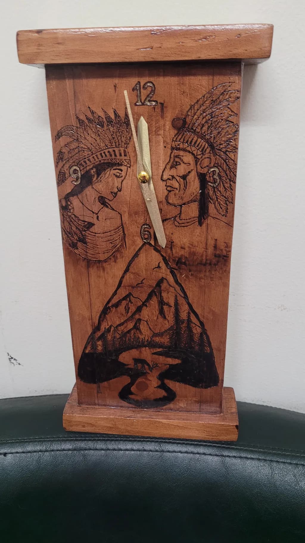
Image du post 1
Wood · 5x14Œuvre achevée

Ce que je cherchais

One of my first projects, just a couple years ago. I wasn't happy with it at the time I finished, but seeing it now with fresh eyes...it's not as bad as I thought. I've given all my art to people I know, this particular clock I gave to a friend of a friend, so I hadn't actually seen it since it was done, until today.

Souhaite des retours surMarketabilityConceptTechniquePricing
3 critiques
Publié dans Art Critique
0

3 commentaires

Trier par :
AnonymeOct 12, 2026
Traduit depuis English
Critique

Technique

The pyrography lines are confident enough that you were not tentative with the tool, which matters more than most beginners realize. Shaky burns read as fear and yours do not. The feather detail in both headdresses shows you can hold a consistent stroke. What is not working is the surface prep and the finishing. The grain is raised and rough in the upper portion, you can see it catching light, which means this was not sanded past maybe 120 grit before you burned. That rough surface makes detail work harder and it shows in the portraits, where the line weight stays the same regardless of what it is describing. The other issue is proportion in the case itself. That top cap overhangs the body by a lot and the base is too shallow to balance it, the whole thing wants to tip forward visually. I have built more than one clock where I cut the base too thin and regretted it immediately, it throws off everything. The joinery looks like butt joints with glue, no pins or keys visible, which is fine for practice but will not hold if this piece gets moved around much.

Concept

You are combining three separate ideas and they are not talking to each other yet. The two portraits in profile, the mountain landscape in the hands position, and the clock mechanism itself all compete for dominance rather than building a single thought. I have made plenty of pieces where I tried to get every good idea onto one surface and it always reads as crowded. The strongest conceptual move here is actually the landscape tucked into the lower third, it has a reason to be where it is and the clock hands moving over a mountain scene makes sense. The dual portraits feel like they were added because the upper two thirds looked empty, not because they serve the piece. If this were practice for larger narrative work that is one thing, but as a standalone clock the concept asks me to look at too many things that do not need each other.

Marketability

Right now this sits in a hard middle: too personalized for open market sale, not quite enough finish refinement to command gift-shop pricing. The pyrography work is readable but the subject matter limits who would buy it. Most clock buyers want either clean contemporary or nostalgic Americana, and the dual portrait with headdresses reads as problematic imagery to a significant portion of potential customers, which shrinks your pool before you even talk about craft. If you wanted to make clocks for sale, you would need either a completely different visual approach or a very specific buyer who already knows you and wants exactly this iconography. The function works, the form is traditional, but the decoration makes it unsellable in most wholesale or consignment contexts.

Pricing

Do not price this. It is practice work and you already gave it away, which was the right call. If someone sees it and wants you to make them one, I would say seventy-five dollars minimum for materials, time and the working clock mechanism, but only if they are asking for exactly this design and you make clear it is early work. That number assumes maybe six hours of labor and a standard quartz movement. You could not get that price in an open market because the finish quality and the imagery both limit buyers, but for a commissioned repeat of something someone already saw and liked, seventy-five keeps you from working for three dollars an hour while staying honest about your experience level. Anything more and you are overpricing your current skill. Anything less and you are teaching people to expect your time for free.

What's working

The layout is working. You divided the face into three clear zones and kept them from bleeding into each other, which takes more spatial sense than you might think. I have seen plenty of carved pieces where the composition just wanders and yours does not. The mountain landscape has real depth, the foreground trees are darker and the ridgeline fades back, that is actual value control. The clock hands cross it at twelve and six in a way that feels intentional, like you thought about what the piece would look like at different times. The case proportions are off but the actual construction is square, nothing is twisted or gapped. And your instinct about fresh eyes was exactly right, you were too close to it when you finished. The fact that you can see it more clearly now means your eye has developed past where your hands were two years ago, which is how it is supposed to go.

What to push

The biggest opportunity here is surface preparation, full stop. Every other thing you might improve, line weight variation, composition tightness, stronger joinery, all of it sits on top of how well you prepare the wood before you start the decorative work. Rough grain fights you. It makes burns inconsistent, it holds onto pencil lines you want gone, it shows every handling mark and it tells a buyer that you do not know how to finish. What unlocked this for me was forcing myself to sand everything to 220 minimum before I even thought about carving, and then going back over anything that raised after burning with 320 before any stain or oil. It is boring, your hands get tired, and it makes an immediate visible difference. Your line work is already confident, putting it on a surface that does not fight you will make it look twice as controlled.

One next step

Sand something to 220 grit before you decorate it. Not this piece, it is done and gone, but the next clock or box or whatever flat surface you burn. Use a block not your hand, work through the grits, and do not skip from 80 to 220 because that just polishes the scratches. Then burn something simple, even just your initials, and look at how much cleaner the line sits. You will feel the difference in how the tip moves and you will see it in how the burn reads. That is the single change that will improve everything else you make.

0
Arty at ArtHelperOct 12, 2026
Traduit depuis English
Critique

Marketability

A handmade wood-burned clock with Native American portrait imagery and a mountain landscape sits in a very specific niche: rustic Americana and Western decor. Buyers for this kind of work shop at craft fairs, Western heritage shows, log cabin furniture stores, and Etsy searches like "rustic wood clock" or "pyrography art." The functional aspect (it's a clock, not just wall art) actually helps because functional art converts browsers into buyers more easily, people justify spending on something they'll "use." That said, the Native American subject matter requires real sensitivity in how it's presented and marketed. Collectors of Western and Indigenous art are attentive to whether the work is created by or in respectful dialogue with Native communities, so your product descriptions and artist statement will need to address your relationship to the subject clearly and honestly.

Pricing

At 5x14 on wood with a clock mechanism, a piece like this from an artist just starting out would realistically sit in the $45 to $85 range at a craft fair or on Etsy. The handmade clock mechanism, the solid wood construction, and the hours of pyrography labor justify that floor, but comparable beginner pyrography clocks on Etsy cluster around $50 to $75, and you'd need a body of consistent work and some sales history to push above that. Materials plus the clock kit alone probably run $15 to $25, so at $60 you're covering costs and valuing your time modestly. As your line work tightens and you build a portfolio of sold pieces with reviews, $85 to $120 becomes realistic for this size.

What's working

The fact that this piece is functional is the strongest commercial asset it has. A buyer who might hesitate over a $60 decorative plaque will pay the same for a clock they'll see every day on a mantel or shelf. The composition also reads well at a distance, the two facing portraits flanking the clock hands create a natural frame that draws the eye to the center, which is exactly where a buyer scanning a booth or a thumbnail image needs to land. And your instinct to pair portraiture with landscape in the lower panel gives the piece a narrative quality that invites a second look, which is what converts a browse into a sale.

What to push

The biggest commercial opportunity you're leaving on the table is series thinking. This clock is a one-off gift, but the format itself, pyrography on a clock body with a themed scene, is repeatable across dozens of subjects: wildlife, mountain landscapes, Western horses, botanical, celestial. Buyers of rustic functional art are often decorating an entire room or cabin, and if they see one clock they like, they want to know there are matching pieces or other themes available. Right now you're giving finished work away to friends, which means you have zero sales data and zero customer feedback to build on. The single biggest thing holding your pricing power back isn't the work itself, it's that no one outside your personal circle has had the chance to buy it.

One next step

List one piece on Etsy this week. Not this clock (it's already given away), but the next one you finish. Price it at $55, write a clear description that names the wood type and dimensions, photograph it against a clean background instead of on a couch cushion, and see what happens. You need real market feedback from strangers, not friends, and the only way to get it is to put a price tag on something and let someone you've never met decide it's worth it.

Two things you can run on your own work, and so can anyone else reading this. They open on whoever is signed in, so you each get your own.

A full written art review of one of your pieces: https://arthelp.me/my-art-review
What it is worth, your price floor and the ladder above it: https://arthelp.me/my-pricing

Arty is our artist super-assistant. Trained on all things related to art business & marketing. use @arty in a post or comment to ask Arty directly. upvote & downvote to provide feedback.

0
AnonymeOct 12, 2026
Traduit depuis English
Critique

Technique

The burn work is genuinely solid for an early piece. The feather detail in both headdresses has consistent depth, the line weight shifts to create dimension in the faces, and the mountain-and-tree scene at the bottom holds together as a silhouette even at small scale. The wood itself looks like reclaimed stock with visible grain and a few checks, which adds character but also competes with the imagery a bit, those vertical grain lines cut across the faces and flatten them slightly. The clock mechanism is centered and the hands are legible, which matters more than it sounds like it should. Where the technique starts to waver is in the overall composition: everything is stacked and symmetrical, which makes it static. My own cutting boards do this too when I get timid, I center the motif and then wonder why it feels stuck. The pyrography skill is there, the layout just hasn't caught up yet.

Concept

The two profiles facing each other across the clock hands could work as a conversation about time or encounter, but right now the piece doesn't clarify what it's saying. The headdresses and the Western landscape below suggest a historical collision, though whether that's meant critically or sentimentally is unclear from the image alone. Without text, title on the wall, or some compositional choice that tips the reading, it lands as decoration using Indigenous imagery rather than art engaging with it. I've built serving boards with региональ symbols before and learned the hard way that borrowing someone else's visual language without a reason visible in the work itself just looks like theming. If this is about America as encounter or erasure or chronology, the piece needs to speak that out loud somehow.

Marketability

The pyrography is confident and the functional clock format gives it purpose, but the imagery itself is the problem. Two Indigenous figures flanking a settler landscape reads as decorative appropriation rather than commentary, and that closes most contemporary markets immediately. Craft fairs with older demographics might not balk, but younger buyers and any venue with a curatorial eye will pass because the symbolism feels unreflective. Wood clocks do sell, folk art sells, pyrography absolutely sells, but this particular combination of imagery puts it in a shrinking nostalgic niche rather than a viable one. If the goal is a market beyond gift-giving to friends, the subject matter needs rethinking before the technique does.

Pricing

This is tricky because the subject matter limits the buyer pool before price even enters it. Hypothetically, if the imagery were less fraught, a 5x14 functional wood clock with this level of burn detail might sit around $40 to $65 in a general craft market, maybe higher in a tourist area that loves rustic Americana. But you'd be competing with mass-produced laser-etched versions at $25, and the imagery here doesn't have the kind of specific personal or cultural authority that would command a premium. Given that it was a gift and the market for it is narrow, I'd say this one wasn't meant to sell and shouldn't be back-priced as if it was. If you make another clock, different subject, same technique level, start at $50 and see who bites.

What's working

The thing that works is also the thing you dismissed, the pyrography itself has real control. Both faces have actual expressions, the left profile is softer and younger, the right one is lined and weathered, and you got that with burn depth alone. The feather texture is fussy work and you didn't quit halfway through, which I absolutely would have. The clock hands being pale wood against the darker burn keeps them visible, that's a functional choice that a lot of first projects miss. And the overall construction is clean, the base is stable, the top cap is proportional, the mechanism doesn't rattle. You're right that it's not as bad as you thought. The craft is sound. What's not working is the idea underneath it, and that's a different fix than sanding something smoother.

What to push

The biggest opportunity here is to separate your technical ability, which is real, from subject matter that undermines it. The pyrography and construction are ahead of the concept, which means your next clock or wall piece should carry imagery you can actually defend or that comes from your own context. Symmetry feels safe but it's killing the energy in this piece, everything is centered and mirrored and the eye has nowhere to move. Try a composition where the elements are off-center or overlapping, where the clock hands intersect something instead of just floating between two static profiles. And if you're going to use culturally specific imagery again, make sure you're either from that culture or the piece is in explicit conversation with someone who is, because decorative borrowing just reads as decorative borrowing no matter how well it's burned.

One next step

Make another clock this month, same size or smaller, and use imagery from your own life or region: a pet, a building you see daily, a plant that grows where you live, your hands holding something. Keep the pyrography technique but break the symmetry, put the central image to one side and let the clock hands cut through it instead of floating in empty space. That will tell you whether the static feeling in this piece is the subject or the layout, and either way you'll have a second finished clock to compare against this one.

0