Demande de critique19j restants pour les critiquesCritiques earn 20X points
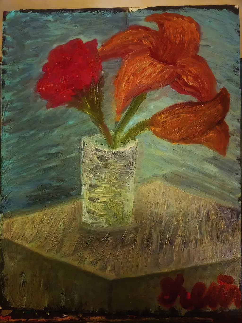
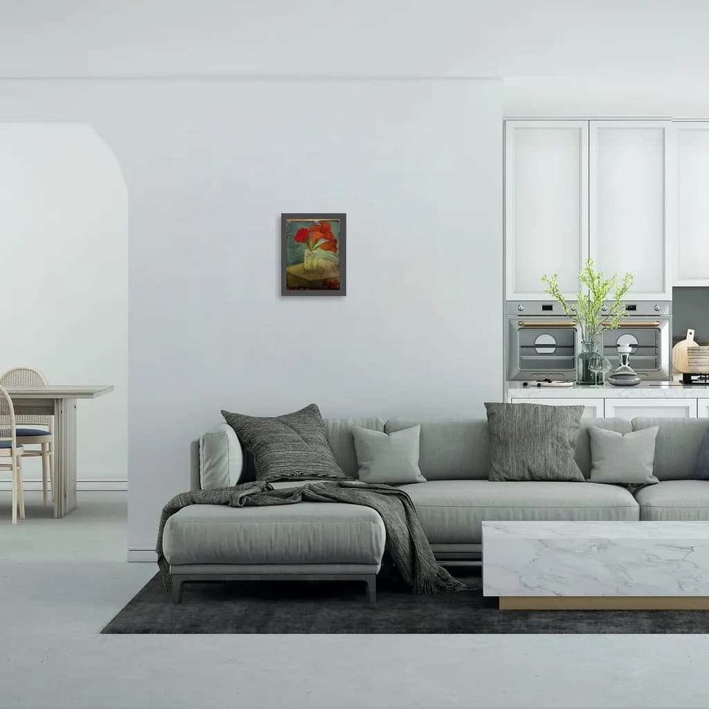
Des lis roses avec des tulipes
Traduit depuis English
1/5
Oil on canvas panel · 11x14Œuvre achevée
Ce que je cherchais
I wanted to capture the intensity of red and orange and the impact such vibrant colors have when mixed into a sterile minty clean environment. The way colors and light shows through a thick handcrafted glass and the way shadows in the corner of a room show depth. The power of purposeful and directing brushstrokes.
Souhaite des retours surConceptTechniqueMarketability
3 critiques
Publié dans Art Critique
1
Technique
I don't work in oil, so I'm reading this for what the marks are doing, not judging the medium itself. The thick, swirling strokes on the petals carry real energy, especially the big orange bloom at upper right where the direction changes inside the form. The vase has good sculptural weight from those vertical scrapes of paint. What's costing you right now is value control. The blue-green background, the table, and the wall behind the flowers all sit in a very narrow middle range, so the flowers float instead of sitting in a room. The shadow under the vase barely separates from the table. When I look at something to paint, I squint first to see where the darks actually go, because it's easy to think a room is evenly lit when it isn't. Your brushwork has authority. The values need the same confidence.
Concept
The concept statement you wrote is doing real work. You named intensity, impact, sterile-versus-vibrant, and directing brushstrokes, which are all visible choices in the piece. The flowers do command the space, that minty-blue wall reads as clean, and the thick paint on the vase and the table sells handmade texture. What I'm not seeing is the shadow depth you mentioned. The corner behind the vase stays flat, same value as the rest of the wall, so the "depth in the corner of a room" part of your concept didn't make it to canvas. That's not a problem with the painting, it's just a gap between what you said you were after and what the piece actually does. The vibrant-in-sterile idea came through. The spatial recession didn't.
Marketability
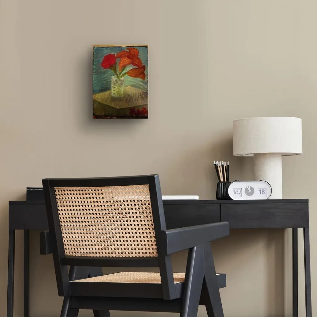
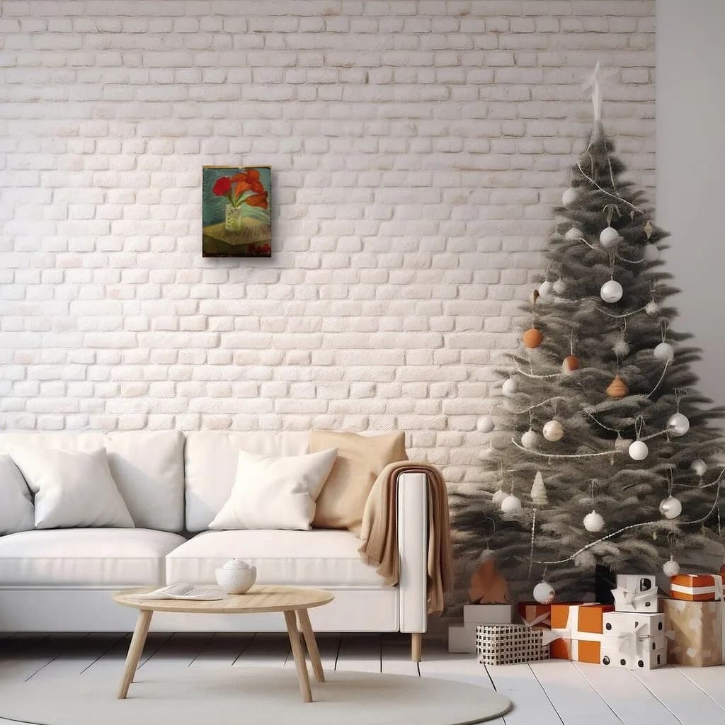
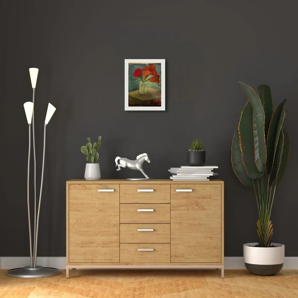
This is a familiar subject in a size that fits domestic spaces, which gives it a practical edge for someone browsing a shop. The color palette is warm and accessible. What's working against you is finish consistency. The edges of the canvas panel show raw, unstained wood, and the paint thins out at the borders, which makes the piece read as a study rather than a resolved work intended for sale. A buyer seeing that in a shop assumes it's not finished or it's practice. If this is headed to print, the rough edges won't transfer, but the flatness of the space will. Prints need to hold up at a distance and close, and right now the lack of a dark anchor (a real shadow, a defined background corner, something to ground the table) means it might feel washed out in reproduction. For a physical sale, you'd need to finish the edges or frame it. For print, you'd need more tonal range to survive the translation.
What's working
The orange flowers are doing exactly what you wanted them to do. They pull focus immediately, the stroke direction inside each bloom makes them feel constructed rather than daubed, and the shift from red to orange to rust across the group gives them individual presence without scattering attention. The vase works. Those vertical marks with the palette knife or stiff brush give it dimension and that handcrafted-glass feel you named. The table's diagonal brushstrokes create movement, which keeps the lower third from going dead. You've got a strong instinct for where to put energetic paint and where to let it go quiet. That's not a beginner move.
What to push
The biggest opportunity here is to take the spatial idea you already have in your head and give it actual paint. You said shadows in the corner show depth. Paint them. Right now the wall is one value all the way across, so there's no corner, no room, just a flat backdrop. Darken the upper left and lower right corners, even slightly, and suddenly the flowers sit inside a space instead of in front of a screen. The same applies under the vase. That shadow needs to be darker than the table and softer-edged than the vase itself, or the whole arrangement keeps floating. You don't need to repaint the piece. You need to add ten brushstrokes in the right places and the spatial claim you made in your concept will actually show up. The piece is almost there, it's just waiting for you to commit to the darks.
One next step
Mix a dark that's blue-green but deeper than anything currently on the canvas, and put it in the upper left corner where wall meets wall. Let it fade toward the center but stay visible. Then take the same color, add a little brown to warm it, and paint the shadow under the vase so it's clearly darker than the table. Two small additions, same session if you want. That will give the piece the depth your concept already named, and it'll make the flowers sit in a room instead of on a poster.