Work In Progress

Resplandor de Invierno - Óleo sobre lienzo (2da en una serie) ¿Qué puedo hacer para mejorar esto?

Traducido de English
Imagen del post 1
Imagen del post 2
1/2
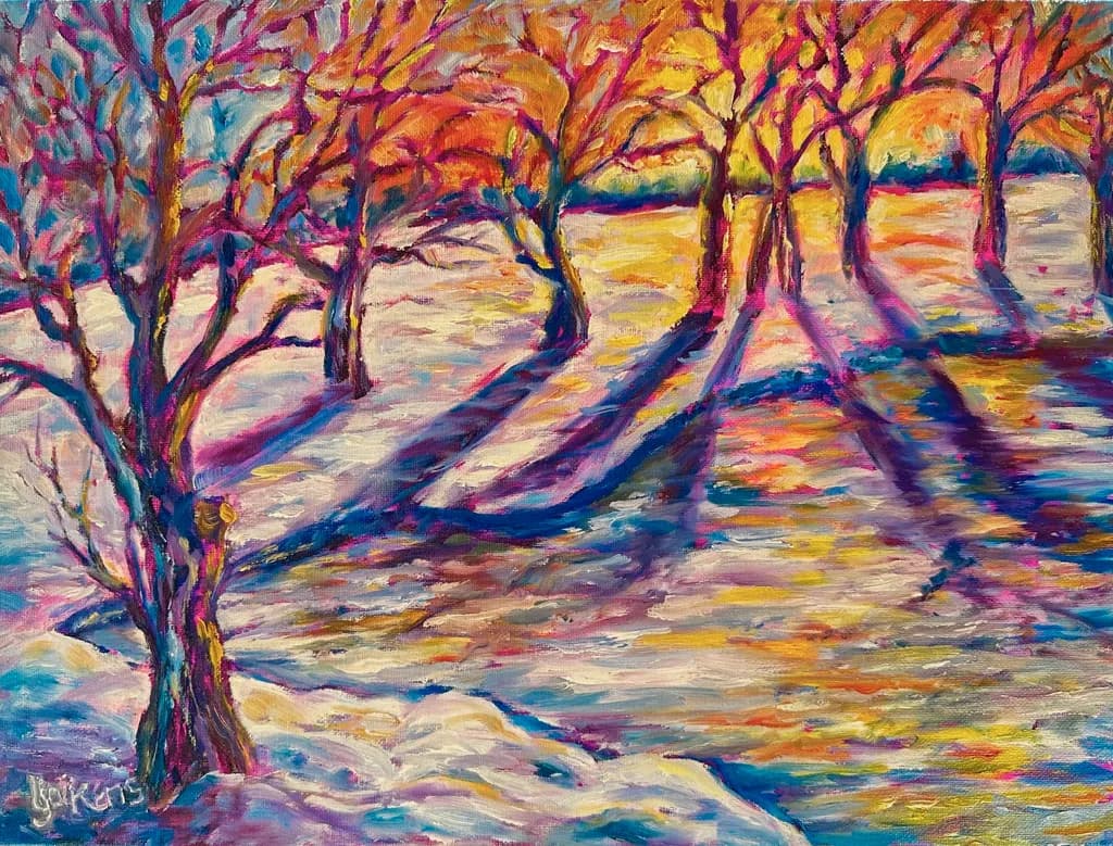
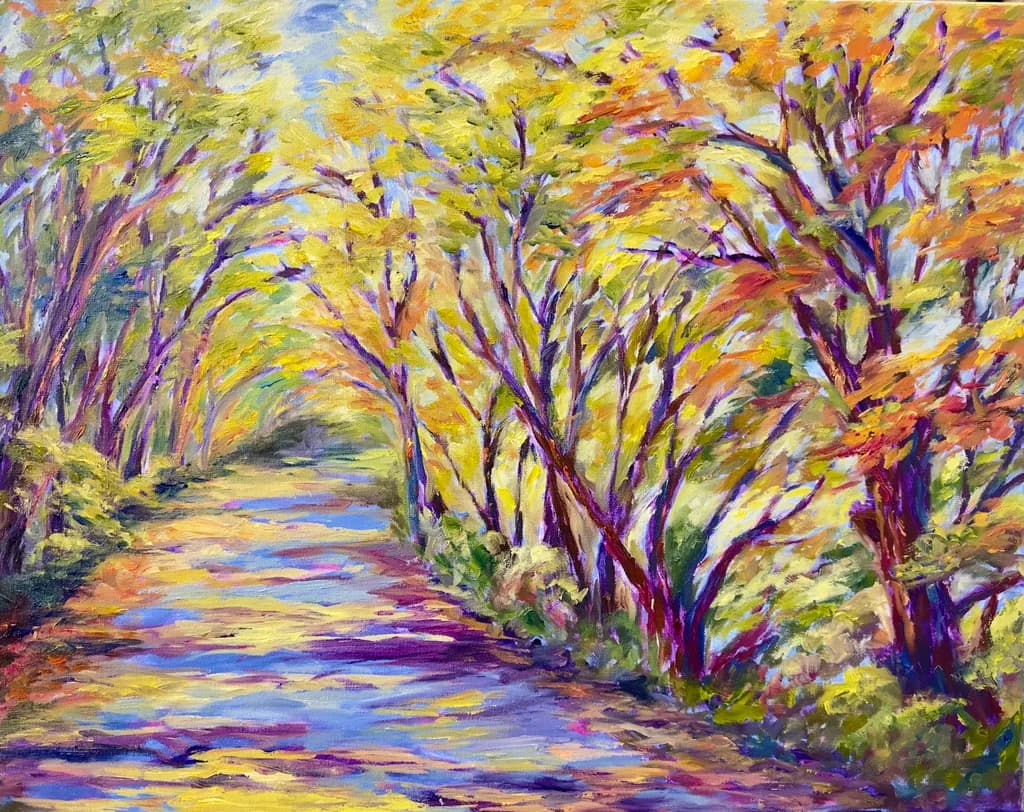
He estado trabajando en un nuevo estilo (impresionismo suelto y abierto) y quiero preparar varias piezas para una exhibición en unos meses. Resplandor de Invierno es mi segunda obra. La Sirena Amortiguada de Otoño es la primera de la serie. Es curioso cómo a veces se ven mejor tus errores en una foto que en la vida real. Veo que necesito darle un pequeño golpe/doblado a las sombras de los árboles justo en la línea de la orilla. También me pregunto si debería intensificar el tono azul en el lago helado cuando la pintura se seque (la pinté hoy). ¡Gracias por cualquier comentario sobre aspectos fuertes y mejoras a hacer!
8

14 comentarios

Ordenar por:
Indra CastilloMar 23, 2026
These are spectacular! You really managed to convey that "last days of winter" feeling. I think I would add a tad more warmth to the first image, so it makes me feel that the ice is melting. Also, I think the tree shadows are too straight. The trees are bent and inclined, the straight line shadows make me feel they are a separate element rather than an effect of your awesome light work
1
Thank you, Indra! Just yesterday, when I was adding more tree branch shadow, I also curved some of the trunk shadows to match the trees. I also added some more warmth. I feel happy that I all of your comments are confirming I am better seeing my mistakes and correcting them. Thank you, thank you!
0
I love working on a series, its difficult, but as each one is created what you learn is so deep. learn about your craft, yourself and more importantly how to put paint on the canvas and use accidents, random marks to create a piece. I once had 30 pieces in a series, and carry what i learned.

Color in both are superb and delicious. the lines are expressive.

I love the second one better. I think its more congruent. I'm not sure of what i mean, but the perspective reads more calm, the lines of the trees and water or path flow together with perspective. I have to say I loved the first one, but then saw the second. then I compared and noticed that the shadows of the trees seem off, not the right angle and in the foreground there is none.

i think you are on your way into expressioonism if you will, but I've said too much.
Understand, I am judging it from my perception, intellectual rules I use when creating a more realistic image and painting. To reiterate, i loved this until you asked for me to be critical.
1
Thank you so much, KB! I truly appreciate when others offer both sincere reactions and honest critiques. It's funny, I just wrote in my blog to this very thing...my penchant for color and expressing emotion at the expense of simple intellectual rules (perspective for example), so eager am I to get the former out! My wacky perspective has become almost a trademark of my artwork! lol My artist mother always tells me that Cezanne and VanGogh had terrible use of perspective too and look where that got them! Yes, I see my art moving more toward expressionism in this way too. Also funny, just yesterday, I'd added in more foreground shadowing of the tree branches, as I saw it more in the photo than in person! Thank you, thank you!
1

i'm glad you aren't offended. if i say anything its because the piece moves me.

0

Thank you, and no worries! You'll laugh, but my reknown artist mother called me yesterday and said, "Linnie, you have a marvelous command of color, but before I die, I am determined to teach you how to use perspective correctly in your artwork!" and she proceeded to go through my paintings and offer me just that! I thought of you and laughed! (but grateful to you and my mom!)

0

About your mom. that is funny. Glad your mom is so engaged with your art.

0
Nikola BozilovicMar 20, 2026
I like these colors!! I'm actually a bit torn on adding more blue to the lake on the second one, it's so warm and radiant right now that the current tones feel really unique for a winter piece 😊
1
Thank you, Nikola. I so appreciate your thoughts. Yes, now that I've observed the painting throughout the day and evening, I like the purple that actually turns warm in the daylight, but then cools down in the late afternoon, evening. I love that when paintings take on a new feeling/mood at different times of the day! (A happy accident maybe!!) I think I'll go light on the blue, just emphasizing the line of the lower shore and at the base of the trees a bit more.
1
Nikola BozilovicMar 21, 2026
That's a great idea!! 😊
0
William PalmMar 20, 2026
I love the balance of warm and cool colors in this winter paradise. The yellows and oranges really radiate a glow of light. Fantastic so far...if anything, you have a path from the mid right to the left behind the first tree, I might emphasize it a bit more...but that's just my taste.
1
Thank you so much, William! I agree with your suggestion and will do that!
1
GinMar 23, 2026
I love how warm you make a cold day look in the first one. On the second, the only critique I have is that my eyes can't decide if the middle path is water or not because of the blue.
0

Thank you Gin. I hadn't thought of that, but on second thought, I am not sure it matters because I really like the blue! I think I'll just let the viewer see what he/she wants to see. (For what it's worth, it was a pathway originally. I think I would have made it more winding with rocks if a river.) Thank you so much for taking the time to comment!

0