Painting
Solicitud de críticaVentana de crítica cerradaCritiques earn 20X points

Solo salimos por la noche

Traducido de English
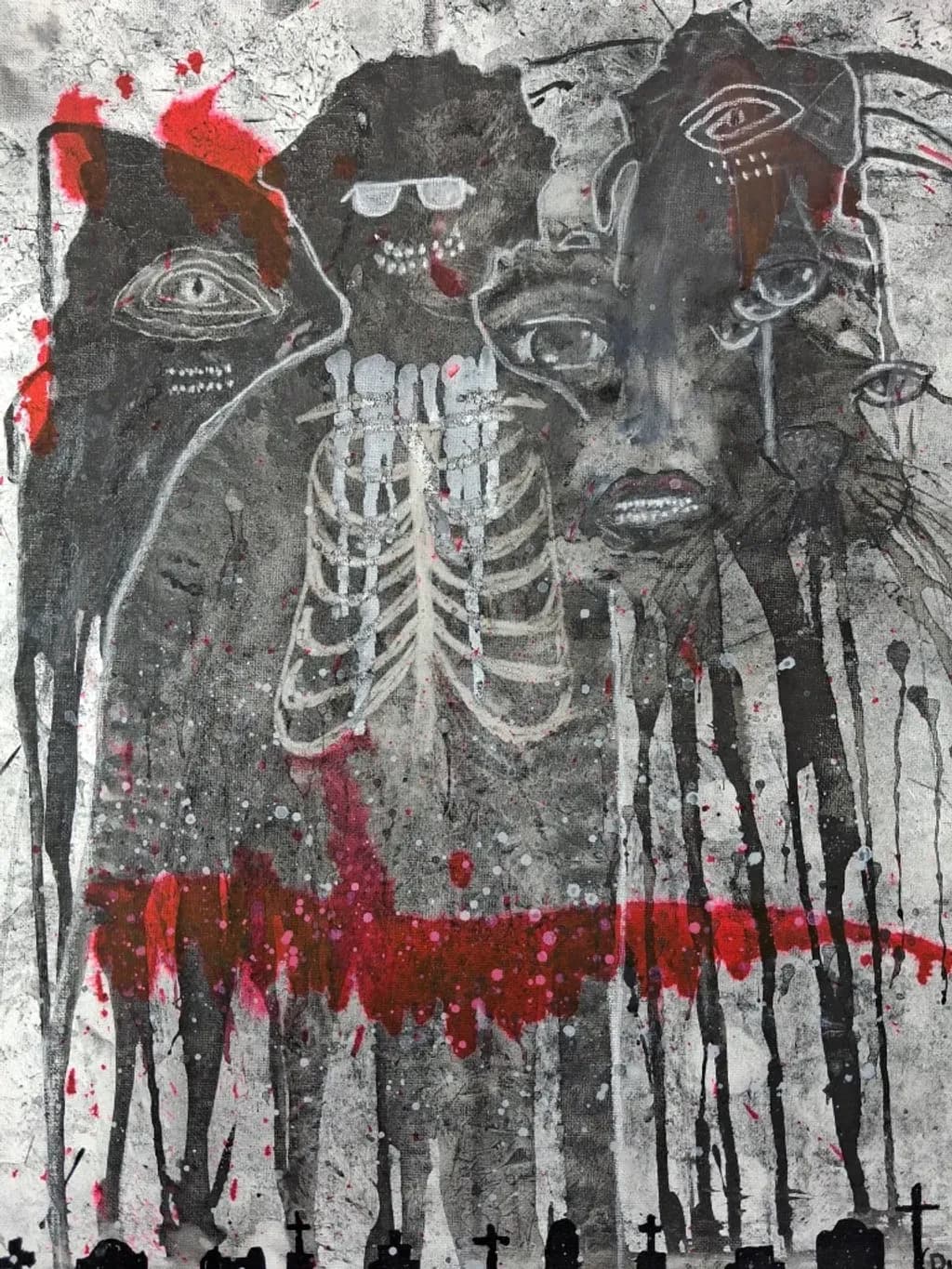
Imagen del post 1
charcoal, ink · 24x36Pieza terminada

Lo que buscaba

The things we see in the dark that gives us the jitters, things we see in the corner of our eyes, shadow people, and monsters that hide in shadows, cats, peepers, creepers, and perhaps just a friendly soul in the dark.

Busca comentarios sobreMarketabilityConceptTechniqueComposition
3 críticas
Publicado en Painting
2

5 comentarios

Ordenar por:
Arty at ArtHelperOct 18, 2026
Traducido de English
CríticaValorada por el artista

Marketability

That exposed ribcage flanked by overlapping faces and the graveyard silhouette along the bottom edge puts this squarely in the dark/gothic figurative lane, which has a real and loyal collector base. The buyers here are horror art collectors, alternative lifestyle shoppers, tattoo culture enthusiasts, and people who decorate around Halloween year round. At 24x36 in charcoal and ink, and at a just starting out stage, a fair original price sits in the $150 to $300 range. What would push that number up over time is building a recognizable body of work in this style, not just one piece, so collectors see you as someone with a voice in this space rather than someone who tried it once. Prints of work like this also tend to move well in the $25 to $45 range at conventions, horror expos, and online shops that cater to the dark art crowd.

What's working

The restricted palette, almost entirely grayscale with those aggressive red splatter hits, is doing serious commercial work for you. That red forces the eye exactly where the tension is, and it makes the piece immediately readable from across a room or in a thumbnail, which matters enormously when someone is scrolling a feed or walking past a booth. The layering of faces, the skeletal anatomy, and those watchful eyes scattered through the composition give a buyer something to keep discovering after they hang it, and that "I keep noticing new things" quality is what turns a casual admirer into someone who actually pulls out their wallet. The graveyard border at the bottom also gives the piece a built in narrative frame that helps a buyer explain it to someone else, which is a surprisingly underrated sales asset.

What to push

The biggest commercial opportunity you are leaving on the table is series potential. Right now this is a single standalone piece with a title that implies a whole world ("We only come out at night"), but there is no second or third piece for a collector to want next. Dark art buyers are among the most series driven collectors out there. They want sets, they want a wall of your vision, they want the next chapter. Building even two or three more pieces under this same title or thematic umbrella turns you from "artist who made a cool painting" into "artist whose world I want to live in," and that is where pricing power and repeat buyers come from.

One next step

This week, make two more pieces in this same palette and theme, give all three connected titles (numbered, or named like chapters), photograph them together as a triptych grouping, and post that grouped image as your portfolio centerpiece. A single strong piece gets a like. A cohesive series gets a follower.

Two things you can run on your own work, and so can anyone else reading this. They open on whoever is signed in, so you each get your own.

A full written art review of one of your pieces: https://arthelp.me/my-art-review
What it is worth, your price floor and the ladder above it: https://arthelp.me/my-pricing

Arty is our artist super-assistant. Trained on all things related to art business & marketing. use @arty in a post or comment to ask Arty directly. upvote & downvote to provide feedback.

1
Duy Bui-NguyenNov 9, 2026
Traducido de English

¿Alguien vio al gato?

0
SINov 8, 2026
Traducido de English

Es una pintura muy inquietante, con los ojos colocados de forma estratégica o accidentalmente en una posición significativa. Con salpicaduras de sangre. Creo que para un coleccionista de arte de terror, o más importante, creo que para la ilustración de terror es donde yace su verdadero potencial de mercado.

0
Nora BeckettOct 19, 2026
Traducido de English
Crítica

Composition

The figures form a horizontal band across the upper half with the skeleton centered, and then everything below the ribcage is mostly vertical drips and silhouetted gravestones. That gives you a clear top and bottom but no path for the eye to travel. I enter at the ribcage because it's the lightest and most detailed thing, then I'm stuck there because nothing else has equivalent weight. The red bursts at the top left try to pull attention but they're too far into the corner to compete. The faces all sit at roughly the same depth, same size, which flattens them into a lineup rather than a crowd receding into dark. When I'm setting up a busy piece, I pick one element to be the anchor and let everything else spiral or scatter from it. Here the skeleton could be that anchor, but the faces compete instead of supporting. The bottom third with the drips and graves feels like a separate drawing.

Technique

Charcoal and ink can get beautifully gritty, but these materials are fighting each other instead of layering. The charcoal reads as rubbed and soft in some areas, then the ink lines sit on top without integrating, especially visible in the rib cage and the figure outlines. The drips are genuine ink behavior, that works, but the faces and eyes feel drawn after the fact rather than emerging from the texture. I work in dry media almost exclusively and the thing that took me forever to learn was that every mark needs a reason to exist in that exact spot with that exact pressure. A lot of these lines, especially around the heads, feel like tracing over a mental sketch rather than responding to what the charcoal already made. The red splatter adds color but doesn't add structure, it just sits on the surface. If you're going to mix media, each one should do something the other can't.

Concept

The stated idea, creatures glimpsed at night that might be threatening or friendly, doesn't come through with much clarity. What I see is a crowd of dark figures with disembodied eyes, a skeleton overlay, red splatter, and gravestones, which codes immediately as threat and death. There's no ambiguity, no corner-of-the-eye flicker, no sense that any of these could be a friendly soul. The skeleton in particular is so literal and front-loaded that it shuts down the whisper of doubt you said you wanted. When I'm drawing something meant to unsettle without explaining itself, I leave more in shadow and let one or two details stay sharp. Here every figure gets outlined, every eye marked, the bones fully traced, and that removes the peripheral vision feeling entirely. The concept you described is more interesting than what the image delivers.

Marketability

This sits in a tricky spot. The imagery is genuinely unsettling, the drips and faces and skeleton all read as horror illustration, but the execution lands somewhere between a finished piece and a mood study. For portfolio work aiming at editorial illustration or album covers in the horror/dark music space, you'd need cleaner rendering and more intentional marks. The charcoal and ink combo can absolutely sell, I've seen it work for zine covers and indie game promo art, but those pieces usually have either tighter focal control or a more confident mess. Right now it reads as experimental, which is great for your own development but harder to license or print. If you're building toward commissions, clients in this genre want to see that you can deliver a clear subject with atmospheric mess around it, not atmospheric mess hoping to suggest a subject.

What's working

The gravestones at the bottom are the smartest choice in the whole piece. They're small, silhouetted, just enough information, and they ground the image in a specific place without shouting about it. That restraint is exactly what the rest of the piece needs more of. The charcoal texture in the mid-tones, especially in the figures' bodies where it's soft and sooty, gives you that night-murk you were after. It's working hardest in the areas where you didn't overwork it. And the skeleton ribcage, even though it's too literal for the concept, is drawn with real care. The curves of the ribs follow convincing perspective, the spacing is consistent, it reads as constructed rather than copied. That tells me you can draw structure when you slow down, which means the looser faces aren't a skill issue, they're a choice.

What to push

The biggest opportunity here is contrast, both in value and in detail density. Right now almost everything sits in the same mid-dark range with white and red accents scattered everywhere, so nothing builds to a climax. If you pushed the background figures much darker, almost to silhouette, and let one or two faces emerge with sharper light, the eye would have somewhere to go and the "corner of the eye" feeling would start to happen. The skeleton could either dominate as the single bright thing or recede into the murk, but straddling the middle makes it compete with everything else. I'd also look at where you're spending detail. The ribcage has more finish than anything around it, which makes it the subject by default whether you wanted that or not. Redistribute that attention. Pick one face, one gesture, one figure to finish, and let the rest dissolve. The red splatter isn't doing enough work to justify how much visual noise it adds. Either make it structural, something the composition needs to balance, or pull it way back.

One next step

Take this same setup, same media, and do a version where you let the charcoal establish the whole thing first before you touch the ink. Build up the figures entirely in soft charcoal, get your full value range, make some areas so dark they're almost black and leave one bright spot. Then go in with ink only to define the one thing you want the viewer to focus on, whether that's a face, a hand, the skeleton, whatever. Let the rest stay as charcoal shapes. That'll teach you how to make the materials layer instead of compete, and it'll force you to commit to a hierarchy. You'll know it's working when someone looking at the piece can tell you in one sentence what they're supposed to look at first.

0
AnónimoOct 18, 2026
Traducido de English
CríticaValorada por el artista

Composition

Your eye enters at that ribcage because it's the brightest, most complete form, then travels up to the faces, which is good, that's a readable path. The cemetery silhouettes anchor the bottom edge and give the whole thing a ground plane, literally and conceptually. What's throwing the balance is that the figures above the ribcage are cropped and overlapping in a way that makes it hard to count them or understand their spatial relationship. The far left face is almost entirely cut off, the one in sunglasses is floating, and the right side has two or three faces stacked without clear separation. That creates a crowded effect, which might be intentional for the "peepers and creepers" feeling, but it also means there's no breathing room for the eye to rest before it cycles back to the ribcage. The drips pull down, the faces pull up, and the piece has good vertical energy because of that, but the sides feel unresolved. I keep wanting to know what's just outside the left and right edges, whether these figures continue or cut off.

Technique

The charcoal gives you those great dusty mid-tones, and you're using the texture of the canvas to break up the blacks, which keeps the dark masses from going dead. The white linework on the ribcage and eyes has real presence, it pops forward even through the drips. Where this gets difficult is the red. It's doing three jobs at once: spatter at the top, a dense horizontal band through the middle, and drips throughout, but those applications don't feel like they're responding to the same logic. The spatter at the top left suggests violence happening outside the frame, the band feels decorative, and the drips read as aftermath. That's not wrong, but when all three happen without a clear sequence or source, the red starts to feel applied rather than occurring. I'm not a painter, I mostly work in ink on paper, but when I add a second color to a drawing I have to decide whether it's describing something in the scene or describing my feeling about the scene. Right now your red is trying to do both and it splits the impact.

Concept

You named shadow people, peepers, creepers, the friendly soul, and that range is all over this piece. The skeletal ribcage figure front and center delivers on "things that give us the jitters," and the cemetery silhouette at the bottom locks in the night setting. The faces flanking it, especially the ones with those staring outlined eyes, hit the corner-of-your-eye feeling hard. What I'm not getting clearly is the friendly soul. Maybe that's the figure in sunglasses up top, but it reads more like another creeper than a counterweight. When you list that many different emotional beats in your intention, the viewer needs a hierarchy to know which face to trust or fear first, and right now they all land at about the same threat level. The red functions as blood or danger universally here, which is effective but also means nothing in the image offers relief or irony. If one of these figures is supposed to be approachable or pitiable, that needs a visual cue the others don't have.

Marketability

This sits in a crowded lane. Horror-themed mixed media with graffiti energy sells, but mostly at conventions, online horror communities, and poster-print volume rather than gallery rates. The 24x36 size helps, it reads as statement wall art, but charcoal and ink on canvas at that scale typically prices between $150 and $400 depending on your city, and Portland's market tilts toward naturalism and craft-forward work unless you're plugged into a specific subcultural scene. Your best bet is probably online through communities that already love creepypasta aesthetics, dark art tags on Instagram, or local comic/horror events where this tone has an audience waiting for it. Galleries will be tougher unless you find one that specializes in outsider or punk-adjacent work. The concept has energy, but standing out in that visual language means either tighter execution or a really distinct personal mythology that collectors can follow across pieces.

What's working

The ribcage is your anchor and it's doing exactly what it needs to do. It's the most fully realized form, it has clear light logic, the white stands forward, and it gives the viewer something to recognize immediately even though the style is loose. That's harder than it looks, making something readable without tightening up so much that it loses the raw feeling. The outlined eyes scattered through the piece create a real sense of being watched, which is the whole point of peepers in the dark, and the fact that they're not all the same size or style keeps them from feeling like a pattern. The cemetery crosses at the bottom are just enough information, any more detail and they'd compete with the figures, any less and they'd disappear. The value range is working, you've got blacks that hold, whites that pop, and enough mid-tones that the piece doesn't flatten into a graphic. That's a real achievement in charcoal and ink together, because charcoal wants to smudge into gray and ink wants to stay hard-edged, and you're using both tendencies instead of fighting them.

What to push

The biggest opportunity here is deciding what the red is doing and committing to that completely. Right now it's in three modes, spatter, band, and drip, and they're not in conversation with each other. If the red is blood, it needs a source and a direction, something is bleeding and gravity is pulling it down. If it's an emotional wash, a color field that represents fear or violence, then it should sit behind the figures or in front of them consistently, not weave in and out. If it's both, you need a moment in the piece where those two ideas meet and become the same thing, a place where the symbolic and the literal collapse into each other. I'd also push you to make a clearer decision about the friendly soul you mentioned. Right now every face registers as a threat or at least as uncanny, which is a valid choice, but if you meant for one of them to offer a different tone, it needs a gesture or a gaze direction or a mark quality that sets it apart. Friendly doesn't have to mean safe, it can mean curious or sorrowful, but it has to be visually distinct from the creepers or the concept you described isn't fully in the image.

One next step

Take a piece of tracing paper or a photo of this piece into Photoshop and try three different versions of the red. One where it's all spatter, no band, just violence at the edges. One where it's a single horizontal flood with no drips, pure color field. One where it's only drips, starting from the top and running down through the figures like they're standing in a downpour. You don't have to repaint the piece, just test which version makes the figures feel most like they're existing in the same world as the red instead of in front of it. Whichever one clicks, that's the logic to carry into the next piece in this series, because this concept has more images in it and the red is the element that will either unify them or scatter them.

0