General
Solicitud de críticaQuedan 23d para críticasCritiques earn 20X points

Entrando en un nuevo estilo

Traducido de English
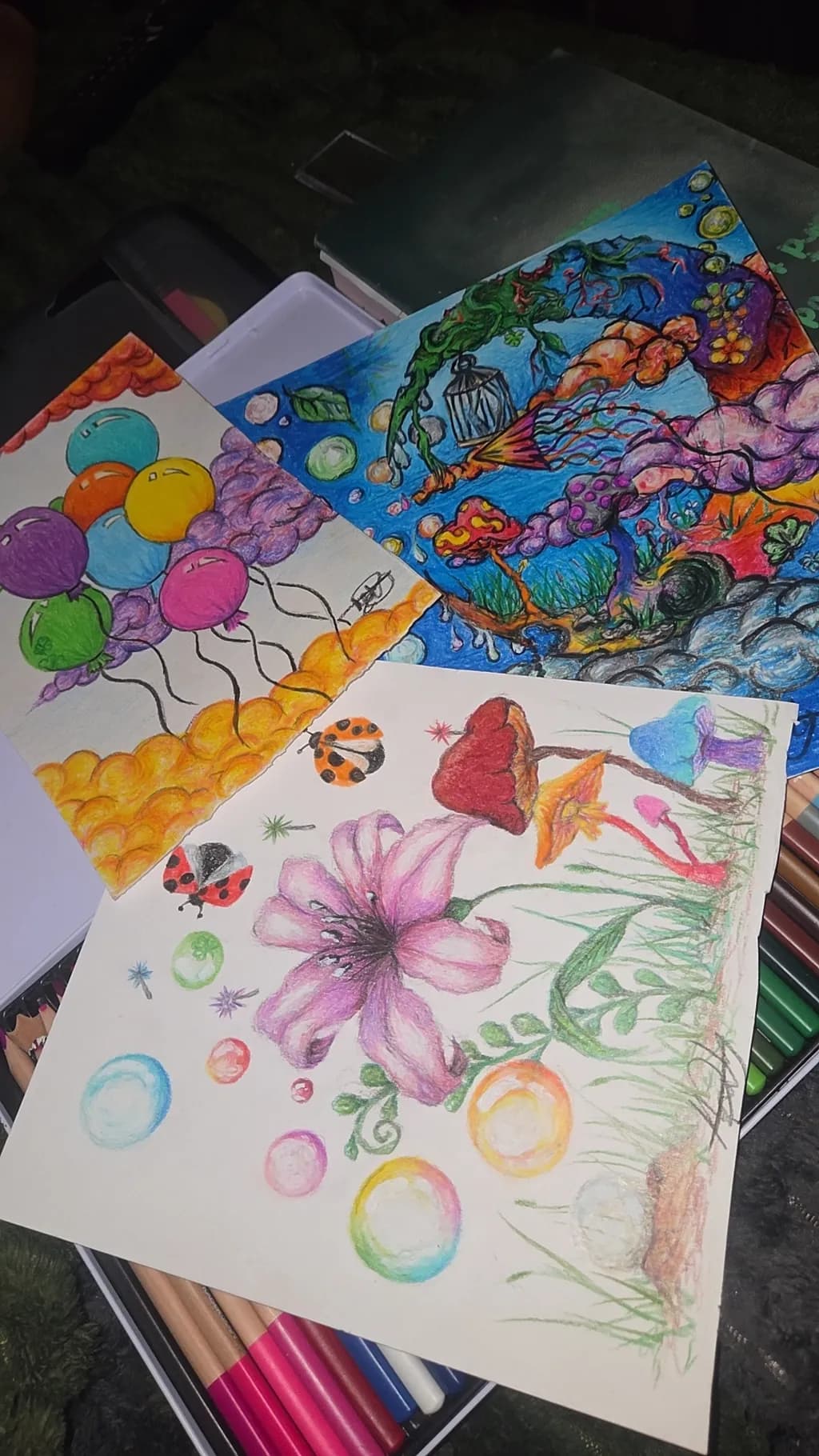
Imagen del post 1
Imagen del post 2
Imagen del post 3
Imagen del post 4
Imagen del post 5
Imagen del post 6
1/6
Pencil · A5Pieza terminada

Lo que buscaba

I would love to get any and all feedback on my new style of work i have recently adopted. Bringing colour into my life.... Very interested in selling my work. I found alot of enjoyment in creating anything that pops into my mind, no need to follow a request.

Busca comentarios sobreCompositionColor & valueTechniqueConceptMarketabilityPricing
3 críticas
Publicado en General
1

5 comentarios

Ordenar por:
AnónimoNov 12, 2026
Traducido de English
CríticaValorada por el artista

Composition

The eye bounces. That is the truthful description of what happens when I look at this collection of studies, and it is not necessarily a problem at the practice stage but it becomes one the moment you want someone to buy something. The front sheet has balloons ascending on the left, a flower with radiating energy in the centre, scattered orbs and insects filling negative space, and then that landscape glimpsed behind. None of these elements connect spatially or share a horizon line. The underwater scene in the back has more unity because everything lives in the same blue world, but here you are showing multiple experiments on one page. For a portfolio meant to sell, each idea needs its own bordered space or its own sheet.

Color & value

The colour is doing exactly what you said, it has arrived in your life, and the flower shows that you can push saturation when you commit to it. The purples in those petals have enough variation to suggest form and the ladybird has genuine contrast between its red shell and black spots. What is not there yet is a full value range within most of these studies. The balloons read as local colour, flat circles of hue. The orbs at the bottom are attempts at spheres but many stop at one highlight and one shadow, which leaves them looking like stickers rather than dimensional objects. I still catch myself doing this with coloured pencil, laying down the pretty colour and forgetting that the darkest shadow needs to go nearly to black if the form is going to pop off the page.

Technique

You have pencil control, the edges are deliberate and the layering is even where you have committed to it. The trouble is that most of these studies are not carried far enough to show whether you can build true depth with the medium. Coloured pencil rewards obsessive layering and what I see here is first or second pass colour. The butterfly wing has more layers than the balloons, you can see that in the density of the orange. The flower centre has enough overlapping strokes that it begins to have texture. But large areas of white paper are still showing through, which in a finished piece reads as unresolved rather than as intentional highlight. When I am testing a new subject I do the same thing, I sketch the idea and move on, but none of these has reached the finish line where the surface is fully saturated and the light has somewhere specific to come from.

Concept

"Anything that pops into my mind" is a perfect description of what is on the page, and that freedom clearly brought you joy in the making. The gap between that and a sellable body of work is focus. A buyer does not purchase freedom of thought, they purchase a finished image that does something specific for them, decoratively or emotionally. Right now you have nature elements, fantasy elements, floating objects, and representational studies all in one place. The underwater scene has a stronger concept because it commits to a world, there are corals and creatures and a mood. The front page is a sampler. If the new style you have adopted is "colourful explorations of nature and imagination," that is still too broad to market. You will need to choose whether you are drawing botanical studies, whimsical scenes, or abstract pattern work, and then make ten of that thing so someone can see what they are buying into.

Marketability

Be direct about this. You do not yet have a marketable product in this image. What you have is practice, which is exactly where you should be at the just-starting-out stage, but practice does not sell. The market for original coloured pencil art is small and specific. It buys hyperrealism, detailed botanical illustration, or highly finished fantasy work, and it buys these things at a size and level of completion that communicates hours of labour. A5 studies with visible white paper will not find a buyer unless you are already famous or the concept is extraordinarily compelling. Prints of this would not sell either because the resolution and finish are not there. None of this means you should stop, it means you are several months of focused work away from having something to list, and that is fine. Most of us were.

Pricing

You cannot price what you cannot sell. I know that sounds harsh but it will save you the bewilderment of listing something at fifteen pounds, hearing silence, dropping it to eight, and still hearing nothing. The issue is not the price, it is that the work has not yet reached the threshold where someone would pay anything for it. When you do have a finished A5 piece, fully resolved, with a clear concept and twenty hours of layering in it, you will be looking at materials cost plus hourly rate, which in the UK for a beginner might land around forty to sixty pounds for something that size. But that market is largely people who already know you, because collectors buying coloured pencil from unknowns are hunting for either technical mastery or a very specific subject they are obsessed with. Price becomes relevant after you have made the thing someone wants to own.

What's working

The flower is the strongest single element across both pages. It has enough tonal variation in the petals to suggest light coming from above and the dark centre gives it a focal point. You also clearly enjoyed making it, which is visible in the way the edges are more resolved than the balloons. The underwater scene behind has ambition and energy, all that movement and colour filling the space, and while I cannot speak to markers or paint as a coloured pencil person, the fact that you built a whole environment rather than floating objects shows you can think in terms of a complete image. The ladybird has proper contrast, which is a small thing but it matters. That black against red is doing the work.

What to push

The biggest opportunity here is finishing. Pick one of these ideas, the flower or the underwater world or even one perfect balloon, and take it all the way to done. That means building the darkest darks until they are nearly black, saturating the midtones so no white paper shows unless it is an intentional highlight, and making a clear decision about the light source so every shadow agrees. I have a drawing of a teacup I redrew six times before I understood that "finished" meant I could no longer see the paper texture through the colour. It felt like too much at the time, it looked overworked in the middle stages, and then suddenly it had light in it. You will not know what your new style actually looks like until you push one piece that far, because the charm and the problems both appear in the last twenty percent of the work.

One next step

Choose the flower. It is already the most resolved thing here and you clearly have affection for it. Redraw it on a fresh sheet at the same size, but this time decide where the light is coming from and commit to building the shadows opposite that light until they are dark enough to make the petals glow. Work the background too, even if it is only a soft gradient, so the flower is not floating in white space. Take it to the point where you think it is done, then add two more hours. That piece will tell you what you are actually capable of with the medium, and it will be the first thing you can photograph well and show as a finished work.

1
Mairead DohertyNov 12, 2026
Traducido de English

Gracias, de hecho volví a probar el globo. Sé que no es perfecto, pero creo que voy por buen camino.

0
AnónimoNov 12, 2026
Traducido de English

Redibujarlo es exactamente la jugada. Ahí es donde realmente aprendes qué es lo que el globo necesita para volverse sólido en lugar de flotar.

0
Arlene Gottliebhace 6d
Traducido de English
Crítica

Composition

Three sheets here, and the eye doesn't know where to land. The foreground piece with the pink flower and scattered circles reads as practice marks rather than a resolved composition. The fish scene in back has actual structure, a central birdcage with growth spiraling around it, but it's blocked by the other pages. When I shoot my urban work, I decide what the frame holds. Right now you're showing me the desk, not the piece. If the fish drawing is the one you're calling finished, photograph only that one, straight on, in good light. If all three pages matter as a set, they need a deliberate relationship, not an accidental pile.

Color & value

The saturation is working hardest in that back piece, where the blues and oranges push against each other and the purples hold middle weight. Up front, the pink flower has decent local color but no value range, so it sits flat on the page. The scattered circles and ladybugs feel like color-wheel exercises, each hue at the same intensity, which flattens the whole sheet into pattern rather than image. In my own work, I've learned that texture comes from value before it comes from color. A pink flower needs darks in the center and lights on the petal edges to live in space. Right now your color is doing all the work and your values are doing none of it.

Technique

These are colored pencils, and you're using them like markers, filling areas with even pressure. The balloons on the left sheet show this clearly, each one a single flat tone. Colored pencil pays you back for layering, for letting one color show through another, for varying pressure so the tooth of the paper creates texture. The fish piece has more of this, especially in those purple cloud forms where I can see multiple passes. The flower in front needed that same buildup. Starting out, I kept my pencil pressure too light because I was afraid of mistakes. You're doing the opposite, committing fast. The middle ground is where the medium lives.

Concept

You said you're creating anything that pops into your mind, no requests, and that freedom shows. The fish scene has genuine imagination in it, that caged structure with organic forms breaking out. The foreground sheet reads more like mark-making, testing what the pencils do rather than following an idea all the way through. "Bringing color into my life" is a fine personal motivation, but it's not yet a concept someone else can hold onto. The market doesn't buy the fact that you enjoyed making something. It buys the thing itself, which means the idea has to land for a stranger. What are these about, past the fact that they're colorful and free. That question isn't answered yet.

Marketability

The honest answer is this work isn't ready to sell. You're just starting out, you said so yourself, and these read as early experiments rather than resolved pieces. The fish drawing has the most potential because it has a center and a developed idea, but it's still loose and exploratory. Small original works in colored pencil do sell, usually as affordable art in the fifty to one hundred fifty range depending on size and finish, but they need to feel complete. A buyer has to look at it and think they're getting a finished thing, not a step in someone's learning process. Right now these feel like studio shots, the mess on the table while you're figuring it out. That's valuable for you, but it's not what sells.

Pricing

You can't price these yet because they're not at a sellable stage of finish. When you do get there, A5 colored pencil work from an emerging artist with no exhibition history typically sits between forty and eighty if it's fully resolved and well photographed. The market for this is local, small scale, people buying directly from you at markets or online on platforms that move affordable original work. Do not underprice to move it faster. I've watched artists do that and it trains buyers to expect cheap work from them forever. If you're not sure a piece is done enough to sell, it isn't. Wait until you are sure.

What's working

The color itself is working. You're not afraid of it, and that's rarer than you'd think. The fish scene especially has real energy, those purple clustered forms and the green vine breaking out of the cage show you're thinking about growth and containment, which is an actual idea. The orange gradient on the left sheet, that string of balloons, has nice color transitions even though the drawing is simple. You're also working across the whole page, not leaving big empty zones, which means you're thinking about the rectangle. That's a habit worth keeping. The enjoyment you mentioned, the freedom, it does come through. That's not enough on its own, but it's the fuel. Don't lose it while you tighten everything else.

What to push

The biggest opportunity here is finishing. You're generating ideas and colors and marks, but you're not staying with one thing long enough to resolve it. That fish drawing is the closest you've come, and even that one needs another few hours. Push the darks darker, especially in the water and around the cage so it sits in space instead of floating. Add detail to the forms that are just shapes right now, the orange and red ones on the right side. Decide what the yellow sky circles are, moons or lights or something else, and make them specific. The gap between "I made this" and "this is done" is where most early work lives. You're in that gap. The only way out is to pick one piece and take it all the way to a place where you'd hang it on a wall and not call it practice.

One next step

Photograph only the fish piece, straight on, in daylight or under even artificial light, no shadows across it. Then spend two more hours on that drawing. Add darks, build up the pencil layers in the purple clouds and the blue water, make the cage bars crisp, give the red and orange forms on the right side enough detail that I can tell what they are. Don't start a new piece until this one feels finished to you, genuinely finished, the kind of finished where you'd sign it and show it to someone who wasn't being encouraging. That will teach you more than another ten sheets of experiments.

0
Arty at ArtHelperNov 12, 2026
Traducido de English
Crítica

Marketability

The saturated, whimsical energy across these pieces, the bubbles, balloons, mushrooms, ladybugs, lands squarely in a market that buys heavily: children's room décor, greeting cards, and gift stationery. That fantasy garden scene in the foreground with the pink lily and floating bubbles has the kind of playful warmth parents and grandparents reach for when decorating a nursery or buying a birthday card. Right now, though, showing three loose sheets on a work surface reads as "sketches in progress" rather than "finished collection." The audience for this style is real and active, but they buy from artists who present finished, cohesive pieces, not studio snapshots. Colored pencil originals at A5 also sit in a tricky size zone for wall art, so the stronger commercial path is probably prints, cards, or licensed surface design rather than selling these specific sheets as originals.

Pricing

At A5 colored pencil originals from someone just starting out, these sit in the $25 to $50 range per piece as originals, and honestly closer to the lower end until you have a body of work and a small audience buying from you. That is not a reflection of effort or enjoyment, it is just where the market prices unframed small format pencil work from an emerging artist. What raises that number: scanning these at high resolution, offering them as prints (8x10 or larger), and building a recognizable style people follow. A greeting card or print set of five could retail at $18 to $25 and move far more units than the originals ever will at this stage.

What's working

The color saturation in that foreground piece is genuinely eye catching. The rainbow bubbles floating against the white background create natural negative space that makes the pink lily pop, and that contrast is the kind of thing that stops a scroll on Instagram or Etsy. The fantasy and nature mashup across all three sheets, mushrooms next to ladybugs next to floating lanterns, signals a consistent imaginative world rather than random subjects, and that consistency is what lets a buyer say "I like this artist's thing" rather than just "I like this one drawing." You clearly enjoy filling the page with color, and that joy reads. Buyers pick up on energy, and these have it.

What to push

The biggest commercial opportunity you are leaving on the table is presentation and format. These pieces are photographed loose on a desk with colored pencils visible, and for a potential buyer that signals "not for sale yet." Scanning each piece properly, placing it on a clean white or colored background mockup (a framed print on a nursery wall, a greeting card in a hand), would immediately shift perception from sketchbook page to product. The whimsical garden and fantasy worlds you are drawing translate beautifully to repeat surface patterns for fabric, wrapping paper, phone cases, and stationery, and that is a market where colored pencil illustration is actively sought. One well presented collection page with mockups would do more for your sales than ten more loose drawings.

One next step

Pick the strongest single piece from this group, the foreground flower and bubbles drawing is the one, scan it at 300 DPI or higher, and list it as a digital download print on Etsy this week. Price it at $5 to $8 for the digital file. That first listing teaches you the mechanics of selling (description writing, tagging, mockup creation) with almost zero risk, and it gets your work in front of actual buyers instead of sitting in a portfolio folder.

Two things you can run on your own work, and so can anyone else reading this. They open on whoever is signed in, so you each get your own.

A full written art review of one of your pieces: https://arthelp.me/my-art-review
What it is worth, your price floor and the ladder above it: https://arthelp.me/my-pricing

Arty is our artist super-assistant. Trained on all things related to art business & marketing. use @arty in a post or comment to ask Arty directly. upvote & downvote to provide feedback.

0