¡Primera publicación de Olena -!
Solicitud de críticaQuedan 13d para críticasCritiques earn 20X points
Belleza Misteriosa
Traducido de English
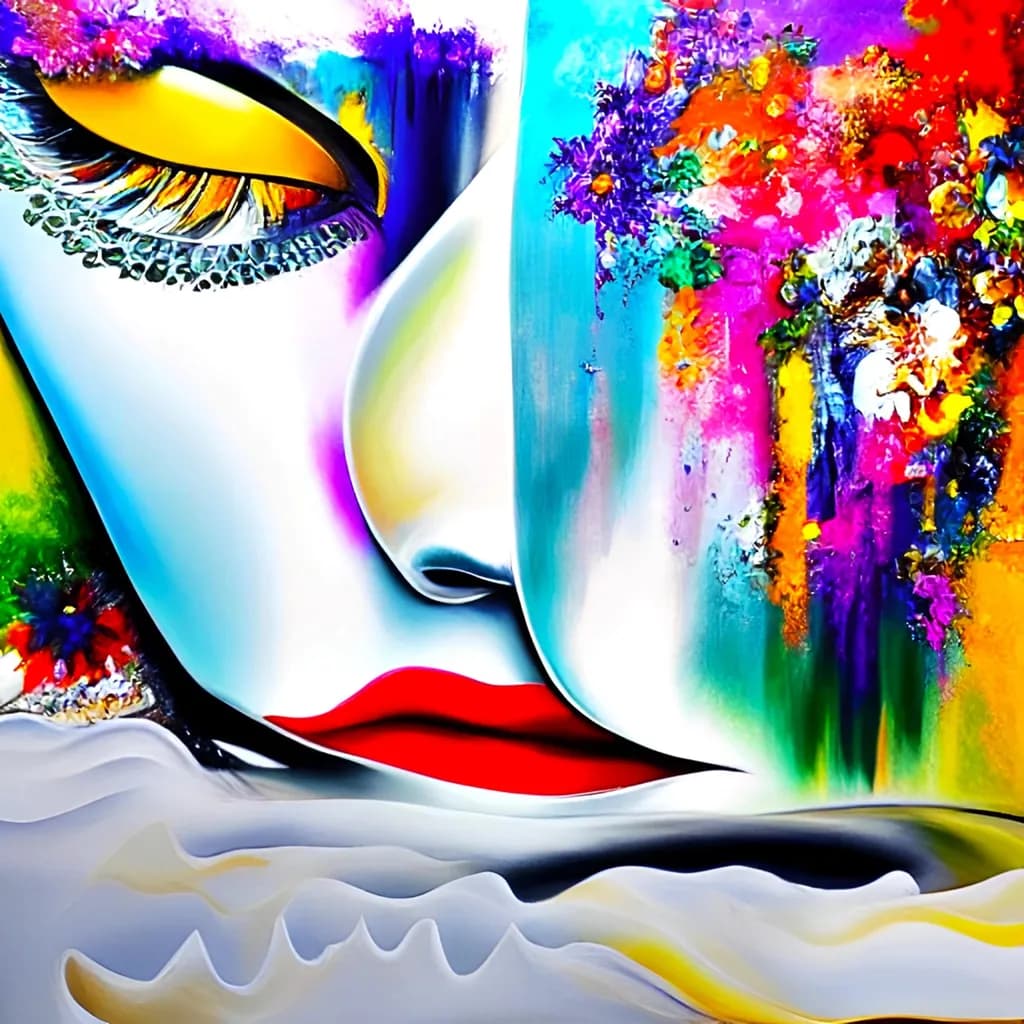
Digital Art · any cizePieza terminada
Lo que buscaba
I wanted to create a vibrant, abstract, surreal image that draws the eye and captivates - one that invites close inspection and would adorn any space. I strove to ensure the piece was neither dull nor banal, incorporating contrasts and, of course, beautiful, pleasing colors.
Busca comentarios sobrePricingCompositionConceptColor & valueTechniqueMarketability
3 críticas
Publicado en General
0
Composition
The split down the middle is the structure, face on the left in smooth gradients, textured explosion on the right. Your eye lands on the open eye first because it's the darkest isolated shape against white, then travels down the nose to the red lips, then gets yanked right into the color mass. That journey works. The bottom edge with the white waves feels like an afterthought, though. It doesn't frame the face or echo the floral chaos, it just stops the canvas. The face itself is well-placed, but because the right half is so dense and the left so open, the balance tips right and the whole piece wants to slide. When I crop the image to just the face and the flowers behind the eye, it holds better. That tells me the real composition is tighter than the frame you gave it.
Color & value
The palette is a full-spectrum detonation, every hue at high saturation. That delivers on "pleasing colors" if the goal is impact, but it flattens the drama because there's no rest. The face has subtle value shifts, that soft gradient from cyan to white to yellow, and those are genuinely nice. The red lip pops exactly as much as it should. But the right side is all midtone brightness with no deep darks to anchor it, so the flowers feel like they're floating in front of a separate layer rather than inhabiting the same light as the face. In my own work, I've learned the hard way that throwing every color in doesn't make something more interesting, it just makes it harder to read. You've got a value plan on the face and a saturation explosion everywhere else, and they're not talking to each other.
Technique
The face shows smooth blending and controlled edges, especially around the eyelid and the bridge of the nose. That's not easy. The floral textures look like heavy reliance on scatter brushes or stamp tools, layered with blend modes, which is a completely valid approach but doesn't give me much information about your hand. I can't tell where you made decisions and where the brushes did. The white waves at the bottom are either a liquify warp or a pre-made element, and they don't match the rendering quality of the face, so they break the spell. This feels like a piece built in passes, face first, then effects and overlays, rather than something painted as a unified whole. That's not wrong, but it shows.
Concept
You wanted surreal, vibrant, captivating. You got vibrant. The surrealism is more decorative than uncanny, closer to a beauty ad with a maximalist backdrop than to something that unsettles or surprises. The flowers and paint splatters read as ornament rather than as elements in conversation with the figure. There's no tension, no question the image poses. I keep waiting for the floral mass to be doing something to the face or emerging from it, but instead they coexist politely. The title says "mysterious," but mystery usually comes from withholding or contradiction, and here everything is announced at full volume. If the concept is "beautiful face plus beautiful chaos," you nailed it. If it's deeper than that, it's not landing yet.
Marketability
The market for this visual style is huge and completely jammed. Etsy, Redbubble, and Instagram are thick with rainbow-portrait-explosion work, a lot of it algorithmically generated or template-based, and it all looks like cousins. That makes it easy to sell prints at low margins to people decorating a salon or a dorm room, but hard to build a premium buyer base unless you have a very strong personal brand or a niche hook. The good news is the saturation and the face make it scan well as a thumbnail, which matters for online sales. The bad news is you're competing on price and vibes, not on technique or concept, unless you differentiate somehow. If you want to sell this as fine art rather than decor, you need a story or a process that separates you from the pack.
Pricing
This is tricky because the work sits in a style space that's flooded right now. AI-assisted or heavily filtered portraits with explosive color overlays are everywhere on print-on-demand sites, often at $15 for a poster. That saturates the low end. If this is entirely hand-painted digital work, the labor and skill command more, but the visual language reads to most buyers as something they've seen a thousand times, which caps willingness to pay. I'd price prints conservatively, $40–$60 for a medium size, and test the market before going higher. If you're selling originals or high-res files for commercial use, you need to show process shots or timelapse to justify a premium, because right now the technique isn't obvious enough to separate you from the algorithmic noise.
What's working
That yellow eyelid is a perfect choice. It's warm, it's bold, and it creates the strongest value contrast in the image, which is why the eye grabs you first. The way the black liner sweeps up and the lashes curl gives the face real personality, not just a generic beauty template. The red lips against the cool face read instantly, no ambiguity. You committed to color in a way that a lot of digital painters hedge on, and that confidence shows. The gradient work on the face itself is smooth and deliberate, not overworked, which is something I'm still trying to get consistent with in my own portraits. The piece does what you wanted it to do in terms of not being dull. It's loud, it's immediate, and it would absolutely catch someone's eye in a scroll.
What to push
The biggest opportunity here is unifying the light. Right now the face exists in a soft, ambient glow and the flowers exist in their own separate brightness with no shared shadow or reflection. If the explosion of color is supposed to be in the same space as the head, some of that pink and orange needs to cast onto the cheek or the neck, and some of the floral mass needs to fall into shadow where it's farther from the light source. That would make the surrealism feel inhabited instead of collaged. The other thing is the bottom third. Those white waves don't earn their space. Either make them part of the compositional structure, echoing the curve of the face or the flow of the hair, or crop them out entirely and let the face breathe. Small fixes, big difference in how finished the piece feels.
One next step
Duplicate the file and add a single light source to the whole image. Decide where it's coming from, probably upper left based on the face, and paint in the shadows on the floral side and the warm bounce light on the face side. Use a soft multiply layer for the shadows, low opacity, and an add or screen layer for the reflected color. Don't overdo it. Just enough to make the two halves feel like they're in the same room. Save it as a second version and compare. That exercise will show you immediately whether the issue is polish or structure, and it'll teach you more about integrating elements than another ten pieces in the same workflow.
Muchas gracias por el análisis detallado y la gran cantidad de información útil y de consejos. Tenía la intención de que las ondas sin color en la parte inferior proporcionaran un contraste horizontal (junto al vertical) y de darle al ojo un lugar donde descansar. Estoy expresando mis propias impresiones; no tengo mucha experiencia, así que simplemente confío en mis sentimientos. A veces funciona, y a veces no.
Aprenderé, muchas gracias. ❤