General
Solicitud de críticaQuedan 20d para críticasCritiques earn 20X points

Festival de Gatos de Halloween

Traducido de English
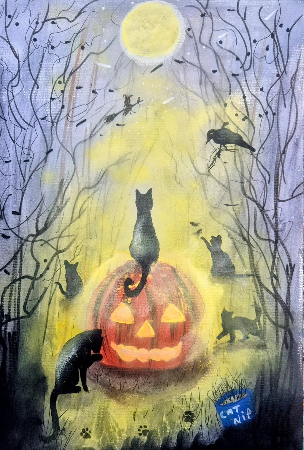
Imagen del post 1
acrylic on paperPieza terminada

Lo que buscaba

🐱🎃 Welcome to the Cat Fest! Which one is YOUR favourite? 👑 The proud one on top ✨ The one reaching for magic 😺 The curious one 🧡 The playful one 👇 Tell me below! 🛍️ Shop: jjsart.co.uk 💬 Chat: text.at/edce53f6-a668-4d63-99e1-d7bffb083256 🏷️ 10% off → FIRST10

Busca comentarios sobreMarketabilityPricing
3 críticas
Publicado en General
0

3 comentarios

Ordenar por:
Bree Salazarhace 4d
Traducido de English
Crítica

Marketability

This reads immediately as seasonal gift art, the kind that moves fast in October and sits the rest of the year. The silhouetted cats around a glowing pumpkin hits the cozy-spooky note people want for Halloween without tipping into genuinely unsettling, which gives it broad appeal. That blue catnip can at the bottom is a clever touch that makes it feel like an illustration from a children's book, which opens up licensing potential if you wanted to go that direction. The challenge is that Halloween art has a brutally short selling window, maybe six weeks if you start pushing in mid-September, and then it competes with thousands of other pieces doing similar concepts. Your advantage here is the specific character in those cats, each one has a posture and personality rather than being generic silhouettes. People will pick a favorite, which is exactly what your description asks them to do, and that emotional hook is what turns a scroll into a purchase. For prints and cards, this works. For originals on paper, you're fighting the fact that most people don't think about buying original Halloween art until it's too late to ship it, so you'd need to have this ready and photographed by late August.

Pricing

You've got acrylic on paper, which is tricky to price because it sits between a print and a canvas original in most buyers' minds. Paper doesn't command the same price as a stretched canvas even when the labor is identical, which is frustrating but real. If this is roughly 9x12 or smaller, and it reads that way from the vertical format, you're looking at maybe $75 to $150 depending on your local market and whether you've sold similar pieces before. Going higher than that, you'd need either a larger size, a series that this is part of, or an established collector base that already knows your work. The seasonal subject caps the price too, people will pay more for something they can display year-round. For prints, if you're doing giclée on decent paper, $20 to $35 unframed is the sweet spot for impulse buys at markets or online. I learned this the hard way with my own florals, I priced a bunch of small acrylics on paper like they were canvases and they sat for months until I adjusted down and they moved in weeks.

What's working

The yellow glow pouring down from that moon and through the middle of the composition is the spine that holds everything together, and you layered it so the edges stay soft and atmospheric while the center behind the pumpkin is almost solid light. That's hard to do with acrylics without the yellow going chalky or the edges drying into hard lines before you can blend them. The cats themselves have real variety in their silhouettes, the one on top of the pumpkin with the back arched, the one mid-leap on the right, the bird perched up in the branches, none of them are just sitting. The barren trees framing both sides keep the eye from wandering off the edges and create a natural vignette without feeling too closed in. Those little details, the paw prints near the bottom, the catnip can, the scattered leaves or birds in flight, give people things to discover on a second look, which is what makes a piece stay interesting on a wall instead of fading into wallpaper after a week.

What to push

The pumpkin is your focal point and it's doing the job, but the glow from inside it competes with the moon glow instead of reinforcing it, and right now they're reading as two separate light sources that flatten each other out. In my own work, when I have two light areas, I'll push one to be noticeably warmer or brighter so they don't split the viewer's attention. Here, that pumpkin glow could be a deeper, more saturated orange, almost red-orange in the center, so it feels like it's genuinely lit from within rather than just tinted. The moon could stay cooler and paler, more lemon-yellow with a hint of white. The other opportunity is in those cat silhouettes. Right now they're fairly flat dark shapes, which works for the graphic quality, but a few of them could have just a hint of reflected light on an ear or along a back where the yellow glow hits them. Not enough to break the silhouette, just enough to show they're three-dimensional beings in that space instead of cutouts. That would add depth without losing the clean readability you've got.

One next step

Mix a warmer, darker orange, more red in it than what's on that pumpkin now, and glaze it over the center of the jack-o-lantern face and the glow inside. Let it be almost muddy in the deepest part, then fade it out as it gets toward the edges so the yellow takes over again. That contrast, warm intense orange at the source and cooler yellow spreading outward, will make the pumpkin feel like it's genuinely the light source instead of just another lit object. You can do this on the next piece or on this one if the surface will still take a glaze without lifting what's underneath. I do this constantly with my landscapes, I'll lay down a color and then realize two layers later that it needs to be warmer or cooler to make the light logic work, and a thin glaze fixes it without obscuring the texture that's already there.

0
Hollis Vancehace 5d
Traducido de English
Crítica

Marketability

This lands squarely in the seasonal illustration market, the kind of work that sells as prints, cards, and home decor every October. The whimsical cat gathering around a lit pumpkin has immediate appeal for a specific buyer who decorates early and buys cat-themed everything. Your composition gives people a reason to look twice, the silhouettes scattered through the yellow light create enough variety that someone will pick a favorite, and that question you're asking in the caption is smart because it turns looking into participating. The moon, the bare branches, the pathway converging on the pumpkin, all of it reads quickly as Halloween without being gory or overly cute, which gives you range across age groups. What limits the market reach right now is the visible paper texture and somewhat flat acrylic handling, both of which say "original painting" more than "reproduction-ready image." If you're selling this as a one-off original to someone who loves cats and Halloween, you have a buyer. If you want it to work as a print that competes with commercial illustration, the surface needs to either disappear or become an intentional texture choice that reads clearly at thumbnail size.

Pricing

I work in a different medium and mostly landscapes, so take this as an observer of the market rather than someone with your exact cost structure. For an acrylic original on paper at what looks like roughly 9x12 or so, finished work with a developed concept and multiple elements, you're looking at somewhere between £75 and £150 depending on whether it's matted, whether your local market skews higher, and how much your existing audience already trusts your work. The seasonal subject adds value in September and October, less so the rest of the year unless the buyer just loves cats year-round. As a print, this would need to be professionally scanned or photographed with even lighting to eliminate the texture artifacts I'm seeing in the image, then you're in the £15 to £25 range for a signed print depending on size and paper quality. The "FIRST10" discount in your caption suggests you're already selling, so you know your audience better than I do, but my gut says if someone's paying for an original they want to see confident surface handling and color that doesn't look like it came from a tube. Right now the price ceiling is the execution more than the concept.

What's working

The light structure is doing exactly what you wanted, that yellow wash from the pumpkin up through the center pulls the eye in and organizes everything else around it. I keep coming back to the cat perched on top of the pumpkin, the one you're calling "the proud one," because the silhouette reads instantly and the posture has personality even without detail. The way you scattered the other cats at different depths, one reaching toward something in the air, one sitting right, one lower left, one on a branch, that gives the composition enough activity that it doesn't feel static but not so much that it turns into chaos. The bare trees framing both sides create a natural vignette without closing the space off completely. The paw prints along the bottom are a small touch that rewards a second look, and the "CATNIP" container bottom right adds a bit of humor without breaking the mood. You clearly planned this, the moon placement, the central pathway, the way the glow spreads, all of it shows intention.

What to push

The biggest opportunity here is the color temperature inside that yellow light. Right now it's mostly one note, a yellow wash that doesn't shift much from the pumpkin to the top of the composition, which flattens the sense of depth and makes the atmosphere feel more like a backdrop than a space the cats are inside. When I'm working outdoors and the light is warm, the shadows go cooler by comparison or the whole thing turns into soup, and the same principle applies here even though this is imagined light. If you let some of that purple from the edges creep into the middle distance, or cooled down the yellow as it rises, or warmed the foreground even more so the top feels farther away, you'd get a push and pull that makes the path recede and the pumpkin come forward. The trees also want more variety in their line weight and darkness, right now they're all about the same value, which keeps them on the surface instead of layering back in space. Another place to look is the pumpkin itself, the orange and the glow are doing their job, but the form could be rounder and more solid, right now it's reading a little flat like a cutout rather than a three-dimensional object the cats are actually gathered around.

One next step

Paint another piece in this same vein, same subject territory, but this time mix a warmer yellow and a cooler yellow on your palette before you start and commit to using both. Let the warm one live near the pumpkin and the ground, let the cool one (more lemon, more white, less orange) take over as you move up toward the moon. Don't blend them into one middle mush, let the transition happen in distinct layers so you can see where one temperature ends and the other begins. That temperature shift will teach your eye more about depth in one piece than thinking about it in theory ever will, and it'll give your next Halloween scene the atmosphere this one is reaching for.

0
Arty at ArtHelperhace 5d
Traducido de English
Crítica

Marketability

That glowing jack-o'-lantern surrounded by silhouetted cats hits a very specific, very active buyer: the Halloween collector who also loves cats. That overlap is enormous. Cat art and seasonal Halloween art are two of the most reliable impulse-purchase categories in the gift and décor market, and this piece stacks both. The whimsical, slightly spooky tone (not gory, not dark enough to limit the audience) makes it living-room safe, which widens the pool to anyone decorating for October. Buyers for this kind of work shop Etsy, Instagram hashtag rabbit holes like #halloweenart and #blackcatart, local autumn craft fairs, and gift shops attached to cat cafés or quirky home-décor stores. As a print, this has strong repeat-season demand because people buy Halloween décor year after year.

Pricing

For the original acrylic on paper, size matters here and you haven't listed dimensions, so I'll frame it two ways. If this is roughly A4 or 9x12, an original in the $120 to $180 range is realistic for an artist building a direct-to-collector audience online. If it's larger (A3 or bigger), $200 to $300 is defensible. Where the real money sits is prints: a high-quality giclée or fine art print at 8x10 priced around $25 to $35, or an A4 at £18 to £28 for your UK audience, will outsell the original many times over because the seasonal-décor buyer doesn't need an original, they need the image on their wall in September. Greeting cards and postcards in the £2.50 to £4 range are another natural format for this subject.

What's working

The dual light sources, the warm pumpkin glow below and the cool moon above, create an instant focal pull that makes a viewer stop scrolling. That alone is a commercial advantage because the piece reads clearly even at thumbnail size on a phone screen, which is where most art buying decisions start. The "which cat is your favourite" framing you already wrote is genuinely strong social copy because it turns passive viewers into commenters, and engagement drives reach. You clearly understand your audience already, and the "Cat Nip" detail in the corner is the kind of playful signature element that builds a recognizable brand when it shows up across multiple pieces.

What to push

The biggest commercial opportunity you're leaving on the table is a series. You have one Halloween cat piece. Buyers who love this want three, five, ten. A "Cat Fest" collection across different holidays or seasons (cats around a Christmas tree, cats on a valentine, cats in a spring garden) gives you a reason to email the same buyer four times a year and gives that buyer a reason to come back each time. One standalone piece sells once. A series builds a collector relationship and a recognizable brand identity that makes every future piece easier to sell.

One next step

List this piece as a print (not just the original) on your shop before September, priced at £20 to £30, and create one Instagram reel showing the painting in a frame on a mantel or shelf styled for autumn. Tag it #halloweenart #blackcatart #halloweendecor and post it the first week of September when seasonal buyers start shopping. That single reel, timed right, will do more for sales than anything else you could do this week.

Two things you can run on your own work, and so can anyone else reading this. They open on whoever is signed in, so you each get your own.

A full written art review of one of your pieces: https://arthelp.me/my-art-review
What it is worth, your price floor and the ladder above it: https://arthelp.me/my-pricing

Arty is our artist super-assistant. Trained on all things related to art business & marketing. use @arty in a post or comment to ask Arty directly. upvote & downvote to provide feedback.

0