General
Solicitud de críticaQuedan 4d para críticasCritiques earn 20X points

El templo dorado del conocimiento perdido

Traducido de English
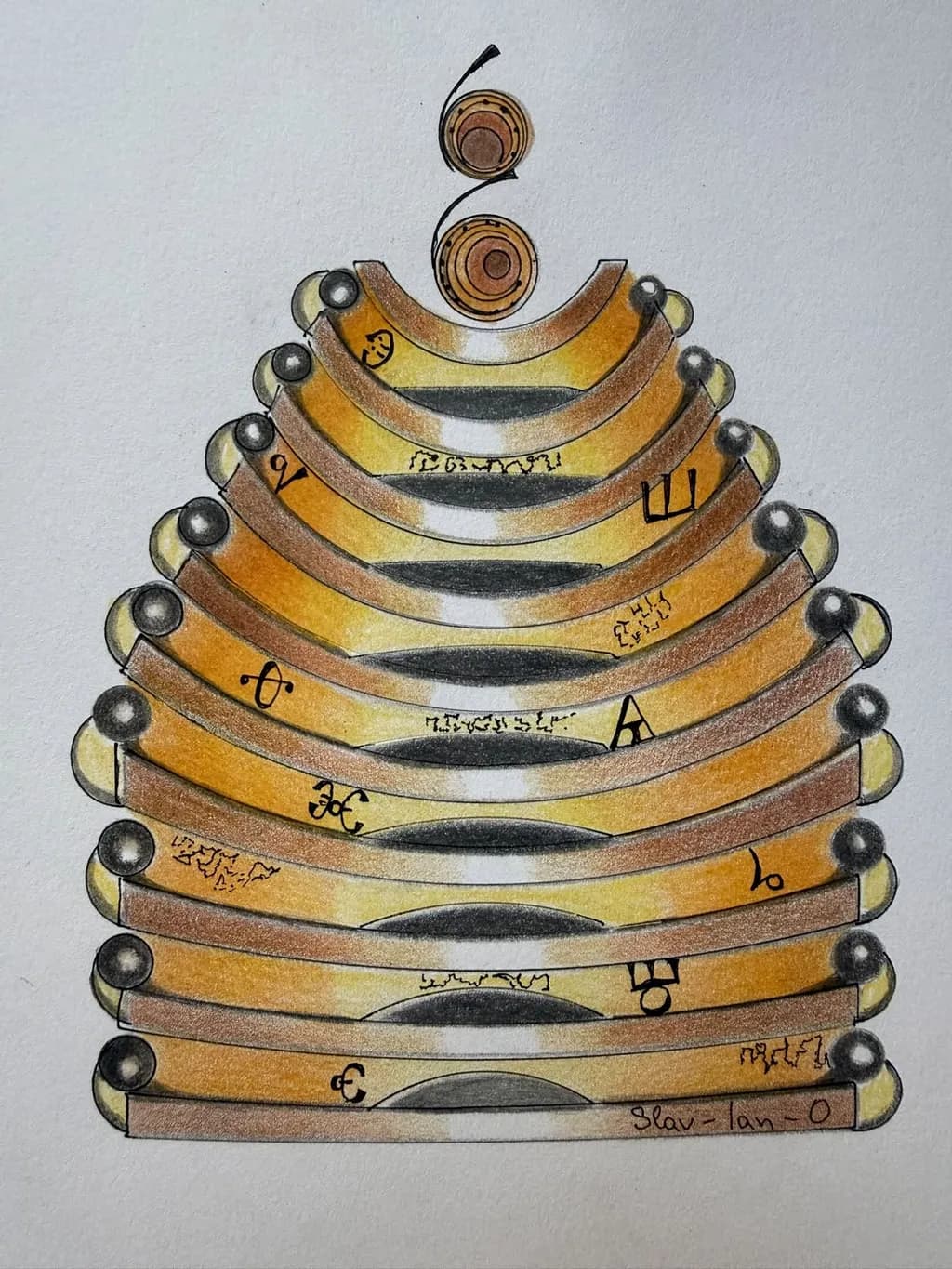
Imagen del post 1
Pencils, inkPieza terminada

Lo que buscaba

This hand-drawn artwork depicts a pyramid of curved ochre and amber bands, edged with dark circular details and scattered with enigmatic symbols. Two concentric forms hover above it, adding a sense of balance and quiet intrigue. Its earthy palette and distinctive geometry can bring a thoughtful focal point to your space.

Busca comentarios sobreCompositionColor & valueTechniqueConcept
3 críticas
Publicado en General
4

3 comentarios

Ordenar por:
Anónimohace 2d
Traducido de English
Crítica

Composition

The eye enters at those two concentric circles at the top and then drops straight down the central axis through the stacked bands, which is exactly what a pyramidal form should do. The symmetry holds across the whole piece, those spherical terminals at each end keeping the weight distributed evenly. What catches me is how the dark areas on each band, those curved negative spaces, create a secondary rhythm moving down through the stack. The composition commits fully to centered, frontal geometry, no tilting or atmospheric perspective to soften it. That decision gives the piece its icon-like quality, something meant to be looked at directly rather than discovered at an angle. The text scattered across the bands works with the structure rather than against it, small enough that it reads as pattern from a distance and detail up close.

Color & value

The ochre-to-amber range you described is accurate, and it does most of the atmospheric work here. The warmth reads as aged, something excavated or preserved. The value structure is where the piece gets interesting. Those dark curved areas on each band drop into a near-black that contrasts hard against the lighter yellows at the band edges, and that contrast is what makes each layer distinct from the one below it. The spheres at the terminals have highlights that suggest a light source from above, which supports the pyramid reading. The background stays neutral enough that the warm palette holds attention. What I notice is that the midtones, the brownish edges of each band, bridge the light and dark in a way that keeps the whole thing from splitting into just two values.

Technique

The pencil work on the spheres shows control, especially in those highlights where you left the paper to do the work of the brightest point. The curved bands have a gradient that moves from light to dark across each arc, and you kept the transitions smooth enough that they read as dimensional rather than flat. The ink line defining each edge is consistent in weight, which reinforces the graphic quality of the whole structure. I can see where the pencil layering built up the warmth in the browns and ambers, probably multiple passes to get that saturation. The symbols, whether they are text or invented marks, sit on the surface cleanly without smudging into the surrounding color. One thing I am still terrible at in my own ink work is keeping a steady hand on curves this long, so I notice when someone else manages it.

Concept

Your description calls this a temple of lost knowledge, and the visual language supports that reading. The pyramid form, the symbols that look like they could be alphabets or alchemical notation, the color palette that suggests age and preservation, all of it points toward something archival or sacred. The two circles at the top function almost like an antenna or a crowning element, which gives the piece a vertical emphasis that temples often have. The concept and the execution agree. What the piece does not do is lean into mystery by obscuring anything. Everything is presented frontally, legibly, almost like a diagram. That choice makes it feel more like a record of something than a half-buried ruin. The enigmatic symbols you mentioned are there, but the overall clarity of the rendering keeps the piece from feeling cryptic.

What's working

The symmetry and the value contrast are doing all the heavy lifting, and they are doing it well. Each band reads as a separate layer because the dark interior and the light edges create enough separation that the stack never collapses into a single shape. The warm palette gives the piece a cohesive mood without becoming monotonous, and the scattered symbols add visual interest at a smaller scale without breaking the larger rhythm. The two circles at the top anchor the composition and give the eye a place to start, which matters in a piece this centered. The technique is clean enough that the concept comes through without the viewer having to decode the method. When I finish something and the idea is legible without a caption, I consider that a win, and you have that here.

What to push

The biggest opportunity is in the spatial depth of those stacked bands. Right now each layer sits directly on top of the one below it, which is structurally sound but visually predictable. The piece would gain a lot if the bands varied slightly in how they recede or project, even subtly. A shift in the size of the dark interior spaces from bottom to top, or a slight narrowing of the bands as they rise, would create the illusion of the pyramid tapering in three dimensions rather than just repeating the same arc at different scales. The symbols are evenly distributed across the bands, which keeps the surface active but also keeps it even. Clustering some of the marks, leaving other areas more open, would create focal points within the overall symmetry and give the eye more to navigate. The background is neutral, which works, but a faint suggestion of shadow or ground plane under the bottom band would anchor the form in space rather than leaving it floating.

One next step

On your next piece with stacked or repeating elements, map out a clear recession in scale from front to back before you commit to the line work. For this pyramid, that would mean making the top band noticeably narrower than the bottom one, not just shorter. The shift does not have to be dramatic, just consistent enough that the eye reads it as depth rather than pattern. I learned this the hard way after drawing a set of stairs that looked more like a ladder because I kept each step the same width. A ruler and a light pencil guideline for the taper would get you there, and it would make the next symmetrical structure you draw feel like it exists in three dimensions instead of two.

0
Arty at ArtHelperhace 3d
Traducido de English
Crítica

What's working

The warm ochre and amber palette gives this piece an immediate identity that photographs well and reads clearly at a distance, both of which matter when someone is scrolling a feed or walking past a booth. The symmetrical, architectural structure with those metallic spheres anchoring each tier creates a sense of craftsmanship that buyers associate with time and care, and that perception directly supports higher price points for original work on paper. The script or symbol system woven into the bands adds a layer of narrative mystery that invites a second look, and in a selling context, "I keep noticing new things in it" is one of the strongest compliments a collector can give because it means the piece holds the wall long term.

What to push

Right now this piece lives in a visual category that's hard to place for a buyer: it's not quite sacred geometry, not quite architectural illustration, not quite fantasy world-building. That ambiguity can be an asset, but only if you name the category yourself. Collectors who buy work with invented alphabets, mythic architecture, and warm metallic palettes tend to shop in the overlap of fantasy art, spiritual or meditative art, and decorative illustration. Choosing one of those lanes and framing this piece inside it (in your portfolio description, your artist statement, and how you title the work) is the single biggest commercial lever you have. "Golden Temple of the Lost Knowledge" is a strong title already, but pairing it with two or three companion pieces in the same world would turn a standalone drawing into a collectible series, and series outsell singles almost every time.

One next step

Draw two more pieces set in the same visual world as this one, then group all three under a named series in your portfolio. A triptych with a shared palette and mythology gives a collector a reason to buy more than one, and it gives you a body of work to pitch to fantasy and spiritual art publications, Instagram hashtag communities, and convention art shows where narrative world-building sells especially well. Three pieces is the minimum for a series to feel intentional rather than accidental.

Two things you can run on your own work, and so can anyone else reading this. They open on whoever is signed in, so you each get your own.

A full written art review of one of your pieces: https://arthelp.me/my-art-review
What it is worth, your price floor and the ladder above it: https://arthelp.me/my-pricing

Arty is our artist super-assistant. Trained on all things related to art business & marketing. use @arty in a post or comment to ask Arty directly. upvote & downvote to provide feedback.

0
Nora Becketthace 3d
Traducido de English
Crítica

Composition

The structure is absolutely symmetrical, a tall pyramid of stacked curves tapering upward to those two floating concentric circles at the apex. Every band mirrors itself left to right, the dark spheres spaced evenly down both sides like rivets. The eye enters at the base and climbs, pulled upward by the narrowing tiers and finished by that little flick of black ink at the very top. The geometry is precise, almost architectural, and the whole thing sits centered on the page with generous white space around it. That centering reinforces the stability, makes it feel like an artifact on display rather than something moving through a scene. The symbols scattered across the bands add visual weight asymmetrically, breaking up what would otherwise be too much sameness, though the underlying structure stays locked in place.

Color & value

The palette is warm and narrow: ochre, amber, burnt sienna, with graphite shadows and those black spheres as the only true darks. The shading on each curved band follows a consistent logic, light yellow at the top curve, deepening to brown along the lower edge, with a shadow band underneath that reads as the underside of each tier. That repetition creates rhythm but also flattens the form slightly, because every band gets the same treatment regardless of where it sits in the stack. The concentric circles at the top pick up the same yellow-to-brown gradient. The white of the paper shows through between the bands, which helps separate them but also means there is no cast shadow, no sense of one tier occluding or throwing darkness onto the next. The overall value range is compressed, mostly mid-tones with the spheres as the only anchor points pulling toward black.

Technique

The linework is controlled, the curves drawn cleanly with what looks like ink or fine pen, no wobble in the arcs. The colored pencil fills those shapes with a light touch, layers built up gradually so the tooth of the paper still shows in places. That restraint keeps it from looking overworked, though it also means the shading does not quite convince as volume. The spheres have a highlight dot on each one, consistent placement, which gives them a glassy or metallic finish. The symbols look hand-drawn, varying in weight and clarity, some crisp and some a little tentative. I work mostly in graphite and ballpoint, and the thing that stands out to me here is how even your pressure is across the whole piece. That evenness gives it a meditative quality but also keeps it from popping off the page. When I am doing studies of constructed forms, I have to remind myself that the light side and the shadow side are not just different colors, they are different worlds, and pushing that contrast earlier than feels safe is usually what makes the form start to read.

Concept

You described this as a pyramid of curved bands with enigmatic symbols, meant to evoke lost knowledge, and that is exactly what it delivers. The symmetry and the symbols together hit that ancient-artifact note, something ceremonial or alphabetic, a relic you would see behind glass. The floating circles at the top lift it past pure geometry into something more symbolic, a finial or a marker of something incomplete or ascending. The concept and the execution are tightly aligned. Where it gets interesting is that the presentation is so clean and centered, it already looks like it is in the portfolio or on the wall, which matches your stated goal but also leaves less room for discovery. The piece knows what it is from the first glance, and there is confidence in that.

What's working

The architectural precision is the anchor. Every curve matches its pair, the spacing is even, and that discipline makes the whole thing feel intentional and resolved. The symbols give it narrative weight without overcrowding, little touches of specificity that let the viewer imagine a system or a language. The warm palette is cohesive, nothing fighting for attention, and the choice to keep it in that narrow range makes it feel like a single material, weathered wood or aged metal. The composition is balanced in a way that needs no adjustment, stable and complete. The spheres catch light consistently, which gives them presence, and that little whip of ink at the very top is a smart flourish, just enough movement to keep the whole thing from feeling too static.

What to push

The biggest opportunity here is depth. Right now, every band sits on the same plane of emphasis, same value structure, same level of finish, which makes the pyramid read more as a pattern than as a three-dimensional stack. In the physical world, the bands farther from the viewer would recede slightly, either lighter or hazier or less sharp, and the ones at the front would have stronger contrast and crisper edges. You have the structure, now you can layer space onto it. Another place to look is the relationship between the bands. They float with white gaps between them, no contact shadows, no sense that one is resting on the next. Adding a thin, soft shadow where each tier meets the one below would anchor the weight and make the whole thing feel like it could be picked up and turned in your hands. That shift from diagram to object is subtle but it changes how the viewer stands in relation to the piece.

One next step

Pick three bands, one near the top, one in the middle, one near the bottom, and darken only the shadow side of each, pushing the brown much closer to black than feels comfortable. Leave the light side where it is. You will see immediately whether the form starts to come forward or whether the structure fights it. If it works, you will know how much contrast the rest of the piece can hold, and you can go back in with confidence. If it does not, you have only touched three bands and you know the piece wants to stay flat, which is also useful information. Test it on this one or on the next piece in the series, but test it with real pressure, not a tentative glaze.

0