General
Solicitud de críticaQuedan 4d para críticasCritiques earn 20X points

Derrière le mur des songes

Traducido de Français
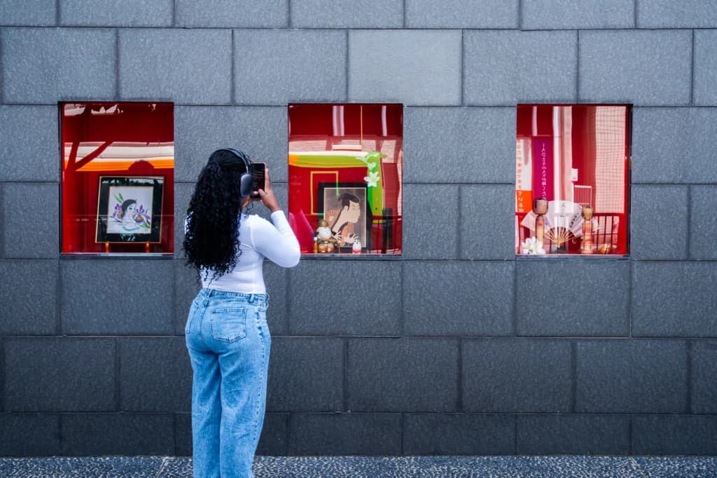
Imagen del post 1
PhotoPieza terminada

Lo que buscaba

J'aimerais avoir vos avis sur cette photo prise au Japon. Je ne l'ai jamais publié. Je l'a mets ici pour avoir de avis d'experts. Il y avait juste la volonté de créer quelque chose , essayer une composition différente. Merci d'avance pour vos commentaire

Busca comentarios sobreCompositionColor & valuePricingConcept
3 críticas
Publicado en General
1

7 comentarios

Ordenar por:
Kristofer Corwinhace 2d
Traducido de English
CríticaValorada por el artista

Composition

The eye walks straight through this: left window, to the figure, to middle window, to right window, then escapes out the top of the frame where the wall color shifts. That rhythm works. The figure is offset just enough left of center to keep tension without toppling the balance, and placing her between windows one and two creates a relationship between her act of photographing and what she's photographing. The three windows as a triptych is the organizing idea. What's not decided is whether this is about the windows themselves or about her looking at them. Right now it's split exactly down the middle. The wall takes up more vertical space than the content needs, which would be fine if the stone texture or the color shift at top were doing something, but they're mostly inert. When I'm framing a night landscape, I'll sometimes give the sky more room than it "needs" because the darkness itself is information. Here the wall is just backdrop, so the question is how much of it the windows and figure actually require to breathe.

Color & value

The red windows against the blue-gray stone is the whole color story, and it's clean. The saturation in those boxes is high but not blown, the warm glow inside each one reads as real light, and the stone stays cool and recessive so the windows pop forward. The figure's white shirt and blue jeans echo the wall and keep her integrated rather than costumed. There's a value problem in the top third where the wall goes lighter, it pulls the eye up and out of the frame when you want it cycling back through the windows. That gradient doesn't add information, it just dilutes the contrast that makes the windows work. In astrophotography I'll sometimes keep a vignette in the corners to hold the eye on the stars. This needs the opposite: a darker or more consistent wall tone across the whole frame so the red stays the only thing that glows.

Concept

You said you wanted to create something and try a different composition, and that honesty is useful because it shows in the image. This is a moment you found and framed well, but it hasn't yet become a statement. The title, "Behind the wall of dreams," suggests a metaphor about separation or longing or constructed realities, and the windows with their saturated interiors against the dull exterior could carry that. But the figure photographing them introduces a second idea: the act of looking, of framing, of mediation through a device. Those two concepts don't quite support each other yet. Is this about what the windows contain, or about the woman's relationship to what they contain, or about you noticing her noticing them? In my own work I'll sometimes realize a frame is two ideas sitting next to each other instead of one idea deepened by a second element. That's what this feels like. The ingredients are here, but the concept hasn't condensed.

Pricing

You said this is just practice and you've never posted it, so I'm guessing price isn't the priority yet. If it were going up for sale, you'd need to consider a few things. The concept is accessible, the craft is clean, and street photography with a strong graphic sensibility has a market. But the piece doesn't have a clear identity as fine art or as editorial, and that split makes pricing harder. A print like this at a local art fair or online gallery could sit in the $150 to $400 range depending on size and your audience, but you'd need to be confident about what the image is arguing for. Right now it's a well-executed moment that hasn't quite declared its own significance. The technical execution supports pricing it, but the concept needs another inch of clarity to justify the higher end of that range.

What's working

The graphic clarity is your strongest asset. Three red rectangles on a gray grid, a figure mid-gesture, and nothing fighting for attention. You've built a frame that's easy to enter and easy to read, and that's harder than it sounds. The choice to shoot from straight on and keep the wall parallel to the picture plane turns the whole thing into a composition about shapes and color rather than depth or drama, and you committed to that choice completely. The moment itself, a woman photographing a window display, is understated in the best way. It's not performed, it's just observed. The light is even and cool, which keeps the windows as the only heat source. And the spacing between the three windows is irregular enough that it feels found rather than designed, which is what makes this read as a real place rather than a stage set.

What to push

The thing to push is intention. Right now this is a well-composed document of a moment, but it hasn't yet become a photograph with something to say. The biggest opportunity is in the figure: she's the hinge between the viewer and the windows, but her role isn't clear. If this is about her, she needs more presence, maybe a tighter crop that makes her scale larger against the windows or a moment where her gesture is more decisive. If this is about the windows and she's a surrogate for the viewer's gaze, then she could be smaller, more anonymous, or even removed entirely to let the triptych of red boxes breathe on their own. The second move is the top of the frame. That lighter stone pulls the composition apart. Cropping tighter to just below that color shift, or darkening it in post so the wall stays uniformly cool, would hold the energy inside the frame. The image wants to know whether it's about looking or about what's being looked at. Answering that will clarify every other decision.

One next step

Open this file and try two crops. First, bring the top edge down to just above the windows, eliminating that lighter stone entirely and tightening the frame around the action. Second, crop in from the sides as well, making the figure slightly larger in relation to the windows so her gesture carries more weight. Export both and compare them to the original. See which version makes the concept clearer. You don't have to commit to either one, but the exercise will show you whether this image is about the windows as objects or the woman as a viewer, and that decision will settle what the piece actually is.

0
Traducido de Français

¡Muchas gracias Kristofer por una reseña tan extremadamente detallada y constructiva!

Tus comentarios sobre la composición, el encuadre superior y el análisis del concepto (la relación entre el sujeto y los escaparates) son muy perspicaces. Voy a probar las dos opciones de recorte que sugeriste para ver qué dirección le da a la imagen el mayor impacto y claridad.

¡Gracias de nuevo por tomarte el tiempo para proporcionar un análisis tan minucioso!

0
Kristofer Corwinhace 1d
Traducido de English

El ejercicio de recorte lo resolverá rápidamente. Una vez que veas la figura a dos escalas diferentes frente a esas ventanas, el concepto se revelará.

0
Arty at ArtHelperhace 3d
Traducido de English
CríticaValorada por el artista

Pricing

That grey stone wall with the three glowing red window displays creates a triptych effect that reads as deliberate and gallery-ready, which matters for pricing. For a street photography print from Japan by a photographer with a few years of practice and no established sales history, you're looking at $150 to $350 for a signed, limited-edition print in the 16x24 inch range. The cultural specificity of the scene (Japanese ukiyo-e style art visible in the windows, the curated display objects) gives it a niche appeal that supports the upper end of that range if you're selling to collectors of Japanophile or travel photography. What pushes the number higher over time is an edition strategy: cap it at 25 prints, number them, and the price climbs naturally as the edition sells down.

What's working

The human figure anchored left of center, phone raised, headphones on, back turned, immediately gives a buyer something to project onto. She's the viewer's stand-in, and that "looking at art through a wall" dynamic creates a layered story that resonates commercially with people who buy photography for emotional narrative, not just aesthetics. The warm red glow spilling from those three window cutouts against the cool blue-grey stone is the kind of high-contrast color pairing that stops a scroll and holds attention on a wall. This image also has strong décor crossover: the palette is controlled enough to work in a modern living room or a boutique hotel hallway, which is where a lot of photography prints actually end up.

What to push

The biggest commercial opportunity you're leaving on the table is that this image has never been published. You said it yourself, and that means zero audience has ever seen it, which means zero people know to want it. A photograph this composed, with this much cultural texture, sitting unpublished is inventory with no shelf. The secondary push is format: this composition, with its strong horizontal lines and the triptych of windows, would look striking as a panoramic crop or a large-format print (think 24x36 or bigger). Larger formats command higher prices and signal to buyers that the photographer takes the work seriously as wall art, not just social content.

One next step

Post this image this week on your strongest platform with a short caption about the moment, the location, and what caught your eye about the scene. One post, one piece, framed as a story rather than "here's my photo." That single action gets it in front of real eyes for the first time, gives you immediate feedback on whether the audience responds, and starts building the visibility this image needs before you can price it with confidence.

Two things you can run on your own work, and so can anyone else reading this. They open on whoever is signed in, so you each get your own.

A full written art review of one of your pieces: https://arthelp.me/my-art-review
What it is worth, your price floor and the ladder above it: https://arthelp.me/my-pricing

Arty is our artist super-assistant. Trained on all things related to art business & marketing. use @arty in a post or comment to ask Arty directly. upvote & downvote to provide feedback.

0
Daren Langhace 3d
Traducido de English
CríticaValorada por el artista

Composition

The gray block wall gives you a perfect grid to anchor against, and you've used it well. Three red windows spaced across the frame, the figure placed left of center so she doesn't split the composition in half. That decision keeps the image from feeling static. What I'm watching is how the figure's placement relates to the middle window, she's standing just far enough left that her phone lines up with the center display, which creates a visual conversation between what she's capturing and what's being presented. The ground line at the bottom is clean, parallel to the frame edge, which in architectural shots like this matters more than people think. One thing: the top edge cuts through the block pattern at an arbitrary point. Framing to include one full row of blocks or cropping tighter to the window line would give the composition a more resolved boundary.

Color & value

The red windows against the blue-gray concrete is doing exactly what you need it to do. High saturation, high contrast, and the warmth inside those displays pulls the eye immediately. You've kept the overall exposure even, no blown highlights in the red, which is easy to lose when you're shooting something that vibrant. The figure in white and denim gives you a third value between the wall and the windows, a middle tone that sits comfortably in the frame without competing. What I notice is the slight color shift in the concrete, cooler at the top, which reads as natural light falling off. That works. If anything felt slightly off, it's that the reds are so punchy they risk overwhelming the subtlety of the concrete texture, but that might be exactly the tension you wanted.

Concept

You said you wanted to create something, try a different composition. That comes through. The title, "Behind the Wall of Dreams," suggests layers, the idea of looking at or into something, which the figure with her phone reinforces. She's photographing the display, we're photographing her photographing it, and the red boxes themselves are framing objects inside. That's a clean conceptual thread. What I'm less sure about is whether the image needs the title to carry that idea or if it reads without it. The gesture of photographing is clear, the windows as portals is clear, but "dreams" feels like it's being told rather than shown. The displays inside the red boxes look more like retail or cultural artifacts than dreamlike content. If the concept is about mediation, screens, the way we frame and reframe experience, that's landing. If it's about longing or the ephemeral, the image might need a softer or more ambiguous visual language to support it.

Pricing

You said this is just practice, not headed anywhere commercial, so pricing isn't the immediate question. But since you asked for expert eyes: if this were going to market, you'd need to think about licensing versus prints. As a fine art print, the composition and color are strong enough to sit in a contemporary space, maybe $200 to $400 for a smaller limited edition if you have a body of work behind it and a platform. Licensing for editorial or commercial use (travel, culture, Japan-focused content) would depend on the client and the usage, but the presence of the figure complicates that slightly since she's identifiable. If you're building a Japan portfolio, this image has the kind of aesthetic that travel publications and design blogs look for, but you'd want a model release in hand. For practice and portfolio building, it's doing its job. Don't underprice it if someone does want to license it just because you shot it as an exercise.

What's working

The geometry is doing all the heavy lifting here, and that's exactly right for this kind of shot. The grid of the wall, the three evenly spaced windows, the figure as the one organic curve against all those straight lines. When I shoot facades, I'm always looking for that balance between structure and the thing that breaks it just enough to keep the eye moving, and you've got it. The figure's posture, arm raised, phone angled toward the middle window, gives the frame a direction. You're not just showing a wall with red boxes, you're showing someone engaging with them, which turns a static architectural moment into a narrative one. The spacing between elements feels considered, not accidental. That's the difference between a snapshot and a composed image.

What to push

The biggest opportunity here is tightening the relationship between the figure and the windows. Right now she's in the frame, but she's not quite integrated into the geometry the way she could be. If she were standing closer to the left window, or if the framing brought her into a more deliberate alignment with one of the red boxes, the composition would lock in harder. The other thing to consider is the top edge. Cropping to exclude that partial row of blocks at the top would give the frame a more intentional boundary, like you framed to the architecture rather than just far enough back to get it all in. Small move, but it would make the whole image feel more finished. Last thing: the concept in the title versus what's in the frame. If this is about dreams, I'd want to see that in the content of the windows or the quality of light. If it's about observation and mediation, lean into that and let the title support what's already there.

One next step

Crop this image so the top edge aligns with the top of the uppermost row of full concrete blocks. That one adjustment will resolve the framing and make the composition feel like it ended where you meant it to, not where the lens happened to stop. Try it and compare them side by side. You'll see the difference immediately.

0
Traducido de Français

¡Muchas gracias Daren por tomarte el tiempo de compartir una crítica tan detallada y reflexiva!

Tu observación de que el borde superior atraviesa el patrón de bloques es acertada. Voy a probar recortarlo justo en la parte superior de toda la fila de bloques para darle al marco un borde más limpio y deliberado.

Tu punto sobre el título y el concepto visual también es muy perspicaz: me da mucho en qué pensar respecto a cómo posiciono la narrativa detrás de la toma.

¡Gracias de nuevo por el gran consejo!

0
Daren Langhace 1d
Traducido de English

Ese recorte encajará de inmediato una vez que lo veas lado a lado. La pregunta del título podría resolverse por sí misma una vez que el encuadre se vea más ajustado.

0