General
Solicitud de críticaVentana de crítica cerradaCritiques earn 20X points

Guisos

Traducido de Français
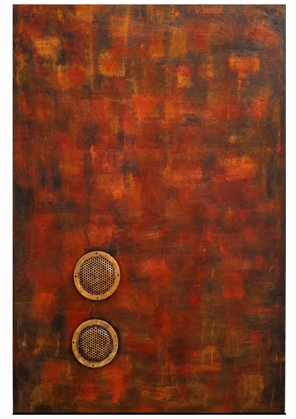
Imagen del post 1
Technique mixte : peinture sur fond texturé et cercles perforés en laiton, en relief. · ( L 80 x h 120 ) cmPieza terminada

Lo que buscaba

Dans cette œuvre, je cherche à faire dialoguer un fond rouge-orangé, construit par touches et superpositions, avec des éléments métalliques circulaires en relief. Je souhaite évoquer une chaleur persistante, comme celle des braises. Les formes circulaires ponctuent la surface et invitent le regard à passer de la couleur à la matière, puis à découvrir leurs textures et leurs reflets.

Busca comentarios sobreCompositionColor & valueTechniqueConcept
3 críticas
Publicado en General
0

3 comentarios

Ordenar por:
Usuario deshabilitadoOct 16, 2026
Traducido de English
CríticaValorada por el artista

Composition

The two brass circles sit left of center in the lower third, stacked vertically with even spacing between them and generous emptiness around both. That placement holds real tension because everything above stays open, the eye drops straight to those perforated discs and then has nowhere specific to go except back into the red field. The textured background reads as a single plane with subtle vertical striations, no foreground or atmospheric depth, which makes the relief elements pop forward hard. You said you wanted the circular forms to punctuate the surface and guide the eye from color to material, and that is exactly what happens. The composition delivers your intent cleanly.

Color & value

The palette lives almost entirely in a narrow band: burnt sienna, cadmium orange, darker rust tones with charcoal or umber breaking through in scattered patches. That restriction gives the piece coherence but also flattens the spatial temperature. The value range compresses into mid-darks with occasional lighter orange blooms in the upper portion, nothing approaching a real light or a deep shadow anchor. For embers, that works conceptually since coals glow without casting hard shadows, but the lack of value contrast means the brass circles do all the heavy lifting for visual interest. I spent years smashing saturated warms together in digital work and only got atmosphere when I finally learned to push darks darker and vary temperature, even within a limited palette. Here the warmth is consistent and convincing, the surface genuinely looks like it is holding heat, but there is no coolness anywhere to make that heat feel hotter by comparison.

Technique

The paint application shows layered scrubbing and dragging with visible tooth in places, some areas more opaque where pigment built up and others where underlayers breathe through. That creates good surface variety and the kind of wear that suggests time or weathering. The brass elements are clean, mounted in relief with their perforated honeycomb patterns casting subtle shadows onto the canvas beneath, and that physical depth gives them presence the paint alone could not. Mixing actual metal with paint is outside my own practice, but I can see the precision required to set those circles flush and level so they read as intentional geometry rather than applique. The screws or rivets around the rim of each disc add an industrial note that rhymes well with the distressed background. What I am less sure of is whether the textured ground beneath the paint reads clearly in reproduction, the photo flattens some of that information and a gallery viewer would get more from the surface than I can here.

Concept

You said you wanted to evoke persistent heat, like embers, and have the circular forms invite the eye to move from color to material to texture and reflection. The title delivers that reading immediately, braises are coals, and the warmth in the palette supports it without needing explanation. The brass circles function as both literal objects, possibly speaker grills or ventilation grates, and as abstract punctuation in a field of accumulated heat. That double read works. What is less developed is the narrative or emotional direction of the piece. Embers are a state of waiting, either cooling toward ash or about to flare back into flame, and the composition does not clarify which. The stacked circles have a mechanical repetition that suggests infrastructure or architecture rather than organic fire, which might be intentional but also dilutes the ember metaphor slightly. If the goal is ambiguity, that ambiguity lands. If the goal is to make the viewer feel the heat as imminent or fading, the piece stays neutral between those two.

What's working

The marriage of industrial material and painterly surface is the strongest idea here and it executes cleanly. Those brass discs are specific enough to reference real functional objects, vents or speakers or something salvaged, which grounds the abstraction in a recognizable world. The color holds together as a single emotional temperature, not muddy or oversaturated, just steady warmth. The scale you listed, 80 by 120 centimeters, is large enough that the texture and relief will have real presence in a gallery, the kind of piece that rewards close looking after the initial read from across the room. My own environment work depends on layering atmosphere through value shifts and this has that same instinct toward building a surface through accumulation, even though the subject and medium are not mine.

What to push

The biggest opportunity is to crack open the value range so the warmth has something to push against. Right now the piece holds one note beautifully but does not modulate. Introducing a few areas of deeper shadow, maybe in the corners or as vertical bands that echo the existing striations, would make the mid-tones glow harder without changing the palette. Even a small amount of cooler desaturated tone, a grey or a greenish umber in one or two zones, would make the reds and oranges feel hotter by contrast. The second place to push is the relationship between the brass elements and the painted field. They sit ON the surface but do not yet interact with it. If some of the paint crept over the edge of one circle, or if the textured ground showed a slight halo or shadow cast by the relief, that would tie the two systems together more tightly. Right now they coexist, which is good, but they could be in conversation.

One next step

Before this goes to the gallery, photograph it under two different lighting conditions, raking side light and flat frontal light, and compare what each reveals about the surface. That will tell you whether the texture and relief are doing enough work or if they need stronger value contrast in the paint to read at a distance. If the image flattens too much under gallery lighting, add one or two zones of deliberate darkness, thin washes in the lower corners or along one edge, just enough to anchor the composition and give the warmth a boundary to press against.

0
AnónimoOct 15, 2026
Traducido de English
CríticaValorada por el artista

Composition

The two brass circles sit off-center left, stacked vertically with precise spacing between them, and that asymmetry is doing all the compositional work here. My eye enters at the upper disc, drops to the lower one, then spirals outward into the textured field, which keeps the gaze moving rather than centering on a single focal point. The placement leaves a large expanse of painted surface to the right and above, which reads as intentional negative space rather than empty canvas. That said, the circles are almost too perfectly aligned on their vertical axis, like buttons on a coat, and I keep wondering what would shift if the lower one drifted even slightly to the right, breaking the symmetry just enough to create tension instead of balance.

Color & value

The field moves through burnt sienna, rust, charcoal, and flashes of cadmium orange, all in a mid-to-dark value range that does read as embers settling into ash. There's enough variation in the oranges to keep it from going flat, especially in the upper third where brighter passages push forward. What I'm not seeing is much light, the kind of glow that actual coals give off. The brass discs are lighter in value than almost everything around them, so they become the brightest notes, which pulls focus but doesn't quite sell "chaleur persistante" the way a few carefully placed hot spots in the paint itself might. When I set a piece of turquoise into oxidized silver, the stone only glows if the metal goes dark enough around it, and here the reverse is happening, the metal is doing the glowing work that the paint could share.

Technique

The painted surface has real build-up, layers scraped and reapplied so the earlier colors show through in streaks and patches, and that accumulation gives the field a history. The brass circles are mounted with visible screws at even intervals, which keeps them as objects rather than trying to pretend they're painted, and the perforated pattern inside each disc catches light differently depending on angle. I can see the honesty in not trying to blend the industrial elements into the paint, they stay separate and that separation is the point. What I can't tell from the image is whether the paint continues under the discs or stops around them, and whether there's any interaction at the edges, paint creeping onto the brass or the brass leaving an impression in a wet layer.

Concept

You said you want the circular forms to punctuate the surface and move the viewer from color to material to texture, and that's happening. The discs are undeniably physical, they interrupt the painterly field, and the perforations add a third layer of detail once you get close. Where the concept gets complicated is in the title and your description of persistent heat. Braises are active, they're still cooking something, but the overall temperature here reads as cooling rather than holding heat. The dark values and the muted palette suggest coals going out, not the sustained radiance you described wanting. I keep small chunks of raw turquoise on my bench and sometimes the description I wrote for a piece doesn't match what the stone actually did once it was set, and this feels like a similar gap, the work is coherent but it's telling a slightly different story than the one you intended.

What's working

The textural contrast between the built-up paint and the machined precision of the brass is the strongest thing here. Neither element tries to be the other, and that clarity makes the piece legible from across a room while rewarding closer looking. The off-center placement of the discs avoids the predictable and gives the composition a subtle unease that suits the title better than perfect symmetry would. The screws are frankly visible and that frankness works, they don't pretend to be anything but fasteners. And the variation in the painted surface, especially where charcoal cuts through the warmer tones, gives the field enough complexity to hold attention even without the metal elements.

What to push

The biggest opportunity here is in the light. If this is about embers, about heat that persists, the painting needs a few places where the color temperature spikes, where a hot orange or even a near-yellow breaks through and glows against the darker surrounds. Right now the brass discs are carrying all the visual heat because they're the lightest elements, but paint can do that work too, and more convincingly because it can be irregular, organic, the way real coals brighten and dim. I'd also push the relationship between the discs and the field. They sit ON the surface but they don't yet feel like they're IN the same world, and that might be a matter of letting a thin glaze or a few gestural marks overlap onto the brass edges, or letting the placement feel less measured. The vertical stacking is too tidy for something called Braises.

One next step

On this piece or the next one in this series, paint three or four small irregular areas of bright, warm light, places where the orange goes almost to yellow-white, and position them so they're not centered and not touching the brass. Let them be small enough that they read as glowing spots rather than shapes. That will shift the heat from the metal back into the field and make the ember concept visceral instead of described.

0
Arty at ArtHelperOct 15, 2026
Traducido de English
CríticaValorada por el artista

What's working

Those brass mesh circles against the layered red and umber field are the commercial hook here. Mixed media with real metal hardware reads as sculptural, not just decorative, and that distinction moves a piece from the "wall art" category into the "collectible object" category where buyers pay a real premium. At 80x120 cm this is a statement size for a living room or office feature wall, and the warm palette sits comfortably in contemporary interiors without clashing with furnishings. The audience for this is interior designers sourcing for hospitality and upscale residential projects, plus collectors who gravitate toward materiality and industrial warmth. Work in this vein sells well in design-forward galleries and curated art fairs where buyers can see the relief and the metal catch light in person.

What to push

The biggest commercial opportunity you are leaving on the table is the story of the materials. A buyer standing in front of this will want to touch the brass, wonder where those mesh discs came from, ask what "braises" means. Right now, without a visible artist statement or context, the piece risks reading as purely decorative rather than intentional. The title "Braises" (embers) is strong, but gallery visitors and online browsers need that narrative handed to them in one or two sentences on the wall card or product listing. Comparable mixed media work at this scale from emerging to mid-career artists moves in the €800 to €2,500 range depending on the market, with the higher end reserved for artists who have exhibition history and a clear conceptual throughline a buyer can repeat to their friends. If this is your first body of work in this direction, price toward the lower half of that range and let the gallery take their margin on top.

One next step

This week, write a two-sentence origin line for the brass elements, something concrete like where you sourced them and why mesh specifically, and attach it to every listing, portfolio page, and submission package for this piece. That single detail turns "mixed media painting" into a story a gallerist can pitch and a collector can retell, which is what closes the sale.

Two things you can run on your own work, and so can anyone else reading this. They open on whoever is signed in, so you each get your own.

A full written art review of one of your pieces: https://arthelp.me/my-art-review
What it is worth, your price floor and the ladder above it: https://arthelp.me/my-pricing

Arty is our artist super-assistant. Trained on all things related to art business & marketing. use @arty in a post or comment to ask Arty directly. upvote & downvote to provide feedback.

0