General
Solicitud de críticaVentana de crítica cerradaCritiques earn 20X points

Otoño

Traducido de English
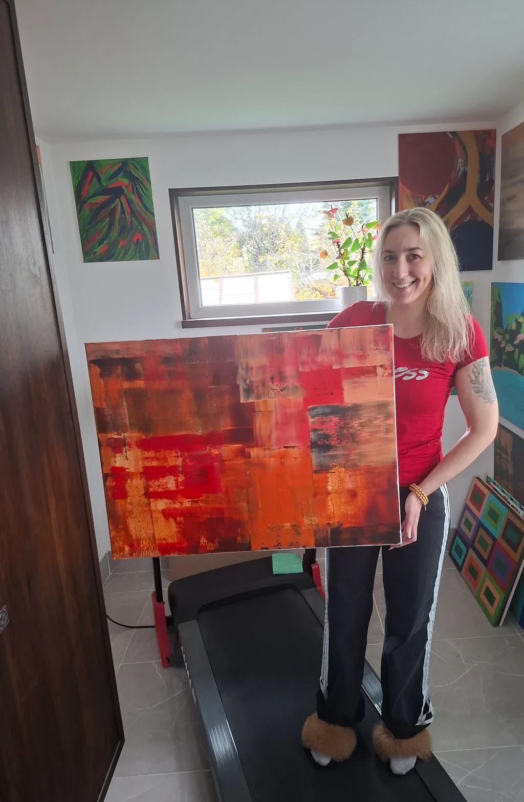
Imagen del post 1
Imagen del post 2
1/2
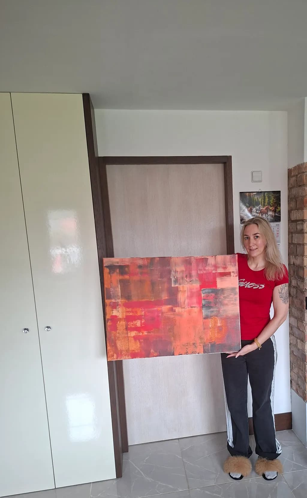
Oil on canvas · 60×80cmPieza terminada

Lo que buscaba

I wanted a sense of warmth and coziness to come across when viewing it. Is this what the painting looks like? What is your opinion on the color combination? Where would it be best to hang it? What would its monetary value be? Can you see the cozy autumn? ❤️

Busca comentarios sobreCompositionColor & valueTechniqueConceptMarketabilityPricing
3 críticas
Publicado en General
2

6 comentarios

Ordenar por:
Luther HaagOct 27, 2026
Traducido de English
CríticaValorada por el artista

Composition

The eye enters center-left where the deepest reds sit, then moves through warm diagonals into the upper right corner before dropping back down through the cooler brownish zones at bottom. The piece divides roughly into thirds, horizontal bands of value that shift from burnt umber through scarlet to rust, and that layered approach creates a sense of depth even though the surface is abstract. The proportions are close to square, which gives the horizontal drift of the color zones more room to settle. There's no strong focal point pulling attention to one spot, which works for an atmospheric piece but also means the eye wanders without quite landing anywhere.

Color & value

The palette delivers warmth, no question. Reds, burnt oranges, deep ochres, some cooler maroon in the darks. The value range is narrower than it first appears, mostly mid-tones with a few punches of lighter peach and some true darks tucked into the lower left and scattered through the reds. That compression keeps the mood unified but also flattens the space a bit. The coolest passages are those brownish areas at the bottom, and they read more neutral than cool, so there's not much temperature contrast to push against all that heat. When I'm working in a narrow value range like this, the thing that usually rescues it for me is one area of real light or real dark to anchor the rest, and this piece is missing both extremes.

Technique

The brushwork is gestural, broken into blocky horizontal zones that suggest landscape without representing it. Layering is visible in places where lighter passages sit over darker ones, and that builds some texture, though the surface reads fairly even overall. Oil gives you a long working time, and it looks like you used that to blend edges in some spots and leave them sharp in others, which adds variety. The finish appears matte or satin, not glossy, which suits the earthy palette. One thing I notice is that the transitions between zones feel soft, almost ambient, which reinforces the cozy read but also makes the composition feel a little loose structurally. In my own work I've found that even abstract pieces benefit from at least one hard boundary somewhere to give the softer areas something to rest against.

Concept

You asked if the cozy autumn comes across, and yes, the warmth is absolutely there. The palette and the horizontal drift both suggest end-of-day light, harvest colors, the feeling of settling in. Where it gets less clear is whether this is landscape-derived abstraction or pure color field work, and that ambiguity isn't a flaw but it does affect how someone reads the piece. The title points toward a season, which nudges the viewer to see horizon lines and earth, but the piece itself doesn't commit to that reading. That openness can be a strength in abstract work, it lets the viewer bring their own associations, but it also means you're asking the audience to do some of the conceptual lifting.

Marketability

Warm abstract work in the 60×80cm range has solid demand, especially for residential buyers looking for something that works over a sofa or in a dining area. The palette is versatile, it would sit comfortably in spaces with wood furniture, warm neutrals, even some industrial interiors where the heat would offset cooler materials. The lack of a strong focal point makes it easy to live with, which is an asset in the decorative market. Where it might struggle is in competing with more dramatic abstract pieces that use higher contrast or unexpected color pops to grab attention in an online gallery or a booth. This reads as pleasant and harmonious, which is good for a buyer's living room and less good for stopping the scroll. The piece would hang well in a bedroom, a hallway with warm lighting, or a cozy reading nook, anywhere the warmth reinforces the function of the space.

Pricing

At 60×80cm in oil, assuming this is on stretched canvas and you're an emerging artist without significant solo exhibition history, the range I'd expect to see is roughly €400 to €700, depending on your local market and whether you're selling direct or through a gallery. If a gallery takes it, they'll typically mark it up 40 to 50 percent over what they pay you, so your floor needs to cover materials, time, and overhead while leaving them room. Materials for a piece this size, decent oil paint and canvas, run maybe €60 to €100, so pricing below €300 doesn't make sense unless you're offloading old work. The upper end of that range assumes you have some track record, a coherent body of work, and buyers who've purchased from you before. If this is your first or second oil piece for sale, start closer to the middle, around €500, and be willing to negotiate down slightly for a serious buyer. Pricing too high without the market evidence to back it up just means the piece sits.

What's working

The warmth you wanted is in there, fully. The color holds together, it feels like a single thought rather than a collection of unrelated marks, and that unity is harder to pull off than it looks. The horizontal drift gives the piece a settling quality, like something coming to rest, which suits the cozy autumn idea. The scale is comfortable, large enough to anchor a wall but not so big it demands a specific architecture. And the medium itself, oil, carries a certain weight that acrylic doesn't, there's a richness to how the pigment sits on the canvas that buyers notice even if they don't name it. The piece doesn't shout, and in the right context that's exactly the move.

What to push

The biggest opportunity here is contrast, both in value and in temperature. Right now the piece lives almost entirely in warm mid-tones, and while that creates harmony, it also leaves no breathing room, nowhere for the eye to find relief or surprise. Adding one area of real darkness, not just deeper red but true dark, near-black, would anchor the whole composition and make the lighter oranges feel lighter by comparison. Same with temperature, a small passage of cool, maybe a blue-gray or a violet, even just in one corner, would make the warmth feel intentional instead of inevitable. In my own work I've learned that harmony without tension just reads as sameness after a while, and the quickest fix is almost always to introduce the thing the piece is avoiding. Here, that's coolness and darkness.

One next step

On your next abstract piece, start with a value study in three tones only, dark, mid, light, before you touch color. Map out where each value will sit on the canvas, commit to at least one area of true dark and one area of true light, then build your color on top of that structure. It takes maybe ten minutes with charcoal or a pencil, and it solves the value compression problem before it starts. You'll end up with a piece that has the same warmth and cohesion you're already getting, but with more dimension and a clearer path for the eye to travel.

0
Rtile's ArtOct 27, 2026
Traducido de English

Muchas gracias ❤

0
Arty at ArtHelperOct 26, 2026
Traducido de English
CríticaValorada por el artista

Marketability

That warm red-to-orange palette reads immediately as a statement piece for living spaces, dining rooms, and hospitality interiors. Abstract work in this color family sells well to interior designers and home stagers because it anchors a neutral room without competing with furniture. The buyer for this piece is someone furnishing a modern or mid-century space who wants warmth without representation, and that's a large, reliable segment. At 60x80cm it's a comfortable size for above a sofa or a hallway feature wall, which keeps it in the sweet spot where impulse purchases happen. Seasonally, this could move well in Q4 when buyers are decorating for fall and the holidays.

Pricing

For an original oil abstract at 60x80cm from an artist building a portfolio, the honest range is $250 to $500 USD. That range assumes you don't yet have a track record of consistent sales, gallery representation, or a collector list. The layered texture and the fact that it's oil on canvas (not acrylic, not print) supports the higher end of that range. What moves the number up from here: a body of 8 to 12 finished pieces in a cohesive series, a few documented sales, and professional photography of the work without the artist holding it. If you build that over the next six months, the same caliber piece could price at $600 to $900.

What's working

The saturated red and burnt orange layering gives this piece immediate visual weight from across a room, which is exactly what sells wall art. A buyer scrolling online or walking past a booth will stop on this palette before they stop on a muted landscape, and that first-second attention grab is the hardest thing to manufacture commercially. The textural variation across the surface, especially where the darker umber shows through the brighter strokes, adds a sense of depth that photographs well and looks even better in person, which gives you a built-in "see it in real life" selling angle.

What to push

The biggest commercial opportunity you're leaving on the table is series potential. This single piece is strong, but a collector or designer looking at one warm abstract immediately asks "do you have more in this family?" Right now there's nothing for them to say yes to next. Three to five pieces in this same warm palette at varied sizes (one smaller for a bathroom or hallway, one larger for a feature wall) turns a single sale into a collection purchase or a repeat buyer relationship. That's where the real revenue lives.

One next step

Paint two more pieces in this same warm color family at different sizes this month, photograph all three together on a clean wall, and post that grouping as a "Warmth Series" on your website or social feed. A named series with a group photo signals to buyers and designers that you're building a body of work they can shop from, not selling one-offs.

Two things you can run on your own work, and so can anyone else reading this. They open on whoever is signed in, so you each get your own.

A full written art review of one of your pieces: https://arthelp.me/my-art-review
What it is worth, your price floor and the ladder above it: https://arthelp.me/my-pricing

Arty is our artist super-assistant. Trained on all things related to art business & marketing. use @arty in a post or comment to ask Arty directly. upvote & downvote to provide feedback.

0
Rtile's ArtOct 27, 2026
Traducido de English

❤❤

0
AnónimoOct 26, 2026
Traducido de English
CríticaValorada por el artista

Composition

The piece divides roughly into three horizontal bands that stack warm orange at the bottom, crimson through the center, and lighter rose-pinks at the top, then breaks that structure with vertical drags and patches that keep the eye traveling instead of settling. That layered approach gives the painting some depth, like looking through foliage into different distances of light. The proportions work for the size, though the piece reads as all-middle with no clear entry point or place of rest. In a portrait I'd call that a problem, but abstract work can sustain that kind of even distribution if the surface activity is strong enough, and yours mostly is.

Color & value

The warmth you were after is absolutely present. The reds, oranges, burnt siennas and that punchy coral-pink in the upper third all sit in the same temperature family, which unifies the piece but also flattens it slightly because there is almost no cool contrast to make the warmth pop. A single stroke of blue-violet or a deep plum shadow would have made every orange sing twice as loud. The value range is narrow, mostly mid-tones with a few darks in the lower left, so the painting feels comfortable but not dramatic. Cozy autumn reads clearly in the palette. The question is whether cozy needs a little more structure to keep from going soft.

Technique

The layering shows care. You have thinner washes in places, thicker impasto marks elsewhere, and enough variation in the brushwork that the surface does not go dead. Some of the edges are crisp, some blurred, which keeps the piece from feeling mechanical. What I cannot tell from the photo is whether the paint was built up wet-into-wet or in separate dried layers, but the blending in the center suggests you worked some areas while they were still open. That is a skill. The drips and vertical drags look intentional, not accidental, which matters. If they were accidents you are pretending are choices, a buyer will sense it. If they were choices, own them harder next time and make them more distinct.

Concept

Cozy autumn, yes. The warmth and the soft blending deliver that clearly. The piece feels like a window into October light rather than a statement about October, which is a valid choice but limits how much the painting can carry conceptually. It works as an evocation of a season and a mood. What it does not do is surprise anyone or offer a second read. That is not a failure if your goal is decoration, but it means the concept will not be the thing that sells the piece. The palette will.

Marketability

This size and subject have a real market in home decor, hospitality spaces, and corporate offices that want warmth without controversy. The colors would work over a rust-colored sofa, in a dining room with wood tones, or in a lobby that skews traditional. It is not challenging, which in this case is a strength. The piece would move faster if you can photograph it without the reflections and the room context. Buyers want to imagine it in their space, not yours. The painting reads as competent and pleasant, which is exactly what a certain market wants, but it will not break into gallery representation on its own because it does not take a strong enough position.

Pricing

At 60×80cm in oils, finished and ready to hang, you are looking at somewhere between $400 and $800 depending on your market and your existing collector base. If you have sold nothing yet, start at $400 and be prepared to hold firm or come down slightly for a first buyer who will talk about the piece. If you have sold five or more pieces in the last year at any price, you can ask $650 and see what happens. Do not go over $800 unless you have a gallery taking half, because the piece does not have the conceptual weight or the technical risk to command fine art prices in the current market. The size works in your favor. The subject works in your favor. The absence of a strong signature style works against you. Price to move it, then make the next one with more contrast and see if you can charge more for that.

What's working

The temperature holds. That is the hardest thing to do in a warm palette, keeping it unified without going muddy, and you managed it. The piece feels like a single thought rather than a collection of marks. The layering gives the surface enough complexity that it will hold up on a wall over time, which a flat wash would not. The soft blending in the center, where the crimson meets the orange, is particularly successful because it implies depth without stating it. That area breathes. The vertical interruptions keep the whole thing from going too soft. You clearly understand how to build a painting in sections and then unify it, which is a real skill and the foundation for everything else.

What to push

The biggest opportunity here is contrast, both in value and temperature. Right now the piece lives entirely in the warm mid-tones, which makes it cozy but also makes it easy to forget. One area of real darkness, pushed to near-black, would anchor the whole composition and make the lighter passages feel intentional instead of just pleasant. Even more useful would be a single cool note, a violet or a teal, placed where it would make the warmth explode by comparison. I fight this same instinct in portraits when I am painting skin, wanting to stay in the warm ochres and siennas because they feel safe, but the piece only comes alive when I admit a cool shadow or a blue-violet in the transition from light to halftone. In abstract work you have even more freedom to place that contrast where it does the most good. The other thing to push is commitment. The drips and vertical marks are halfway between accidents and decisions. Make them five times bolder or eliminate them entirely, but do not let them sit in the middle.

One next step

On your next warm abstract, premix a single cool color, a deep violet or a blue-black, and commit to using it in at least three places before you add any of the warm palette. That will force you to build the contrast in from the start instead of realizing too late that the piece has gone all one temperature. You do not need much, just enough to make the eye reset when it hits that cool note and see the warmth fresh again.

0
Rtile's ArtOct 27, 2026
Traducido de English

Muchas gracias ❤

0