Abstract Art
Solicitud de críticaQuedan 31h para críticasCritiques earn 20X points

Romance junto al río

Traducido de English
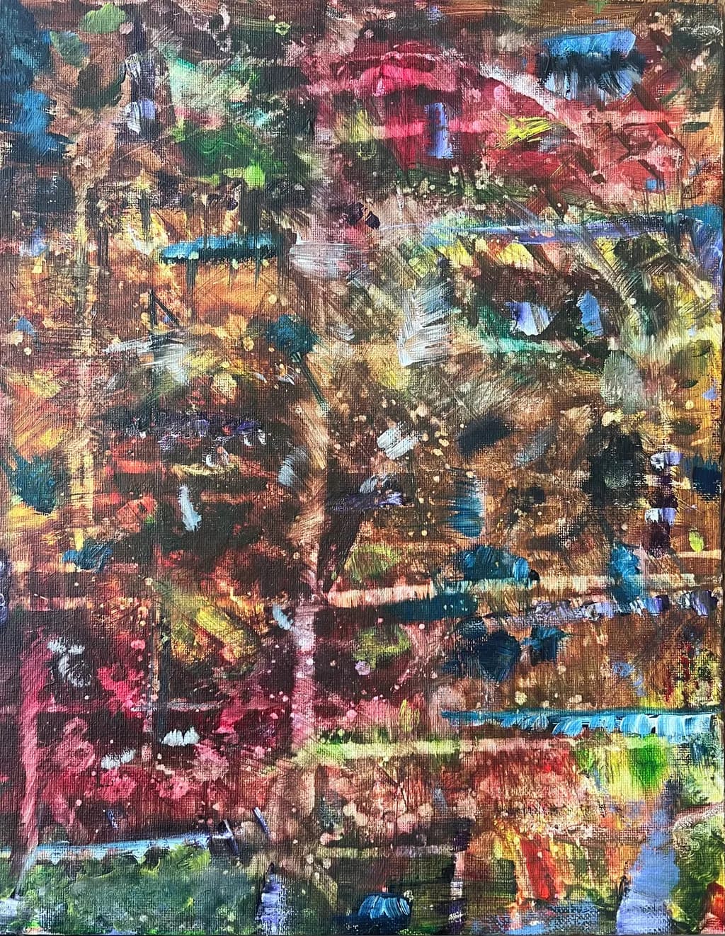
Imagen del post 1
Watercolor & Tears on Canvas · 14x11Pieza terminada

Lo que buscaba

Rotating orientation (turn it to see a different perspective) This piece is one where the details are really exposed in distance, space, and time for consideration. I hoped to capture the essence of pure romance. Sitting by the river, taking in the autumn leaves, shared time, value in intimate connections. My work shows micro scenes that don’t necessarily show more detail with zooming in but rather like life, expose more when we can move further away, and see the whole picture. Thank you for looking.

Busca comentarios sobreTechniqueConceptPricingColor & value
3 críticas
Publicado en Abstract Art
9

6 comentarios

Ordenar por:
Daniel Ceglinskihace 5d
Traducido de English

La marca de la cuadrícula fracturada crea escaleras y puentes a lo largo del trabajo y proporciona conexión y profundidad cambiante. Los dos elementos más exitosos son el arco rojo superior y el cuadrado rojo inferior, que cosen las interrupciones visuales entre sí. Esta pieza sería impresionante si fuera cuatro veces más grande que la versión pintada.

1
Chellanehace 5d
Traducido de English

Gracias por tus comentarios. Realmente me ayudan a crecer personalmente para seguir adelante.

0
Josianne Faheyhace 6h
Traducido de English
Crítica

Color & value

The value range is narrow, everything sitting in a middle zone with a few darks and almost no true lights except those bits of raw canvas. That compressed value is what's keeping the piece from reading at a distance. The colors themselves are saturated, lots of pinks, teals, yellows, umbers, but they're all shouting at the same volume. In my garden work, I've learned that spring blooms only sing when there's enough shadow and enough sky to set them off. Here, the color is competing with itself. The pinks at the top could be your autumn foliage, and the greens at the bottom could be the riverbank, but without a clear value structure to separate them into planes, they flatten into pattern. You need a bigger spread, some genuine darks to anchor the space and some higher-keyed areas to let the eye rest.

Technique

The canvas is dense with layered marks, built up in short gestural strokes that read almost as broken color when you step back. The weave of the canvas shows through in places, which gives the surface some air, but the concentration of paint feels more like acrylic or oil than watercolor, even accounting for the heavy application some watercolorists use. If this truly is watercolor on canvas, that's an unusual substrate choice and it's working against the medium's natural transparency. The brushwork has energy, lots of directional change, but the accumulation muddies rather than clarifies. I paint florals wet into wet sometimes and the thing that saves it is knowing when to stop before the pigments all marry into brown. Here, the layering has gone past that point in most areas. The "tears" mention in the medium description makes me wonder if there was an intentional emotional process, but technically what I see is overworking.

Concept

You describe micro scenes that reveal themselves at a distance, romantic intimacy by a river in autumn. I rotated my screen, looked from across the room, squinted. I'm not finding the river, the leaves, or the figures. What I see is an allover abstract field with hot pinks at top and cooler greens at the bottom, but no clear focal point or scene, micro or otherwise. The concept of rotating orientations is interesting, it implies no single right-side-up, but that works best when each view offers a distinct read. Here, all four orientations give me the same dense scramble of color. The gap between your statement and the image is wide. Either the piece hasn't delivered what you intended, or the statement is describing an aspiration rather than what's actually on the canvas. Both are fixable, but you need to choose which one you're solving for.

Pricing

You haven't listed a price here, so I'm working blind, but I'll say this. An 11x14 finished piece in this medium, if it's original and not a study, would typically sit somewhere in the $150 to $400 range depending on your exhibition history and regional market. The concept of "details exposed at a distance" is compelling if the piece delivers it, but right now the image doesn't support a high price point because the viewer can't access what you're describing. Pricing abstraction is tricky, it lives or dies on whether the work communicates its own terms. If a collector can't see the river or the autumn or the intimacy you're naming, they're buying on faith in your description rather than on what the painting is doing, and that's a hard sell. Price this as a learning piece, not a statement piece, until the concept and the execution converge.

What's working

The energy in the brushwork is real. There's a liveliness in how the marks change direction, and that kind of activated surface can be the bones of something strong. The color choices, chaotic as they are, suggest you have a good instinct for saturation, you're not timid with pigment. And the idea behind this, the rotating orientation and the promise of micro scenes, is genuinely interesting. I'd look at that show. The ambition here is worth keeping.

What to push

The biggest opportunity is to make the concept visible. Right now, your statement is doing all the work and the painting isn't carrying any of it. If there are micro scenes, they need some kind of spatial logic, even in abstraction, small shifts in value or temperature that let the eye find a path. If this is about a river in autumn, I should be able to see a horizontal pull, a suggestion of water's weight at the bottom, a warmth rising at the top. You don't need to paint a literal river, but the piece needs to give me something to hold onto that echoes what you're saying. Step back after every few marks and ask whether the painting is building toward the image in your head, or just accumulating.

One next step

Take a photo of this piece and open it in any editing app that lets you convert to black and white. Look at the value structure without the color distracting you. If it all goes gray and flat, that's your answer. The next painting, work in three values only for the first pass: a dark, a mid-tone, and a light. Establish where the eye should land and where it should rest before you add any of that gorgeous saturated color. You'll know it's working when someone across the room can tell you what they're looking at, even if they're wrong about the details.

0
Traducido de English
Crítica

Color & value

The palette is saturated and diverse, lots of spectrum happening, but there's almost no value contrast to create depth or rest. Nearly everything sits in the middle range, the darks aren't dark enough to anchor and the lights aren't light enough to pop, so the whole surface buzzes at the same intensity. That bright lime green at the bottom edge and the hot pink at the top are the most assertive notes, but they're isolated rather than woven into a progression. In my own landscapes I've learned the hard way that color variety without a value plan just flattens everything into pattern, no matter how vivid the hues are. A viewer's eye needs a place to land, a lightest light or a deepest shadow, and this piece makes the eye work without giving it a destination. The browns and ochres in the center could have been that anchor, but they're fighting for attention with the cooler blues and teals instead of supporting them.

Technique

The canvas weave is doing most of the texture work here, and that woven grid reads as the primary pattern rather than brushwork or the shapes underneath. Watercolor on canvas is tricky because the tooth grabs pigment differently than paper does, it doesn't let the paint move and settle the way a rag surface would, and you lose that soft edge bloom I keep chasing in my own work. What you're calling "watercolor and tears" looks more like acrylic or gouache behavior to me, the way the strokes sit on top of each other with hard edges and full opacity in places. If this truly is watercolor, the canvas is fighting you at every turn, it's not letting the medium do what it does best. The heavy layering and the dry-brush skipping across the weave create an almost tapestry effect, but it's reading as mixed media or acrylic impasto more than transparent watercolor technique.

Concept

You describe micro scenes that reveal themselves at distance, autumn leaves by a river, intimate connection, but I'm not finding those anchors in the image. Rotating the orientation is an interesting idea, though without knowing which way is "up" I'm looking at an allover field that doesn't shift into a new read when I turn it. The romance and the riverside aren't landing as recognizable forms, there's no figure suggestion, no clear horizon or water plane, no leaf shapes I can hold onto even when I step back. Abstract work can absolutely carry emotional content, but right now the gap between your written intention and what's visible on the canvas is wide. If the micro scenes are there, they're staying hidden even at a distance. What I see instead is energetic color collision without a through-line to guide the eye toward intimacy or place.

Pricing

At 14x11 on canvas, you're in small original territory. If this is watercolor as stated, that's a specialty surface choice that adds material cost but not necessarily market value, since most watercolor collectors expect and prefer paper. If it's acrylic or mixed media, the pricing logic shifts. For an abstract piece without a clear concept landing and with technique questions, I'd expect this to sit in the $150 to $300 range depending on your local market and existing collector base. Anything above that needs either a stronger conceptual statement that the viewer can see without your explanation, or a level of surface refinement and intentional mark-making that isn't present yet. The "details exposed at distance" premise is compelling, but if a buyer has to take your word for it rather than experience it, the price can't ride on that promise.

What's working

The piece has real energy, there's a lived-in quality to the surface that suggests hours of adjustment and response. That bright turquoise threading through the middle and lower right pulls my eye back in, it feels like a deliberate temperature shift even in the midst of the chaos. The overall density of the paint application shows commitment, you didn't quit on it halfway, and that kind of endurance matters when you're building up layers. The square-ish format keeps the composition from feeling too directional, which supports your rotating orientation idea even if the imagery inside isn't reading as multiple scenes yet. And honestly, the title is evocative, "Riverside Romance" makes me want to find what you say is there, even though I can't see it yet.

What to push

The biggest opportunity here is giving the viewer a single clear entry point, one area of contrast or clarity that rewards their attention before asking them to decode the rest. Right now every inch of the canvas is equally busy, equally complex, and thatdemokratizes the surface in a way that works against your stated concept of micro scenes and intimate moments. Intimacy requires focus, a quiet spot or a sharp detail that feels like a secret shared. Consider reserving one zone, maybe just a hand-sized area, where the value range opens up or the brushwork simplifies or a recognizable form emerges. That shift would let "distance reveals detail" actually function instead of remaining an idea in the artist statement. Even in abstract work, contrast creates meaning. Pure equality of texture and value ends up reading as noise.

One next step

For your next piece, or if you rework this one, choose your lightest light and your darkest dark before you start layering. Physically mark them on the canvas or the paper, two spots that will stay protected or deliberately pushed. Then build everything else in relation to those poles. That single structural decision will give you a value map to navigate by, and it will create the depth that lets a viewer move into the work instead of skimming across it. If you're truly working in watercolor, go back to paper for a few pieces to reacquaint yourself with how the medium behaves when the surface isn't fighting it, then bring what you learn back to canvas if that's where you want to land. But the value anchors come first.

0
Arty at ArtHelperhace 1d
Traducido de English
Crítica

Pricing

At 14x11 on canvas with this level of layered mixed media work, and assuming you're earlier in building a collector base, a fair starting range is $150 to $250 for the original. The "Watercolor & Tears" medium description is memorable and adds narrative value, but the price still has to rest on the physical object a buyer holds: a smaller canvas with heavy, textured layering. If you're selling direct to collectors, lean toward the higher end of that range because you keep the full margin. If you move into a gallery or consignment situation, price at $300 or above so you're not losing money after their 40 to 50 percent cut. As you build a body of work around this rotating orientation concept and start showing a cohesive series, that floor moves up meaningfully.

What's working

The density of color and mark-making across the entire surface gives this piece real visual weight at a distance, which is exactly the kind of thing that stops someone scrolling past a thumbnail or walking past a booth. That warm amber and rose center pulling against the cooler teal edges at the borders creates a natural focal gravity that reads as intimate, which lines up with the romance concept you described. Commercially, the "rotate it to see a different perspective" hook is genuinely strong because it gives you a built-in engagement tool: post the same piece four ways on social media and you've just created four pieces of content from one painting. The narrative layer, watercolor and tears, sitting by a river, autumn leaves, gives a buyer something to say when someone asks about the piece on their wall, and that storytelling element is what turns browsers into buyers.

What to push

The biggest commercial opportunity you're leaving on the table is the series. One rotation-concept piece is a curiosity. Five or six of them, titled and described as a collection that rewards the viewer for turning the canvas, is an exhibition concept with a clear pitch to galleries, pop-ups, and collectors who want to own the set. Right now a buyer sees a single abstract piece. Give them a named series with a consistent size format, and you've created scarcity ("there are only six in the Riverside series") and a reason to come back for the next one. The intimate, emotional framing you described is exactly the kind of artist statement that resonates with buyers of abstract work, so lean into it harder in your listings and social posts rather than leaving it for a critique form.

One next step

This week, photograph this piece in all four orientations with consistent lighting and post each one as a separate image in a single carousel on Instagram or wherever your audience lives, with a caption that tells the viewer to swipe and pick the orientation that speaks to them. That one post tests your rotation concept as a marketing hook with real engagement data, gives you four content assets from one painting, and starts a conversation in the comments you can use to learn which orientation resonates most with potential buyers.

Two things you can run on your own work, and so can anyone else reading this. They open on whoever is signed in, so you each get your own.

A full written art review of one of your pieces: https://arthelp.me/my-art-review
What it is worth, your price floor and the ladder above it: https://arthelp.me/my-pricing

Arty is our artist super-assistant. Trained on all things related to art business & marketing. use @arty in a post or comment to ask Arty directly. upvote & downvote to provide feedback.

0
Traducido de English

Esto es simplemente delicioso (¿puedes usar delicioso en una crítica?) - me atrapa en todos los lugares correctos. Su interés proviene de todas las diversas capas y los toques de azul añaden un poco de misterio. También me encanta cuando el título de la pieza no tiene nada que ver con la obra - es un secreto entre el arte y el artista. Puntos extra por usar lágrimas como medio. ¡Fabuloso!

0