Kritik-AnfrageKritikfenster geschlossenCritiques earn 20X points
Sennas letzter Tanz
Übersetzt aus English
Watercolor · 8.27 × 11.69 inchesFertiges Werk
Was ich erreichen wollte
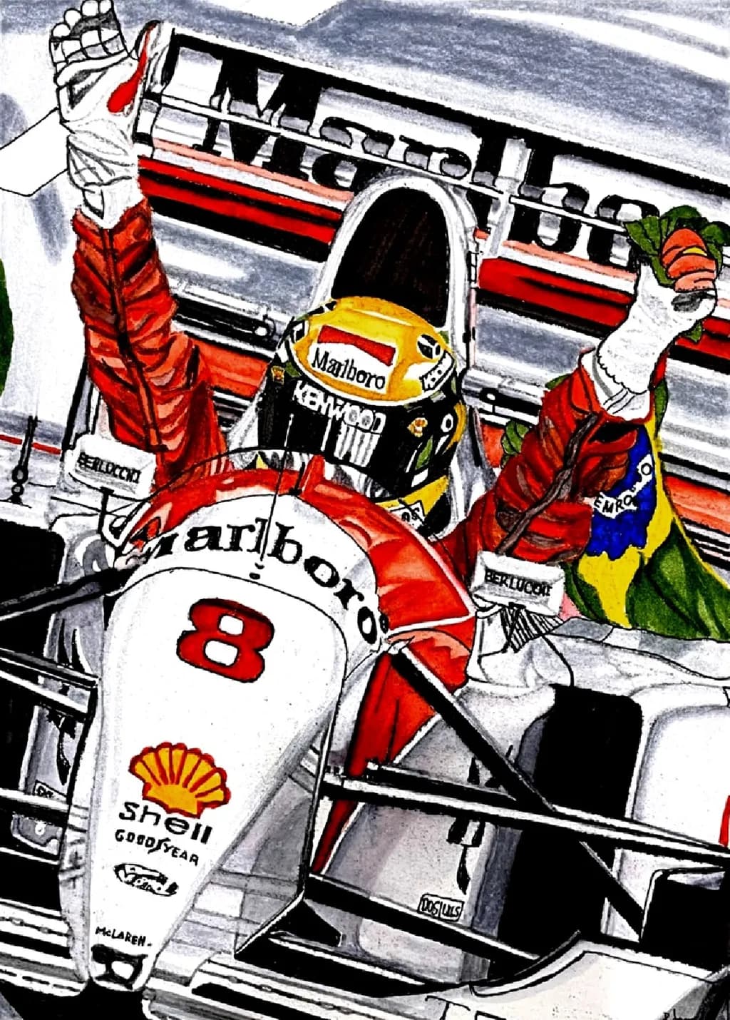
Vision: High-contrast artwork NG AutoArt frames Ayrton Senna’s 1993 McLaren victory tightly, letting vivid colors pop aggressively. Narrative: The posture honors his defiant spirit and fierce national pride as he grips the Brazilian flag. Feeling: Evokes raw adrenaline, nostalgia, and inspiration to conquer impossible odds.
Wünscht Feedback zuCompositionColor & valueTechniqueConceptPricing
3 Kritiken
Veröffentlicht in Watercolor Art
6
Composition
The eye enters through that yellow helmet dead center, then follows the raised arms outward to the flag and champagne, which creates a strong upward V that reads as triumph. You've framed it tight, cockpit filling most of the rectangle, sponsors and car details pushed right to the edges so there's no breathing room, which matches the intensity you were going for. The angle is slightly low, looking up at Senna, which gives him stature. What's not quite landing is the left arm with the flag, it's competing for attention with the helmet rather than complementing it, and the grandstand behind feels like an afterthought, those horizontal stripes flattening the space instead of adding depth. When I'm working a tight composition like this, I've learned the background either needs to recede hard or push forward as a character, right now it's doing neither.
Color & value
The reds absolutely pop, that's where the contrast lives, the suit and car livery against the grays and blacks create exactly the aggressive color you described. The yellow helmet pulls focus perfectly. But the value structure is uneven, the champagne bottle on the right and the flag both sit in a similar mid-value range as parts of the suit, so they're fighting instead of separating. The grandstand reads flat because it's all one value of blue-gray, no light side or shadow side. In my own travel work I've had to push darks way darker than feels safe to make the lights sing, and this piece needs that, especially in the cockpit shadows and the underside of the raised arms. The white of the car is doing good work holding the bottom third, but it could go one step lighter to anchor the whole value range.
Technique
This is marker or mixed media, not watercolor as you listed, the edges and saturation tell me that immediately. The line work is confident, especially on the helmet and car details, those sponsor logos are crisp. The reds show layering, you've built up that suit in passes which gives it dimension. What's struggling is the transition areas, where red suit meets black glove, where helmet meets visor, those edges are either too hard or too soft without intention behind the choice. The grandstand stripes look rushed compared to the care in the foreground, and the flag's green and yellow aren't integrating with the rest of the palette, they're sitting on top. I work in watercolor and gouache so I can't speak to marker technique from experience, but I can see where the medium is doing the work for you versus where you're controlling it.
Concept
You said "defiant spirit and fierce national pride" and the raised arms with the Brazilian flag deliver that, the posture reads as victory. "Raw adrenaline" is there in the tight framing and saturated reds. Where it's not quite landing is "1993 McLaren victory," because the visual doesn't clarify which race, which moment, what made this particular win significant versus any other podium. The title says "last dance" which implies finality, but nothing in the image communicates that weight, it's a generic celebration. When I sketch a travel moment, the specific light or one small detail is what makes it that place and not just any café, and this piece needs its equivalent, something that says why this victory mattered in Senna's story. Right now it's a well-executed sports illustration of a win, but it's not yet the narrative portrait you described.
Pricing
You're heading to a print store, which means you need to price both originals if you're selling this one, and print runs. For an 8.27 × 11.69 mixed media piece of a recognizable sports figure, the original has licensing risk, Formula 1 and the Senna estate are protective of commercial use and you've reproduced logos, likenesses, and trademarks without rights. That makes the original nearly unsellable through legitimate channels, and prints are legally murky at best. If you're committed to this as a shop piece, you'd need to stylize it further away from photographic reference, lose the sponsor logos, and frame it as fan art, which typically sells as small prints in the fifteen to thirty-five dollar range depending on your following. The technical execution here isn't yet at a level where collectors would pay gallery prices even if the licensing were clear. This is hard news but it's real, I've seen artists build whole shops on IP they don't own and get cease-and-desist letters that wipe out years of work.
What's working
The color choice is doing exactly what you wanted, those reds against the grays create energy and the yellow helmet is a perfect focal point. The tight crop was the right call, it puts us in the moment instead of observing from a distance. The level of detail on the car, the sponsor patches, the helmet design, that shows care and the willingness to put in hours on the tedious parts, which matters when you're building toward print work. The posture communicates triumph clearly, both arms up, head back, it's a readable gesture even at thumbnail size. You've captured a specific driver in a specific era of racing, the McLaren livery and Marlboro branding place it in time, and that specificity is valuable even though it's creating the licensing problem I mentioned above.
What to push
The biggest opportunity here is to make the background support the foreground instead of flattening it. Right now the grandstand is decoration, it's not adding atmosphere or depth, and those stripes are pulling the eye in the wrong direction, horizontally across when the composition wants to move vertically up through the arms. Push those stands way back in value, lighten them or gray them down so they recede, maybe add some blur or lost edges to separate the planes. The second push is the flag, it's the narrative key, the "fierce national pride" you named, but it's getting lost in the same value as the suit. That green and yellow could be more saturated, brighter, maybe even backlit so it glows against the stands. When I'm working a piece where one element carries the emotional weight, I've learned to give it the best light and the most contrast, and your flag hasn't gotten that treatment yet.
One next step
Scan or photograph this piece as it is now for your records, then take the grandstand area back. Mix a transparent gray, something way lighter and cooler than what's there, and glaze over those blue stripes until they're half the current value. You want them to recede hard, to feel like background atmosphere instead of a competing pattern. Do that first, before you touch anything else, and look at the piece again. That one change will make the figure and flag come forward, and it'll show you immediately whether the rest of the composition can hold or needs more work. It's a small enough fix that you can do it this week without overworking the piece, and it'll teach you something about value structure that'll apply to the next one.