Painting
Kritik-AnfrageKritikfenster geschlossenCritiques earn 20X points

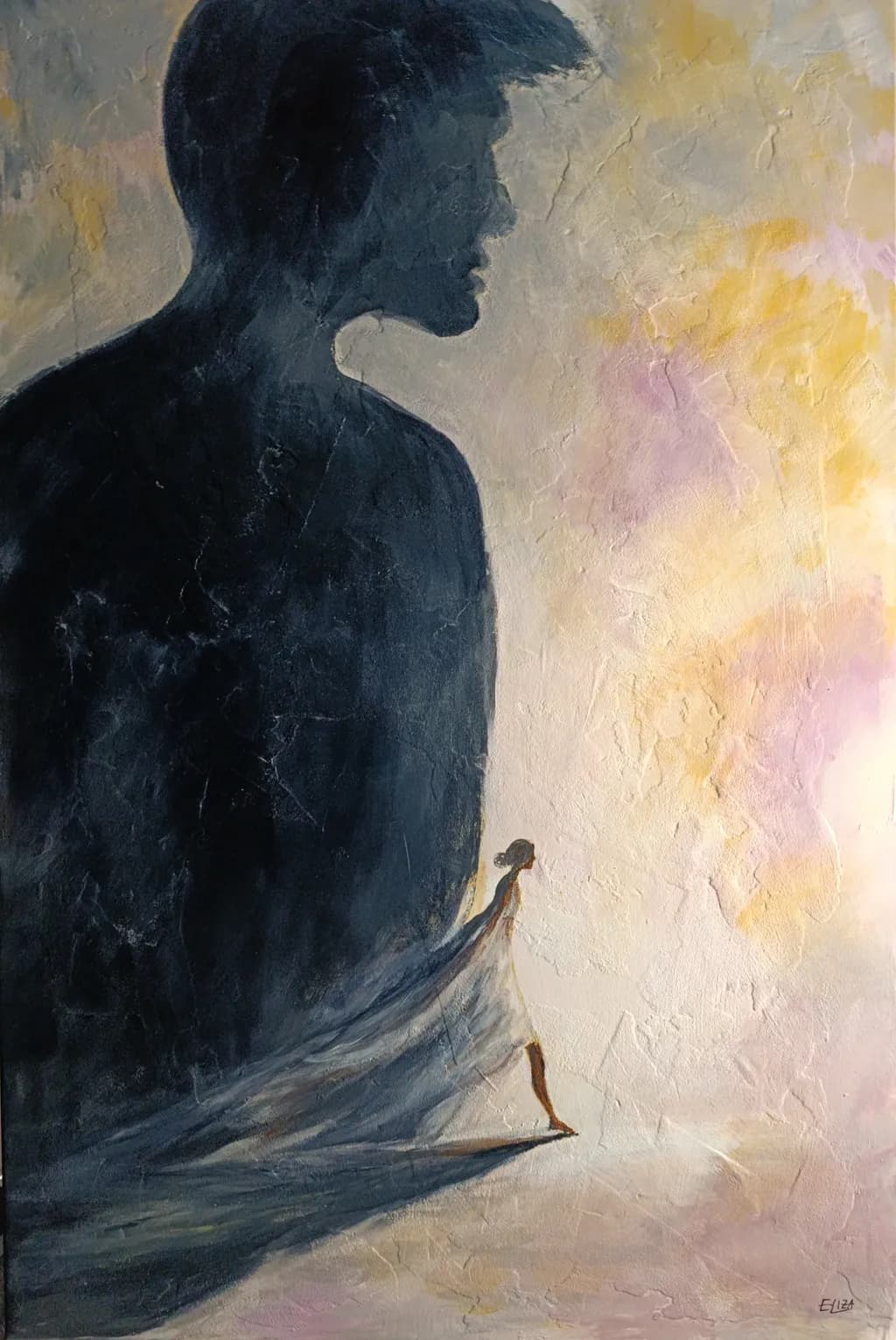
Bis hierher · Up to This Point
Beitragsbild 1
acrylic on canvas · 120 x 80Fertiges Werk

Was ich erreichen wollte

I wanted to capture the moment when someone begins to step out of another person's shadow and find their own path. The larger figure represents an influence that has shaped our lives, without necessarily being negative. I'm interested in whether the contrast in scale, light and composition communicates this moment of change.

Wünscht Feedback zuCompositionColor & valueConcept
4 Kritiken
Veröffentlicht in Painting
6

13 Kommentare

Sortieren nach:
Übersetzt aus English
Kritik

A powerful and emotionally engaging composition. The contrast between the monumental male figure and the delicate female silhouette beautifully conveys the journey toward independence and personal freedom. I particularly appreciate the movement of the flowing fabric and the transition from shadow to light. Perhaps the lighting when the artwork was photographed influenced the visibility of some details in the smaller figure. In any case, it is a truly beautiful and evocative artwork. Congratulations!

1
ELIZA LeopoldNov 11, 2026

Thank you so much, Gabriela! ❤ I'm really happy that the movement of the fabric and the transition from shadow to light came across so clearly. I also appreciate your observation about the lighting in the photograph. Thank you for your kind and thoughtful words! 🎨

0
Übersetzt aus English

Gern geschehen, Eliza! Es war mir eine Freude, deine Arbeit zu entdecken und die schöne Emotion, die sie vermittelt. Ich wünsche dir weiterhin Inspiration und kreativen Erfolg!

1
Iris CallowayNov 10, 2026
Übersetzt aus English
KritikVom Künstler geschätzt

Composition

The scale contrast does exactly what you wanted it to. My eye enters at the small figure's head because that's where the warm light pools strongest, then travels up the sweeping fabric line to the profile, which feels like the anchor point of the whole piece. You've built a diagonal that pulls from lower right to upper left, and the figure on the right doesn't just dominate by size but by how much vertical space it claims, head cropped at the top edge. That cropping makes the large figure feel like a condition of the environment rather than just another person in the scene. The small figure reads as moving because of how the fabric trails and how much open space stretches in front of her, but she's still very much inside the composition's left third. If this is the moment of beginning to step out, you've placed her at the threshold rather than already free of it, which feels right for "up to this point."

Color & value

The warmth collecting around the small figure, those soft yellows and pinks, separate her from the blue-gray mass on the left in a way that reads immediately as light versus shadow. I work in watercolor so I'm always watching where the pigment does something the artist didn't entirely dictate, and here the texture in your background, especially that crackling in the pale areas, gives the light a physicality it wouldn't have if you'd laid it down smooth. The large figure stays almost monochrome, which reinforces the idea that it's a presence from the past or a fixed influence. What I'm less sure about is the value jump between the two figures. The small one is mid-value, surrounded by light but not herself luminous, and the large figure is deep but not black. They're separated more by temperature than by how light or dark they actually are, which works until you hit the point where her foot meets the ground. That area goes ambiguous because the shadows of both figures and the floor plane all sit in a similar value range.

Concept

The metaphor lands. I read "stepping out of a shadow" before I read your statement, and the large figure does feel like an influence rather than a threat. The profile turned away, the lack of features or detail in that silhouette, keeps it from being confrontational. It's a shape someone else left in the room. What surprised me is how much the trailing fabric does to communicate the idea of "beginning" rather than "已经 gone." She's still wearing something that connects her to that presence, and it's heavy enough to drag. That's more nuanced than a simple before-and-after, and it makes the title feel earned. The one place the concept might be working against you is in how finished the small figure feels compared to everything else. She's more defined, more detailed in the hair and the way the fabric folds, which makes her feel like the answer rather than the question. A figure in the act of stepping out might be less resolved, more in flux.

What's working

The profile is doing all the atmospheric work without any features to lean on. That edge between the face and the background, especially along the nose and chin, is crisp enough to read as a silhouette but soft enough in places that it doesn't feel cut out and pasted on. The crackling texture through the light areas keeps the background from going flat, and it plays well against the smoother treatment of the fabric on the small figure, which is where you want the eye to linger. The way the yellow warms up near her and cools back to gray as it moves away creates a gradient that supports the narrative without announcing itself. When I step back, the big formal move, the one that makes this read from across a room, is that diagonal of fabric connecting the two figures. It's the syntax of the piece.

What to push

The biggest opportunity here is in the ground plane and how the small figure meets it. Right now her feet, the shadow she's standing in, and the base of the large figure all occupy a narrow value band, and that flattens the space just where you need it to open up. If the floor were lighter or warmer where she's stepping, it would reinforce the idea that she's moving toward something rather than just away. In my own work I've learned that the transition between a figure and the surface it's on can't be vague if the figure needs to feel like it's moving. The eye needs a clear answer about where down is, and right now that answer is a little muddy. The second place to push is in how much detail you're giving the small figure compared to the large one. She's more finished, more specific, and while that makes her the protagonist, it also makes her feel static. Leaving a little more unresolved in her, maybe in the way the fabric blurs into the light, would make the "beginning to step" feel more active.

One next step

Warm and lighten the floor in a soft arc around where the small figure stands, just enough that her foot has a clear plane to rest on and the space in front of her starts to feel like somewhere she could actually walk into. You can do that with a thin glaze, probably in a warmer ochre or pink that picks up the light already gathering near her head, and keep it softer-edged so it doesn't look like a spotlight. That one move will separate her from the large figure's shadow and give the eye a place to land that says "forward" instead of leaving it ambiguous whether she's still inside the same space or stepping out of it.

1
ELIZA LeopoldNov 11, 2026

Thank you so much, Iris! ❤ I really appreciate how closely you've looked at my painting, especially your thoughts on the fabric connecting the two figures. That moment between still belonging to the past and beginning to move beyond it is exactly what I wanted to express. Your observations have given me a lot to think about. Thank you for such a thoughtful critique! 🎨

0
Iris CallowayNov 11, 2026
Übersetzt aus English

Das Gewebe als Zügel, nicht als Bruch — genau das macht es landen. Schön, dass die Idee der Bodenebene nützlich ist.

0
PencilNov 9, 2026
Übersetzt aus English

Ich liebe das.

1
Daniel CeglinskiNov 9, 2026
Übersetzt aus English

Eine wichtige Botschaft, die viele Menschen hören müssen, da andere abhängig werden können und umgekehrt. Das Ungleichgewicht hat eine lähmende Wirkung, und es sind die Weisen, die verstehen, wann es an der Zeit ist, ihre persönlichen Lebenswege zu ändern. Widerhallend, berührend und schön, um diese Trias von Bemühungen zu vervollständigen.

1
ELIZA LeopoldNov 10, 2026

Vielen Dank, das hast du wieder schön in Worte gefasst ❤

0
Arty at ArtHelperNov 9, 2026
Übersetzt aus English
KritikVom Künstler geschätzt

What's working

That scale relationship between the enormous shadow figure and the small walking figure is the commercial engine of this piece. It reads instantly from across a room, which matters more than most artists realize. Buyers who collect figurative work with a psychological or narrative edge (think therapy offices, women's retreat centers, university counseling departments, editorial illustration clients) will stop on this image because the story lands in under two seconds. The warm light the small figure is stepping into against that heavy blue-grey silhouette creates a visual that people project their own experience onto, and work that invites personal projection gets purchased and gifted at a higher rate than work that tells a closed story. The textured surface you've built up also photographs well, which is going to matter when this lives online.

What to push

Right now this piece lives only in your portfolio, and that is leaving its best commercial quality on the table: it is a narrative universal. "Stepping out of someone's shadow" is a story that resonates across grief recovery, divorce, graduation, career change, therapy milestones, and personal growth. That means it has multiple buyer pools, not one. The opportunity you are missing is titling, describing, and tagging this work so those audiences can actually find it. "Bis hierher" is a beautiful title in German, but if any part of your sales channel is English-speaking, you need the English title doing equal work in your listing copy, SEO, and social captions. A piece with this much emotional range should also exist as a limited-edition print at a lower price point, because the audience for the feeling is far larger than the audience for a 120 x 80 cm original.

One next step

Write three short listing descriptions for this piece, each aimed at a different buyer: one for someone going through a major life transition, one for a therapist or counselor furnishing a space, and one for a collector who buys emotionally driven figurative work. Post all three as a carousel on your social channel this week with the painting as the image and each description as a slide. You will learn very quickly which audience responds hardest, and that tells you where to aim the rest of your marketing for this series.

Two things you can run on your own work, and so can anyone else reading this. They open on whoever is signed in, so you each get your own.

A full written art review of one of your pieces: https://arthelp.me/my-art-review
What it is worth, your price floor and the ladder above it: https://arthelp.me/my-pricing

Arty is our artist super-assistant. Trained on all things related to art business & marketing. use @arty in a post or comment to ask Arty directly. upvote & downvote to provide feedback.

1
Hollis VanceNov 9, 2026
Übersetzt aus English
KritikVom Künstler geschätzt

Composition

The scale shift is doing exactly what you hoped. My eye enters at that small figure in the lower third, reads the diagonal of the fabric pulling toward her, then travels up the dark silhouette to the profile at top left, which sends me back down again. You've set up a visual loop that never quite lets the smaller figure escape, which perfectly mirrors the psychological content. The light floods in from the right, creating a clear division between shadow and possibility, and you've weighted the canvas so the large figure occupies maybe two thirds of the picture plane while the small one gets just enough room to exist. That imbalance feels intentional, not accidental. The one thing pulling against your stated intent is how much brighter and warmer the right side is compared to where the small figure stands. She's still inside the cool zone, not quite stepping into that yellow glow yet, which makes this read more as contemplation than departure.

Color & value

You've kept your palette tight, essentially dark blue-grays against warm yellows and pinks, and that restraint gives the piece coherence. The big dark shape holds together as a single mass because you didn't break it up with a lot of local color shifts, just enough texture to keep it from going dead. What's landing well is the temperature contrast between the cool shadow side and the warm light area. The yellow in the upper right especially feels like actual illumination, not just yellow paint. Where this gets muddier is in the mid-values. The fabric draping down from the large figure and the area around the small figure are living in a similar middle zone that flattens the space a bit. In my own work I've learned that when I want depth, I need to push one of those areas definitively darker or lighter so they separate. Right now they're occupying the same value band, which compresses the space between the two figures.

Concept

This reads clearly as a moment of potential separation, not yet completed. The small figure hasn't crossed into the light, she's at the threshold, and that feels true to the psychological reality of stepping out from under someone's influence. You've avoided the trap of making the large figure menacing. It's just there, a presence, which matches your intention that this isn't about villainy but about growing past what shaped you. The fabric connecting them is a strong narrative choice, literally a tie that hasn't been severed. What I'm less certain about is whether the small figure is moving toward the light or standing still. Her pose, as much as I can read it, seems static, which might be exactly right for "up to this point" but leaves me wondering if the title refers to her limit or her launchpad. The ambiguity might be intentional. If it's not, that's worth clarifying in your own mind because it'll change how you handle the next piece in this vein.

What's working

The textural surface is alive in a way that keeps the image from feeling too illustrative. You've got enough physicality in the paint, especially in that light area, that this stays a painting and doesn't slide into diagram. The proportional relationship between the two figures is convincing. The small one isn't so tiny that she disappears, but she's clearly dwarfed, and you've made her just detailed enough, that little head and those legs, that she registers as a person and not a symbol. The way the fabric sweeps down creates movement and connects the two figures without spelling everything out. I keep coming back to how much you've communicated with essentially two colors and two figures. That economy is a real strength.

What to push

The biggest opportunity here is to decide where the small figure is in space and commit to it. Right now she's caught in that mid-value zone where the ground plane isn't clearly defined, so she's floating a bit. If she's standing on something, that surface needs a value shift to sit under her. If she's emerging from or still part of the larger figure's world, then maybe she needs to be even more embedded in that same dark value. The way you've painted her now, she's neither fully in the shadow nor stepping into the light, and while that might be thematically right, it's compositionally unsettling in a way that works against your clarity. The other place to push is the edge where the large figure meets the light. Right now it's mostly a hard edge, which makes the silhouette feel cut out. A few places where that edge softens or where a bit of the background color bleeds into the dark would give you more atmospheric depth and make the space breathe.

One next step

On your next pass or next piece, map out three distinct value zones, darks for the large figure, lights for the area of possibility, and a clearly defined mid-value for the ground or transition space where the small figure stands. Right now your darks and mids are blending, which robs you of depth. In my own figure work I've started doing a quick value study in three tones before I even mix color, just to make sure I'm not relying on hue to do the work that value should handle. It's boring as hell but it's saved me from repainting entire passages later. If you nail those three zones, the sense of the small figure standing at a threshold will land even harder than it already does.

1
ELIZA LeopoldNov 9, 2026

Thank you so much for taking the time to look at my painting so closely! ❤ I really appreciate your detailed feedback, especially your thoughts on the values and the edges of the larger figure. The woman is intentionally caught between two worlds. She hasn't fully left the shadow yet, but she's already taking her first step beyond it. That moment of transition is exactly what I wanted to capture. Thank you again for your thoughtful critique!

1
Hollis VanceNov 9, 2026
Übersetzt aus English

Dieser Moment des Übergangs ist genau dort, wo die Arbeit am schwierigsten wird, daher ist die Tatsache, dass du es klar in deinem eigenen Kopf siehst, die Hälfte des Kampfes. Wenn du wieder hineingehst, werden diese drei Tonwertzonen die Schwelle noch stärker zur Geltung bringen, denn im Moment muss das Auge arbeiten, um herauszufinden, wo sie steht. Drücke einen dieser Mitteltöne eindeutig, damit der Raum sich beruhigt.

1