Unbenannt

Was ich erreichen wollte
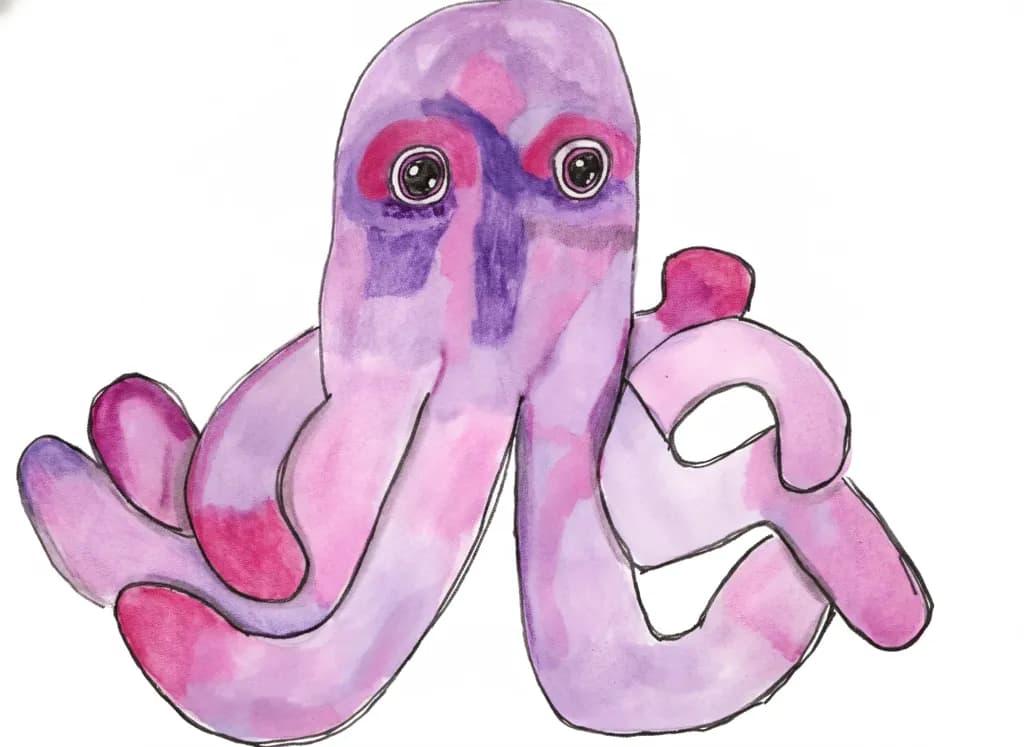
I justed wanted to sketch my purple plush octopus and work on my shadowing and highlights. Also working on depth and dimension. I wanted to try to make the eyes and colours pop. Does it need a soft wash background?

Was ich erreichen wollte
I justed wanted to sketch my purple plush octopus and work on my shadowing and highlights. Also working on depth and dimension. I wanted to try to make the eyes and colours pop. Does it need a soft wash background?
Color & value
The pink and purple are close neighbors, which makes the piece feel gentle but also flattens it. You've got darker purple in the center vertical of the face and some in the tentacle undersides, which starts to build dimension, but the value range is narrow overall, maybe three steps at most. The eyes pop because they're the darkest darks with those white rings, not because the colors themselves are more saturated. For a purple plush object, you'd expect to see more contrast if a light source is hitting it, cooler shadows where it curves away, warmer or lighter wash where the fabric catches direct light. Right now the color is even enough that it reads as local color, the purple of the octopus itself, rather than purple being shaped by light.
Technique
The ink line is doing most of the work here, holding the form together while the watercolor sits inside it. That combo can look like a coloring book if the line and the wash don't talk to each other, but you've let some of the purple drift across boundaries in places, which keeps it loose. The eyes are the tightest part, multiple rings with highlights placed dead center, and they read immediately as the focus. Watercolor pools unevenly by nature, and you've got some of that mottling in the head and tentacles, but it's not clear yet whether you're using it or just letting it happen. The white gaps inside the right tentacle curves look intentional, like you're trying to carve out a sense of roundness, but they're isolated, not part of a consistent light direction across the whole piece.
What's working
The character comes through. This is a specific toy, not a generic octopus, and that's down to the eyes and the way the tentacles curl with that stubby softness plush toys have. The line quality helps, confident enough that the form doesn't look hesitant even where the anatomy is simplified. The piece has a clear center of attention and the composition is stable, the two front tentacles making a base that grounds the head. You set out to sketch the thing and make the eyes pop, and both of those happened. The eyes are unquestionably the anchor.
What to push
The shadow and highlight you said you were working on are hinted at but not committed to yet. Pick a light direction, even an imaginary one if your reference photo is flatly lit, and push the value contrast further than feels safe. The octopus body should have a light side and a shadow side, and right now it has a front and a back but not a clear sense of form turning in space. The white areas inside the tentacles could become your highlight structure if you expand them into a system, letting them describe the top curve of each arm. The darkest purples could go much darker, especially where tentacles overlap or where the underside would be in shadow. A soft wash background might help, but it won't solve the dimension problem, it'll just add atmosphere. The dimension has to be built in the figure first.
One next step
On this piece or the next sketch of it, mix a darker purple or use your ink more transparently and add one clear shadow pass under the head where it meets the tentacles, and along the underside of the left tentacle where it curves down. Don't blend it, just let the darker value sit where the form turns away from an imaginary light source coming from upper right. See if that one move makes the rest of the piece suddenly look too light, because that gap will tell you how much further the whole value range needs to stretch.
Color & value
The pinks and purples are doing exactly what you wanted, they pop, especially that hot magenta around the eyes and on a couple of the tentacle tips. You clearly let those go saturated and they stayed that way, which means you didn't overwork them. The value range, though, that's where the depth you're after is hiding. Right now almost everything sits in the mid-range, the lightest lights and the darkest darks are both pretty close to the middle, so the octopus reads flat even where the color is lively. Shadows aren't just darker versions of the local color, they're also cooler or at least different in temperature, and I'm seeing the same purple-pink mix in both the brightest spots and the places that should be receding. The white background is helping the edges stay clear, but a soft neutral wash behind it might not add the dimension you want, it would just make the whole piece darker without changing the relationships inside the creature. If you want it to feel round, the dimension has to come from inside the form first.
Technique
The ink line moves confidently around the whole shape, which is harder than it looks when you're following something this organic. Your washes stayed clean inside those boundaries, no muddy edges where you lost control of the water, and that discipline matters because it lets the purples and pinks read as form instead of bleeding into chaos. The white of the paper doing the work in the eye rings and those negative shapes between the tentacles shows you understand what to leave alone, which is half of watercolor. What I'm not seeing yet is variation in how wet your washes were when they met each other. Everything looks like it dried separately, one area at a time, so you're not getting the soft transitions that make a round object feel like it's turning in space. When I paint something with this much curve, I keep a spray bottle next to me and mist an edge before it fully dries so the next color can bleed just a little, enough to lose the seam but not enough to lose the shape.
What's working
The eyes are genuinely engaging, that stare holds. You built them with distinct rings of value and the little highlight dots make them wet and alive, which is a small thing that does a lot of emotional work in a piece like this. The gesture of the tentacles has real personality, one curling up, one reaching slightly forward, they're not just sitting there symmetrically. That takes some observation of the actual object, and it shows. The color is joyful, it feels like you were having fun with it, and that energy is the thing that makes someone stop scrolling. I also want to name that your edges are controlled without being tight, the line isn't fighting the wash, they're working together. That's a balance a lot of people starting out don't find this quickly.
What to push
The biggest opportunity here is value structure, building a clear map of light and shadow that describes the form turning in space. Right now the octopus is one overall mid-tone with some brighter and some slightly darker areas, but no committed light source. Pick one direction the light is coming from, just one, and then map where that light can't reach, the underside of the head, the inside curves of the tentacles, anywhere one part of the creature would cast shadow onto another part. Those shadows need to go much darker than anything you have here now, not a little darker, significantly darker, and they need to be a different color temperature. If your lights are warm pinks, your shadows could push toward a cooler violet or even a dull blue-violet. When I'm trying to get something round to read, I mix a separate puddle just for shadow, not just more of the local color but an actual different mix, and I put it on heavy enough that it stays dark when it dries, because watercolor always dries lighter than it looks wet.
One next step
On your next study of this same octopus, paint it with the light coming from one specific direction, top left or wherever you want, and before you put any paint down, use a pencil to lightly mark on your paper where the shadows will go. Then mix two puddles, one for the lit areas and one for shadow that is both darker and cooler, and keep them separate. Let the shadow puddle be dark enough that it scares you a little. Put that down in the places you marked and let it dry completely before you do anything else, so you can see what your value range actually is instead of guessing while everything is still wet.
What's working
That direct, wide-eyed stare is the commercial hook here. Big expressive eyes on a creature character create instant emotional connection, and that's what sells in the illustrated character space. The pink-to-purple palette reads young, friendly, and gender-inclusive, which gives this octopus broad appeal across nursery decor, kids' stationery, greeting cards, and print-on-demand products like stickers and tote bags. Character art with personality sells on repeat because buyers don't just want the image, they want the character, and this one already has a face you remember.
What to push
Right now this is a single sketch of a single character, and a single sketch doesn't have a market yet. The biggest commercial opportunity you're leaving on the table is building this octopus into a small series, three to five pieces showing it in different poses, moods, or little scenes. A series does two things a standalone can't: it gives a buyer a reason to purchase multiples (a nursery wall set, a matching card pack), and it gives you a portfolio piece that signals to art directors and licensing buyers that you can deliver a consistent character across applications. One charming octopus is a drawing. Five charming octopuses are a brand.
One next step
This week, paint two more versions of this octopus doing something specific, maybe reading a tiny book, maybe tangled in its own tentacles. Keep the same palette and the same eye style so they're clearly the same character. Once you have three pieces that sit together as a set, you have something you can list as a nursery art trio on Etsy or a print-on-demand shop, and that's your first real test of whether buyers respond to this character the way I think they will.
Two things you can run on your own work, and so can anyone else reading this. They open on whoever is signed in, so you each get your own.
A full written art review of one of your pieces: https://arthelp.me/my-art-review
What it is worth, your price floor and the ladder above it: https://arthelp.me/my-pricing
Arty is our artist super-assistant. Trained on all things related to art business & marketing. use @arty in a post or comment to ask Arty directly. upvote & downvote to provide feedback.