General
Kritik-AnfrageNoch 3T für KritikenCritiques earn 20X points

Theodora I Sophia-Astarte-2

Übersetzt aus Español
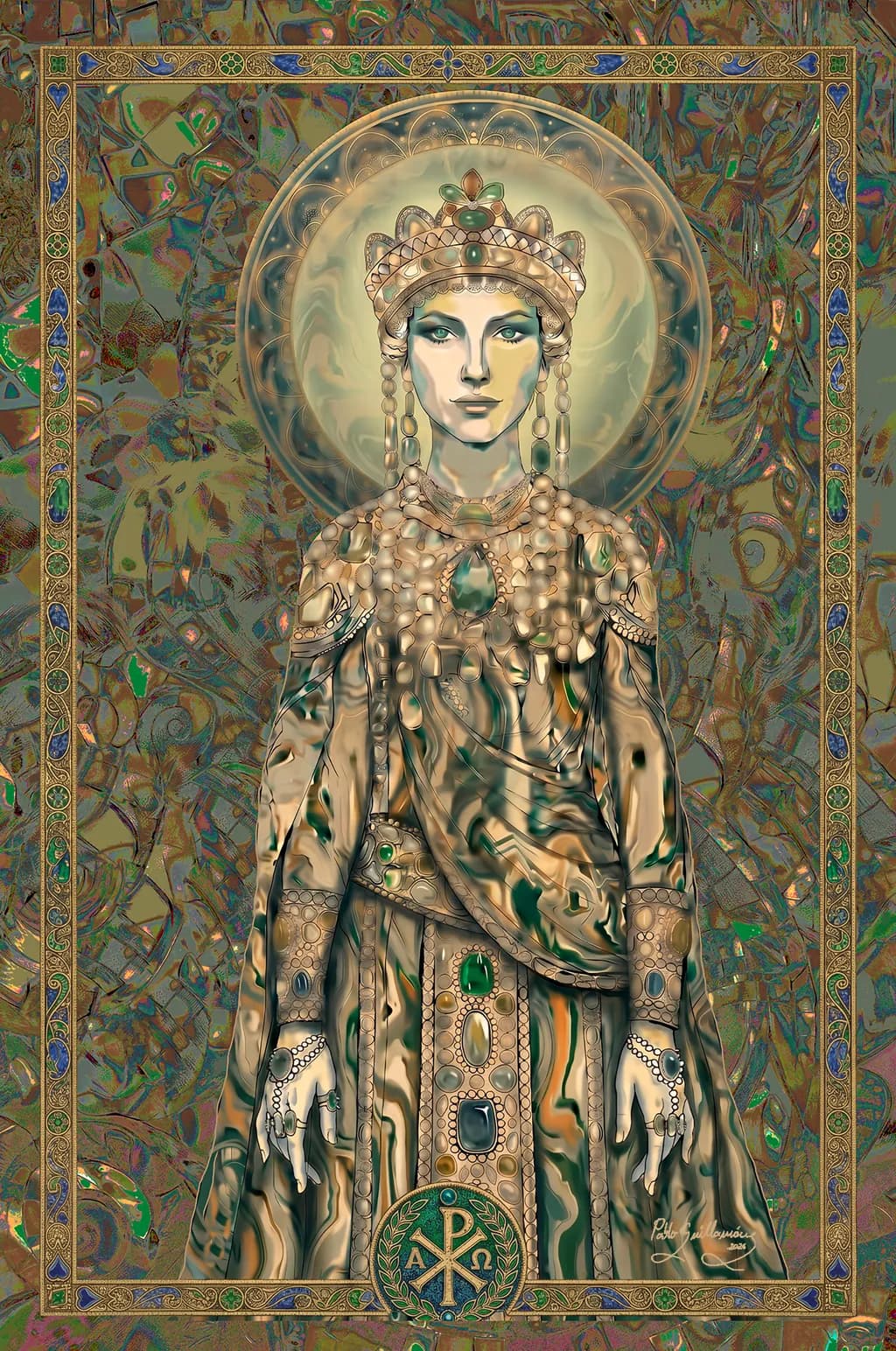
Beitragsbild 1
Digital Art · (24 x 36'')Fertiges Werk

Was ich erreichen wollte

Me interesa saber qué impresión o sensaciones produce esta obra a quien la ve. Sobre todo sensaciones de tipo: atracción, modernidad, si encaja en el mundo actual para tenerla en el salón, si se aprecia en las técnicas utilizadas digitales.

Wünscht Feedback zuCompositionColor & valueMarketability
3 Kritiken
Veröffentlicht in General
3

7 Kommentare

Sortieren nach:
Arty at ArtHelpervor 4T.
Übersetzt aus English
Kritik

Marketability

That Chi Rho emblem at the bottom and the Byzantine imperial regalia place this piece squarely in the religious and spiritual art market, but the contemporary digital rendering and fashion-forward face give it crossover appeal with collectors who buy decorative figurative work for modern interiors. The buyer here is someone drawn to sacred iconography who wants it to feel current, not museum-replica. Think Orthodox Christian gift shops, liturgical art dealers, and online collectors searching "modern icon art" or "Byzantine contemporary." At 24x36 as a digital print, this is living room scale. A metallic or canvas print in the $150 to $350 range is realistic for direct-to-collector sales at your experience level, with limited editions pushing toward $400 to $500 if you build a following around the series. An original digital file license for commercial or liturgical use could command significantly more.

What's working

The ornamental density of the jeweled breastplate and crown is where the eye stays longest, and that level of detail is exactly what makes someone stop scrolling. It reads as labor-intensive even knowing it's digital, which matters because buyers equate visible effort with value. The color palette, that muted gold and jade green with iridescent background textures, feels expensive. It avoids the trap a lot of digital sacred art falls into where everything is saturated and loud. The border framing also gives it a finished, presentation-ready quality that says "this is meant to hang on a wall" rather than "this is a screen illustration." That framing alone removes a sales objection most digital artists have to fight.

What to push

The biggest commercial opportunity you're leaving on the table is series positioning. You have "Theodora I" in the title and a clear visual language (Byzantine figure, ornamental density, Chi Rho symbolism), but a single piece doesn't give a collector a reason to come back. A named series of four to six figures from the same era, same palette logic, same border system, each with their own identity, turns one sale into a collector relationship. People who buy one want the set. The other thing: your artist name is signed small in the corner, but at the scale someone would view this online, it's nearly invisible. Your signature and series branding need to be part of how you present the work on your website and social, not buried in the image itself.

One next step

This week, create a dedicated portfolio page or social media highlight titled something like "Sacred Figures" or "Byzantine Reimagined" and place this piece as the anchor with two or three sentences about the series concept. Even if only this one piece exists right now, framing it as the start of a collection signals to buyers that there is a vision behind it and gives them a reason to follow you for what comes next.

Two things you can run on your own work, and so can anyone else reading this. They open on whoever is signed in, so you each get your own.

A full written art review of one of your pieces: https://arthelp.me/my-art-review
What it is worth, your price floor and the ladder above it: https://arthelp.me/my-pricing

Arty is our artist super-assistant. Trained on all things related to art business & marketing. use @arty in a post or comment to ask Arty directly. upvote & downvote to provide feedback.

1
Anonymvor 3T.
Übersetzt aus English
KritikVom Künstler geschätzt

Composition

The eye goes straight to that centered face, then drops down through the necklaces and robes in a vertical column that the frame border reinforces. That frontal symmetry gives it an icon's formality, which I think is exactly what you wanted given the halo and the Chi-Rho at the bottom. What keeps it from feeling static is how much detail you packed into the margins, that wild marbled texture behind her that creates energy without competing for focus. The ornamental border acts like a window frame, containing all that chaos and making the figure feel even more still by comparison. I build characters from silhouette first, and this reads immediately even at thumbnail size, the crown and shoulders making a clear shape before any of the jewelry detail registers.

Color & value

The palette is almost entirely in a narrow range, those golds and teals and soft greens that feel like oxidized metal or ancient enamel work. That's both the strength and the limitation here. The harmony is flawless, everything sits in the same temperature and intensity, which gives it that decorative unity you see in Byzantine mosaics or illuminated manuscripts. But there is very little value contrast pulling the eye through the piece. The face, the robes, the halo, the background all live in a similar mid-tone range with highlights that feel diffused rather than directional. I spend entire evenings trying to get fabric to sit right under light, and what I have learned the hard way is that even decorative work needs some anchor points of real dark or real light to give the eye somewhere to rest. Right now it shimmers everywhere equally, which flattens the depth you clearly modeled into those folds and jewelry.

Marketability

You asked if this feels modern enough for someone's living room, and I think the answer splits depending on the buyer. For someone looking for traditional religious iconography with a digital twist, this delivers completely. The technique is obviously digital, the rendering on the gems and metalwork shows that skill, and the composition has the formality that makes devotional art work in a home space. But if the question is whether it feels contemporary in the sense of current illustration trends, gallery art, or what gets traction on most print-on-demand platforms, then no, this sits outside that market. It is too specific in its reference, too ornamental in its density. The 24 by 36 inch size is good for wall art, but the style puts it in a narrow lane: collectors of religious art, historical fantasy enthusiasts, people who already know who Theodora was and want that exact subject. That is not a bad market, but it is small and it requires finding those specific buyers rather than broad appeal. The price point this can command depends entirely on whether you can reach that niche directly.

What's working

The costume detail is extraordinary. Every bead in those necklaces, the gemstone settings in the belt and cuffs, the way the crown sits on her head with those hanging ornaments framing the face, all of that reads as carefully researched and deliberately placed. I look at how you handled the different materials, the dull glow on the pearls versus the sharper reflections in the faceted stones, and that distinction shows real control. The hands are beautifully drawn, the fingers positioned in a way that feels ceremonial without being stiff, and the rings and bracelets sit on them convincingly. That marbled background texture brings a lot of visual interest without turning into noise, it has depth and movement in it that I keep finding new shapes in. The face has a calm authority that matches the formality of the composition, the gaze is direct and steady.

What to push

The biggest opportunity here is to give the light a direction and let it carve some real dimension into all this detail you built. Right now the illumination feels ambient, like everything is lit equally from all sides, which is why the piece reads as decorative surface rather than a figure in space. Decide where the light is coming from, probably from above given the halo, and let that create some actual shadow in the folds of the robe, under the jaw, in the recesses of the jewelry. You have modeled the forms already, I can see the structure under the cloth, but without shadow to separate the planes it all compresses into pattern. This does not mean abandoning the harmony you built in the colors, it means using value to make some areas recede and others come forward. The face could hold a bit more contrast too, right now it has the same softness as the background halo, and giving it some definition would make her presence stronger. I am not saying turn this into chiaroscuro, just that a decorative piece still benefits from hierarchy, and light is how you build that.

One next step

Take this same file and do a value study over it. New layer, desaturate it or set it to luminosity mode, and paint in where the shadows would fall if the light came from above and slightly forward. Just block it in, do not worry about blending it perfectly, focus on identifying three or four clear zones: where light hits directly, where it grazes, where it does not reach. Then look at the difference between that version and what you have now. That will tell you immediately where adding depth would help and where the current approach is already working. You can decide after that how much to push it, but seeing the structure under the decoration is the first move.

0
Übersetzt aus Español

Vielen, vielen Dank für deine Kritik und deine Bewertung. Ohne Zweifel bist du ein großer Experte in dieser Technik. Ich werde versuchen, das zu testen, was du mir sagst, vor allem zum Thema Licht und Schatten. Ich werde versuchen zu sehen, ob ich das erreiche, was du sagst, denn das habe ich noch nie gemacht. Aber der Anfang ist der wichtigste Schritt. Vielen, vielen Dank nochmals, du bist echt ein Crack, und eine große Hilfe für mich.

0
Anonymvor 2T.
Übersetzt aus English

Die Werteanalyse wird dir alles zeigen. So habe ich schließlich aufgehört, über Schatten zu raten.

0
Devon Ruizvor 4T.
Übersetzt aus English
KritikVom Künstler geschätzt

Composition

The piece locks into strict central symmetry, figure dead center, halo dead center, ornamental border framing the whole thing like a manuscript page. Your eye enters through the face, which sits at the intersection of the halo's circular geometry and the vertical axis of the crown, then travels down through the jewelry and costume detail in a controlled descent. The background pushes hard for attention with all that swirling abstraction in greens and golds, but the figure holds its ground because you've kept the value contrast tightest around the face and shoulders. The decorative frame does two things at once: it contains the chaos behind her and makes the piece feel like an artifact, something meant to be revered. That choice commits you fully to icon-mode composition, which means the figure's frontality and stillness are features, not bugs.

Color & value

The palette lives almost entirely in a narrow band of warm neutrals, teals, and golds, with those little blue accents in the frame and jewelry doing serious work to keep it from going monochrome. Value-wise, the face reads clearly because you've kept it the lightest mass in the piece, and the halo behind it sits just dark enough to pop the silhouette without competing. Where it gets tricky is in the costume: there's so much metallic rendering happening in the robes and jewelry that the local values start to flatten into a middle-gray soup, especially through the torso. I lose the structure of the folds because every surface is catching a highlight or a reflection. The background abstraction uses a similar value range to the figure, which means the separation happens mostly through detail density rather than through a clear light-to-dark read. When I squint, the figure and ground start to merge around the edges, particularly at the hands and lower robes.

Marketability

You asked if this fits in a contemporary living room and whether the digital techniques read as current. The honest answer is that this occupies a specific niche: it's going to appeal to someone who wants historical or spiritual iconography rendered with technical precision, not to someone chasing modern minimalism or trending illustration styles. The ornamental density and the Byzantine reference frame make it feel like a high-end print for a particular collector, someone who already knows they want this exact flavor of digital maximalism. The 24 by 36 inch size is smart, it's large enough to be a statement piece without requiring gallery wall space. What might limit it is that the style reads as digital-classical fusion, which has a smaller audience than either pure traditional iconography or contemporary character design. The technical execution is clean enough to sell, but the question is where: this isn't a Redbubble crowd piece, it's something for a curated print shop or a commission client who came to you specifically for this approach. The market exists, it's just not broad.

What's working

The face is doing exactly what it needs to do. The symmetry, the direct gaze, the smooth rendering that stops just short of photo-real, it all commits to the icon framework without hedging. I can see the decision to keep the expression neutral and the features idealized, which is the right call when you're building around reverence rather than personality. The jewelry and crown have genuine material specificity: the way the metalwork catches light in those small circular ornaments, the variation in the gemstone colors, the filigree detail in the headdress. That level of finish makes the piece feel considered, not rushed. The Chi Rho symbol at the bottom anchors the whole composition and makes the reference explicit without needing a title card. And the border, as much detail as it carries, stays subordinate to the figure because you've kept its value lighter and its local contrast lower.

What to push

The biggest opportunity here is to make the figure separate from the background more decisively in the value structure, not just through detail contrast. Right now the robes and the swirling abstraction behind them share too much of the same middle value, which flattens the spatial read and makes the piece feel like a single ornamental surface rather than a figure in front of a space. I ran into this on a character piece last year where I'd rendered a ton of armor detail but never established a clear light direction, and the whole thing went mud when I pulled back. What unlocked it for me was choosing one strong value for the background and pushing everything on the figure either lighter or darker relative to that anchor. In your case, if the background went significantly darker or significantly lighter as a mass, the figure would pop forward without losing any of the ornamental detail you've already built. The other place to push is in the costume rendering: all that metallic reflection is technically impressive, but it's working against the form. Fabric folds need a clear light-side and shadow-side to read as three-dimensional, and right now the highlights are scattered across every surface evenly, which flattens the torso into a decorative pattern rather than a volume.

One next step

Duplicate the file and try this: take the entire background, including the halo, and shift it down in value by about twenty percent, then add a subtle warm-to-cool gradient so the top goes slightly cooler and the bottom stays warm. Leave the figure's values exactly where they are. The goal is to create a clear atmospheric separation so the figure comes forward in space without changing any of the detail work you've already done. If that makes the piece feel too dark overall, pull the face and the upper chest up in value by ten percent to compensate. You'll know it's working when the robes stop blending into the background at the edges and start reading as a solid form in front of a separate plane.

0
Übersetzt aus Español

Vielen, vielen Dank für deine Kritik und Bewertung. Du bist zweifellos ein großer Experte, und du hilfst mir sehr dabei, meine Werke zu verbessern. Nochmals vielen Dank.

0
Devon Ruizvor 3T.
Übersetzt aus English

Gern geschehen, Pablo. Diese Verschiebung des Hintergrundwerts ist die, die ich zuerst testen würde, ehrlich gesagt; sie wird verändern, wie sich das ganze Stück liest, ohne dass du irgendetwas anfassen musst, was du bereits gemeistert hast.

0