Kritik-AnfrageKritikfenster geschlossenCritiques earn 20X points
Der Wächter
Übersetzt aus English
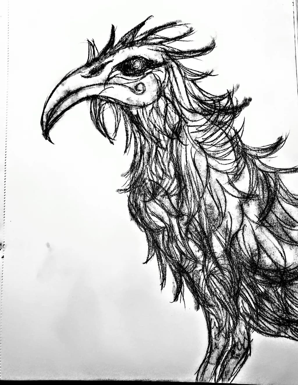
Graphite · 12×9Fertiges Werk
Was ich erreichen wollte
An undead raven skeletal and wild ruffled feathers wide eyed with a feeling of him having gone thru a lifetime of he'll like a warrior with an eternity of knowledge and wisdom and well kept secrets while being a little rough ND worn he doesn't elicit fear instead a message of no matter how hard the path u can reach a well deserved end
Wünscht Feedback zuMarketabilityPricingTechnique
3 Kritiken
Veröffentlicht in General
4
Technique
The line quality is confident, especially in the feathering where each stroke has weight variation and the overall rhythm feels organic rather than traced. You kept the sketch energy, which gives the piece life. The beak has real structure, the curve reads as form not outline. What is missing is a committed value hierarchy. The darkest darks in the eye and the beak are close to the midtones everywhere else, so the piece has no clear entry point when you step back. In my own work I have learned this the slow way, that holding onto every texture costs you the ability to guide the eye. The ruffled feathers you wanted come through in the upper crest and along the neck, but the lower body trails off into tentative marks that feel unfinished compared to the decisiveness above. The spiral under the eye is a nice embellishment but it competes with the pupil instead of supporting it.
Marketability
The skeletal raven occupies a very specific niche: dark fantasy illustration with a gothic edge. That niche has a real customer base, mostly online, mostly buying prints and apparel. Your problem is competition density. Etsy and Redbubble are flooded with skull animals, and yours needs to work harder to stand out in thumbnail. The eye detail is strong, the feathering has texture, but the composition reads flat in small format because everything lives in the same value range. When I scroll through dark art markets, the pieces that stop me have either a tighter focal punch or a more theatrical use of negative space. Yours has the craft but not yet the stop-scroll power. It will sell to people who already found you, which means it is a portfolio piece more than a lead generator.
Pricing
If this is going to print, you are pricing the file work and the exclusivity of the original drawing separately. For a 12×9 graphite original at professional level, you could ask $200 to $350 if the artist name carries existing demand, but without that audience the market price drops to $80 to $150. For prints, an 8×10 should sit around $15 to $25 depending on paper quality, and anything above that needs either a known name or a very dedicated fanbase in the dark fantasy community. The hard truth is that raven skulls are common enough that buyers expect accessible pricing unless the execution is museum tight or the artist has built a following that lets them charge for scarcity. Right now you are in the middle ground where the technique is solid but the subject does not command a premium on novelty alone. Start conservatively, raise prices as demand proves itself.
What's working
The head plumage is where you committed. Those sweeping, layered strokes in the crest have real movement, they feel wind-touched and chaotic in a way that matches the "rough and worn" part of your intention. The eye itself holds the undead intelligence you were after, the wide stare with enough detail in the iris to suggest seeing without tipping into cartoon. The beak structure is convincing, it has the predator hook and the weight of bone. You kept irregularity in the feather edges, little breaks and jags that make this feel like a creature with miles on it rather than a clean illustration. That texture instinct is your strength. When I look at architecture I am always drawn to the weathered brick, the surface that carries time, and you have that same eye here in the way the feathers fray and the line work refuses to smooth itself out.
What to push
The biggest opportunity is to make a choice about where the darkest darks live and then defend that choice everywhere else. Right now the piece has a gentle gradation across the whole bird, which diffuses the intensity you described. If the eye is the seat of knowledge and secrets, it should own the blackest black. If the beak is the warrior weapon, it should cut against lighter space with more contrast. The body trailing off into lighter, sketchier marks could work if it felt like an intentional dissolve, a ghost-bird fading, but next to the dense upper half it reads as unfinished rather than atmospheric. You need to either bring the lower body up to the same level of commitment or push it much lighter so the fade feels like a design decision. The white space on the right is passive. It is not framing the bird, it is just leftover paper. Cropping tighter or adding a single dark accent on that side would give the composition a shape instead of a default.
One next step
Take this exact drawing and do a value study in a separate quick sketch, blocking in only three tones: black, mid-gray, white. No feather detail, just shapes. See where the piece pulls your eye when it is that simple. My guess is you will find the head works and the body disappears. Once you see that clearly, go back into the lower neck and chest with your darkest graphite and build real shadow structure so the ruffled texture sits in space instead of floating. Thirty minutes of committed darks in the body will change how the whole piece reads.