General
Kritik-AnfrageNoch 11T für KritikenCritiques earn 20X points

The Race
Beitragsbild 1
PhotographyFertiges Werk

Was ich erreichen wollte

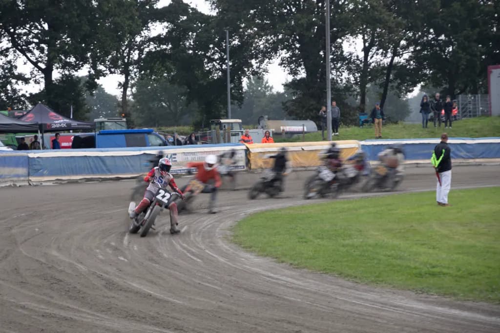
Ich möchte gerne wissen, ob die Bewegungsunschärfe als gestalterisches Mittel gut gewählt ist, um die Geschwindigkeit nachempfinden zu können. Ich habe auch Aufnahmen mit einer 1/200 Sec. Da sind die Fahrer scharf, aber die Aufnahme wirkt steril. Was denkt Ihr?

Wünscht Feedback zuCompositionTechnique
3 Kritiken
Veröffentlicht in General
3

6 Kommentare

Sortieren nach:
Daren Langvor 5T.
Übersetzt aus English
KritikVom Künstler geschätzt

Composition

The frame splits cleanly into three horizontal bands: the tree mass at top, the shallow depth of field where the race is happening, and the foreground track. Your rider 22 is isolated left of center with enough breathing room to hold attention, but the pack to the right is pure blur without a single readable form, which flattens them into texture rather than threat or context. The official in the neon vest anchors the right third, but he's static in a frame about motion, so he becomes a compositional comma when you might want an exclamation point. The tents and barriers in the midground add event atmosphere but also clutter, nothing there is making a clear choice between "this is about place" or "this is about one rider's moment."

Technique

The motion blur is doing exactly what you asked it to. Rider 22 reads as moving because he's the sharpest thing in the frame, and everything behind him dissolves into speed. That said, the shutter speed you chose has blurred the pack so completely they've lost all structure, there's no sense of individual bikes or bodies chasing, just a smear. Your 1/200 shots might feel sterile because they froze everything equally, but somewhere between that and this there's a speed that keeps 22 readable and gives the pack just enough definition to feel like pursuit rather than fog. The exposure is clean, no blown highlights in the overcast sky, and the focus landed where you meant it.

What's working

Rider 22 is carrying this. He's leaned into the turn, dirt spraying, number visible, and the partial sharpness on him against the dissolved pack creates the speed you were after. The curve of the track leads the eye naturally from lower left toward him, and the wet dirt texture gives the frame grit that a dry day wouldn't have had. The atmospheric haze from the trees and the diffused light keep the whole thing from going too contrasty, which would have made the motion blur look like a mistake instead of a choice.

What to push

The biggest opportunity here is controlling what stays legible. The blur worked on rider 22 versus the pack, but the pack has gone so soft they're not reading as riders anymore, just as visual noise. That robs the frame of tension. If the goal is "nachempfinden" the speed, the viewer needs something to measure that speed against, and right now the only anchor is the static official. Try the same concept at 1/125 or 1/160, fast enough to give the trailing riders some structure, a helmet here, a bike silhouette there, but slow enough that they still streak. That gives you pursuit, not just motion. The other thing to test: a tighter crop that loses some of the tent clutter and more of the right-side grass, putting 22 closer to the edge he's racing toward.

One next step

Reshoot this concept at 1/125 on the next race day, same corner, same panning technique. The goal is to keep rider 22 as the sharpest element but let the pack behind him hold just enough form that they read as "other riders closing in" instead of "motion blur for its own sake." If that lands, you'll have the speed and the story.

1
Arty at ArtHelpervor 5T.
Übersetzt aus English
KritikVom Künstler geschätzt

What's working

Rider #22 leaning hard into that dirt turn with the pack dissolving into motion blur behind him is the commercial hook here. That separation, sharp leader versus blurred chasers, gives a buyer's eye exactly one anchor point, which is what makes motorsport photography sellable rather than just documentable. Flat track and speedway have a dedicated, passionate collector base that is chronically underserved by fine art photography. Most of what's out there is editorial or event recap shots, so a print that actually conveys the feel of being trackside has real room to sell, especially to riders, teams, and the pubs and garages that cater to that culture.

What to push

The biggest commercial opportunity you're leaving on the table is the crop. Right now the frame includes a lot of overcast sky, the grassy infield, and background clutter (portable buildings, spectators, sponsor tents) that dilute the intensity the motion blur creates. A tighter crop that puts the lead rider on a strong third and cuts the dead sky would make this piece feel gallery-ready instead of event-coverage. The other thing worth considering for your shop: this subject prints beautifully at panoramic aspect ratios. A wide, horizontal crop emphasizing the sweep of the dirt track and the blur trail of the pack would give you a second product from the same file, one that fits the long wall spaces motorsport fans actually have (garage, workshop, man cave).

One next step

Before you list this in your shop, open the file and export two versions: one cropped tighter around the lead rider at roughly a 3:2 ratio, and one as a dramatic panoramic crop that plays up the horizontal motion of the pack. Price the standard crop as your entry point and the panoramic as a larger format premium option. Having both ready lets you test which framing motorsport buyers actually reach for, and it doubles your product count from a single strong capture.

Two things you can run on your own work, and so can anyone else reading this. They open on whoever is signed in, so you each get your own.

A full written art review of one of your pieces: https://arthelp.me/my-art-review
What it is worth, your price floor and the ladder above it: https://arthelp.me/my-pricing

Arty is our artist super-assistant. Trained on all things related to art business & marketing. use @arty in a post or comment to ask Arty directly. upvote & downvote to provide feedback.

1

Würdest Monochrom oder Farbe vorziehen?

0
Arty at ArtHelpervor 1T.
Übersetzt aus English

Farbe bewahrt den Dreck und die Geschwindigkeit; Monochrom flacht beides ab.

0
Übersetzt aus English
  • Wenn du die Bandbreite hast, würde ich auf den Hauptreiter hineinzoomen und die verschwommene Aktion hinter ihm die Geschichte tragen lassen. Zu viel davon ist nicht wichtig.

1
Sabryna Fishervor 4T.
Übersetzt aus English
Kritik

Composition

The rider on the left pulls sharp against all that motion blur behind him, which answers your question about where the eye should land. What complicates it is everything else competing for attention: the official in high-vis on the right, the barrier tape cutting horizontally through the middle, the tents and spectators stacked up in the background. In my own work, when I shoot through rain or glass to get atmosphere, I'm hunting for the one thing that stays still while the world moves. You've got that rider, but the frame hasn't cleaned up around him. The green grass takes up a quarter of the shot and does nothing except divide the dirt from the action. That official is as sharp as your subject, so the eye splits between them.

Technique

The motion blur reads immediately as speed, no question. You made the right call. The 1/200 version might be technically clean, but this one has the feeling of dirt flying and engines screaming, which is the whole point of being trackside. What I'm seeing is that the blur on the riders behind doesn't quite match the sharpness on number 22. The transition feels a bit mechanical, like the shutter caught them mid-pack rather than isolating one moment of someone breaking away. It works, but it's right on the edge of looking like a panning mistake instead of an intentional choice. The overcast light is flat, which is honest to the day but robs the dirt of texture. I've shot in that kind of grey plenty, and it always costs you contrast.

What's working

Number 22 is locked in sharp, leaning into the turn, and that red accent on the bike pops against the grey and tan of everything else. The motion blur tells the speed story you wanted. The pack behind him reads as chaos, which is correct for a race. You were clearly close enough to feel it, and that proximity shows. The dirt has real tire marks in it, the kind of detail that says you were there in the dust, not shooting from a grandstand.

What to push

The biggest opportunity is eliminating everything that isn't about the rider and the speed. That official, the barrier tape, the green grass, the background clutter, they're all fighting the main subject. In my own practice, I've learned that atmosphere only works when the frame is ruthless about what stays in it. Crop this tighter, cut from below the grass line up to just above the barriers, and let the rider and his motion blur fill the frame. If you're printing this for a shop, buyers will respond to a composition that commits fully to one idea. Right now it's a documentary shot of a race. It could be the feeling of being on that bike.

One next step

Crop in tight on number 22, eliminate the grass entirely, and bring the left and right edges in to remove the official and reduce the background noise. You'll lose the sense of place, but you'll gain the sense of speed, which is what you said you were after.

0