Kritik-AnfrageKritikfenster geschlossenCritiques earn 20X points
Noch immer vereint
Übersetzt aus English
1/2
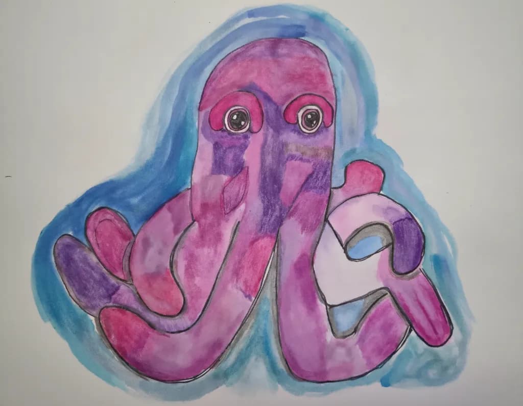
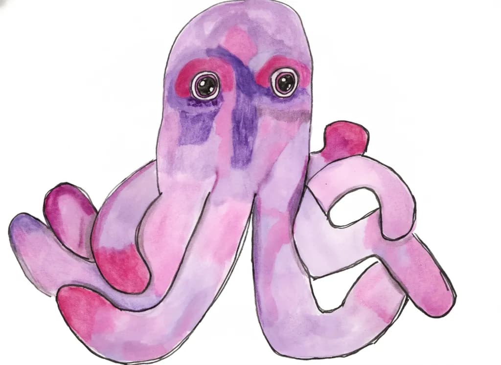
Watercolour ink and colour pencils · 12 × 16Fertiges Werk
Was ich erreichen wollte
I was indpired to sketch my plush purple octopus. Ive been working on highlighting and shadows. I added some darker patches to help the colours pop more. I added a blue wash on the outside to add a deeper contrast.
Wünscht Feedback zuColor & valueTechnique
3 Kritiken
Veröffentlicht in General
1
Color & value
The pink-to-purple gradient across the octopus body and tentacles is the heart of this piece, and you're getting real dimensional shifts out of it. I can see where you layered darker purple into the shadowed undersides of the tentacles and along the vertical sections of the face, which is exactly the instinct you want for turning a flat shape into a round form. The blue wash around the edges does what you said you wanted it to, it punches the warm pinks forward. What's not quite there yet is the value range inside the octopus itself. The darkest darks and the lightest lights are too close together, so even though the color shifts are visible, the form reads a bit flat. When I'm working on something that needs to pop off the page, I squint until I can barely see color, just light and dark, and if everything goes the same middle gray, I know I need to push my shadows way deeper or pull some highlights way lighter.
Technique
Mixing watercolor ink with colored pencil is tricky because the two don't really talk to each other, they just sit on top of one another, and you can see that tension here. The ink gave you those soft bleeds in the blue background and some of the pink washes, but the pencil on top is fighting the wetness of what's underneath. In a few spots, especially on the upper head area, the pencil looks like it's skipping across a waxy or still-damp surface rather than biting into the paper. I spent years fighting acrylic dry time before I figured out my medium needed me to work with its nature instead of against it, and this feels similar. If you want the ink and pencil to live together, you need bone-dry paper before the pencil goes down, and even then, pencil over a slick ink wash will never grip the way it does over dry pigment. The black outlines around everything are doing a lot of structural work holding the shapes together, which tells me the color and value inside those shapes aren't quite doing that job on their own yet.
What's working
The composition is confident. You centered the octopus, gave it space to breathe, let those tentacles spread into the corners without cramping them. The two front tentacles reaching toward the viewer have real personality, like this creature is curious or playful, and that comes through in the gesture of the curves. The eyes are the anchor, the first place I looked, and you kept them simple and bright so they hold attention. The purple you chose for the shadowed sections has enough red in it to stay related to the pink, which means the whole octopus feels like one creature lit by one light source rather than a patchwork of unrelated colors. That kind of color harmony is something I see intermediate painters still struggling with, so the fact that you're thinking about it this early is a real strength.
What to push
The biggest opportunity here is committing to a real light source and letting it carve the form. Right now the shadows exist, but they're tentative, like you were afraid to go dark enough to lose the pretty pink underneath. You said you were working on highlighting and shadows, and I believe you were thinking about them, but the piece needs you to feel them. Pick one direction for the light to come from, top left or top right, and let that decision control everything. Where the light hits directly, leave it pale or even lift some pigment back to white paper. Where the form turns away, where one tentacle tucks under another, go dark enough that it feels like a real drop into shadow. The contrast you added with the blue wash on the outside is working, but the octopus itself needs that same kind of bravery about value inside its own body. I had a floral piece last year that looked washed out until I finally just mixed a purple so dark it was almost black and put it in the deepest petal creases, and the whole painting snapped into focus. This octopus is waiting for that moment.
One next step
Before you start another piece, take this one and go back in with just the darkest purple you have, either pencil or ink. Find three places where one form is definitely behind or under another, like where a tentacle curls under the body or where two tentacles overlap, and make those shadows twice as dark as they are now. Don't blend them, don't soften them yet, just put the dark down and see what happens to the form. You can always lighten later, but if you never find out how dark is dark enough, every piece will stop short of the dimension you're reaching for.