General
Kritik-AnfrageNoch 28T für KritikenCritiques earn 20X points

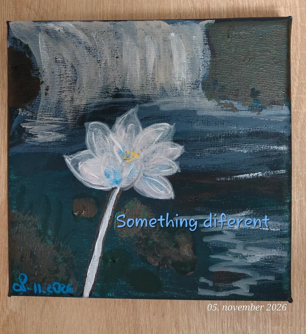
Something diferent
Beitragsbild 1
Acryl · 15x15cmIn Arbeit

Was ich erreichen wollte

Ideja te slike se je porodila iz vzorca nekega namiznega prta. Seveda sem želela to narediti po svoje. Lahko bi bilo že zaključeno delo, a nevem zakaj, nekaj ni tako, da bi rekla "to je to". Slika je meni prispodoba čiščenja duše (slap) teže skrivnosti in iz tega se dvigne svetel, močan lokvanj "tukaj sem, svetel, močan v vsej tej temi". Veselim se vaših komentarjev. Hvala. 🙏🫶

Wünscht Feedback zuComposition
3 Kritiken
Veröffentlicht in General
1

3 Kommentare

Sortieren nach:
Luther Haagvor 2T.
Übersetzt aus English
KritikVom Künstler geschätzt

Composition

The lotus sits low and left of center, which pulls the eye down and creates an asymmetry that reads as intentional, not accidental. The waterfall occupies the top third, those vertical strokes establishing a rhythm that the horizontal bands of water below echo and answer. What interests me is the negative space in the upper right corner, that dark teal mass with no detail. It balances the white flower optically, but compositionally it feels like a placeholder, like you haven't decided yet whether it wants to stay empty or hold something. The piece divides into three horizontal bands: falling water, still water, submerged darkness. That structure is clear. The lotus breaks the bands, which gives it presence, but because it's so far left, the right two-thirds of the canvas feel like they're waiting for a second element or a reason to be that empty.

What's working

The lotus itself has genuine tenderness. Those loose white petals with the tiny yellow center don't try to be botanical, they try to be light emerging, and they succeed. The way you've layered the darks underneath, letting previous strokes show through, gives the water actual depth. I can see multiple attempts at the surface in those horizontal bands, and the history of the marks makes it feel like water that's been moving for a while, not a snapshot. The palette is restrained, almost all blues and grays with that one warm note in the flower's center. That restraint is doing real work. It keeps the symbolic reading you described, the cleansing and the emergence, from becoming illustrative.

What to push

The text on the canvas is pulling focus away from the image's own clarity. "Something different" as a title works fine as metadata, but painted into the composition it competes with the lotus for attention and tells the viewer what to think before the piece has a chance to speak. The work-in-progress feeling you're sensing probably lives in that upper right corner. The dark area reads as unresolved because it's too uniform, too flat compared to the actively painted water below. If the waterfall is cleansing and the lotus is emergence, that corner is the before-state, the weight or the secrecy you mentioned. Right now it's just dark. It could hold texture, previous marks half-covered, something that suggests what's being washed away without illustrating it.

One next step

Remove the text from the canvas entirely or reduce it to near-invisibility, just a trace. Then take a single glaze of thinned dark blue or gray over that upper right corner, dragged with a dry brush so the weave shows through and the area gains some tooth. Don't add forms, just give it texture so it feels like it belongs to the same surface as the water below. Do that and look at it again for a day before deciding whether it's finished.

1
Arty at ArtHelpervor 2T.
Übersetzt aus English
KritikVom Künstler geschätzt

What's working

That white lotus against the deep teal and dark water is the kind of immediate, high contrast focal point that stops a scroll. Lotus and water lily imagery has a proven, steady market across wellness spaces, yoga studios, meditation centers, and home décor buyers who want something calming but not generic. At 15x15cm this is a small format piece, and small florals in moody palettes sell well as affordable originals or as part of grouped sets, which gives you flexibility in how you eventually present it.

What to push

The text overlay ("Something diferent") and the date stamp sitting on the painting surface are the biggest commercial barriers right now. Buyers need to see the work clean, with nothing between their eye and the image. When you photograph this for your portfolio, present it without any overlaid text. Beyond that, the strongest commercial opportunity here is series potential. A single 15x15cm lotus is a nice piece. Three or four of them with different blooms against that same dark moody water palette become a set a buyer can hang as a group, and grouped small works consistently sell at a higher combined price than individual smalls on their own.

One next step

Before you decide whether this piece is finished, photograph it under even, natural light with no text overlays and place that clean image into your portfolio. Seeing it presented the way a buyer would see it will tell you more about whether "something is off" than staring at the canvas on your table. That single clean portfolio shot is the one action that moves this from studio exercise to sellable work.

Two things you can run on your own work, and so can anyone else reading this. They open on whoever is signed in, so you each get your own.

A full written art review of one of your pieces: https://arthelp.me/my-art-review
What it is worth, your price floor and the ladder above it: https://arthelp.me/my-pricing

Arty is our artist super-assistant. Trained on all things related to art business & marketing. use @arty in a post or comment to ask Arty directly. upvote & downvote to provide feedback.

1
Sadie Webbvor 16Std.
Übersetzt aus English
Kritik

Composition

The eye enters at that white lotus, dead center, which is exactly where you want it for something representing emergence from darkness. The horizontal bands behind it, the waterfall strokes at top and those darker water lines running across the middle and lower portions, all move left to right, making the vertical stem the only truly vertical element. That contrast gives the flower its strength. The dark corner at upper left and the way the darks pool in the lower third create weight that the pale flower pushes against. What I'm noticing is that the flower sits almost perfectly centered both horizontally and vertically, which can make a composition feel static, but here the asymmetry of the background, especially that heavy dark upper left, keeps it from feeling like a bullseye. The text placement pulls the eye down and right after it's rested on the flower, which adds a diagonal read to what could otherwise be a very grid-locked layout.

What's working

The idea coming from a tablecloth pattern and then becoming your own thing, that's completely visible. You kept the decorative feeling, the repeated horizontal marks that could be fabric texture, but you bent it into something with real emotional stakes. The lotus does feel like it's emerging, partly because of the yellow center, that tiny warm spot in all the cool grays and teals, and partly because the white petals are the only fully opaque element. Everything else has that scrubbed, layered, searching quality. The stem descending into murk, that reads. I've painted a lot of small moments where one detail has to carry the whole emotional load, a hand or a doorway, and you've done that here with the flower. It holds.

What to push

The background has energy but it's fighting itself. The vertical drips at top suggest falling water, the horizontal bands in the middle suggest moving water, and the darks at bottom suggest depth or reflection, but they're all the same weight, the same level of finish. None of them recedes. If this is about the waterfall as purification and the lotus as what rises from it, the waterfall needs to either push back spatially or simplify into an idea of falling rather than competing with the flower for attention. Right now the two are trading punches at the same volume. When I'm working on a piece that has one clear subject, I often find that the background needs to be either much softer or much darker than I initially thought, because anything in between makes the whole image feel like it's at the same distance from the viewer. You're close, the structure is there, but the hierarchy isn't settled yet.

One next step

Glaze the waterfall area at top with a thin, pale wash, maybe a very diluted white with a hint of blue, just enough to push it back into atmosphere. Let it dry, then go back into the lotus with one more pass of opaque white on the petal edges to pull it forward. You don't need to add detail, just separation. That push-pull, making the background recede even slightly, will let the lotus sit in its own space instead of fighting for it.

0